What Is Multiple Regression: A Practical 2026 Guide
Unlock business insights! Discover what is multiple regression, its interpretation, assumptions, and how to apply it with real-world examples in 2026.
https://www.youtube.com/watch?v=-JTKf-a1JpU
published
Outrank AI
multiple regression, data analysis, predictive modeling, business analytics, python regression
83fc3df3-04ff-4217-b127-420e0f0ac083

You're probably in a familiar meeting. Usage is up, retention looks healthier, and someone asks the question that matters: why?
The product team points to a new feature. Marketing thinks a campaign drove better traffic. Sales says larger customers onboarded more users. Each story sounds plausible, and each has some evidence behind it. But when several things change at once, a dashboard usually tells you only that the outcome moved, not which inputs were important.
That's where people start making decisions from intuition dressed up as analysis. Multiple regression gives you a more disciplined way to separate signals that move together and ask a sharper question: when several factors are in play, which ones still matter after accounting for the others?
Table of Contents
Answering Why Beyond a Single Cause
A product manager logs in on Monday and sees that weekly active users jumped. That's good news, but it creates a harder problem. Three things happened around the same time: a feature launch, a burst of paid traffic, and a strong content push. If you only compare one input to one output, you'll almost always over-credit the most visible change.
That's the primary business use case for what multiple regression is. It helps you evaluate several possible drivers at once, instead of pretending the world changed for one clean reason. For teams working in product, growth, and lifecycle, that matters because the things you care about, activation, engagement, churn, expansion, usually move because of multiple forces operating together.
A lot of confusion starts when people use a simple correlation chart to answer a causal-looking question. If dashboard shares and retention move together, that's interesting. But users who share dashboards might also be the same users who invited teammates, built more reports, or came from a different acquisition channel. You need a method that can hold those other factors in view at the same time.
Practical rule: If your business question starts with “which of these factors matters most,” you're already beyond single-variable thinking.
Multiple regression won't magically prove causality. It won't replace experimentation. But it does improve how you reason about messy business reality. It lets you say something more useful than “this metric rose after launch.” You can ask whether the launch still looks important after accounting for traffic mix, team size, plan type, and prior engagement.
If your team is trying to move from reporting to explanation, it helps to understand where regression fits alongside diagnostic analytics. Reporting tells you what happened. Diagnostic work starts asking why. Multiple regression is one of the clearest tools for doing that with discipline.
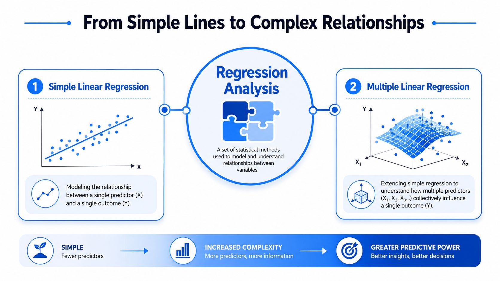
From Simple Lines to Complex Relationships
The easiest way to understand multiple regression is to start with its simpler cousin.
With simple linear regression, you use one predictor to estimate one outcome. Think of ad spend and sign-ups. Or time-to-first-value and retention. You draw a line through the data that best captures the relationship between one input and one result.
Why one variable is rarely enough
That setup is useful, but business questions rarely stay that clean for long. Sign-ups don't depend only on ad spend. They also depend on brand traffic, sales outreach, seasonality, pricing changes, and product quality. Retention doesn't depend only on one feature action. It's shaped by user intent, company size, onboarding quality, and how much value the product creates early.
A one-variable model asks, “How does X relate to Y?”
A multiple regression model asks, “How does each X relate to Y while holding the other Xs constant?”
That “holding the others constant” part is the whole game. It's what makes the method useful for business decisions.
If you want a visual refresher on the simpler version, this guide to a regression line on a scatter plot is helpful because it shows the jump from one fitted line to a model with several inputs.
A business example that makes it click
Use a house-pricing analogy, because it maps well to product analytics.
A simple model might predict house price from square footage alone. That's not wrong. Bigger homes often cost more. But you already know the limitation. Two homes with the same size can have very different prices because of neighborhood, age, condition, and number of bedrooms.
Multiple regression lets you write a richer model:
Outcome | Predictors |
|---|---|
House price | Square footage, bedrooms, age, neighborhood |
User retention | Invites sent, dashboards created, reports exported, onboarding completion |
Expansion revenue | Product usage depth, seat growth, support activity, account maturity |
The same logic applies to product work. Suppose you're trying to understand what drives account expansion. Looking only at “reports exported” might suggest a strong relationship. But maybe larger accounts both export more and expand more. Multiple regression helps isolate whether exports still matter after account size is in the model.
A useful mental model is a mixing board, not a light switch. Several knobs can affect the outcome at once, and the model tries to estimate the contribution of each knob.
So, what is multiple regression in plain language? It's a way to model one outcome using several inputs, so you can make better predictions and better decisions in settings where several things are happening at once.
The Engine Room How the Model Finds the Best Fit
Under the hood, multiple regression looks more technical than it feels in practice. The common form is:
Y = β₀ + β₁X₁ + β₂X₂ + β₃X₃ + ε
You don't need to love equations to use this well. You just need to know what each piece is doing.
The equation in plain English
Here's the translation:
Y is the outcome you care about. That might be retention, revenue, conversion rate, or support cost.
β₀ is the intercept. Think of it as a baseline starting point in the model.
X₁, X₂, X₃ are your predictors. These are the factors you think might influence the outcome.
β₁, β₂, β₃ are the coefficients. They tell you how much the outcome changes when each predictor changes, assuming the others stay fixed.
ε is the error term. It captures everything the model doesn't explain.
Take a product example. Suppose Y is thirty-day retention. Your predictors might include invites sent, projects created, and reports exported. The model estimates how each of those actions relates to retention after accounting for the others.
That last phrase matters because it's where many readers get tripped up. A coefficient is not saying, “users who export reports are different from everyone else.” It's saying, “among users who are otherwise similar on the other predictors in the model, exporting reports is associated with this change in the outcome.”
What best fit actually means
So how does the model choose those coefficients?
Most standard multiple regression uses ordinary least squares, often shortened to OLS. The basic idea is simple: the computer tries many possible combinations of coefficients and chooses the one that makes the model's predictions as close as possible to the actual observed values.
The word “least squares” sounds abstract, but the intuition is concrete. For every row in your dataset, the model makes a prediction. That prediction is usually a bit off. The gap between the predicted value and the actual value is called a residual. OLS finds the set of coefficients that makes those gaps collectively as small as possible.
Here's a business-friendly way to picture it:
With one predictor, the model fits a line.
With two predictors, it fits a plane.
With more predictors, it fits a higher-dimensional surface that you can't visualize directly, but the logic is the same.
Don't treat regression as a black box that produces truth. Treat it as a machine that searches for the cleanest summary of patterns in your data.
That's also why feature choice matters so much. If you leave out an important variable, the model may assign too much importance to another one. If you add predictors that duplicate each other, interpretation gets muddy. The fitting process is mechanical. The business judgment about what belongs in the model is still yours.
Reading the Output Interpreting Your Regression Results
Most regression confusion happens after the model runs. The output looks formal, and people either overtrust it or ignore it. You don't need to read every line. For most business work, three items deserve most of your attention: coefficients, p-values, and R-squared.
A sample output you might see
Suppose your team runs a model where the outcome is user retention, and the predictors are a few early product actions.
Variable | Coefficient | P-value | Business read |
|---|---|---|---|
Intercept | baseline | varies | Starting level in the model |
Invites sent | positive | low | Team collaboration may be linked to stronger retention |
Dashboards created | small positive | higher | Signal may be weak or noisy once other actions are included |
Reports exported | strong positive | low | This action may be closely tied to user value |
Onboarding completed | positive | low | Finishing setup appears meaningfully associated with retention |

That table is intentionally qualitative. In practice, your software will show exact values. The point is learning how to translate them into decisions rather than staring at them as abstract statistics.
For a broader framing of how statistical reasoning supports business interpretation, this comparison of descriptive and inferential statistics examples is useful. Regression lives in that inferential zone. You're not just summarizing data. You're estimating relationships.
How to read coefficients p values and r squared
Start with the coefficient.
A coefficient tells you the direction and size of the relationship for a predictor, all else equal. A positive coefficient means higher values of that predictor are associated with a higher outcome. A negative one means the opposite. The size tells you how much movement the model expects in Y when X moves by one unit.
Here, units matter. “One more invite sent” is easy to picture. “One more logged event” may be meaningless if the unit is too granular. Good analysts often rescale variables so the coefficients describe something a product team can reason about.
Then look at the p-value.
In plain English, the p-value helps you judge whether the relationship looks strong or could plausibly be noise in this sample. A lower p-value gives you more confidence that the coefficient reflects a real pattern rather than random variation. It is not a truth stamp, and it is not a measure of business importance. A tiny effect can be statistically convincing, and a large effect can still be uncertain if the data is thin or messy.
Finally, check R-squared.
R-squared tells you how much of the variation in the outcome your model explains. A higher value means the model captures more of what's going on in the data. But don't turn it into a scorecard for truth. A model can have a respectable R-squared and still be badly specified for decision-making. It can also have a modest R-squared and still reveal a useful operational insight.
A practical reading order looks like this:
Scan coefficients first: Which variables look directionally interesting?
Use p-values to filter confidence: Which relationships seem stable enough to discuss seriously?
Use R-squared for context: How much of the overall pattern is this model capturing?
Return to the business question: Which findings would change a roadmap, an onboarding flow, or an experiment backlog?
Coefficients tell you where to look. P-values tell you how cautious to be. R-squared tells you how incomplete the picture still is.
The Rules of the Road Key Regression Assumptions
Regression is easy to run and easy to misuse. The model can return tidy output even when the underlying setup is shaky. That's why experienced analysts treat the assumptions as rules of the road, not textbook trivia.
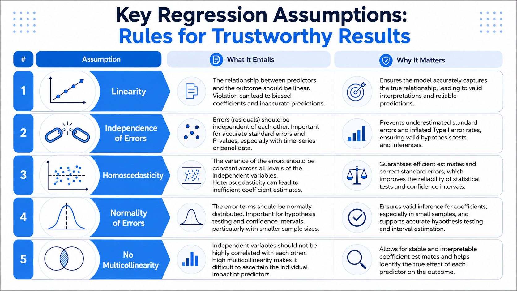
The assumptions that matter in practice
Here are the big ones in plain language.
Linearity: The model assumes each predictor has a roughly linear relationship with the outcome. If retention improves sharply early on and then plateaus, a straight-line assumption may miss the true shape.
Independence of errors: The mistakes the model makes shouldn't be systematically linked across observations. This gets tricky in time-series data, repeated measurements, or account-level product data where events cluster.
Homoscedasticity: The spread of errors should stay fairly even across the prediction range. If the model is much noisier for large customers than small ones, your estimates may still exist, but inference gets less trustworthy.
Normality of errors: For many practical uses, especially with larger datasets, this matters less than people fear. But for formal inference and cleaner confidence intervals, analysts still check whether residuals are wildly skewed.
No severe multicollinearity: Predictors shouldn't be near-duplicates of each other. If “messages sent” and “active days” mostly measure the same behavior, the model may struggle to tell you which one deserves credit.
How teams usually spot problems
You don't need advanced diagnostics to catch many issues. Start with simple visual checks and common sense.
Assumption | What a problem feels like in business terms |
|---|---|
Linearity | The effect seems to bend, plateau, or spike at thresholds |
Independence | Customer or time patterns make errors cluster together |
Homoscedasticity | Predictions are much worse for one segment than another |
Normality | Residuals have obvious extreme skew or heavy tails |
Multicollinearity | Two variables fight for credit and coefficients flip around |
The easiest assumption to underestimate is multicollinearity. Product teams often include several variables that all represent engagement intensity. That sounds responsible, but if those variables overlap too much, the coefficients can become unstable. One run says dashboard creation matters. Another says report exports matter. The truth may be that both proxy for a broader “engaged user” pattern.
If adding or removing one related predictor dramatically changes the coefficient on another, treat interpretation carefully.
A few practical checks help:
Plot residuals: Look for obvious curves or uneven fan shapes.
Review variable pairs: If two predictors move almost in lockstep, don't expect clean separation.
Segment results: If the model behaves differently for self-serve and enterprise users, one combined model may be hiding that.
Good regression work isn't about satisfying theory for its own sake. It's about making sure the recommendation you give a product or growth team rests on analysis that can survive scrutiny.
Regression in Action A Product Engagement Example
A SaaS product team wants to understand what early user behaviors are most associated with later engagement. The team isn't asking an academic question. They want to know which onboarding moments deserve design effort, prompts, and experiments.
The question
The working outcome is retained_at_30_days. The candidate predictors are actions users can take in their first sessions: dashboards created, invites sent, reports exported, and onboarding checklist completed.
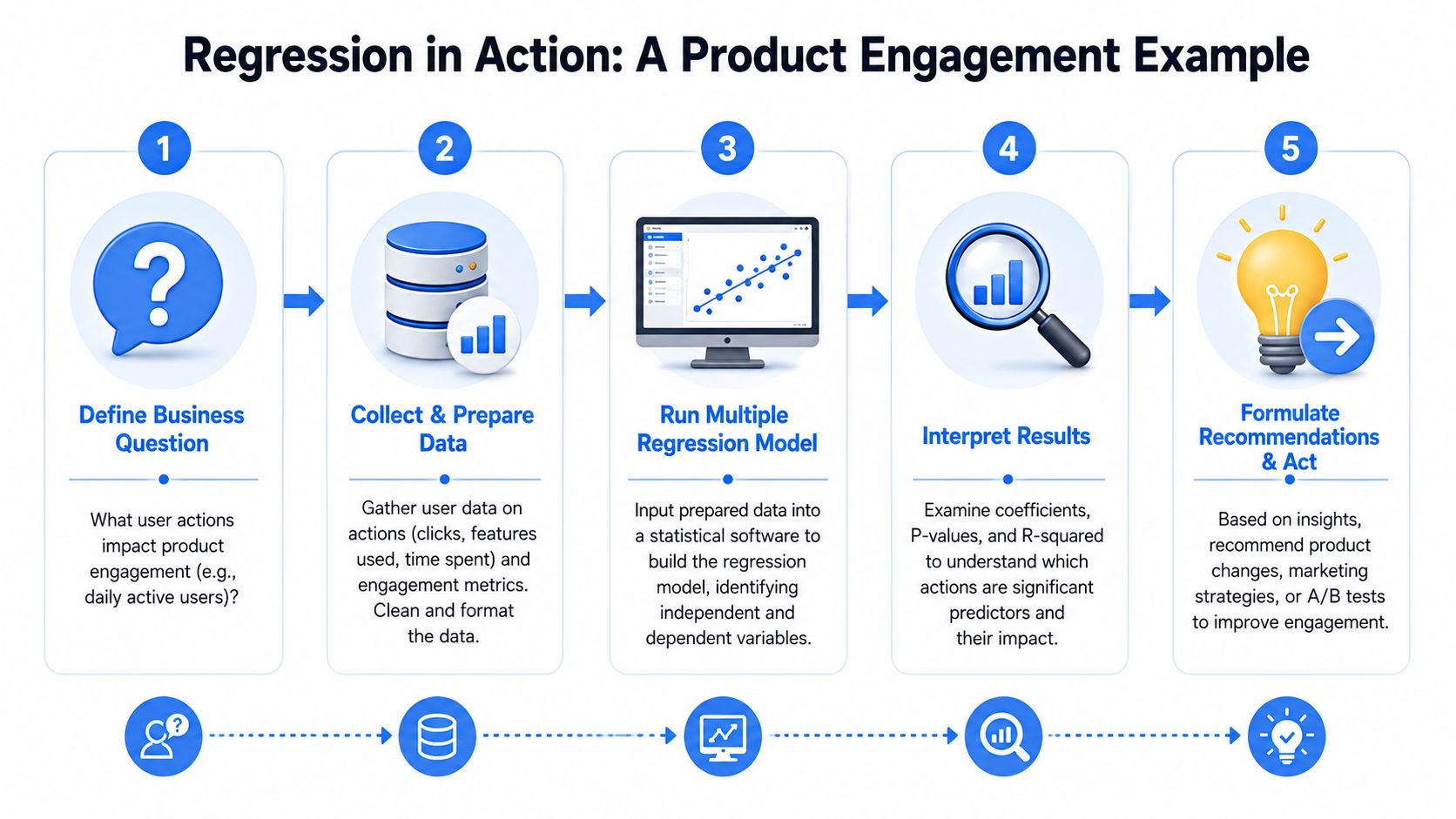
The first pass at the data is misleading. Users who export reports also tend to invite teammates. Users who complete onboarding are also more likely to create dashboards. Looking at any single action alone makes several of them look equally promising. The team needs a model that considers those actions together.
They prepare a table where each row is a user and each column is one predictor. They also add a few controls that might otherwise distort interpretation, such as account type and acquisition source. Then they run a multiple regression model and read the output with the logic from earlier sections.
A plausible interpretation might sound like this:
Reports exported shows a clear positive relationship with retention, even after accounting for the other actions.
Onboarding completed also stays meaningful, suggesting setup progress matters independently.
Dashboards created looks directionally positive, but once the other variables are in the model, it no longer stands out as strongly.
Invites sent may still matter, though its interpretation depends on whether collaboration is naturally concentrated in certain customer segments.
Midway through this kind of analysis, it helps to pause and check whether the patterns are operationally believable, not just statistically tidy.
The decision
The product implication is more valuable than the model itself. If report export remains the strongest signal after controlling for nearby behaviors, the team may treat first export as a critical activation event.
That doesn't mean “build more export buttons” and call it a strategy. It means asking what export represents. Maybe users export only after they've reached a meaningful insight. Maybe it signals successful setup plus stakeholder sharing. The action item could be redesigning the path to that value moment, not merely increasing clicks on an export control.
A sensible response could include:
Improve product guidance: Add in-app prompts that help users reach their first usable report faster.
Design an experiment: Test whether making export workflows more discoverable changes downstream engagement.
Refine the model: Add account-level controls or segment by persona to see whether the relationship holds consistently.
That's the practical value of multiple regression. It turns a noisy list of correlated behaviors into a more disciplined prioritization tool. Not perfect truth. Better decision support.
Run Your First Regression with Modern Tools
If you want to run a first pass yourself, Python is a common place to start. A standard workflow uses pandas for data prep and statsmodels for the model:
That workflow is still solid, but operational friction is often the primary bottleneck. Teams waste time exporting CSVs, cleaning files locally, and rebuilding the same logic outside the warehouse. Modern analytics platforms reduce that gap by letting people work closer to live company data, with inspectable SQL and Python in the same environment. If you're comparing options, this overview of statistical tools for data analysis across R, Python, SPSS, and SAS is a useful framing.
One practical option is Querio, which lets teams work with warehouse data through SQL and Python notebooks generated from natural-language questions. That setup is useful when product managers and analysts want to explore models without passing files around or waiting for a custom extract every time the question changes.
If your team is trying to move from dashboard watching to decision-grade analysis, Querio is built for that workflow. It gives technical and non-technical users a shared workspace on top of warehouse data, where they can inspect the SQL, extend the analysis in Python, and answer questions like retention drivers without turning the data team into a ticket queue.

