Business Intelligence
Which Chart Type Should You Use for Time-Series Data?
Pick the chart that answers your question: lines for trends, areas for totals, bars for period comparisons, sparklines for KPIs.
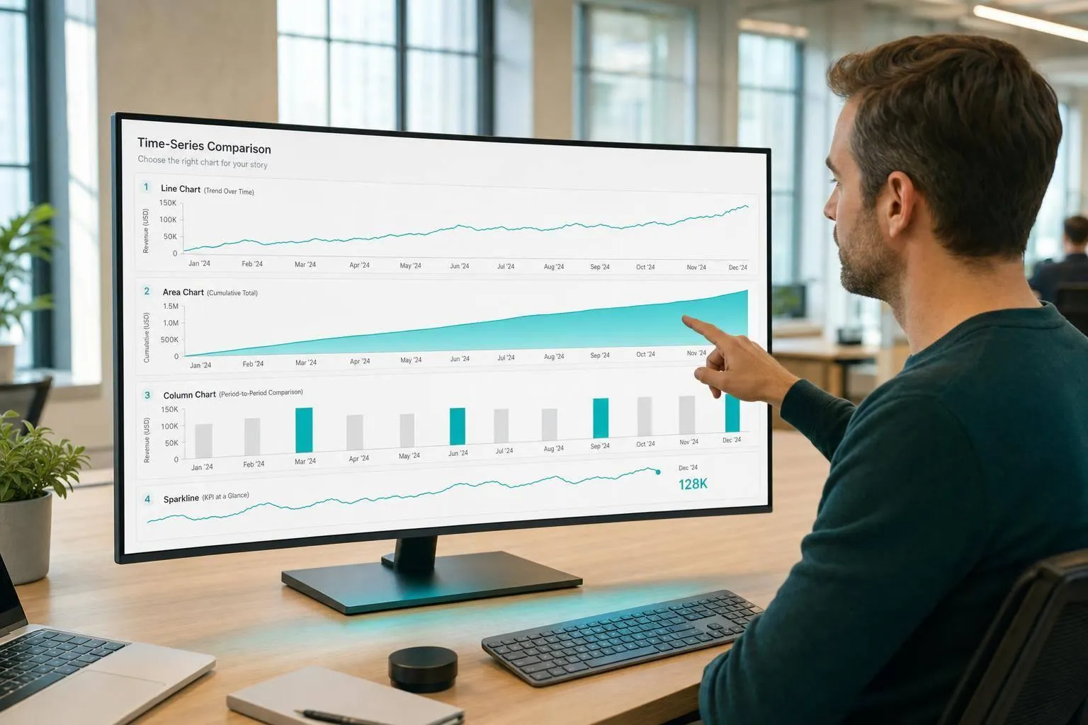
Use the chart that matches the question. If you want to show a trend, use a line chart. If total size over time matters, use an area chart. If you need period-by-period comparison, use bars. For compact KPI checks, use sparklines. For gaps, spikes, or repeated time patterns, use scatter plots or heatmaps.
I’d keep the rule simple:
- Line charts: best for continuous trends and rolling averages
- Area charts: best for total magnitude or cumulative change
- Bar charts: best for comparing a small number of time periods
- Sparklines: best for tiny KPI trend views
- Scatter plots: best for missing dates, outliers, and odd spikes
- Heatmaps: best for seasonality, like hour-by-day or week-by-month patterns
A few rules matter more than the chart itself:
- Keep line charts to about 4–6 series
- Start bar and area charts at zero
- Don’t treat missing dates as zero unless zero is the true value
- Remove incomplete periods, like a partial day
- Keep metric definitions and time grain the same across dashboards
For example, a $125,000 monthly revenue trend may fit a line chart, but unusual claims by day may be easier to spot in a scatter plot. Same time-series setup, different question.
::: @figure 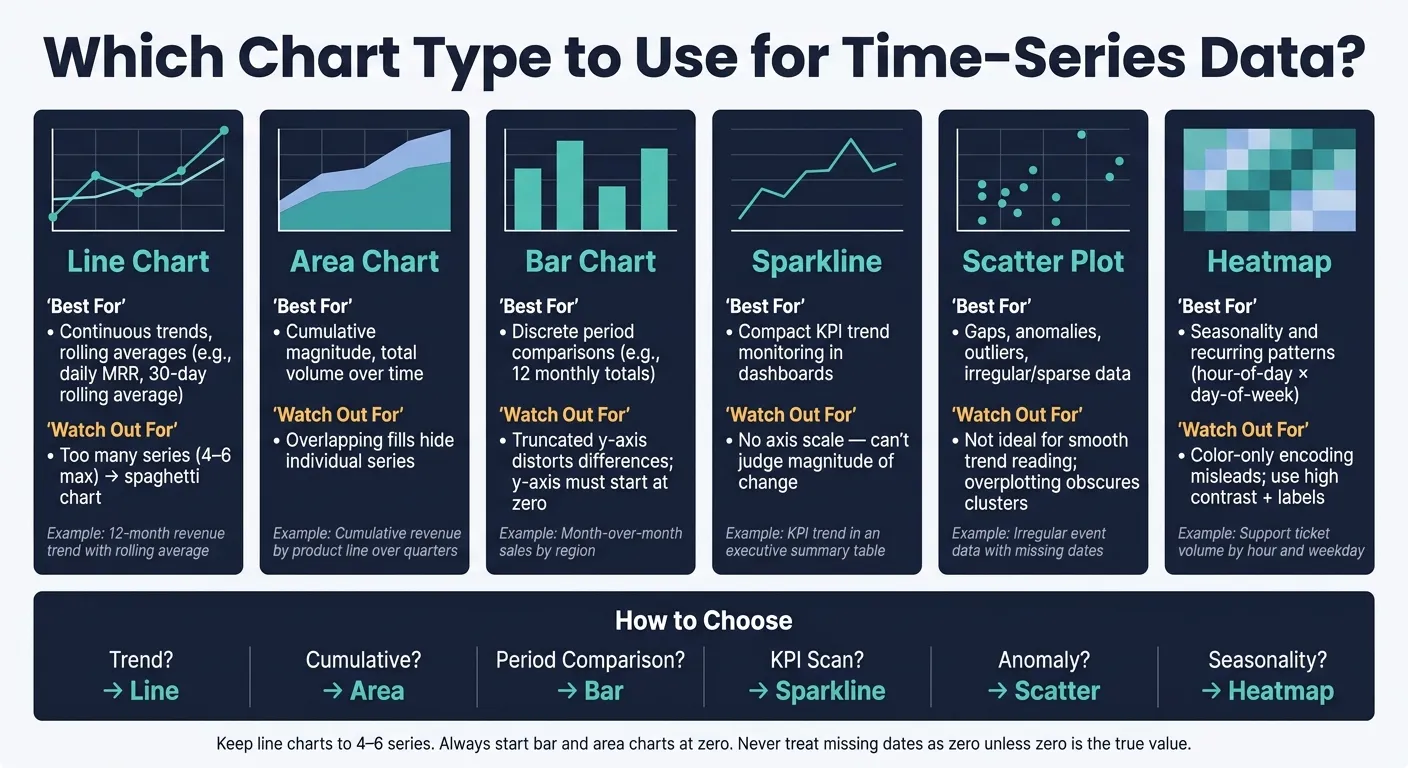 {Which Chart Type to Use for Time-Series Data: A Visual Guide}
:::
{Which Chart Type to Use for Time-Series Data: A Visual Guide}
:::
Master Time Series: 15 Unique Tableau Visualizations
::: @iframe https://www.youtube.com/embed/IS1Gpsgc6a4 :::
Quick comparison
| Chart type | Best for | Watch out for |
|---|---|---|
| Line | Trends, rolling averages | Too many lines become hard to read |
| Area | Totals, buildup over time | Overlap can hide series |
| Bar | Month-to-month or quarter-to-quarter comparison | Cut y-axis can distort differences |
| Sparkline | Small KPI views | No scale for exact reading |
| Scatter | Outliers, gaps, missing dates | Not good for smooth trend reading |
| Heatmap | Seasonality and repeated patterns | Color-only encoding can mislead |
Bottom line: I’d pick the chart based on the decision you need to make, not the metric name. That keeps the visual simple, the message clear, and the data easier to trust.
A chart-selection framework for time-series analysis
Start with the decision the chart needs to support: trend, comparison, cumulative change, anomaly detection, or seasonality. That sounds simple, but it’s where a lot of chart mistakes begin. Pick the chart based on the business question it needs to answer, not just the name of the metric.
Match the chart to the analysis task
The table below maps common time-series tasks to the right chart, points out the usual way each one goes wrong, and connects each option to a BI use case.
| Chart Type | Best Use Case | Best Fit For | Common Failure Mode | Example Business Scenario |
|---|---|---|---|---|
| Line chart | Continuous trends and rolling averages | Dense time series with many periods | Too many series → unreadable "spaghetti" | 12-month revenue trend with a rolling average |
| Area chart | Cumulative change and total magnitude | Stacked parts that add to a meaningful whole | Overlapping fills hide individual series | Cumulative revenue by product line over several quarters |
| Bar chart | Discrete period comparisons | Fewer periods, such as 12 monthly totals | A truncated y-axis can exaggerate differences [1] | Month-over-month sales by region |
| Sparkline | Compact KPI monitoring | Summary tables and executive dashboards | No axis makes exact values unreadable | KPI trend in a summary table |
| Scatter plot | Gaps, anomalies, and outliers over time | Irregular or sparse data with missing dates | Overplotting obscures clusters | Irregular event data with missing dates |
| Heatmap | Seasonality and recurring patterns | Hour-of-day × day-of-week or week × month grids | Coarse color encoding without a legend misleads | Support ticket volume by hour and weekday |
One rule helps a lot here: keep line charts to 4–6 series. Once you go past that, the chart usually turns into spaghetti. At that point, small multiples - a grid of separate charts - are the better move. Each series gets room to breathe, and people don’t have to fight the chart just to read it.
Choose the right time grain before charting
Set time grain once in dbt or your semantic layer so daily, weekly, and monthly charts all use the same bucketing logic across Snowflake, BigQuery, Redshift, and Postgres.
This matters more than people think. If one chart groups by calendar week and another uses a different rule, the numbers can drift even when both teams think they’re showing the same thing.
With grain fixed, the next step is making sure the metric itself means the same thing everywhere it shows up.
Keep metric definitions consistent across charts
Chart disagreements are often metric-definition problems wearing a chart costume. If two dashboards show different revenue totals, the issue usually isn’t the chart type. It’s that "revenue" was defined in two different places.
Define revenue, churn, and rolling averages once, then reuse those definitions across dashboards, notebooks, and AI workflows. Keep each definition tied to the warehouse query and live connection, not a CSV export, so every chart stays auditable.
With task, grain, and definitions lined up, the next section compares line, area, and bar charts directly.
Line vs. area vs. bar charts for time-series reporting
Line charts are best for trends. Area charts work when you want to show total size over time. Bar charts are best for side-by-side period comparisons. Use the table for a quick pick, then check the notes to see where each chart starts to fall apart.
| Feature | Line Chart | Area Chart | Bar Chart |
|---|---|---|---|
| Analytic Intent | Trends, rate of change, rolling averages | Cumulative magnitude, total volume | Discrete period comparisons, totals |
| Ideal Time Density | High (e.g., daily traffic or MRR trends) | Moderate to high | Low (e.g., 12 monthly revenue totals) |
| Y-Axis Baseline | Can be non-zero if labeled | Must start at zero | Must start at zero |
| Business Example | 30-day rolling average of MRR | Cumulative revenue or backlog growth | Q4 sales by product |
| Failure Mode | Spaghetti with too many series | Overlapping fills hide individual series | Noisy and cluttered with long series |
Line charts for continuous trends and rolling averages
Line charts are the default pick when the data is dense and continuous. Think daily MRR, stock prices, or a 30-day rolling average. They also work well for smoothed metrics. For example, if you place a rolling average on top of a raw daily series, readers can spot the signal without losing sight of the noise.
The big problem is adding too many series. Once you get past 4–6 lines, the chart turns into a mess of overlapping paths and becomes hard to read.[2] A simple fix: push secondary lines into light gray and make only the main metric bold.
Area charts for cumulative change and total magnitude
Use an area chart when the main point is the total magnitude, not just whether the metric went up or down. Cumulative revenue and backlog growth are good examples. The filled shape helps show scale at a glance.
Where area charts struggle is overlap. If two or more series share the same chart without stacking, the fills run into each other and it gets hard to tell one series from another. Stacked area charts fix that overlap issue, but they create a new one: only the bottom series has a steady baseline. That means comparing the middle or top series over time takes mental math most readers won't bother doing. So use stacked area when the total matters most and exact comparison between each series matters less.
Bar charts for discrete period comparisons
Bar charts make sense when the periods are few and clearly separated. January vs. February, Q1 vs. Q2, or 12 monthly totals all fit well. There’s one hard rule here: the y-axis must start at zero. If you cut off the axis, even a small gap can look much bigger than it is.[1]
Bars also stop working well when the series gets long. As you add more periods, the chart gets noisy and harder to scan.
If the goal is compact monitoring, spotting anomalies, or seeing seasonality, switch to sparklines, scatter plots, or heatmaps.
When sparklines, scatter plots, or heatmaps work better
When a standard trend chart hides more than it shows, switch to sparklines, scatter plots, or heatmaps. These chart types work best when you're tracking a KPI, spotting odd behavior, or finding where activity clusters. They're not the best pick when the main goal is showing trend direction over time.
| Chart Type | Best For | Not Ideal For | Common Mistake |
|---|---|---|---|
| Sparkline | Trend direction at a glance | Precise value reading | Scale context is missing, so readers can't tell how large a change is [2] |
| Scatter plot | Gaps, anomalies, and outliers | Continuous trend tracking | Using it to show a smooth trend |
| Heatmap | Recurring patterns and concentration | Exact value reading | Relying on color alone can reduce readability for colorblind readers [1] |
Sparklines for compact KPI monitoring
A sparkline is a stripped-down line chart. No axes. No labels. Just the shape of the trend.
That's what makes sparklines useful in dashboards where space is tight. You can scan a lot of KPIs fast. But there's a catch: they hide scale. A sharp-looking jump might be tiny, or it might be huge. You can't tell from the line alone.
So don't show a sparkline by itself. Pair it with the KPI value and the period-over-period change.
If the problem is missing data points or strange spikes, a scatter plot usually does the job better.
Scatter plots for gaps, anomalies, and outliers over time
If the question is "what looks wrong?", a scatter plot can beat a line chart.
Each point stands on its own. That means missing intervals show up as visible gaps, and isolated spikes pop out right away. You don't get the false sense of continuity that a connected line can create.
Use scatter plots when the business question is whether the series breaks pattern, not whether it goes up or down.
Heatmaps for seasonality and recurring patterns
A heatmap shows where values cluster over time. That's useful when you want to see concentration, seasonality, or repeated behavior that gets flattened in a trend chart.
For example, a heatmap can show:
- support volume by hour
- feature usage by day
- any repeated activity pattern tied to time
This is where heatmaps shine. They help you spot when activity bunches up, not just how much happened.
One design rule is worth enforcing: don't rely on color alone. Use high contrast, clear labels, and non-color cues so the chart stays readable for users with color vision deficiencies [1].
Before publishing, check the grain, scale, and color encoding.
Making the right chart trustworthy in warehouse-native BI
Picking the right chart type gets you only halfway. The other half is making sure the metric, time grain, and query logic are correct. A polished heatmap built on a shaky metric is still wrong.
Common failure modes to check before publishing
In BI, many chart problems don't come from the visual itself. They come from the definition behind it. Here are the big ones to catch before anything goes live:
- Wrong time grain: A daily bar chart that includes part of the current day can look like a sudden drop. Cut off or remove the incomplete period.
- Missing dates treated as zeros: If your warehouse has no row for a given day, missing dates should usually appear as gaps. Show zero only if zero is actually the right value.
- Inconsistent metric definitions: "Active user" has to mean the same thing across teams and dashboards. If that meaning shifts across dbt models or BI views, the numbers stop matching. That's definition drift[1].
- Time zone mismatches: If you group a UTC timestamp by day without adjusting it to the viewer's time zone, events can land on the wrong date.
- Rolling-average mismatches: A rolling average needs the same window and cutoff everywhere. If not, two charts can look alike while saying different things.
Stale dashboards can do just as much damage. When event schemas or metric definitions change in dbt, archive old views right away[1]. Keep the current logic in one governed place so people don't end up comparing old and new definitions by accident.
Always label whether data is real-time, refreshed daily, or shown with a lag[1]. That tiny note saves people from a lot of bad reads.
A short chart-choice checklist for data teams
Before you publish any time-series chart, use a simple flow. Start with a line chart for continuous trends. Use an area chart when cumulative buildup is the point. Pick bars when you're comparing a small set of discrete periods. Switch to sparklines when you're scanning many KPIs at once. And if the main issue is seasonality, gaps, or outliers, go with scatter plots or heatmaps.
Chart choice matters. But the part that makes a chart believable is the logic under it. Charts built from live warehouse connections - querying Snowflake, BigQuery, or Redshift directly - stay current and traceable. Charts built from CSV exports can drift quietly the second the source schema changes[1]. With live querying, you can inspect the SQL, check the grain, and confirm the source dbt model.
This is where Querio works well for data teams. Every answer is written as real, inspectable SQL or Python in a reactive notebook, and charts redraw on their own when the query changes. Metric definitions live in a governed semantic layer - plain files synced to the same GitHub repo as your dbt project - so "active user" means the same thing whether the question comes from a Slack bot, a dashboard, or a Claude session via MCP. No CSV round-trips, no opaque logic, no definition drift across surfaces.
FAQs
::: faq
When should I use small multiples instead of one multi-series line chart?
Use small multiples when you need to compare more than six series, or when you want to compare trends across categories like regions or segments. If you cram everything into one line chart, it can turn into a messy spaghetti chart fast.
A grid of panels with shared axes keeps the view clear. It also makes side-by-side pattern comparison much easier and cuts down on the color-matching clutter that comes with an overcrowded multi-series chart. :::
::: faq
How should I show missing dates in a time-series chart?
Keep time intervals consistent, and show gaps instead of hiding them. That way, the x-axis stays evenly spaced and doesn't suggest steady performance when the data is actually missing.
If a time period had no activity, be upfront about it. Use a visual break or dashed line to mark the gap, and add a short note if stakeholders need context on why those dates are missing. :::
::: faq
What time grain should I choose for this metric?
Choose a time grain that gives you enough detail without turning the chart into static. You want it broad enough to show the trend, but not so broad that it hides swings that matter.
The right choice depends on the business decision in front of you. A retention problem from the last 30 days, for example, usually doesn’t need a two-year trend unless seasonality is part of the story. And for recurring reports, it helps to lock in one standard view - like a trailing 12-week window - so people can compare results the same way each time. :::