Business Intelligence
When to use different types of graphs
Learn how to choose the right graph type to effectively visualize data, enhancing clarity and decision-making across various analysis goals.
Graphs simplify data and help turn numbers into insights that drive better decisions. Choosing the right graph ensures your message is clear and actionable. Here's a quick guide to match your data and goals with the right graph type:
Bar Charts: Best for comparing categories (e.g., sales by region). Easy to spot differences.
Line Graphs: Ideal for showing trends over time (e.g., monthly revenue growth).
Scatter Plots: Use to find relationships between two variables (e.g., ad spend vs. sales).
Pie Charts: Great for showing proportions (e.g., budget breakdowns).
For more complex data:
Treemaps: Visualize hierarchical data (e.g., budget allocations).
Network Diagrams: Map relationships and connections (e.g., supply chain dynamics).
Heatmaps: Highlight geographic trends or intensity (e.g., regional customer activity).
Key Tip: Start by identifying your data type (quantitative or qualitative), define your goal (comparison, trends, relationships, or composition), and consider your audience's needs. The right graph transforms data into a story everyone can understand.
Every Chart Type Ranked - What to Use and What to Avoid
Main Graph Types and When to Use Them
Choosing the right graph can transform raw data into clear, actionable insights. Below, we explore key graph types and their best use cases, helping you match the right visualization to your specific business needs.
Bar Charts: Comparing Categories
Bar charts are perfect for comparing values across categories or groups. By using bar heights to represent data, they make differences easy to spot [1]. Whether you're analyzing revenue by product line, sales performance across regions, or customer satisfaction scores by department, bar charts provide a straightforward way to visualize business data for comparisons.
They work best when the differences between categories are significant [3]. If you're focusing on absolute numbers or highlighting contrasts between groups, bar charts are often the ideal choice [5]. They’re great for spotting trends, outliers, and historical highs or lows [4]. Just keep in mind: too many categories can clutter the chart, making it harder to interpret.
Line Graphs: Tracking Trends Over Time
When you need to show how data evolves, line graphs are the way to go. They’re particularly effective for tracking smaller changes that bar graphs might overlook [3]. By connecting data points with lines, they allow viewers to easily follow trends or patterns [1].
Modern AI data analytics tools can enhance line graphs by spotting trends and flagging anomalies that might signal key business events or data issues. For example, when analyzing quarterly sales growth or market trends, line graphs clearly reveal whether performance is improving, declining, or holding steady - insights that are crucial for strategic decisions.
Scatter Plots: Finding Correlations
Scatter plots are ideal for exploring relationships between two variables. They help identify correlations - whether positive, negative, or nonexistent [3]. For instance, you might use them to check if advertising spend correlates with sales growth or if employee training hours relate to productivity scores [4].
AI-powered tools can take scatter plots further by adding trend lines, clustering related data points, and highlighting outliers that might warrant deeper investigation. This makes scatter plots a powerful tool for uncovering patterns and relationships between variables [6].
Pie Charts: Showing Proportions
Pie charts are great for illustrating how parts contribute to a whole. They’re commonly used for displaying budget breakdowns, market share distributions, or survey results [3]. Their intuitive design makes them effective for showing percentage contributions [8].
However, pie charts do have limitations. While they’re excellent for visualizing proportions, bar charts are better for comparing exact numbers [7]. To keep pie charts clear, limit them to a few slices, label values directly, and consider interactive features for extra detail [5] [8].
Graph Type | Best Use Case | Key Strength |
|---|---|---|
Bar Chart | Comparing categories | Clear visual comparison of values |
Line Graph | Tracking trends over time | Shows progression and patterns |
Scatter Plot | Finding correlations | Reveals relationships between variables |
Pie Chart | Showing proportions | Intuitive part-to-whole visualization |
Advanced Graphs for Complex Data
When dealing with intricate data - like hierarchies, relationships, or geographic patterns - choosing the right charts is essential because basic options often fall short. They can obscure critical insights that are essential for making informed decisions. Advanced visualizations, however, bring clarity to even the most complex datasets, enabling smarter business strategies.
Treemaps for Hierarchical Data
Treemaps are perfect for illustrating part-to-whole relationships within a hierarchy. Developed by Ben Shneiderman, these visualizations use nested rectangles to represent hierarchical data, with each rectangle's size reflecting a quantitative value [9]. This makes it easy to identify which elements contribute most to the overall picture.
"Tree structured node-link diagrams grew too large to be useful, so I explored ways to show a tree in a space-constrained layout." – Ben Shneiderman [9]
Treemaps shine when you’re working with positive numerical values and clearly defined categories [11]. They’re especially effective for visualizing organizational structures, budget allocations, or sales performance across categories. Their interactive features allow users to drill down into the data, uncovering patterns and outliers that might otherwise remain hidden [10].
To create impactful treemaps, keep labels minimal (three to four tiles at most) and avoid including negative values [9]. Adding high-contrast borders around top-level categories and ensuring text remains legible can help audiences quickly grasp the information [11][12].
Treemaps are widely used across industries. For example:
Project management dashboards visualize incomplete tasks by project and priority.
Governmental dashboards analyze accident casualties based on vehicle type.
Retail dashboards track product returns by category, aiding strategic decisions [10].
Network Diagrams for Relationships
Network diagrams are designed to map connections and relationships within complex systems. They use nodes to represent entities and links to show their interactions [13][14]. These visualizations go beyond raw data points to reveal the underlying structure - whether it’s customer journeys, social media influence, or supply chain dynamics.
A great example comes from a sustainability study where researchers mapped 47 individuals and their 297 collaborators. This visualization uncovered cohesive groups and isolated individuals, leading to strategic introductions that sparked new conservation projects [14].
When building a network diagram:
Clearly define your scope and gather detailed relationship data.
Use universally recognizable symbols and color codes to differentiate connection types.
Avoid overcrowding by layering complex networks across multiple diagrams.
Regularly validate the diagram against real-world configurations to maintain its usefulness [15].
These diagrams are invaluable for pinpointing bottlenecks, identifying key influencers, and understanding connection patterns within a system.
Heatmaps for Geographic Data
Geographic heatmaps use color gradients to display the intensity of activity or trends across locations. They’re ideal for spotting regional patterns, customer clusters, and trends that influence strategic decisions.
Unlike traditional charts, heatmaps condense detailed geographic data into a single, intuitive view. By using darker shades for higher values, they make it easy to interpret regional trends at a glance [16][17].
In practice:
Retailers use heatmaps to track peak traffic times and optimize staffing.
Manufacturers analyze production line efficiency to identify bottlenecks.
Urban planners rely on population density maps to allocate resources and manage public services effectively [16].
Heatmaps are particularly useful for real-time monitoring. Whether it’s tracking website user behavior, monitoring network performance, or analyzing sales data across regions, these tools provide immediate insights that support quick adjustments [16].
Summary of Advanced Graphs
Advanced Graph Type | Best For | Key Advantage |
|---|---|---|
Treemap | Hierarchical part-to-whole data | Space-efficient nested visualization |
Network Diagram | Relationship mapping | Reveals connection patterns and key nodes |
Geographic Heatmap | Location-based intensity data | Immediate geographic pattern recognition |
These advanced visualization techniques push beyond standard charts, transforming complex datasets into actionable insights. They’re a step closer to leveraging AI-powered graphing tools like Querio for even deeper data exploration. You can even create graphs using AI to automate these complex visualizations.
AI-Powered Graph Features in Querio
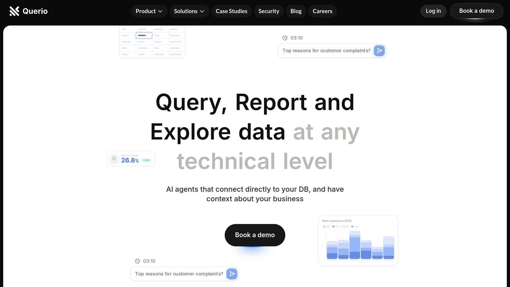
Visualizing data is one thing, but choosing the right graph type for your dataset and objectives? That’s often the bigger challenge. This is where Querio steps in. By blending AI-powered recommendations with intuitive dashboards, Querio makes data visualization and analysis approachable for teams of all skill levels. And it doesn't stop there - Querio also fosters real-time collaboration through its dynamic dashboard features.
Automated Chart Selection
Querio’s AI takes the guesswork out of chart selection. By analyzing your data structure, patterns, and relationships, it recommends the most effective visualization for presenting your insights. This means no more trial and error when deciding between bar charts, scatter plots, or heatmaps.
This capability is becoming more critical as global data creation is expected to skyrocket from 149 zettabytes in 2025 to over 394 zettabytes by 2028 [20]. With such overwhelming data volumes, manually choosing the right graph becomes nearly impossible for most organizations.
Querio doesn’t just stop at suggesting charts. Its AI algorithms also automate analysis and create interactive visualizations tailored to your business context [19]. Features like natural language processing (NLP) allow users to ask questions in plain language, such as "What’s the trend in sales this year?" and instantly receive relevant visual insights [19]. The system even factors in advanced analytics and predictive modeling to recommend visualizations that support smarter decision-making [19].
To get the most out of Querio’s automated chart selection, focus on areas where automation can make a significant difference. Start small - pilot projects are a great way to showcase the technology’s potential before rolling it out across your organization [18]. Also, keep your datasets clean and updated to ensure the AI’s recommendations remain accurate and reliable [18].
But Querio doesn’t just stop at automation. Its dynamic dashboards transform how teams interact with data, making insights accessible and actionable.
Dynamic Dashboards for Team Collaboration
Querio’s dynamic dashboards take visualization to the next level by turning static charts into collaborative workspaces. These dashboards are fully customizable, allowing team members to adjust views, dive into specific metrics, and share insights - all without needing technical expertise.
And the results speak for themselves. Teams using collaborative dashboards report a 52% improvement in communication, while 77% of top-performing teams rely on shared visualization tools to stay aligned [21].
Collaboration Benefit | Measured Impact |
|---|---|
Team Communication | 52% improvement [21] |
High-Performing Team Adoption | 77% usage rate [21] |
Querio’s dashboards also integrate with real-time data. As your underlying data updates, so do your dashboards, ensuring everyone has access to the latest insights [19]. Additionally, AI-powered alerts notify team members about emerging trends or critical changes, keeping everyone on the same page [19].
The platform’s natural language interface makes it easy for different departments to interact with the data. Organizations looking to scale these capabilities can learn how to add natural-language analytics to their own workflows. For example, a marketing manager might ask, "What are the conversion rates by channel this quarter?" while a finance team member queries, "How does budget variance look across departments?" Both get tailored visualizations based on their specific needs, all while working from the same unified data source.
Querio’s integrated notebook environment further bridges the gap between technical analysis and actionable strategies. By combining real-time collaboration with AI-driven insights, Querio ensures that your data doesn’t just sit in charts - it drives meaningful decisions.
How to Choose the Right Graph: 3-Step Framework
Picking the right graph doesn’t have to be overwhelming. By following this straightforward framework, you can align your data with the most effective visualization, ensuring your insights are clear and impactful.
Step 1: Identify Your Data Type
Start by figuring out whether your data is quantitative or qualitative - this will guide your choice of graph.
Quantitative data deals with numbers, such as sales figures or website visits. It can be further broken down into two types:
Continuous data includes values that can fall anywhere within a range, like monthly revenue or customer ratings. Use line graphs to show trends over time or scatter plots to reveal correlations.
Discrete data consists of distinct, countable numbers, like the number of employees or product categories. Bar or column charts work best here.
Qualitative data, on the other hand, focuses on characteristics rather than numbers. It includes categories like product types or regions, and can be divided into:
Categories (no specific order), such as product colors or department names.
Ordered categories, like satisfaction levels (poor to excellent).
Binary data, which has only two options, such as yes/no answers.
Here’s a quick reference:
Data Type | Best Graph Options | Example Use Case |
|---|---|---|
Continuous Quantitative | Line graphs, scatter plots | Monthly revenue trends |
Discrete Quantitative | Bar charts, column charts | Number of orders by region |
Categories | Bar charts, pie charts | Market share by competitor |
Ordered Categories | Bar charts, stacked bars | Customer satisfaction levels |
A simple question can help: "Am I working with numbers or categories?" Once you know, figure out if the numbers are continuous or distinct.
Step 2: Define Your Analysis Goal
Your goal determines the type of graph you need. Think about what you want to show: comparison, trends, relationships, or composition.
Comparison: Highlight differences between groups or categories. Bar charts work well here.
Trends: Use line graphs to track patterns over time.
Relationships: Scatter plots are ideal for showing connections between variables.
Composition: Show how parts make up a whole. For simple datasets, pie charts are effective; for more complex ones, try stacked bar charts.
"How many variables do you want to show in a single chart? How many data points will you display for each variable? Will you display values over a period of time, or among items or groups?" [2]
Answering these questions will help you choose a graph that aligns with both your data and your audience’s needs.
Step 3: Consider Your Audience and Format
Your audience’s level of expertise and the format of your presentation play a big role in choosing the right visualization. A good graph should be both accurate and easy to understand.
For general audiences, keep it simple. Use basic bar graphs, line charts, or pie charts to avoid confusion.
For experts, you can use more complex visuals, like heat maps or multi-variable scatter plots, as they’re comfortable with detailed data.
The way you’re presenting also matters:
Live presentations: Stick to clean, simple visuals that are easy to digest at a glance.
Documents or slide decks: When sharing materials via email, it’s okay to include more detailed charts since readers can take their time.
Interactive vs. static visuals are another consideration. Interactive dashboards are great for in-depth analysis, while static charts often work better for reports or presentations where clarity is key.
Finally, think about the delivery method. Charts for large screens need larger fonts and simpler designs, while those for laptops or mobile devices can include finer details. And remember, your visualization must grab attention quickly - if it doesn’t communicate its value right away, your audience might not engage with it.
Conclusion: Key Points for Effective Graph Use
Choosing the right graph can make or break business decisions. The line between a chart that confuses and one that clarifies lies in understanding your data, your goals, and your audience.
Tips for Choosing the Right Graph
The foundation of good data visualization is clarity. Always ask yourself: What do I want my audience to understand? Keep your visuals straightforward and focused to avoid confusion. Stick to familiar chart types that are easy to interpret, and steer clear of overcrowded visuals like overly segmented pie charts.
Align your graph with the story your data tells:
Bar charts work best for comparisons.
Line graphs highlight trends over time.
Scatter plots reveal relationships or patterns.
Pie charts are ideal for showing simple proportions.
Remember the 80/20 rule of analytics: 80% of impact often comes from just 20% of insights [22][23]. Prioritize those key takeaways instead of overwhelming viewers with excessive details.
Now, let’s explore how Querio simplifies this process.
Getting Started with Querio
Querio takes these principles and makes them easy to apply. With its AI-driven tools, you can create real-time dashboards and visualize business data with AI effortlessly - all for $39 per month, with a free trial to get you started [24][25]. Querio’s natural language interface lets you ask questions like, "What are the monthly sales trends by region?" and instantly generates a suitable chart. Plus, it integrates directly with major databases like PostgreSQL, MySQL, and MariaDB, ensuring fast and relevant insights.
As renowned data visualization expert John Tukey once said, "The simple graph has brought more information to the data analyst's mind than any other device." Querio builds on this idea, combining simplicity with AI-powered recommendations, so you can unlock insights without needing advanced technical skills.
FAQs
How can I choose the best graph type for my data?
Choosing the right graph depends on your data type and the message you're trying to convey. Bar charts are ideal for comparing quantities across different categories, while line graphs excel at showing changes or trends over time. If your goal is to examine the relationship between two numerical variables, scatter plots are a solid option. For illustrating proportions, pie charts can work, but they’re best reserved for datasets with only a few categories to keep things visually clean.
Consider whether your data is categorical or numerical, how much data you’re dealing with, and the key insights you want to emphasize. By aligning your graph choice with these factors, you’ll create visuals that are both clear and impactful, aiding in better analysis and decision-making.
What are common mistakes to avoid when selecting and creating graphs?
When creating graphs, certain missteps can reduce their impact and clarity. A common issue is using too many colors or selecting colors that fail to clearly distinguish data points. This can overwhelm the viewer and muddy the message. Instead, opt for a simple, cohesive color scheme that emphasizes the most important details.
Another frequent problem is cramming too much data into one graph, which can make it difficult for people to grasp the main takeaway. Select the graph type that best suits your data and focus on showcasing only the most relevant points. Keeping your design straightforward and focused ensures your message comes across effectively.
By steering clear of these errors, you can craft graphs that not only look polished but also communicate insights clearly, making it easier for your audience to draw meaningful conclusions.
How do advanced graphs like treemaps and network diagrams improve data visualization?
Advanced graphs like treemaps and network diagrams can make complex data easier to understand and act upon.
Treemaps are perfect for showcasing hierarchical data. They use nested rectangles to represent part-to-whole relationships, making it simple to compare categories. For instance, you can use a treemap to display how sales are spread across various product lines. This helps you quickly spot trends or outliers, even in massive datasets.
Network diagrams, on the other hand, are all about relationships and dependencies. They’re great for visualizing connections within systems - whether it’s mapping workflows or analyzing how resources are allocated. By pointing out patterns and bottlenecks, these diagrams can guide smarter decisions and improve strategic planning.
Together, these graph types can reveal insights that might otherwise stay buried in your data, giving you an edge in analysis and decision-making.
Related Blog Posts


