How to Make Heat Map for Smarter Business Decisions in 2026
Learn how to make heat map quickly with tips on data prep, tools, and interpreting results to unlock insights.
https://www.youtube.com/watch?v=qCHlwHe0_Wo
published
Outrank AI
how to make heat map, heat map tutorial, data visualization, business intelligence, data analysis
f56d8b27-473c-4423-8fc6-5948491faccf

Let's be honest, staring at a spreadsheet packed with numbers can feel like trying to read a different language. A heat map is your translator. It takes that complex grid of data and turns it into an intuitive visual story, using a simple color gradient to show you exactly where the action is.
It’s one of the most effective ways to get an instant read on performance, risk, or even user behavior.
Why Heat Maps Are Your Secret Weapon for Instant Insights

We're all overloaded with data, so clarity is king. Heat maps are powerful because they skip the boring part—scanning endless rows and columns—and get right to the point. You can immediately see the patterns, spot the weird outliers, and find the exact areas that need your attention.
Think of it as a diagnostic tool for your data. The colors do the heavy lifting, shifting from cool blues for low values to hot reds for high ones. It’s a simple concept, but it has a huge impact on how quickly you can make smart decisions.
Turning Data into Actionable Intelligence
The real magic of a heat map is how it exposes relationships you would have otherwise missed. Imagine you're a product manager looking at user engagement. A heat map could instantly show you a bright red "hotspot," revealing that your new feature is a massive hit with enterprise clients but is getting zero love from your small business users.
That kind of aha! moment is what this is all about. It lets your team get answers without having to wait in line for an analyst to run a custom report. When your tools are connected directly to your data warehouse, the story unfolds in real-time, right in the colors. If you want to dive deeper, you can explore other powerful data visualization techniques in our guide.
Key Takeaway: Heat maps make data analysis accessible. They empower anyone on the team, from a marketing lead to a startup founder, to find the "so what?" in their data without needing a PhD in statistics.
This need for clarity is why the data visualization market is exploding, projected to jump from $5.9 billion in 2021 to $10.2 billion by 2026. Teams are relying on visuals like heat maps to turn overwhelming information into a clear strategy. For example, a quick analysis might show that 62% of trial users drop off at step three of onboarding—a critical insight that tells you exactly where to focus your product improvements. You can read more about the growth of the data visualization market.
Common Business Applications
Heat maps are incredibly versatile. I’ve seen them used across almost every business function to get results. Here are just a few common scenarios:
Marketing Analytics: Figure out the best time of day and channel for your ads by visualizing campaign performance.
Sales Performance: Instantly spot your top-performing regions and products by mapping sales figures.
Product Management: See which user groups are adopting new features and guide your roadmap accordingly.
These visuals are also a cornerstone of effective digital marketing services, helping teams refine their user experience and engagement strategies. Ultimately, when you learn how to make a heat map, you’re not just learning a new chart type—you’re gaining a faster path from raw data to a confident decision.
Preparing Your Data for an Effective Heat Map
Let's be honest—a heat map is only as good as the data you feed it. A beautiful chart built on a messy foundation is worse than useless; it's misleading. Getting your data structured and cleaned up front is the single most important step to creating a heat map that actually reveals something meaningful.
Most heat maps need data in a simple matrix format. Think of a grid. You'll have one variable defining the rows (like user cohorts by sign-up date) and another for the columns (like their activity by month). The cells where they intersect hold the value you want to visualize, such as the user retention rate.
Imagine you're a product manager. You could set up a pivot table with product lines as your rows and quarterly sales figures as your columns. Right away, your data is organized perfectly for a heat map to show you which products are performing well and when.
Cleaning and Refining Your Dataset
Once your data is in a grid, it's time to get your hands dirty with some cleaning. Raw data is never perfect, and a few common hiccups can completely throw off your visualization.
First, figure out what to do with null or missing values. Do you replace them with a zero? An average? Or just leave them out? There’s no single right answer; it all depends on the context. For sales data, a zero makes sense. But for user engagement, a zero might incorrectly signal "no activity" when it really means "no data," which can skew your color scale.
I’ve seen this happen countless times: a single outlier completely ruins a heat map. One extreme value can wash out the entire color palette, making all the subtle, important variations in the rest of the data invisible. You might need to cap those extreme values or switch to a logarithmic scale to keep the visual honest.
Normalizing Data for Accurate Comparisons
Normalization is another make-or-break step, especially if you're comparing metrics that live on totally different scales. If you try to map website traffic (in the thousands) against conversion rates (single-digit percentages) on the same heat map, the huge traffic numbers will hog the entire color spectrum.
Standardizing your data puts everything on a level playing field, so the colors tell a true story. We have a separate guide that goes deep into the nuts and bolts of how to properly standardize data if you want to learn more.
Finally, think about granularity. Are you looking for daily, weekly, or monthly trends? If you group your data too broadly (like by year), you'll miss the seasonal patterns. But if you get too granular (like by the hour), you might just be looking at noise.
To make sure you've covered all your bases, I've put together a quick checklist. Running through these steps before you build your chart will save you a lot of headaches later.
Heat Map Data Preparation Checklist
This checklist will help you systematically ensure your data is clean, properly structured, and ready to be visualized accurately.
Checklist Item | Why It's Important | Example Action |
|---|---|---|
Data Structure | Heat maps require a matrix format (rows, columns, values) to function. | Use a pivot table in Excel or a |
Missing Values | Gaps in data can create blank spots or skew color scales if not handled properly. | Replace nulls with 0 for sales data or use an average for sensor readings. |
Outlier Management | A single extreme value can make the rest of your data appear as a single color. | Cap values above the 99th percentile or apply a logarithmic transformation. |
Normalization | Ensures variables with different scales (e.g., revenue and % growth) are comparable. | Use Min-Max scaling to bring all values into a 0-1 range. |
Data Granularity | The time frame or grouping level affects the patterns you can see. | Aggregate daily data into weekly or monthly sums to spot broader trends. |
Ticking off these items doesn't just feel good—it's your best insurance against building a heat map that looks impressive but tells the wrong story.
Alright, your data is prepped and ready to go. Now for the fun part: choosing the right tool to bring your heat map to life.
The tool you pick really comes down to a few things: your comfort level with code, how complex your data is, and who you need to share your insights with. Your options span from the spreadsheets you use every day to powerful programming libraries, and each has its own sweet spot.
For Quick and Simple Visuals
Honestly, for a lot of day-to-day tasks, you don't need to look any further than Microsoft Excel or Google Sheets. Their built-in conditional formatting is basically a heat map generator in disguise. It's the perfect way to get a quick visual on smaller datasets without touching a single line of code.
Think about it: a marketing manager can just paste campaign performance data into a sheet, highlight the numbers, and apply a color scale. Instantly, they can see which channels are hot and which are not. It’s fast, accessible, and surprisingly effective for high-level takeaways.
For Customization and Automation
When you need to dial in the details or build something you can run again and again, it's time to level up to a coding library. For data analysts and scientists, this is usually the default.
In the Python world, you have fantastic options like Seaborn and Plotly.
Seaborn is my go-to for creating beautiful, static heat maps that are ready for a presentation or report with very little fuss.
Plotly, on the other hand, is all about interactivity. It lets you build heat maps where your team can hover over cells to get exact values, which is a total game-changer for digging into the data.
For Integrated Business Intelligence
If your team lives and breathes in centralized dashboards, a dedicated Business Intelligence (BI) platform is the way to go. Tools like Tableau or Looker are built for this. They connect directly to your data sources, so you can create polished, interactive heat maps that update in real-time as new data flows in.
These are standard for embedding visuals into executive dashboards and sharing them across the whole company. If you're exploring this route, we've got a detailed guide on the best dashboard software that breaks down the top players.
This flowchart lays out the kind of thinking that goes into getting your data ready before you even open one of these tools.
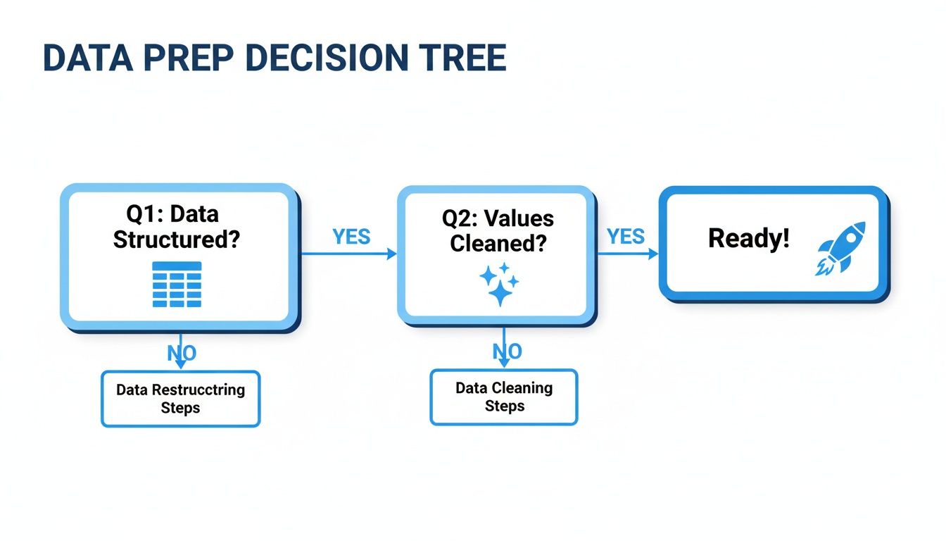
As you can see, getting the structure and cleanliness right from the start is what prevents you from creating a beautiful, but totally misleading, chart.
For Fast, Modern Data Workflows
There's also a new breed of tool emerging that helps teams skip the traditional BI bottlenecks. Platforms like Querio plug right into your data warehouse, giving you the power of a Python notebook with the ease of an AI assistant.
This hybrid approach means both technical and non-technical folks can explore data and build visualizations without getting stuck in an analyst's queue. This flexibility is becoming more important; in fact, a recent report found that 68% of data professionals prefer using heat maps for multivariate analysis. You can dig into the market trends in data visualization tools to see why this kind of direct access is in demand.
I’ve seen product leaders use Querio to pull data straight from the warehouse into a Pandas DataFrame and spin up an interactive Plotly heat map in minutes. That’s a process that used to take days of back-and-forth with the data team. It’s a massive speed boost.
Comparison of Heat Map Creation Tools
To help you decide, here's a quick breakdown of the tools we've covered, highlighting what they're best for and who they're designed for.
Tool | Best For | Technical Skill | Key Feature |
|---|---|---|---|
Excel / Google Sheets | Quick, simple analysis of small datasets | Beginner | Built-in conditional formatting |
Python (Seaborn/Plotly) | Deep customization, automation, and large datasets | Intermediate / Advanced | Full control over aesthetics and interactivity |
Tableau / Looker | Integrated enterprise dashboards with live data | Beginner / Intermediate | Drag-and-drop interface, seamless sharing |
Querio | Fast, collaborative analysis directly on the data warehouse | All Levels | AI-assisted notebook and direct SQL/Python access |
Ultimately, there's no single "best" tool—it's about matching the tool's power to your specific need. Whether you're whipping up a quick visualization in a spreadsheet or building a dynamic, shareable dashboard, the goal is always the same: turning that grid of numbers into a story people can understand at a glance.
Creating Your Heat Map with Real-World Scenarios
Alright, enough with the theory. The best way to really understand heat maps is to get your hands dirty and solve some actual business problems. Let’s walk through a few common scenarios where a heat map isn't just a nice-to-have, but a critical tool for making smart decisions.
We'll look at everything from a marketing budget puzzle to a product adoption mystery, using a mix of tools like Python, BI platforms, and modern data notebooks. The goal here isn't just to follow steps but to see how each visualization directly answers a strategic question.
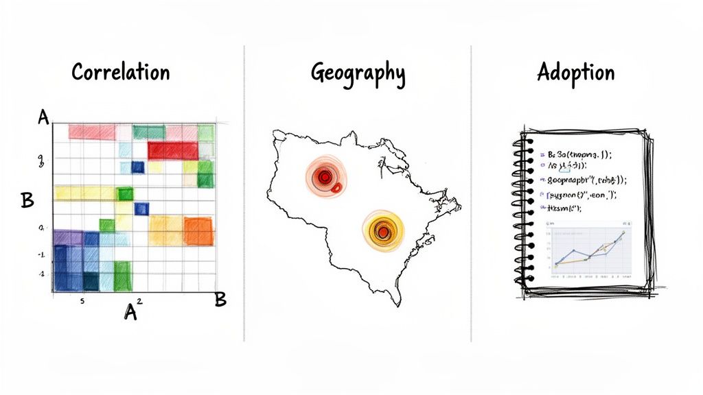
Uncovering Marketing ROI with a Python Correlation Matrix
Let’s say you're a marketing director staring at a budget spreadsheet. You’re pouring money into PPC, social media, content, and email campaigns, but you have a nagging feeling you don’t know which channels are actually driving sales. A correlation heat map is perfect for this.
Using Python's fantastic Seaborn library, you can build a matrix that instantly shows the relationship between your channel spend and sales numbers. A bright red, "hot" square where "PPC Spend" intersects with "Monthly Sales" tells you there's a strong positive link. On the flip side, a cool blue square might reveal a channel that's just not pulling its weight.
This isn't just a chart; it's your new best friend when it comes to defending your budget. I once saw a startup use this exact analysis to find out their slow-burn content marketing had a much stronger tie to long-term sales than their pricey PPC ads. That insight led them to completely rethink their strategy.
Getting this done is surprisingly straightforward:
First, pull together your monthly spend for each channel and the matching monthly sales into one table.
Next, use a library like Pandas to run the correlation calculation on your data.
Finally, feed that correlation matrix into Seaborn’s
heatmap()function, and you've got your visual.
Suddenly, you have a clear, data-driven map of your marketing engine, showing you exactly where your next dollar will have the most impact.
Visualizing Customer Density with a Geographic Heat Map
Now, picture yourself as a national sales director. You need to figure out where your customers are clustered to redraw sales territories or plan a series of marketing events. This is a classic job for a geographic heat map.
With a BI tool like Tableau, you can plot customer zip codes or addresses directly onto a map. The heat map layer will immediately highlight your hotspots—maybe a bright glow over major cities or an unexpected cluster in a suburban area you hadn't considered.
This kind of visual is a game-changer for answering location-based questions like:
Where is the most logical place to open our next office?
Which cities should we target for a high-impact regional campaign?
Are our sales territories truly balanced, or is one rep swamped while another has a sparse patch?
It's so much more intuitive than scrolling through a spreadsheet of addresses. Seeing the data on a map gives you instant context. For a deeper dive into how visuals drive decisions, check out these examples of business intelligence in practice.
Tracking Feature Adoption in a Querio Notebook
Finally, let's think about a product manager trying to see if a new feature is actually being used. They can't wait days for an analyst to pull a report; they need answers now. This is where a modern, self-serve platform like Querio comes in.
The recent explosion in heat map popularity is tied directly to the demand for interactive, immediate data exploration. In Querio, you can connect straight to your data warehouse, spin up a pivot table (say, 2026 user retention by cohort and feature), and even use libraries like Folium for geographic analysis.
The intensity scales on the heat map can quickly reveal that you have 55% engagement in the US versus just 32% in EMEA, with hotspots climbing over 80% in tech hubs like San Francisco. We often see product leaders at startups use these to visualize A/B test results, showing how Feature X lifted retention by 22% for 65% of their user segments. This trend is a big part of the data visualization market's evolution.
By building a heat map with user segments on one axis and features on the other, the PM can see in seconds which groups are embracing the new tool and which are leaving it on the shelf. That insight is pure gold, telling them exactly where to focus their next educational webinar, marketing push, or product update.
How to Interpret Your Heat Map and Take Action
So, you've created a heat map. It looks great, full of vibrant colors and clear patterns. But now what? A pretty chart is useless if you can't turn it into smart decisions. The real magic happens when you translate those colorful squares into actions that fix problems or uncover opportunities.
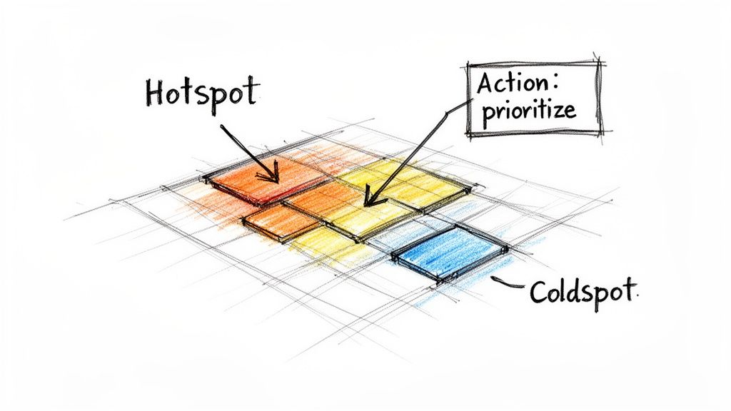
Without proper interpretation, a heat map is just modern art. Let's get to the part that matters: reading the story your data is telling you. The best place to start is with the extremes—the brightest, most intense colors and the palest, quietest ones.
Identifying Hotspots and Coldspots
The first thing you'll notice are the hotspots and coldspots. These are your visual breadcrumbs, leading you directly to the most interesting parts of your data.
Hotspots (High Concentration): These are the intense reds, oranges, or dark shades that practically jump off the screen. A hotspot isn't automatically "good" or "bad," it just signals a high concentration of activity. It might be your best-selling product category, a blog post with incredible engagement, or a landing page with an alarmingly high bounce rate.
Coldspots (Low Concentration): On the flip side, you have the cool blues and light-colored patches showing low values or inactivity. A coldspot could be a marketing channel that’s completely fizzling out, a product that no one in a key demographic is buying, or a new feature that’s being totally ignored by users.
Learning to read these patterns is how you truly understand user behavior. From there, you can find concrete ways to improve the conversion rate of your web pages and other key metrics.
Asking the Right Questions
Once you’ve pinpointed these areas, the real analysis begins. It’s not enough to see a hotspot and say, "Great, sales are up in California." You need to dig deeper and ask why.
Key Takeaway: A heat map doesn't give you the answers; it tells you where to start asking the questions. Use it as a launchpad for deeper investigation, not as the final conclusion.
Let's say a hotspot reveals a spike in customer churn right after a software update. The question isn't just "Why did this happen?" It's more specific: "Did a bug get introduced?" or "Was this new feature communicated poorly?" That leads to a clear action, like rolling back the update for affected users or creating a better onboarding guide.
A coldspot deserves the same level of curiosity. A lack of sales in a major city shouldn’t just be ignored—it could be a massive untapped market. This is where you start asking critical questions:
Are we sure we have product-market fit in this region?
Is a local competitor eating our lunch?
Is our brand message just not connecting with the culture there?
This is the process: from visual pattern to probing question to strategic action. It’s how you turn a simple heat map into a powerful tool that helps you confidently decide where to focus your time, money, and energy.
Common Questions (and Quick Answers) About Making Heat Maps
Even with the best instructions, you're bound to hit a few snags or have questions pop up as you start building your own heat maps. It's just part of the process. Here are some of the most common questions I get, along with practical answers to keep you moving.
What's the Best Color Scheme for a Heat Map?
This is a big one, because your color choice can either clarify or completely distort your data's story. The golden rule? Stay away from the default rainbow palette. It looks vibrant, but it's notoriously misleading because the human eye doesn't perceive the color transitions evenly.
Instead, match the color scheme to your data:
Sequential Schemes: Think of a single color fading from light to dark, like pale blue to a deep navy. This is your go-to for data that moves from low to high in a straightforward way, like user engagement scores or monthly sales figures.
Diverging Schemes: These are perfect when your data has a natural middle point, like 0 or a specific average. A classic red-to-white-to-blue scale, for example, instantly shows you which values fall above or below the center, making it great for things like profit/loss analysis.
Can I Make a Heat Map on a Geographic Map?
You absolutely can, and it's one of the most powerful ways to visualize location-based data. This is often called a geo heat map or a choropleth map. It’s the perfect tool for seeing data density across different regions, like tracking sales performance by state or mapping out website traffic by country.
Tools like Tableau and Python libraries such as Folium are fantastic for this. They let you overlay your data onto a real map, which immediately brings geographic trends to life in a way a simple table never could.
How Should I Handle Outliers in My Data?
Outliers can wreck a perfectly good heat map. A single, massive number can throw off your entire color scale, washing out all the subtle but important variations in the rest of your data.
The goal is to make the patterns in the majority of your data visible, not to let one anomaly dominate the entire visual.
You have a few ways to deal with them. You can cap the values at a certain threshold (a technique called winsorizing), apply a logarithmic scale to pull in extreme values, or just remove them if you're sure they're data entry errors.
What’s the Difference Between a Heat Map and a Treemap?
It's easy to mix these two up, but they're built for different jobs. A heat map uses color intensity to show the magnitude of a single variable across a two-dimensional grid. It excels at showing correlation and density.
A treemap, on the other hand, uses the size of nested rectangles to display hierarchical data. It’s all about showing part-to-whole relationships, like breaking down a company's revenue by product category and then by individual product.
Ready to build heat maps without the BI bottleneck? With Querio, you can connect directly to your data warehouse and use AI-powered notebooks to get from raw data to actionable insights in minutes. Explore Querio and start building smarter visuals today.

