Distribution of Data: Mastering Data Distribution for
Distribution of data - Unlock true product insights by mastering the distribution of data. Explore key concepts, essential visualizations, and learn to avoid
https://www.youtube.com/watch?v=N-Igkw7__z0
published
Outrank AI
distribution of data, data analysis, business analytics, product metrics, data visualization
7494bd70-21a9-4841-b8ca-6635631da0c8

Your dashboard says average engagement is up. The team celebrates for a day, then someone asks the uncomfortable question: if the average is better, why doesn’t the product feel healthier?
That tension shows up everywhere. Average session length rises, but retention stays flat. Average deal size looks strong, but revenue forecasting feels erratic. Average resolution time improves, but support leaders still hear complaints from customers who waited too long. The average isn’t lying. It’s just incomplete.
What’s missing is the distribution of data. That’s the part that shows whether your metric is tightly clustered, spread out, lopsided, or hiding multiple user groups. Once you see distribution, a lot of product questions stop being mysterious. You can tell whether one metric reflects a stable pattern or a messy mix of very different behaviors.
If you already work with summaries like totals, averages, and trend lines, you’re in the right place. This is the next layer after basic reporting and descriptive analytics in business decision-making. It’s where numbers start acting less like scoreboard entries and more like evidence.
Table of Contents
Introduction Why Averages Are Not Enough
A product manager checks the weekly dashboard for a new feature. Average time spent with the feature looks healthy. On paper, that sounds like adoption. In reality, the launch still feels off. Sales isn’t hearing excitement, onboarding feedback is mixed, and the support team says some users seem lost.
That’s a classic sign that the average has compressed too much information into one number.
Take session time. If a small group of power users spends a long time exploring workflows while a larger group bounces quickly, the average can land in the middle and suggest a stable experience that doesn’t reflect reality. It’s like saying the average temperature across a country is mild while ignoring that one region is freezing and another is in a heatwave.
Practical rule: When a metric looks healthy but decisions still feel uncertain, stop asking for one better summary and start asking for the shape behind it.
The shape matters because business decisions depend on variation. A retention issue may live in one segment, not the whole user base. A pricing problem may affect only high-value customers. A feature might be loved by one group and ignored by another. None of that shows up clearly in a single average.
For non-technical teams, statistics often feels inaccessible. Terms like skewness, standard deviation, and normality sound academic, so people retreat to simple charts and executive summaries. That’s understandable, but it leaves money on the table. The distribution of data is often the difference between a team reacting to surface metrics and a team understanding behavior.
What Is a Data Distribution Anyway
A data distribution is the pattern of how values are spread across a dataset. If you lined up every observation for a metric, the distribution would describe what that lineup looks like. Are most values packed together? Are they spread out? Do they lean heavily in one direction? Are there two clusters instead of one?
A room-height analogy makes this easier. If I tell you the average height in a room, you know one thing. If I show you every person’s height, you know much more. You can see whether the majority are close to that average, whether a few unusually tall or short people are pulling it around, or whether the room contains two different groups.
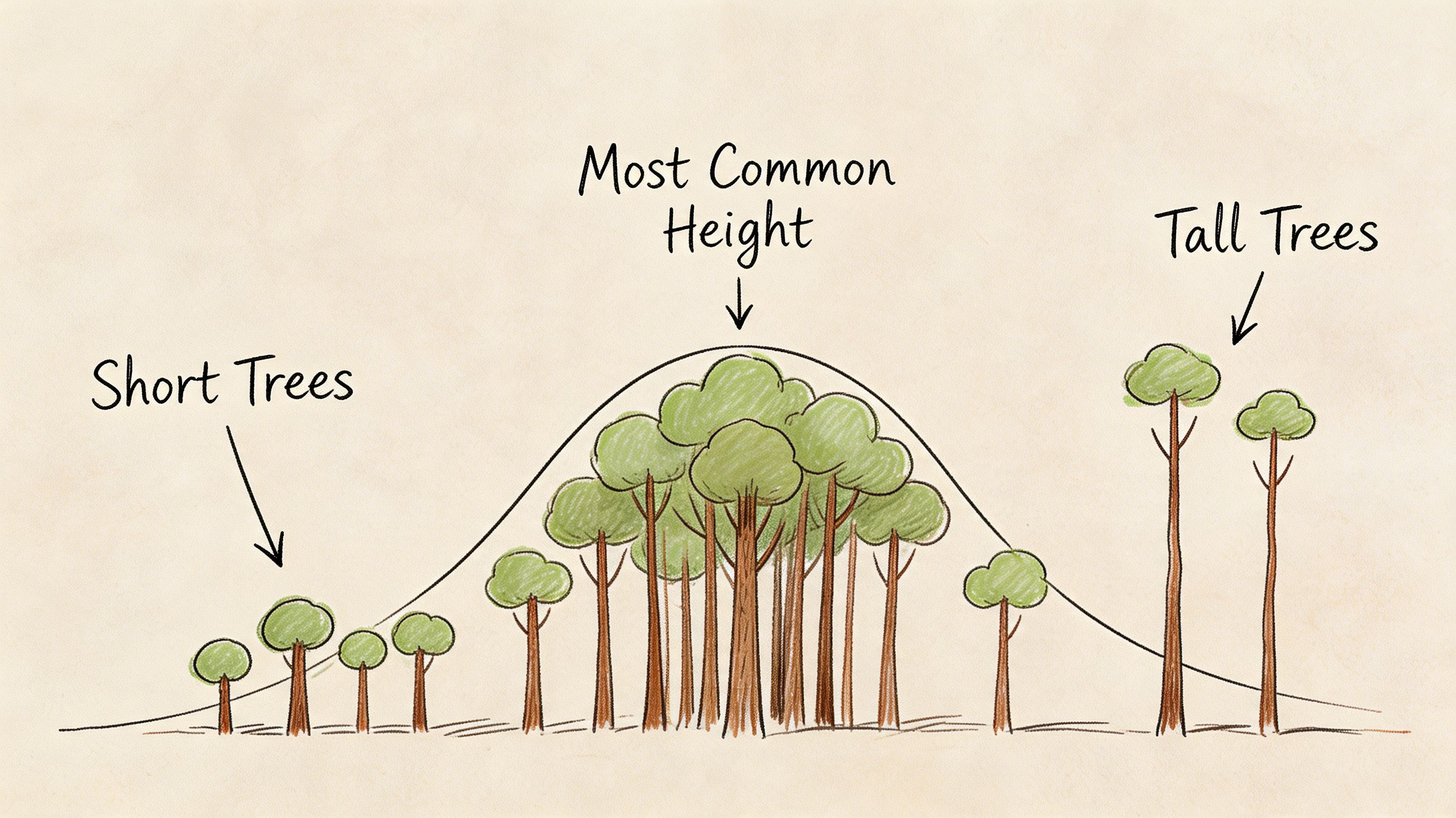
That’s what happens with product and business metrics too. You’re rarely managing “average users.” You’re managing many individual behaviors stacked together.
According to MathBits’ explanation of distribution shape in statistics, data distribution describes how values spread across a dataset, and it’s essential for choosing the right statistical method. That same resource groups distribution thinking into center such as mean, median, and mode, spread such as range, variance, and standard deviation, and graphical shape such as symmetric or skewed patterns.
Why product teams should care
If you run a pricing experiment, the distribution of upgrade revenue tells you whether the change affected many users a little or a few users a lot.
If you monitor support response times, the distribution tells you whether the team is consistently fast or merely “fast on average” while a painful tail of tickets waits much longer.
If you evaluate onboarding completion, the distribution tells you whether users behave like one population or several. That’s often the first clue that one onboarding flow is serving very different customer intents.
A lot of this work starts during exploratory data analysis for product and business questions. The point isn’t to make everyone a statistician. The point is to build enough intuition that you stop making decisions from flattened summaries.
The shape is often the real story
Averages answer, “Where is the middle?”
Distributions answer bigger questions:
How consistent is this metric
Are outliers driving the result
Do we have one user pattern or several
Can we safely use a standard statistical test
Should this metric be judged by mean or median
A product metric without its distribution is like a customer interview with only the closing sentence preserved.
That’s why the distribution of data matters so much in self-service analytics. Once teams can inspect shape directly, they don’t need to wait for a specialist every time a summary metric feels suspicious.
Four Key Properties of a Distribution
When analysts describe a distribution, they usually break it into a few core properties. Think of these as the basic handles you can grab when a metric starts behaving strangely. Together they tell you where the data sits, how much it varies, and whether its shape is balanced or distorted.
Central tendency
Central tendency is the “middle” of the distribution. The most common measures are mean, median, and mode.
The mean is the average commonly used. Add the values, divide by the count, and you get one central number. It’s useful, but it’s sensitive to extreme values. If a handful of enterprise customers spend much more than everyone else, the mean spending per customer can look higher than what a typical customer spends.
The median is the middle value when data is ordered from low to high. That makes it more resilient when the distribution is lopsided. In business data, that matters a lot because metrics like customer revenue and lifetime value are often right-skewed. In those cases, a few high values can pull the mean above the median.
The mode is the most frequent value or value range. Teams don’t use it as often in dashboards, but it can be handy when you want to know what behavior is most common rather than what the average says.
For a product manager, the practical question is simple:
Use the mean when the distribution looks reasonably balanced and you care about total impact.
Use the median when outliers are common and you want a better picture of the typical user.
Use the mode when the most common behavior matters, such as common order size or most typical usage tier.
Spread
Spread tells you how tightly grouped or widely scattered the values are. Two products can have the same average session time and behave completely differently if one is consistent and the other is all over the place.
The language here includes range, variance, and standard deviation. Range gives you the distance from the smallest to the largest value. Variance and standard deviation describe how far values tend to sit from the mean. In practice, standard deviation is the more interpretable of the two for most business users.
A small spread often means the experience is stable. A large spread can signal:
Inconsistent onboarding
Uneven feature adoption
Segment differences hidden inside one metric
Operational unreliability, such as wide swings in delivery or support times
If your average weekly activation rate holds steady but the spread grows, that’s often a warning sign. The top of the funnel may be behaving differently across channels, plans, or regions.
Manager’s shortcut: Ask two questions together. What’s the average, and how much does it vary?
Skewness
Skewness describes whether the distribution leans more to one side.
A right-skewed distribution has a long tail on the high end. That’s common in metrics like revenue per customer, purchase amount, and time spent by highly engaged users. A few large values stretch the right side, which often makes the mean larger than the median.
This matters more than many teams realize. Excelsior’s discussion of skewed distribution shapes notes that right-skewed distributions are common in business metrics like revenue and customer lifetime value. The same source says 68% of data leaders in a 2025 survey reported that misanalyzing skewed distributions causes 20-30% errors in growth forecasting, and fewer than 15% of traditional BI tools offer auto-detection.
That gap explains why non-technical teams often misread healthy-looking metrics. A right-skewed average can be heavily influenced by a small group of high-value accounts or unusually active users.
A few practical implications:
Revenue metrics often need median and percentile views, not just average revenue.
Engagement metrics may need segmentation before comparison.
A/B test readouts should be checked for outlier sensitivity before declaring a winner.
Kurtosis
Kurtosis is the least intuitive property, and many smart operators ignore it until it bites them.
It describes how heavy the tails of the distribution are and how much extreme behavior shows up relative to the middle. A distribution with heavier tails produces more unusual values than you’d expect from a tidy bell curve. In product terms, that can mean occasional but important spikes in refund size, system latency, support backlog, or account expansion.
You don’t need to become attached to the term itself. What matters is the business interpretation: How often do extreme observations show up, and should you trust models that assume they’re rare?
That’s especially useful in operational metrics. A team might report that average API latency is acceptable while customers still remember severe slowdowns. Heavy tails are often why.
Here’s a simple summary table:
Property | What it tells you | Business question it answers |
|---|---|---|
Central tendency | Where the middle is | What does a typical result look like |
Spread | How variable the values are | Is the experience consistent |
Skewness | Whether one side stretches farther | Are outliers pulling the average |
Kurtosis | How heavy the tails are | How much extreme behavior should we expect |
Once you can read these four properties, the distribution of data stops feeling abstract. It becomes a practical way to judge whether a metric is trustworthy, stable, and decision-ready.
Common Data Distributions in Business Analytics
Some distributions show up so often that it’s worth learning their “business story.” You don’t need to memorize formulas. You just need to recognize the pattern and know what kind of question it fits.
Normal distribution
The normal distribution is the familiar bell-shaped curve. Values cluster around a center, and the left and right sides are roughly balanced. Many teams use it as the default mental model because it’s simple and because many analytical methods assume something close to normality.
Its most practical feature is the 68-95-99.7 Rule. According to Data Science Dojo’s overview of the normal distribution, 68% of values in a normal distribution fall within one standard deviation of the mean, 95% within two, and 99.7% within three. That makes it useful for spotting unusual observations and setting expectations for what counts as “normal” variation.
In business work, a roughly normal pattern can appear in measurement-heavy processes where many small factors combine. That makes the normal distribution useful for anomaly detection, quality monitoring, and some forecasting workflows.
If a metric behaves close to normal, teams can often use standard methods more confidently. If it doesn’t, they need to slow down and verify assumptions.
Binomial distribution
The binomial distribution fits yes-or-no outcomes across a fixed number of opportunities. Did a user convert or not? Did an email get opened or ignored? Did a trial account activate or fail to activate?
This is one of the most useful distributions in product and growth work because so many business questions boil down to repeated binary events. A/B testing, conversion funnels, signup completion, and experiment analysis all lean on this kind of structure.
The big advantage of thinking in binomial terms is clarity. You stop treating conversion as a vague percentage and start thinking about a process with repeated trials and observed successes. That makes your assumptions more explicit and your comparisons cleaner.
Poisson distribution
The Poisson distribution models counts of events over an interval. That interval might be time, sessions, orders, or support shifts. It’s a natural fit for things like system errors, daily ticket arrivals, or failed payment events.
This kind of data isn’t about “how much” in a continuous sense. It’s about “how many times did this happen.” That’s a different analytical shape, and it often calls for different modeling choices.
For a product manager, this matters when a dashboard includes operational event counts. If you’re monitoring incidents, account alerts, or inbound ticket spikes, a Poisson-style view is often closer to reality than a normal one.
Common Data Distributions at a Glance
Distribution Type | What It Models | Common Business Example |
|---|---|---|
Normal | Symmetric values centered around a mean | Measurement-driven process metrics and anomaly checks |
Binomial | Repeated yes-or-no outcomes | Conversion in an A/B test |
Poisson | Event counts over an interval | Daily system errors or support tickets |
There’s another practical angle here. Imarticus’ discussion of business data distributions notes that Binomial and Poisson distributions are important for event-based business data, such as conversion rates and rare event frequency. The same source says distribution-aware preprocessing reduced model bias by 18% AUC on credit datasets.
You don’t need to build machine learning systems to benefit from that mindset. The lesson is simpler: when you match the method to the shape of the data, analysis gets more trustworthy.
The right distribution doesn’t make your data smarter. It keeps your team from asking the wrong mathematical question.
That matters in self-service analytics. Non-technical users often need enough structure to know whether a metric should be handled like a balanced measurement, a yes-or-no process, or an event count. Once they can classify the pattern, they make better choices about charts, summaries, and tests.
How to Visualize and Interpret Data Distributions
You won’t understand the distribution of data by staring at a column of numbers. You need charts that reveal shape quickly. Each visualization has a different job. Good analysts don’t ask which chart is “best.” They ask which question they’re trying to answer.
A practical workflow often starts with one chart, then uses a second to confirm what the first suggests. If you’re building a dashboard or notebook for cross-functional teammates, that pairing matters. One visual gives intuition. Another gives precision.
For teams trying to make these charts accessible beyond analysts, good data visualization and dashboard design practices are part of the job, not decoration.
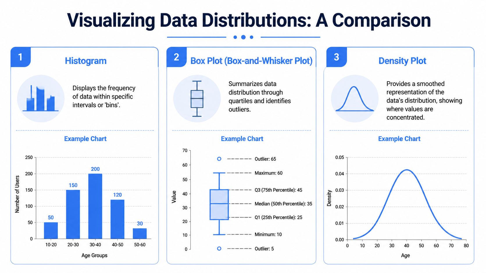
Histogram
A histogram groups values into bins and shows how many observations fall into each range. It’s usually the fastest way to see the raw shape.
Use it when you want to know:
Is the data roughly symmetric or clearly skewed
Are there one or multiple peaks
Where are values concentrated
Do we have long tails
A histogram is often the first chart I open for metrics like session time, order value, or time-to-resolution. If the bars stack into a neat mound, the metric may be relatively well-behaved. If the bars drag off to one side, bunch into two humps, or show isolated extremes, the average is probably hiding something important.
Density plots and KDEs
A density plot or kernel density estimate smooths the shape into a continuous curve. It answers the same broad question as a histogram, but in a cleaner visual form.
That makes it especially useful when you compare segments. If new users and returning users have different engagement patterns, overlapping density curves can show separation more clearly than side-by-side averages.
Density plots are also helpful when the histogram looks noisy because of bin choices. The smoothing can reveal whether a bump is a real pattern or just a visual artifact.
Box plots
A box plot summarizes the distribution using quartiles and highlights outliers. It doesn’t show as much raw shape as a histogram, but it’s excellent for comparison.
Use it when you want to know:
What’s the median
How wide is the middle spread
Are there potential outliers
How do several groups compare quickly
For product leaders reviewing team-level or segment-level metrics, box plots are efficient. You can place several next to each other and spot differences fast. If one customer segment has a much higher median and a wider spread, that’s a sign to investigate separate behavior patterns.
Q-Q plots
A Q-Q plot is more technical, but it’s one of the most useful charts when you need to check whether a dataset behaves close to a normal distribution. If the points follow a roughly straight line, normality is more plausible. If they bend away sharply, the data may be skewed, heavy-tailed, or otherwise non-normal.
Many standard tests rely on the assumption of normality. Should this assumption prove incorrect, p-values and conclusions can drift.
This video-based guidance on normality checks and multimodal detection notes that misapplying parametric tests such as t-tests to skewed data can inflate false positives by up to 50% in small samples. It also recommends using Q-Q plots and Shapiro-Wilk tests before analysis, and points to violin plots for spotting multimodal patterns such as a bimodal distribution that signals separate segments.
Here’s how I’d choose among the visuals:
Chart | Best for | Watch out for |
|---|---|---|
Histogram | Raw shape and concentration | Bin size can change the look |
Density plot | Smoothed comparison of shapes | Can hide sample-size quirks |
Box plot | Quick segment comparison and outliers | Doesn’t show full shape |
Q-Q plot | Checking normality assumptions | Less intuitive for non-technical readers |
If a decision depends on whether a metric is “normal enough,” don’t guess from the average. Look at the chart.
That habit becomes especially powerful in notebook-based workflows. A PM can ask for a histogram, then a box plot by segment, then a Q-Q plot for the same metric without waiting for a separate analytics sprint. That’s where self-service stops being shallow reporting and starts becoming real analysis.
Putting It All Together A Product Analytics Example
A product manager launches a new collaboration feature. After the first few weeks, the headline metric looks good. Average engagement time with the feature is higher than expected, and the leadership team starts discussing a bigger rollout.
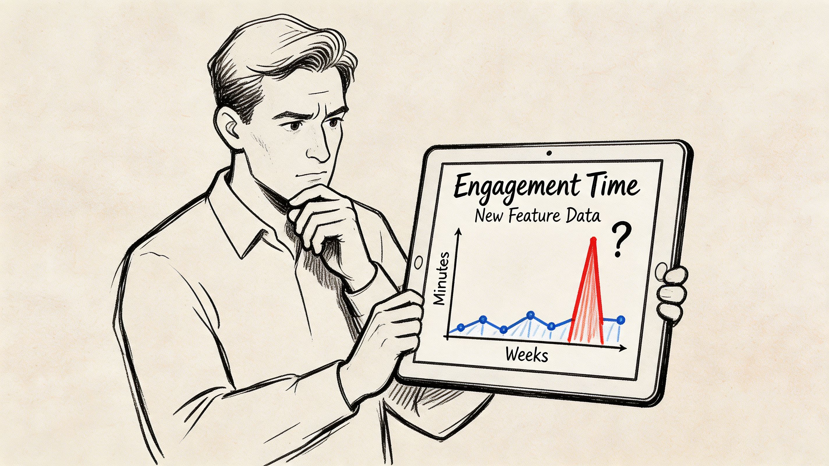
But the PM keeps hearing mixed signals. Some users praise the feature and ask for more depth. Others try it once and disappear. The average says “strong adoption.” The customer story says “uneven experience.”
What the average hid
The PM starts with a histogram of engagement time and immediately sees the issue. The data doesn’t form one clean hump. It looks bimodal, with one cluster of users spending a short amount of time and another cluster spending much longer.
That changes the interpretation completely.
Instead of one average user, there are really two groups:
Casual explorers who click in, test the feature, and leave
Power users who spend meaningful time and build the feature into their workflow
If the PM had relied only on the average, they might have concluded the onboarding was working for everyone. The distribution shows that one group understands the value quickly while another never gets there.
How the PM checked the shape
The PM doesn’t stop at the histogram. A box plot by user segment confirms that variability is wide. A violin plot reinforces the split in behavior. Then a Q-Q plot shows the metric isn’t behaving like a nice normal distribution, which matters because the team had planned a simple significance test on engagement time.
That caution is justified. The same normality-check guidance discussed earlier is often paired in practice with scatter and trend diagnostics, but here the key issue is shape. The external guidance cited earlier reported that using parametric tests on skewed data can inflate false positives by up to 50% in small samples, which is why teams use Q-Q plots and Shapiro-Wilk checks before analysis.
The PM reframes the question. Instead of asking, “Did average engagement go up?” they ask:
Which user segment gets value quickly
Which segment stalls early
Should onboarding differ by user intent
What metric best captures success for each group
After that, the team reviews session recordings and account context. The casual explorers are mostly new users who reached the feature before understanding the surrounding workflow. The power users are people who already had a clear use case.
A short explainer helps make this concrete:
The resulting product decision is specific. The team creates separate onboarding paths. One path helps first-time users understand the use case before asking for deep engagement. The other accelerates experienced users toward advanced actions.
That’s a key value of distribution analysis. It doesn’t just improve a chart. It changes the decision from “roll this out harder” to “serve different users differently.”
Streamline Distribution Analysis with Querio
Distribution analysis often breaks down at the exact point where it becomes useful. A PM sees that the average isn’t enough, asks for a histogram or normality check, and then waits in line behind ten other analytics requests. By the time the answer arrives, the launch review has passed and the decision has already been made.
That’s the operational problem self-service analytics should solve.
Querio is built for teams that need more than dashboards but don’t want every useful question routed through an overextended data team. It deploys AI coding agents directly on the data warehouse and uses a file-system approach with custom Python notebooks, so teams can move from plain-English questions to real analysis in the same environment.
For distribution work, that matters because the workflow is rarely one step. You ask for a metric. Then you need the histogram. Then a segment comparison. Then a box plot. Then maybe a Q-Q plot or a notebook cell that checks whether the data shape supports a standard test. Traditional BI tools often stop too early. They summarize. They filter. They chart. But they don’t always support the back-and-forth that real analysis requires.
Querio fits that middle ground well:
Plain-English to analysis: Product managers can start with business language instead of writing SQL from scratch.
Notebook flexibility: Teams can run visual checks, compare segments, and iterate without switching tools.
Shared infrastructure: Data teams set the foundation once instead of acting like a human API for every follow-up question.
Customer-facing potential: The same file-system approach can support internal decisions and external analytics experiences.
That combination is what makes statistical thinking usable for non-technical users. You don’t need a statistician for every distribution question. You need a system where good defaults, reusable notebooks, and warehouse-native analysis make the right question easy to ask.
Conclusion From Data Points to Data Stories
The distribution of data turns a metric from a headline into a story.
Averages still matter. You should keep using them. But they’re only the opening sentence. The full story lives in the spread, the skew, the tails, and the possibility that one metric contains several different user behaviors.
That shift changes how product teams work. Instead of reacting to a single number, they start asking whether the experience is consistent, whether outliers are driving results, and whether one segment is succeeding while another struggles. Those are better questions. They lead to better roadmap decisions, more honest experiments, and sharper customer insight.
For founders and product leaders, this isn’t academic polish. It’s operational clarity. The teams that understand distribution don’t just report what happened. They can explain why the metric looks the way it does, who is experiencing it differently, and what to do next.
That’s when analytics becomes useful in the way leaders need it. Not as a pile of data points, but as a way to see the business more clearly.
If your team wants that kind of clarity without bottlenecking on analysts, Querio gives you a practical path there. It combines AI-powered querying with notebook-based analysis directly on your warehouse, so product managers, founders, and data teams can explore distributions, test assumptions, and turn raw metrics into decisions faster.

