Guide
Python Jupyter Notebook Data Analysis: A Practical Guide
Master python jupyter notebook data analysis with this hands-on guide covering setup, pandas workflows, visualizations, modelling, and sharing reproducible

Only 1,203 of 15,817 Jupyter notebooks connected to biomedical publications ran without errors, and just 879 reproduced identical results when rerun. That finding from a large-scale reproducibility study changes how teams should think about Python Jupyter Notebook data analysis. A notebook isn't merely a convenient place to explore a dataset. Once other people depend on its outputs, it becomes production-adjacent analytics infrastructure, and it needs the controls that any shared analytical system requires.
The appeal is obvious. Jupyter puts Python code, tables, charts, and explanatory text into one interactive document. Analysts can inspect data incrementally, test an idea, and preserve the reasoning alongside the result. The same flexibility also creates risk. A notebook can display polished output while depending on an old kernel state, an unrecorded package, a cell executed out of order, or a source file that only exists on its author's laptop.
This guide treats the notebook as a deliverable that another person must be able to understand, execute, inspect, and extend. The workflow covers environment setup, pandas cleaning, exploratory analysis, baseline modelling, reproducibility controls, and the operational layer that turns a one-off analysis into a reusable team asset.
Table of Contents
- Why Most Jupyter Notebooks Break When You Share Them
- Setting Up Your Python and Jupyter Environment the Right Way
- Importing and Cleaning Data with Pandas
- Exploratory Data Analysis and Visualizations That Actually Help
- From Exploration to a Baseline Model in Scikit-Learn
- Making Notebooks Reproducible and Shareable for Teams
- Turning Notebooks into Self-Serve Analytics Infrastructure
Why Most Jupyter Notebooks Break When You Share Them
An analyst emails a colleague a .ipynb file after finishing a sales analysis. The recipient opens it, clicks Run All, and gets a KeyError. After fixing that, the kernel reports ModuleNotFoundError. A later cell runs, but the totals don't match the chart in the email because the notebook contains outputs generated from an earlier data extract. The analysis may have been correct when written, yet confidence collapses as soon as nobody can reproduce it.
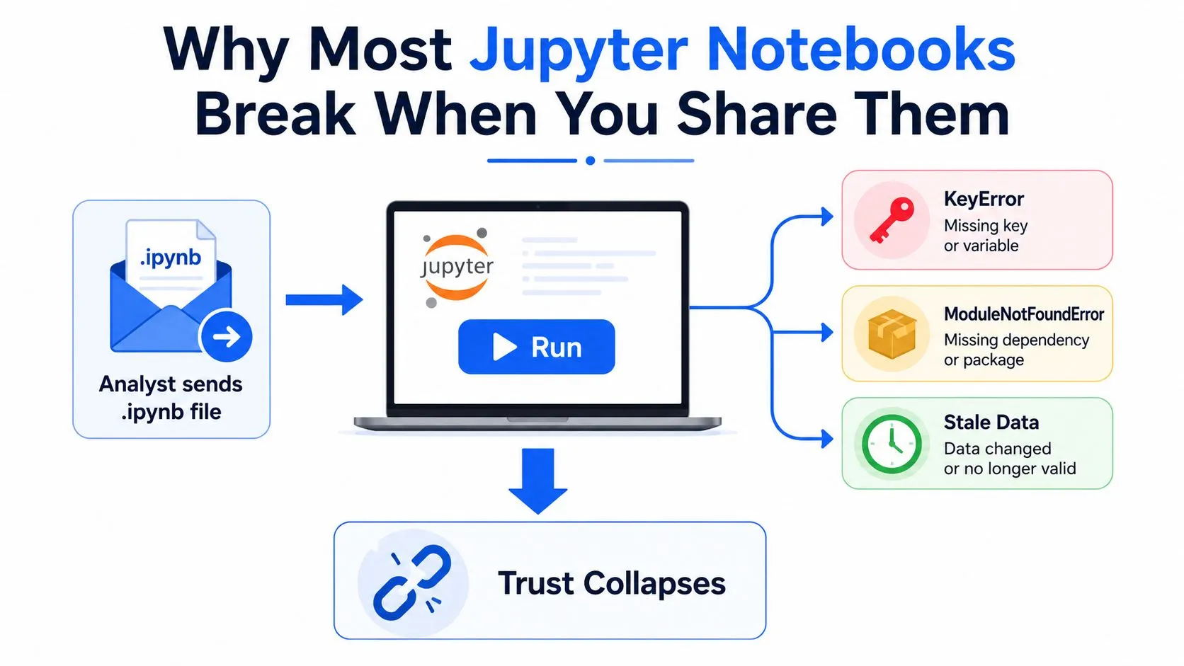
Jupyter's interactive model explains much of this behavior. Each cell mutates a shared namespace, so the visible order of cells isn't necessarily the execution order. A variable can retain a value from an earlier experiment, a dataframe can be modified in place, and a later cell can succeed only because the author ran an unseen setup cell hours earlier.
Practical rule: Treat a notebook as a small application with a mutable runtime, not as a static document.
The evidence is difficult to dismiss. A GitHub-based study of 10,000 Python Jupyter notebooks found that only 17.36% could be fully executed without error, and only 27.46% of those successfully executed notebooks were exactly reproducible. The study links failures to environment drift, hidden dependencies, and assumptions about cell order, while separate research found that about one quarter of notebooks contain no explanatory text. Those findings are documented in the large-scale assessment of Python notebooks.
A second study examined 15,817 notebooks associated with 3,467 biomedical publications. Only 1,203 completed without errors, and 879 reproduced identical results, while 324 produced different results despite running successfully. The researchers traced notebooks through article text and GitHub, then reran them in environments close to the originals, a useful model for validating shared analytical work. The full methodology appears in the biomedical notebook reproducibility study.
A share-ready notebook therefore needs four properties:
- A clean runtime: Restart the kernel and execute cells from top to bottom.
- Declared dependencies: Record the Python version and package versions.
- Stable inputs: Identify the source data, extraction date, and expected schema.
- Human-readable reasoning: Explain decisions in markdown, not only in code.
The rest of the workflow exists to make those properties routine rather than aspirational.
Setting Up Your Python and Jupyter Environment the Right Way
Environment setup is part of the analysis, not a preliminary chore. A notebook that works only inside a globally modified Python installation has no reliable boundary around its dependencies, so start with a project-specific environment.
Create an isolated project
Install a current Python release through pyenv or the official Python installer. Then create an environment with either the standard library's venv or uv, and activate it before installing anything:
python -m venv .venv
source .venv/bin/activate
python -m pip install --upgrade pip
python -m pip install jupyterlab pandas numpy scikit-learn matplotlib seaborn plotly ipykernel
On Windows, activate the environment with .venv\Scripts\activate. The exact environment manager matters less than the boundary. Don't install project packages into the system interpreter and hope a future collaborator has the same setup.
Register the environment as a named Jupyter kernel:
python -m ipykernel install --user \
  --name sales-analysis \
  --display-name "Python (sales-analysis)"
That extra step prevents a common failure mode: JupyterLab starts successfully, but the notebook runs against a different interpreter than the one where packages were installed.
Capture the environment inside the notebook
Pin dependencies immediately in requirements.txt, or use a pyproject.toml with a lockfile generated by your chosen tool. A basic capture command is:
python -m pip freeze > requirements.txtFor a notebook that needs to explain its own runtime, install watermark and add:
%load_ext watermark
%watermark -v -p pandas,numpy,scikit-learn,matplotlib,seaborn,plotly
The output becomes part of the executed notebook, so a reviewer can see which interpreter and packages produced the result.
Use a compact project layout:
project/
├── notebooks/
├── data/
├── src/
├── README.md
├── requirements.txt
└── .gitignore
Keep reusable transformations in src/ instead of burying every function in notebook cells. Keep raw data outside version control when it contains sensitive information or changes frequently, and document how to obtain it in the README.
Add .ipynb_checkpoints/ to .gitignore, then commit the notebook itself through Git. Teams standardizing their notebook conventions can also compare the workflow with this guide to the best Python notebooks.
Environment habit: If you can't recreate the kernel from a clean checkout, you haven't finished setting up the project.
Importing and Cleaning Data with Pandas
Cleaning starts at the file boundary. A messy sales export might contain inconsistent date strings, currency symbols in revenue, sentinel values such as "NA" and -1, extra spaces, and column names that change capitalization between exports. Patch those problems deep inside the notebook and you'll make the transformation hard to audit. Coerce the data deliberately as it enters the workflow.
import pandas as pd

sales = pd.read_csv(
    "../data/sales.csv",
    dtype={
        "order_id": "string",
        "customer_id": "string",
        "region": "string",
        "revenue": "string",
    },
    parse_dates=["order_date"],
    na_values=["NA", "N/A", "", -1],
)
Parsing dates and missing values at import makes downstream operations predictable. If the source contains multiple date formats, load the column as text first, inspect the exceptions, and normalize them with an explicit parser rather than accepting ambiguous values without verification.
Normalize the schema before analysis:
sales.columns = (
    sales.columns
    .str.strip()
    .str.lower()
    .str.replace(r"[^a-z0-9]+", "_", regex=True)
    .str.strip("_")
)

sales["revenue"] = (
    sales["revenue"]
    .str.replace(r"[$,]", "", regex=True)
    .pipe(pd.to_numeric, errors="coerce", downcast="integer")
)
errors="coerce" is useful when you want malformed values surfaced as missing values, but it shouldn't end the investigation. Count the newly created nulls and inspect representative rows before deciding whether to discard, correct, or quarantine them.
Make missingness a business decision
dropna() is reasonable when a row can't support the intended calculation and the missing records are documented. It isn't a neutral default. Forward-fill can make sense for a time series where a value remains valid until a new observation arrives, while domain-aware imputation may be appropriate when the business meaning supports it. Never replace missing revenue with zero unless zero means “no revenue” in the source system.
Teams dealing with incomplete exports can use this practical reference on handling missing data, but the decision still belongs in the notebook's narrative. Record why a row was removed, why a value was imputed, and which downstream metrics could be affected.
Finish with assertions, not visual optimism:
assert sales["order_id"].notna().all()
assert sales["order_id"].is_unique
assert pd.api.types.is_datetime64_any_dtype(sales["order_date"])
assert pd.api.types.is_numeric_dtype(sales["revenue"])

print(sales.dtypes)
print(sales.isna().sum())
display(sales.describe(include="all"))
The uniqueness assertion is appropriate only if the source contract says each order appears once. If duplicates are valid line items, assert uniqueness on the correct composite key instead. The final validation pass turns “the dataframe looks fine” into a set of explicit conditions.
Exploratory Data Analysis and Visualizations That Actually Help
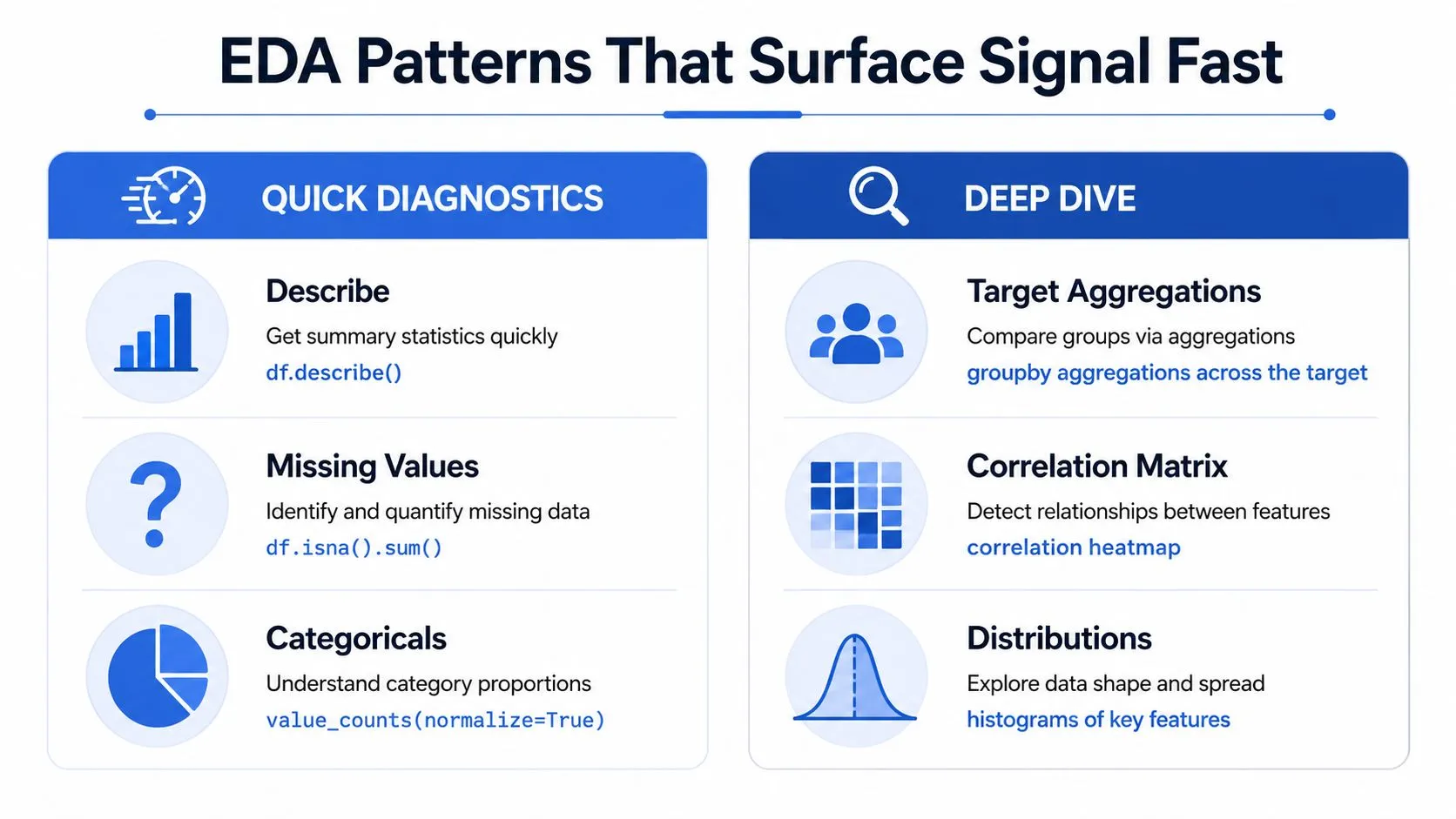
Exploratory data analysis should answer questions, not produce a gallery of attractive charts. Start with diagnostics that reveal shape, missingness, category imbalance, and plausible relationships. Then choose a chart that lets a person verify the finding without decoding unnecessary decoration.
import pandas as pd
import seaborn as sns
import matplotlib.pyplot as plt
import plotly.express as px

df.describe()
df.isna().sum()

region_mix = (
    df["region"]
    .value_counts(normalize=True)
    .rename("share")
)

target_by_region = (
    df.groupby("region", as_index=False)["revenue"]
      .agg(["count", "mean", "median"])
      .reset_index()
)

numeric_corr = df.corr(numeric_only=True)
value_counts(normalize=True) is useful for composition because it shows category shares rather than only row counts. groupby becomes more informative when you retain both count and a detailed summary such as the median. A correlation matrix can flag linear relationships, but it doesn't establish causation and can hide nonlinear patterns.
Match the chart to the question
Use matplotlib when you need a controlled, repeatable figure for a report or PDF. It gives you explicit control over axes, annotations, and layout. Use seaborn when statistical graphics and sensible defaults matter, such as distributions, boxplots, heatmaps, and categorical comparisons. Use Plotly Express when stakeholders need hover inspection, zooming, filtering, or an HTML artifact.
fig, axes = plt.subplots(1, 2, figsize=(12, 4))

sns.histplot(data=df, x="revenue", kde=True, ax=axes[0])
sns.boxplot(data=df, x="region", y="revenue", ax=axes[1])
axes[1].tick_params(axis="x", rotation=35)
plt.tight_layout()

sns.heatmap(
    numeric_corr,
    cmap="vlag",
    center=0,
    annot=True,
    fmt=".2f",
)
plt.show()

interactive = px.scatter(
    df,
    x="marketing_spend",
    y="revenue",
    color="region",
    hover_data=["order_date", "customer_id"],
)
interactive.show()
For binning, use pd.cut when business boundaries matter, such as revenue bands defined by policy. Use pd.qcut when you need quantile-based groups with roughly balanced row counts. Check the resulting bins because duplicate edges and extreme values can produce surprising categories. Avoid deprecated APIs such as distplot; use histplot or displot instead.
A practical selection rule keeps EDA focused:
- Distribution: Histogram, KDE, boxplot, or violin plot.
- Comparison: Ordered bar chart or boxplot across categories.
- Relationship: Scatterplot, with color or facets only when they clarify a meaningful subgroup.
- Composition: Stacked bars or a normalized category table, with pie charts reserved for simple, small category sets.
The strongest notebook pairs each plot with a short interpretation and a follow-up question. A chart without a stated purpose is usually an interactive screenshot waiting to become stale.
For a broader framing of these techniques, see this explanation of exploratory data analysis.
From Exploration to a Baseline Model in Scikit-Learn
Modelling deserves a clear boundary inside the notebook. Create a new Modelling section after cleaning and EDA, avoid mutating the source dataframe in place above the split, and seed stochastic operations deliberately:
import numpy as np

np.random.seed(42)
For classification, separate features and target, then use a stratified split so the class mix remains comparable:
from sklearn.compose import ColumnTransformer
from sklearn.impute import SimpleImputer
from sklearn.linear_model import LogisticRegression
from sklearn.model_selection import train_test_split, cross_val_score
from sklearn.pipeline import Pipeline
from sklearn.preprocessing import OneHotEncoder, StandardScaler

X = df.drop(columns="converted")
y = df["converted"]

numeric_features = ["age", "sessions", "marketing_spend"]
categorical_features = ["region", "device"]

preprocess = ColumnTransformer(
    transformers=[
        (
            "numeric",
            Pipeline([
                ("imputer", SimpleImputer(strategy="median")),
                ("scaler", StandardScaler()),
            ]),
            numeric_features,
        ),
        (
            "categorical",
            Pipeline([
                ("imputer", SimpleImputer(strategy="most_frequent")),
                ("onehot", OneHotEncoder(handle_unknown="ignore")),
            ]),
            categorical_features,
        ),
    ]
)

model = Pipeline([
    ("preprocess", preprocess),
    ("classifier", LogisticRegression(max_iter=1000)),
])

X_train, X_test, y_train, y_test = train_test_split(
    X,
    y,
    test_size=0.2,
    stratify=y,
    random_state=42,
)

model.fit(X_train, y_train)
Putting imputation and encoding inside the pipeline prevents preprocessing from learning information from the held-out data. Evaluate the model with cross-validation and a metric suited to the task, such as ROC-AUC for a classifier or RMSE for a regressor.
scores = cross_val_score(
    model,
    X_train,
    y_train,
    cv=5,
    scoring="roc_auc",
)

print(scores.mean(), scores.std())
The baseline should compete with a deliberately simple reference, such as the majority class for classification or the median target for regression. If the model doesn't beat that reference, tuning a forest or adding features won't fix the underlying problem. Keep calibration, feature importance, and hyperparameter searches in later work so the first modelling pass remains readable and independently rerunnable.
| Model | Task | Primary Metric | Secondary Metric | Notes |
|---|---|---|---|---|
| Majority-class baseline | Classification | ROC-AUC | Accuracy | Establishes the no-skill reference |
| Logistic regression | Classification | ROC-AUC | Accuracy | Interpretable first model with a compact pipeline |
| Median predictor | Regression | RMSE | MAE | Simple reference for continuous targets |
| Random forest | Classification or regression | Task-specific | Task-specific | Useful after the pipeline and baseline are validated |
Making Notebooks Reproducible and Shareable for Teams
A share-ready notebook needs more than one file. It needs pinned dependencies, clean execution, and enough narrative context for the next person to understand and rerun the analysis. Reproducibility requires several defenses because each addresses a different failure. A requirements file helps with package drift, but it cannot restore the correct data extract. A clean execution catches hidden cell dependencies, but it cannot explain a business rule that exists only in the author's memory.
Capture the environment and execution
Start by freezing installed packages:
python -m pip freeze > requirements.txtFor tighter control, use a lockfile such as pip-tools output or poetry.lock, according to the team's package workflow. Record the Python version and important system assumptions in the README. Retain %watermark output inside the notebook so the rendered artifact includes its runtime context.
Make randomness explicit. Set random_state on scikit-learn splitters and estimators, and consider setting PYTHONHASHSEED in the execution environment when deterministic hashing matters. Determinism does not make a flawed analysis correct. It makes changes easier to diagnose.
Execute the complete notebook from a clean kernel:
jupyter nbconvert \
  --to html \
  --execute notebooks/sales_analysis.ipynb \
  --output sales_analysis.html
Commit the executed output when reviewers need to inspect the result without starting Jupyter. Treat cached output as evidence from one run, not proof that the current code still works.
Version the logic, not just the rendered page
Git tracks the file, but ordinary notebook diffs can be noisy because outputs and cell metadata remain inside the JSON document. nbdime provides notebook-aware diffs and merges, making code review more practical. Keep cells small enough for a reviewer to isolate one transformation, and move stable business logic into tested Python modules.
Parameterization limits copy-paste forks. With papermill, a template can receive an input date, region, or source path, then generate a new executed artifact for that run. This is safer than editing constants manually across nearly identical notebooks.
Design the handoff for the audience
The recipient may lack the environment, data access, or context required to interpret a raw .ipynb file. GitHub can render a notebook, but that display is still a snapshot with limited interactive behavior.
A minimum handoff should include:
- Pinned dependencies: Provide a requirements file or lockfile.
- Executed output: Commit or publish HTML generated from a clean run.
- Narrative markdown: Explain each major decision and assumption.
- Data documentation: State the source, grain, filters, and refresh process.
- Stakeholder view: Publish through Voilà or Streamlit when readers should not install Jupyter.
Teams comparing collaboration, versioning, and lifecycle options can review these data analysis tools for team collaboration, versioning, and reproducibility. The evidence supports treating notebooks as production-adjacent infrastructure: a large study found 73% of 936 executable published notebooks were not reproducible through straightforward approaches, often because people had to infer cell order and hidden assumptions, as reported in the MSR reproducibility research. Many teams stall when every request triggers another manual rerun, screenshot, and hidden modification. Parameters, validation, orchestration, and versioning make those execution steps observable and repeatable.
Turning Notebooks into Self-Serve Analytics Infrastructure
A notebook becomes infrastructure when other people and systems can invoke its logic without asking the original author to open a kernel. Its useful unit is a versioned transformation with named inputs, validated outputs, an execution record, and an access boundary.
That requires more than adding a scheduler. Expose parameters through papermill instead of editing cells by hand. Use an orchestrator or scheduled job to run the notebook when source data refreshes. Save outputs in a governed table or published artifact, then record the commit hash, execution timestamp, input parameters, and validation results with each run. These records turn a notebook execution into evidence that another analyst or system can inspect.
Separate exploration from recurring answers
Exploration benefits from flexibility. Recurring analytics needs contracts. A notebook answering a monthly revenue question should identify source tables, define the metric, validate row grain, and fail visibly when the schema changes. A one-time investigation can remain more fluid, but it still needs enough context to stop a later reader from treating provisional output as a maintained metric.
A semantic layer translates dataframe columns into business concepts. It can define revenue, active customer, conversion, or retention consistently, so a dashboard or chat interface does not reinterpret the same field across notebooks. Access controls then determine who can view the result, query the governed output, or inspect the underlying code.
Operational standard: A scheduled notebook should leave behind both an answer and an explanation of how that answer was produced.
The gap between scratchpad and service is where teams often stall. They can produce a useful analysis, but each new request triggers another manual rerun, screenshot, and hidden modification. Parameters, validation, orchestration, versioning, and a stakeholder-facing view make those execution steps observable and repeatable while preserving the notebook as an analytical workspace.
Querio is one option for this model. It provides a reactive Python notebook where cells can contain SQL, Python, Markdown, tables, charts, and written explanations, while preserving the chain of logic for review and reuse. Such a workspace can sit between exploratory analysis and self-serve access, provided the team applies the same controls described above.
A practical promotion checklist looks like this:
- Define the notebook's inputs and expected schema.
- Move reusable transformations into tested modules where appropriate.
- Parameterize dates, entities, and source locations.
- Execute from a clean environment through an orchestrator.
- Persist validated outputs and run metadata.
- Publish a view that lets non-technical users consume the answer without editing code.
A governed analytical component has a defined interface, repeatable execution, and evidence for review. When other people and systems can invoke its logic without asking the original author, the useful unit becomes a versioned transformation with named inputs, validated outputs, an execution record, and an access boundary.
Querio gives data teams a shared notebook workspace for combining SQL, Python, charts, tables, and explanations against warehouse data. If you are replacing repeated analyst handoffs with reviewable, reusable self-serve analysis, visit Querio to see how the workflow fits your team.