Guide
Key Performance Indicators for Supply Chain Management
Master key performance indicators for supply chain management with formulas, data models, and role-specific dashboards to drive operational resilience.
Most advice about key performance indicators for supply chain management starts with the same shortlist: OTIF, inventory turnover, forecast accuracy, and cost per shipment. Those measures matter, but a dashboard can report them perfectly and still fail the people running the network. The harder question is whether the data model explains why performance changed, whether the alert reaches the person who can respond, and whether the metric reflects the realities of a particular corridor, port, or operating system.
Supply chain KPI practice matured around measurable ratios such as lead time, inventory turnover, service level, and stockout rate. A 2007 review described the field's movement toward nonfinancial measures and intangible drivers, while later literature mapped a much broader KPI universe that includes resilience and digital performance. The logistics and supply chain metrics review and the review of digital supply chain performance metrics show why a modern measurement system must connect efficiency with decision speed, recovery, and interoperability.
Table of Contents
- Rethinking Supply Chain Measurement
- Core Operational Ratios and Formulas
- Role-Specific Priorities for Data and Operations
- Benchmarking Across Geographies and Trade Lanes
- Building the Data Model and Dashboard Architecture
- Measuring Resilience and Automation Gaps
- Operationalizing KPIs with Alerts and Action Triggers
Rethinking Supply Chain Measurement
A larger dashboard does not produce better supply chain management. It often obscures the few signals that should change a purchasing decision, production schedule, or carrier assignment. Measurement quality depends on whether each KPI connects a reliable data model to a decision, not on how many ratios the dashboard displays.
Traditional measures remain useful because they anchor discussions in observable outcomes. Service level links customer demand with inventory availability, while inventory turnover links product movement with working capital. APICS and ASCM teaching materials use 95% service level as a standard example, meaning that 5% of demand is not satisfied from inventory or the current production schedule in that example. The documented KPI definitions and historical development provides a shared vocabulary, but a definition alone cannot show whether a metric supports action across a specific network.
Audit the portfolio, not just the dashboard
A KPI earns dashboard space when a named operator can respond to it. Review every metric against four questions:
- Decision owner: Who can change the outcome?
- Decision window: How quickly must that person respond?
- Required grain: Does the metric require order, SKU, shipment, supplier, facility, or lane detail?
- Data consequence: Which source fields must be accurate for the result to carry meaning?
A metric without an owner is a report. One with an owner but no decision window is a retrospective score. One without the required grain is usually a vanity metric, even when its arithmetic is correct.
Practical rule: Keep a KPI only when a breach produces a defined next action, an accountable role, and a traceable source record.
This audit also exposes dashboard design problems. A metric may be valid at network level yet useless for a planner who needs shipment, supplier, or lane-level context. Analytics engineering must preserve that drill path rather than compressing every operational question into a single aggregate.
Move from outcomes to causes
OTIF can show that customer service deteriorated. It cannot distinguish an inventory allocation failure from a late supplier receipt, border delay, or unrealistic promise created at order entry. Pair each outcome KPI with causal dimensions and leading indicators, so the dashboard supports diagnosis instead of merely documenting failure.
The literature covers a measurement system broader than cost, time, and quality. One review identifies 37 distinct digital supply chain KPIs in its systematic treatment of the subject. That breadth does not justify placing all 37 on one screen. It requires a governed model connecting service, inventory, recovery, automation, and data quality, with each role receiving the signals tied to its decisions.
Core Operational Ratios and Formulas
Foundational ratios connect finance, operations, and analytics engineering. They fail when teams calculate them from different grains or dates. Inventory turnover built from different inventory snapshots is not a disagreement about performance. OTIF calculated against requested date by one team and promised date by another is not comparable.
Define the grain and date logic before building the dashboard. Store order lines, requested and promised dates, delivery timestamps, ordered and delivered quantities, COGS, inventory valuations, and demand history at the lowest useful level. Centralize aggregation rules in a governed metric layer. Rebuilding formulas inside individual dashboards creates silent variation that is difficult to audit.
| KPI | Formula | Primary Data Sources |
|---|---|---|
| OTIF | Orders delivered on time and in full ÷ total orders | Order lines, requested or promised date, delivery timestamp, ordered and delivered quantity |
| Service level | Demand satisfied from inventory or current production schedule by requested date and quantity ÷ total demand | Demand transactions, inventory availability, production schedule, requested date |
| Inventory turnover | COGS ÷ average inventory | General ledger or finance system, inventory valuation snapshots |
| Days of supply | Available inventory ÷ average daily demand | Inventory position, demand history, exclusions for unavailable stock |
| Stockout rate | Stockout events or unmet demand ÷ relevant demand opportunities | Inventory events, orders, demand transactions, availability status |
OTIF requires explicit business rules
On-Time In-Full measures the share of orders delivered by the applicable date with the required quantity. The arithmetic is short. The specification is not. State whether a partial shipment fails the whole order, how cancellations are handled, which date controls timeliness, and how backorders attach to the original demand.
Calculate OTIF from order lines when promised quantities exist at line level. Shipment headers can report a complete shipment while leaving a high-priority line short. Preserve order-line identifiers through allocation, shipment, delivery, and returns. That lineage lets an analyst trace a failed result to operational evidence instead of debating the dashboard.
Inventory turnover translates stock into operating efficiency
Inventory turnover = COGS ÷ average inventory. The ratio shows how often inventory cycles during a period, yet its meaning changes with the reporting period, valuation method, and product mix. Independent KPI guidance notes that industry benchmarks can range from roughly 4 to 12 turns per year, so segment the measure by product family, channel, and demand volatility instead of assigning one enterprise target.
High turnover may reflect fast movement and less cash tied up in stock. It may also hide availability risk if constrained or safety stock is excluded, or if demand is rising faster than replenishment. Pair turnover with service level, stockout rate, and days of supply. The operational objective is adequate availability at an economically defensible inventory position, not maximum movement.
Days of supply makes inventory operational
Days of supply = available inventory ÷ average daily demand. Use available inventory when allocations, quality holds, damaged units, or reserved stock cannot fulfill orders. Physical inventory alone can overstate supply. Select the demand denominator deliberately. A trailing average can stabilize routine reporting, while a forward demand plan may better support replenishment. Display the definition and exclusions beside the metric so users know what the value represents.
The familiar 95% service-level teaching example is a reference point, not a universal threshold. Volatile products, long replenishment lanes, and stable local items require different rules. For related transport and fleet measures, an operator's guide to fleet benchmarks helps connect warehouse outcomes with vehicle and delivery activity. For practical guidance on defining and governing KPI calculations, see this guide to measuring key performance indicators.
Role-Specific Priorities for Data and Operations
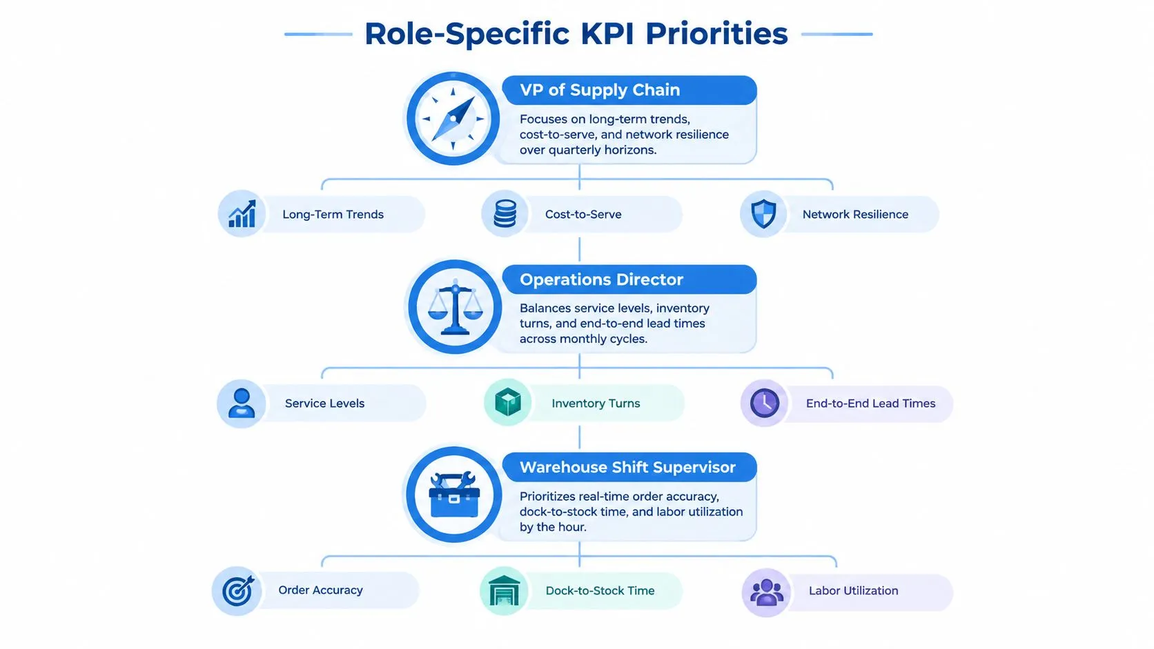
A warehouse shift supervisor and a vice president of supply chain don't need the same dashboard. They operate at different time horizons, control different levers, and require different levels of detail. A monolithic scorecard forces one audience to scan irrelevant information while the other waits for an analyst to extract the right slice.
The supervisor needs execution-level signals: order accuracy, dock-to-stock time, open exceptions, labor utilization, and stockouts by location. The operations director needs comparative views across facilities, suppliers, and product groups. The VP needs trends in working capital, service exposure, network dependency, and recovery capacity.
Design views around decisions
Role-based analytics shouldn't mean duplicating the warehouse. Build one governed semantic layer, then expose different dimensions and refresh expectations through role-specific views.
- VP of Supply Chain: Aggregate service, inventory exposure, cost-to-serve, supplier concentration, and disruption recovery by region and business unit.
- Operations Director: Compare facilities, channels, suppliers, and lanes. Provide drill-through from a performance change to the orders, receipts, and shipments behind it.
- Warehouse Shift Supervisor: Surface open tasks, blocked inventory, picking accuracy, receiving queues, and exceptions that can be resolved during the shift.
The key design choice is not cosmetic filtering. It is preserving the path from executive signal to operational record. A VP who sees falling service should be able to move from region to facility, facility to process, and process to affected orders without requesting a custom report.
Give self-service a governed foundation
Data teams become a human API when every new question requires a ticket. Prevent that by publishing reusable entities such as orders, order_lines, inventory_snapshots, shipments, receipts, suppliers, facilities, and trade_lanes, with documented keys and timestamp semantics.
Product managers may need customer-facing fulfillment views, while operations leaders need internal exception detail. Both can use the same modeled facts if access policies separate sensitive fields from shared performance measures. The warehouse should support exploration, but definitions must remain centralized so self-service doesn't become uncontrolled metric creation.
A good executive dashboard answers “where is risk concentrated?” A good frontline view answers “what should I do next?”
Benchmarking Across Geographies and Trade Lanes
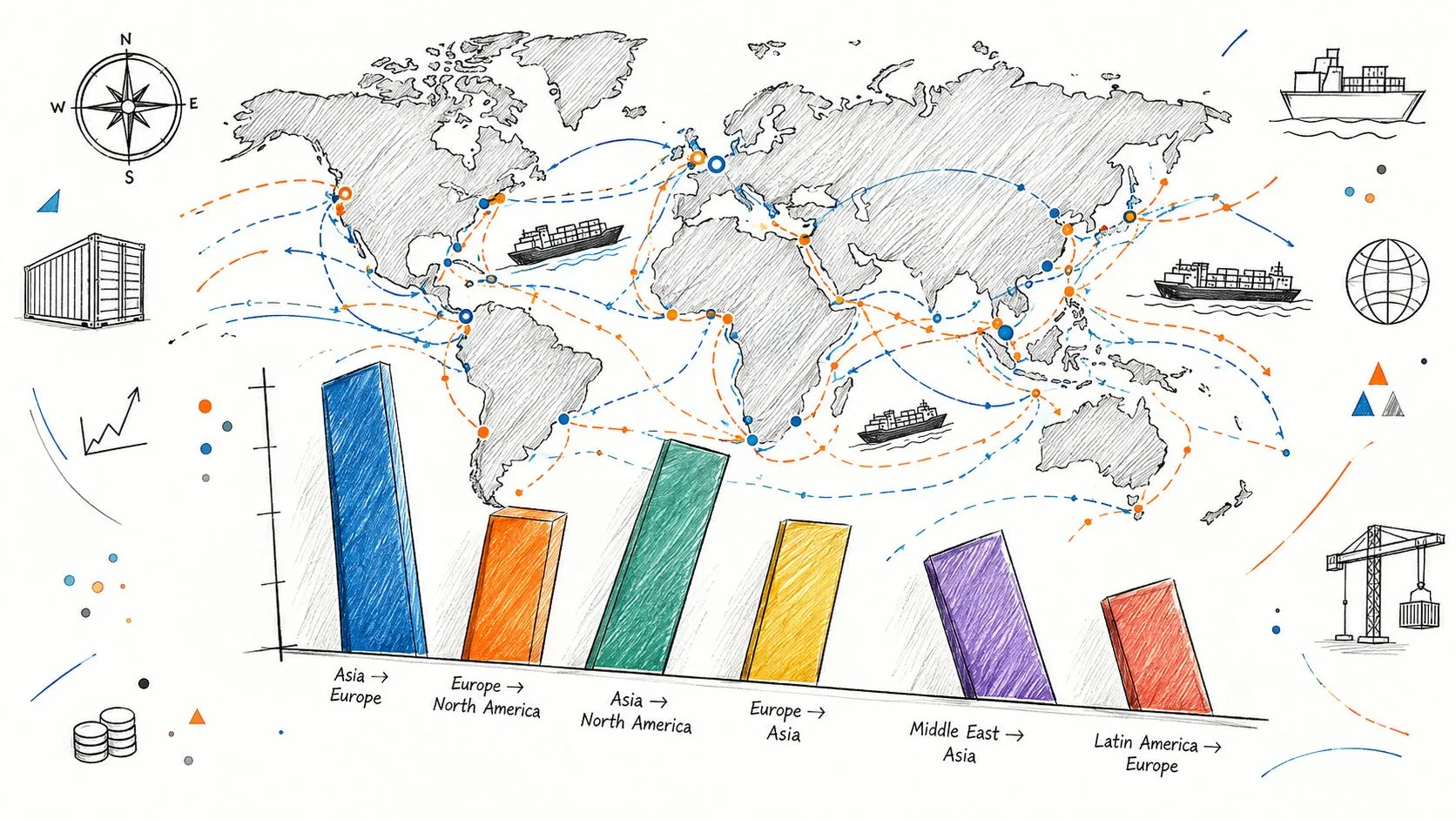
A global on-time delivery target can punish the wrong team. The same internal warehouse process may perform consistently while two trade lanes experience very different border procedures, transshipment patterns, port congestion, or inland connectivity.
The World Bank Logistics Performance Index 2.0, based on 2023 to 2024 tracking data, measures speed and connectivity and identifies unpredictability at ports, transshipment hubs, and inland checkpoints. That matters because a headline delivery KPI can hide the external conditions that determine whether a shipment reaches the customer on time.
Segment the denominator
Don't compare every country, port, and fulfillment center against one benchmark. Create a lane-aware KPI model with dimensions for:
- Origin and destination: Facility, country, region, and customer market.
- Network path: Port pair, transshipment hub, border crossing, carrier, and mode.
- Process milestones: Booking, pickup, export clearance, departure, arrival, import clearance, and final delivery.
- Context: Product class, incoterm, service promise, and disruption status.
This lets analysts decompose delivery performance into internal handling time and external dwell time. If final delivery is late because a shipment spent extended time at a border checkpoint, reducing warehouse pick time may improve a local measure without changing customer outcomes.
Benchmark like an operator, not a spreadsheet
Use internal historical performance to establish a baseline within comparable lanes. Then compare facilities or carriers after controlling for route structure, service promise, and product requirements. A regional manager shouldn't carry the full blame for a connectivity penalty they can't influence.
Trade compliance data also affects the operating picture. Teams handling European imports may need a reliable way to find an EORI number quickly when validating counterparties and documentation workflows. That isn't a replacement for delivery KPIs, but it can support the master data and exception processes that make lane-level analysis trustworthy.
The contrarian conclusion is straightforward: improving on-time delivery may require redesigning a corridor, reducing hub dependence, or improving document readiness rather than pushing a warehouse team to work faster. Your benchmark should expose that choice.
Building the Data Model and Dashboard Architecture
A KPI dashboard is only as reliable as its joins. Supply chain data commonly spans ERP orders, warehouse management events, transportation milestones, finance valuations, supplier records, and carrier feeds. If those systems don't share stable identifiers and timestamp rules, the dashboard can display a precise number that no operator can reconcile.
Model the business events first
Use a star schema or a comparable dimensional design around operational facts. Typical fact tables include order lines, inventory snapshots, receipts, shipment legs, delivery events, and stockout events. Dimensions should cover products, facilities, suppliers, customers, carriers, lanes, calendar dates, and service promises.
Preserve event time and ingestion time separately. A delivery event may occur before a carrier feed reaches your warehouse, and analysts need both the operational timestamp and the data freshness timestamp. Keep source-system identifiers, correction flags, and late-arriving records so users can distinguish a real operational change from a backfilled transaction.
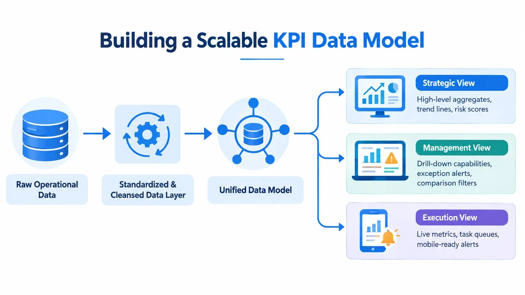
A practical modeling sequence looks like this:
- Raw layer: Store source records with minimal alteration and retain provenance.
- Cleansed layer: Standardize units, currencies, time zones, status codes, and identifiers.
- Unified layer: Join facts to conformed dimensions and expose shared business entities.
- Metric layer: Define OTIF, turnover, days of supply, and exception logic once.
- Serving layer: Publish executive, management, and execution views with appropriate access controls.
Centralize definitions and test the joins
The metric layer should expose both the result and its components. For OTIF, users should be able to inspect the on-time flag, in-full flag, applicable date, ordered quantity, delivered quantity, and exclusion reason. For days of supply, expose available stock, demand denominator, lookback window, and product eligibility.
Automated tests should check uniqueness of business keys, nonnegative quantities where appropriate, timestamp ordering, valid facility mappings, and reconciliation to finance or operational control totals. Test coverage matters more than dashboard polish when a single duplicate shipment can distort service and inventory views.
The architecture doesn't need to trap users inside a rigid BI workflow. A file-system approach with custom Python notebooks can let technical and nontechnical users build analyses on governed warehouse data while the data team maintains reusable models. For background on data modeling in a data warehouse, focus on the relationship between raw facts, conformed dimensions, and downstream metric consumers.
Measuring Resilience and Automation Gaps
Efficiency metrics answer whether the network performed as planned. Resilience metrics answer whether the organization can detect a disturbance, decide under uncertainty, and restore service without waiting for a manual data intervention.
That distinction matters because recent supply chain KPI research highlights a wider execution problem. A 2025 IMD survey identified advanced analytics, real-time decision-making, AI and machine learning, and digital ecosystem interoperability as the largest execution discrepancies. A separate 2025 survey found that dashboards remain dominated by OTIF, on-time delivery, and days of inventory on hand, while CO₂ emissions per shipment appeared at 8%, showing how peripheral sustainability measurement remained in that surveyed dashboard area. The resilience KPI analysis documents both gaps.
Add capability measures to outcome measures
A resilient measurement system should track recovery and decision infrastructure, not just the final service result. Useful candidates include:
- Time to recover inventory: Time required to restore inventory after a disruption, a lead-time-related measure highlighted in resilience research.
- Exception detection latency: Time between the first anomalous event and the creation of a recognized exception.
- Decision latency: Time between exception creation and an approved operational response.
- Automation coverage: Share of eligible decisions supported or executed by a defined workflow.
- Interoperability health: Status of critical feeds, identifier mappings, and event completeness across partners.
- Human override rate: Frequency with which operators reject automated recommendations, segmented by reason.
These measures shouldn't be treated as vanity scores. Each one should connect to a failure mode. If recovery takes too long because inventory positions arrive late, the remedy belongs in data integration. If recommendations are rejected because the model ignores allocation rules, the remedy belongs in feature design or governance.
For implementation patterns that connect operational sources, models, and workflows, see AI use cases for supply chain data integration. The important shift is to measure whether intelligence reaches the decision point, not merely whether a model exists.
Operationalizing KPIs with Alerts and Action Triggers
A dashboard that requires a manager to notice a problem is a passive report, not an operational control. The useful KPI is the one that detects a meaningful deviation, routes it to an owner, and records what happened afterward.
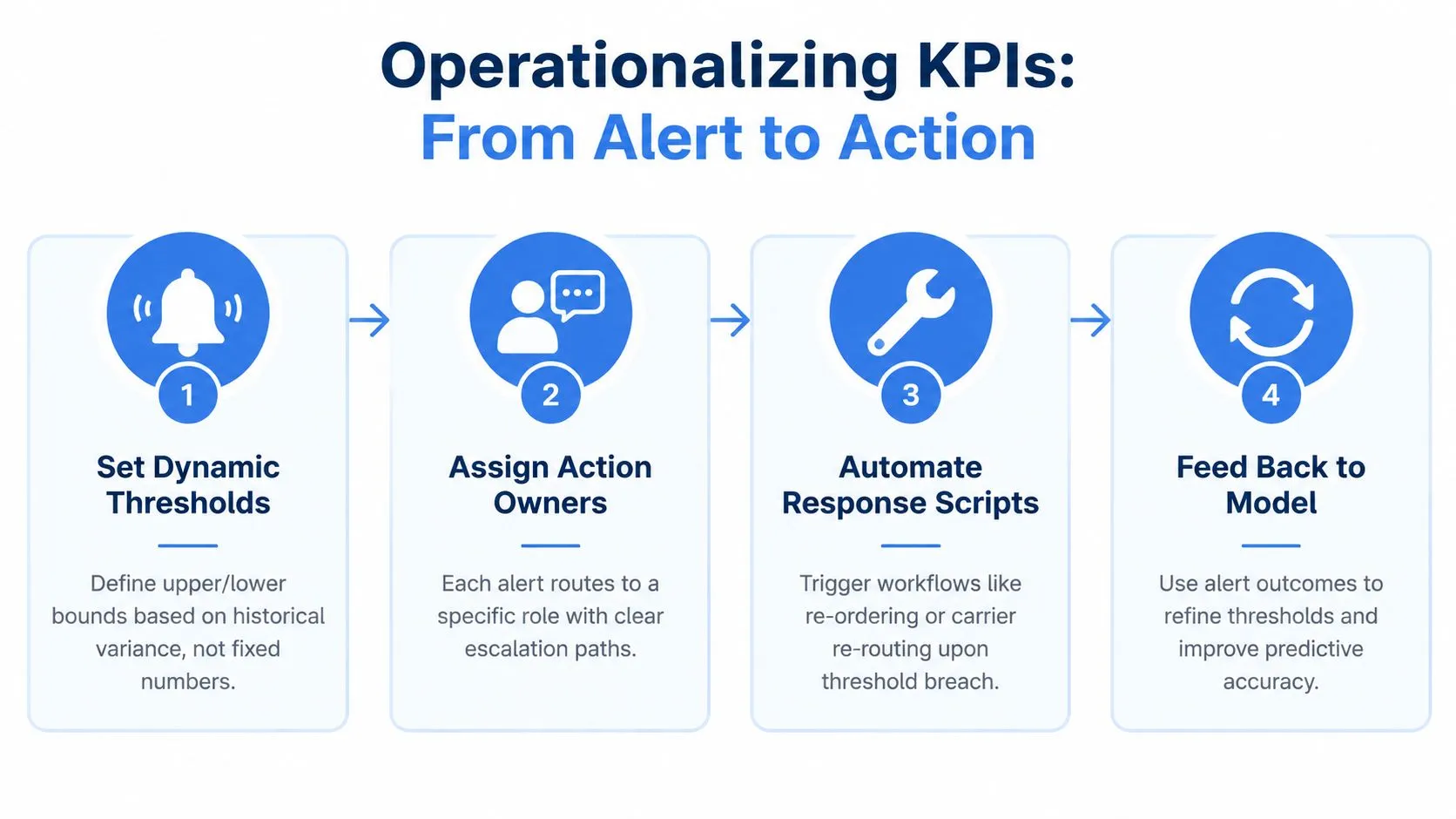
Fixed thresholds are easy to configure and often wrong. A lead time that is normal for one lane may be anomalous for another, while a seasonal demand pattern can make a static stockout threshold either noisy or dangerously slow. Build thresholds from historical variance, planned events, product criticality, and lane context, then review false positives with the people receiving the alerts.
Convert a breach into a workflow
A practical trigger design has four parts:
- Define the deviation: Specify the metric, grain, comparison window, and minimum data-quality conditions.
- Assign the owner: Route a stockout risk to the inventory planner, a dock exception to the warehouse lead, and a documentation issue to the responsible compliance role.
- Specify the response: Create a task, request a replenishment review, propose a carrier change, or escalate a blocked shipment.
- Capture the outcome: Record whether the alert was valid, what action occurred, and whether the issue resolved.
The Peak Transport KPI program provides useful context for organizing transport measurement around operational accountability. The same principle applies beyond fleet operations. An alert without ownership becomes noise, and repeated noise trains teams to ignore the system.
Control alert fatigue
Use severity tiers and suppression rules. Group related events into one incident when several shipment legs fail for the same external cause, and pause alerts when a planned disruption is already recorded. Retain every suppressed event for analysis, because suppression should reduce duplication, not erase evidence.
Operational dashboards should expose current queues and next actions, while executives should see unresolved exposure and recovery trends. Real-time data analysis tools for logistics and supply chain control towers can support this separation between execution detail and management oversight. Measure the alert system itself through detection delay, acknowledgment, resolution, override reasons, and recurrence. Those are the signals that tell a data leader whether the KPI program is improving decisions or merely producing more notifications.
Querio provides AI coding agents that work directly on warehouse data, using custom Python notebooks and a file-system approach to support governed self-service analysis. If you're rebuilding supply chain KPI definitions, data models, and operational views, visit Querio to explore how your data team can move from answering repetitive requests to maintaining reusable analytics infrastructure.