When to Use a Pie Chart for Clear Dashboard Storytelling
Unsure when to use a pie chart? This guide explains the rules for creating clear, effective pie charts on your dashboards and offers powerful alternatives.
https://www.youtube.com/watch?v=o7F-tbBl_hA
published
Outrank AI
when to use a pie chart, data visualization, dashboard design, chart types, business intelligence
0afc3f1d-cafd-40c6-bdd8-232529ea0ffd

The short answer? You should only reach for a pie chart when you need to show proportions of a single, meaningful whole.
Think of it like a pizza. A pie chart’s one and only job is to show how that whole pizza is divided up. It’s perfect for giving everyone a quick, intuitive look at how the total breaks down at a specific moment in time.
The One Job a Pie Chart Does Perfectly
Let's say you're looking at your company's total website traffic for last month. A pie chart is a fantastic way to show where that traffic came from. For example, it can instantly show that 50% came from organic search, 30% from social media, and 20% from direct visits.
Its entire purpose is to illustrate a part-to-whole relationship. Each slice represents a piece of the total, and all the slices must add up to 100%.

This visual metaphor is powerful because it's so familiar. The circular shape implies a complete set, making it easy for almost anyone to grasp the relative contributions of each category without much effort. When the main question is, "What percentage of the total does this category represent?" a pie chart gives a fast, intuitive answer.
But that strength is also its greatest weakness. A pie chart is a snapshot, not a movie. It’s built to show static composition—not trends, changes over time, or precise comparisons between similar-sized slices. If you try to force it to do anything else, you'll likely end up with a chart that's more confusing than helpful. For more complex stories, you'll need to explore which type of information is best represented by a chart.
The Core Principle: Keep It Simple
The golden rule for pie charts is to keep them simple. They work best when you have just a handful of categories—ideally 2 to 5 slices at most. This allows you to clearly show how each part contributes to the whole, making them a great fit for quick business snapshots like a market share breakdown.
This is exactly why they’re still so common in executive summaries and high-level dashboards, where the goal is immediate comprehension, not deep-dive analysis.
A pie chart should tell one simple story: how a total amount is divided. If your data requires viewers to compare slices to each other with precision or track changes, a bar or line chart is almost always a better choice.
To make the decision even easier, here's a handy table that boils down the basic do's and don'ts.
Quick Guide When to Use a Pie Chart
This table summarizes the core principles for using pie charts effectively in business reporting and dashboards. Think of it as your cheat sheet for deciding if a pie chart is the right tool for the job.
Use a Pie Chart When... | Avoid a Pie Chart When... |
|---|---|
You are showing parts of a single whole. | You need to compare categories to each other. |
The total of all categories equals 100%. | Your data changes over time. |
You have 2 to 5 distinct categories. | You have more than 5 or 6 categories. |
You need a quick, at-a-glance visual. | Precise data comparison is critical. |
Ultimately, choosing the right chart comes down to understanding the story your data needs to tell. When that story is about simple proportions, a pie chart can be a powerful and effective tool.
The 3 Golden Rules for Using a Pie Chart
Before you even think about using a pie chart, you need to run your data through a quick three-point inspection. Think of these as the non-negotiable laws of pie charts. Getting them right is the difference between a chart that tells a clear, honest story and one that just creates confusion.
First and most importantly, all your slices must add up to a meaningful whole. This is the big one. Your data categories have to combine to equal 100% of something real and tangible. For example, breaking down website traffic by source (Organic, Social, Direct, etc.) works perfectly because all those sources together represent 100% of your traffic.
On the other hand, if you tried to chart survey responses where people could pick multiple answers, it would be a disaster. The total would blow past 100%, and the very concept of a "whole" would be meaningless.
Rule 1: Your Data Must Form a Complete Pie
This is really the bedrock of a pie chart's integrity. Each slice represents a piece of a total pie. If that total isn't a complete, logical set, the chart instantly becomes misleading. It's like trying to show someone the ingredients for a cake but forgetting to mention the flour—the other ingredients just don't add up to the real thing.
A pie chart is a visual contract with your audience. You're promising them that the slices shown are the only slices and that together, they make a complete picture. Break that contract, and you lose trust.
This is exactly why you can't just drop a category without thinking. If you have an "Other" category that makes up 10% of your data and you just delete it, the rest of the slices no longer add up to 100%. The part-to-whole relationship is broken, and the chart is officially invalid.
Rule 2: Keep the Slices to a Minimum
The second rule is simple: don't go overboard with categories. Honestly, the sweet spot is somewhere between two and five slices. Once you start pushing past six, you get a cluttered, unreadable mess. Our brains are just not good at comparing the angles and areas of a bunch of tiny, sliver-like slices.
Think about a quarterly sales report broken down by four regions: North, South, East, and West. A pie chart is a great fit. But what if you have fifteen different sales territories? The slices would be so thin they'd be impossible to tell apart. In that scenario, a simple bar chart is a far, far better choice. For more help picking the right visual, our data visualization guide on choosing the right charts covers all the best alternatives.
Rule 3: Compare Parts to the Whole, Not to Each Other
Finally, the third rule is all about purpose. Use a pie chart to compare individual parts to the whole, not to compare different parts against each other. This is a classic mistake. If your main goal is to show which category is slightly bigger or smaller than another, a pie chart will fail you, especially when the values are close.
For instance, a pie chart is great for showing that Organic Search is the single biggest chunk of your total website traffic. But if you need your audience to see exactly how much larger Organic is than Direct traffic, a bar chart will give them that answer instantly. It's just way easier for us to compare the length of two bars side-by-side than it is to judge the angles of two pie slices.
How to Avoid Common Pie Chart Mistakes
Even when you have the perfect data for a pie chart, things can go wrong fast. It's one thing to know when to use one, but it's another thing entirely to avoid the common pitfalls that turn a clear insight into a confusing mess. The good news is these mistakes are surprisingly common, and just as easy to fix.
The most frequent offender is what I call the "crowded pizza" problem—cramming in way too many slices. Once you go past five or six categories, a pie chart becomes almost impossible to decipher. Our brains just aren't wired to accurately compare the angles of a dozen paper-thin slivers. At that point, it’s just a colorful decoration, not a useful tool.
Another classic error is forgetting to arrange the slices in a logical order. A random jumble of categories forces your audience to hunt around the circle, slowing down their understanding. The whole point of a chart is to deliver an "at-a-glance" takeaway, and a disorganized pie chart completely undermines that.

Ditching Distortions for Clarity
Probably the most damaging mistake of all is using those flashy 3D or "exploding" pie chart effects. They might catch the eye, but they create serious perceptual distortions that completely misrepresent your data. A slice in the foreground of a 3D chart always looks much bigger than a slice of the exact same value in the background.
Key Takeaway: Clarity should always win over decoration. Things like 3D effects, shadows, and exploding slices are just visual noise. They actively work against accurate data interpretation, so stick to a clean, simple 2D format to tell an honest story.
These kinds of visual tricks break the fundamental promise of data visualization: to present information truthfully. The goal isn't to add stylistic flair that introduces bias; it's to make the data easier to understand.
Practical Fixes for Common Errors
Alright, let's talk about how to fix these issues. With just a few simple adjustments, you can transform a confusing chart into a powerful and effective one.
Too Many Slices: If you have more than five categories, your best bet is to group the smallest ones into a single "Other" slice. This instantly cleans up the visual and keeps the focus where it should be—on the most significant parts of the whole.
Disordered Data: Always, always order your slices. Best practice is to place the largest slice at the 12 o'clock position and then arrange the rest clockwise, from largest to smallest. It creates a natural, logical flow for the eye.
Misleading Effects: Just turn them off. Modern BI tools like Querio often have smart defaults that guide you toward flat, 2D designs for a reason. Always choose the 2D version to ensure the area of each slice accurately represents its true value.
Think about it this way: instead of a cluttered, 10-slice 3D pie chart showing website traffic sources, a much better approach is a clean 2D chart. You could show the top four traffic sources individually and group the other six into that handy "Other" category. The chart immediately becomes readable, and the most important information stands out. By steering clear of these common traps, you can make sure your pie charts deliver quick, accurate insights every single time.
Designing Pie Charts People Actually Understand
Knowing when to use a pie chart is only half the battle. The other half is designing one that’s instantly clear, and that’s a skill every analyst should master. A great pie chart doesn't just display numbers; it communicates a key insight so cleanly that your audience gets it in a single glance. This is especially vital for busy executives who depend on your dashboards for quick, accurate takeaways.
The single most impactful design choice you can make is to label your slices directly. Don't make people work for the information. Instead of a separate legend that forces their eyes to dart back and forth, put the category name and its percentage value right on or next to the slice it represents. It’s a simple tweak that massively reduces the effort required to understand the chart.
Creating a Natural Visual Flow
With your labels in place, the next step is to bring some order to the chaos. A pie chart with randomly arranged slices is like a jumbled sentence—all the words are there, but they don't form a coherent thought. The fix is wonderfully simple: order your slices from largest to smallest.
This creates a natural visual path for the eye to follow. Always begin with the biggest slice at the 12 o'clock position, then arrange the rest clockwise in descending order. This simple convention guides the viewer's eye in a predictable pattern, making the data much easier to digest. This logical flow is even more critical when you're figuring out how to design dashboards for mobile users, where every pixel counts and clarity is everything.
A great pie chart feels effortless to read. By ordering slices and labeling them directly, you remove friction and allow the main insight—the part-to-whole relationship—to shine through without any distractions.
Using Color with Purpose
Color is a powerful tool, but when used without a plan, it just creates noise. Your goal isn't to make a rainbow; it's to enhance understanding. Think of color as a spotlight you can use to draw attention to the most important piece of the story.
For instance, try using one bold, attention-grabbing color for the most critical slice and muted, neutral shades like gray for everything else. This technique, often called highlighting, immediately tells your audience, "Look here. This is what matters."
Here are a few principles to keep in mind:
Limit Your Palette: Stick to a small, cohesive set of colors. Using too many, or colors that are too similar, makes it hard to tell the slices apart.
Emphasize with Contrast: A high-contrast color is perfect for making a specific data point pop. It’s a great way to show your company's market share against the competition.
Ensure Accessibility: Remember that not everyone sees color the same way. Use a colorblind-safe palette to make sure your chart is readable for everyone. Most modern data viz tools have these built-in.
The table below summarizes these best practices into a handy checklist.
Pie Chart Design Best Practices Checklist
A checklist summarizing actionable design tips to ensure your pie charts are clear, accurate, and easy to interpret.
Best Practice | Why It Matters | Implementation Tip |
|---|---|---|
Label Slices Directly | Reduces cognitive load by eliminating the need for a separate legend. | Place the category name and percentage value directly on or next to each slice. |
Order Slices Logically | Creates a natural visual flow, making comparisons easier. | Start the largest slice at 12 o'clock and arrange others clockwise in descending order. |
Limit to 5 Slices | Prevents visual clutter and ensures each slice is large enough to be meaningful. | Group smaller categories into an "Other" slice if you have more than five. |
Use Color Strategically | Guides the viewer's attention and highlights the most important data. | Use a single, high-contrast color for the key slice and neutral tones for the rest. |
Check Color Accessibility | Ensures the chart is readable for people with color vision deficiencies. | Use a colorblind-safe palette or test your chart with a colorblindness simulator. |
Ultimately, every design choice should serve one goal: clarity. By combining direct labels, logical ordering, and purposeful color, you can design pie charts that people don't just see—they actually understand and can act on.
Choosing a Smarter Chart Alternative
While pie charts have their moments, they often aren't the hero your data story needs. Realizing their limits is the first step toward creating more powerful and honest data visualizations. When your focus shifts from just showing simple proportions to making sharp, accurate comparisons, it’s time to look at better tools for the job.
A simple bar chart, for instance, almost always beats a pie chart when you need to compare the size of different categories. Our brains are wired to judge lengths much more accurately than angles or areas. This makes it a breeze to see not just which category is bigger, but by exactly how much—a critical advantage when clarity is king.
When Precision and Trends Matter
If you need to show how a part-to-whole relationship changes over time, a stacked bar chart is a fantastic option. Picture tracking your website's traffic sources every month. A parade of pie charts would be a nightmare to compare side-by-side. But a stacked bar chart neatly shows how the contribution of each source—like Organic, Social, and Direct—grows or shrinks from one month to the next.
Then there's the donut chart, a modern cousin to the pie chart. It functions in much the same way by displaying proportions, but its hollow center gives you a handy spot to highlight a key total or an important metric. Just remember, it still carries the same baggage as a standard pie chart when it comes to comparing slices. For a deeper dive, check out our complete guide on the different types of graphs and when to use them.
Visualizing Complex and Hierarchical Data
But what if your data has layers, with categories nested inside other categories? That's where a treemap shines. It uses a series of nested rectangles, where the size of each box represents its value. This lets you show both the part-to-whole relationship and the data’s hierarchy at the same time—something a flat pie chart could never do.
Sometimes, the data calls for something entirely different. For illustrating specific concepts, like economic principles, learning specialized techniques like graphing supply and demand curves will offer far more insight than a simple proportional chart ever could.
A pie chart answers, "What percentage of the whole is this?" A bar chart answers, "Which one is bigger, and by how much?" Picking the right chart is all about knowing which question is most important for your audience to answer.
This decision tree gives you a quick visual guide to the core design rules that hold true whether you land on a pie chart or choose something else.
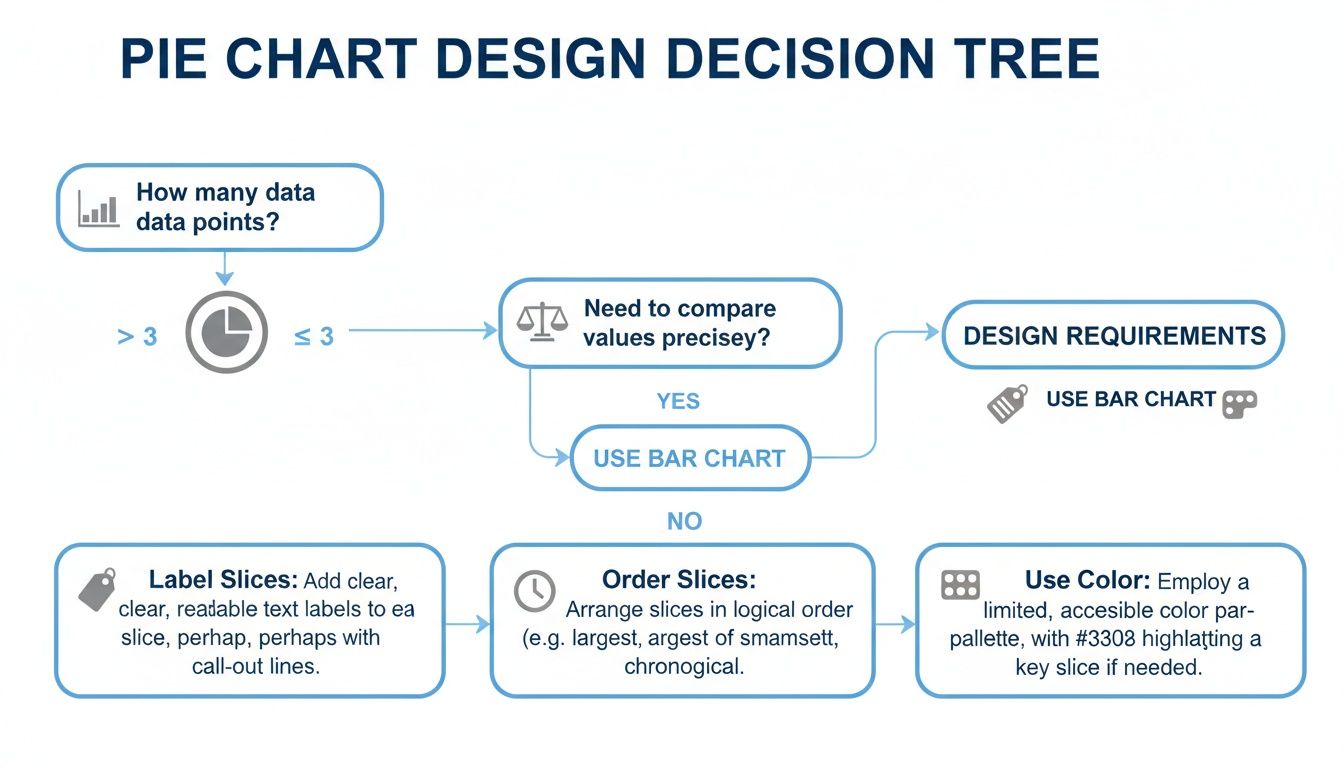
This flow underscores that no matter what chart you use, fundamentals like clear labels, logical ordering, and smart color choices are non-negotiable. The goal is always to pick the visual that tells your data’s story with the most clarity and impact.
Putting Pie Charts to Work on Your Dashboards
Theory is great, but seeing how pie charts work in the real world is where the lightbulb really goes on. Knowing the rules is one thing, but seeing a pie chart deliver a clear, immediate insight on a business dashboard is what truly solidifies its purpose. They’re at their best when you need a quick, high-level snapshot to inform what you do next.

Let's walk through a few scenarios where a pie chart is exactly the right tool for the job.
Marketing Lead Source Breakdown
Picture a marketing manager looking at their quarterly performance dashboard. Right there, a pie chart breaks down all new leads by where they came from. The slices might look something like this: Organic Search (45%), Paid Social (30%), Webinars (15%), and Referrals (10%).
In a single glance, that manager knows that their SEO strategy is paying off, driving almost half of all leads. They can also see that webinars, despite the effort they take, are a solid contributor. That one visual might spark a decision to invest more in webinar content next quarter to see if they can grow that slice of the pie.
Finance Department Expense Allocation
Budget reviews are a perfect home for a pie chart, especially when you’re dividing expenses into a few broad categories. A finance leader can instantly see spending priorities without getting bogged down in a long spreadsheet. For instance, a chart showing quarterly spend as R&D (35%), Marketing (30%), Sales (20%), and G&A (15%) makes it immediately clear where the company's money is going. You can explore more of these data visualization applications on insight7.io.
If that R&D slice looks a little thin for a company that prides itself on innovation, an executive can flag it for discussion in the next leadership meeting. It’s that simple.
A well-placed pie chart on a dashboard doesn't just show data; it prompts critical business questions. It turns a percentage breakdown into a starting point for strategic conversations and decisive action.
Operations Support Ticket Priority
An operations lead needs to get a feel for the support team's workload right now. A pie chart is perfect for this, breaking down active tickets by priority: High (15%), Medium (55%), and Low (30%). This gives them an immediate temperature check on the entire support queue.
Seeing that more than half of the tickets are "Medium" priority is actually a good sign. It probably means the team is managing the incoming flow well and that major crises (High priority tickets) aren't piling up. This simple part-to-whole view helps them allocate resources and make sure service levels are being met, all without having to dig through dense tables of data.
Pie Chart FAQs: Your Common Questions Answered
Even when you know the rules, you'll still run into tricky situations where you're not quite sure if a pie chart is the right call. Let's clear up some of the most common questions that pop up. Getting these right will give you the confidence to build dashboards that truly help your team.
Here are the practical answers to the questions we hear most often.
Can I Use a Pie Chart to Show Changes Over Time?
This is a hard no. It's one of the most common missteps in data visualization. A pie chart is a snapshot of one single moment. Think of it as a photo, not a video. It’s built to show a static composition, like "What was our market share in Q4?"—not how it evolved.
Trying to compare market share from Q1 to Q2 with two side-by-side pie charts is a classic mistake. It forces your audience to become human protractors, trying to mentally compare angles and slice sizes between two separate visuals. It's confusing and inefficient.
A far better choice for tracking proportions as they change over time is a stacked bar chart or a line chart. These are purpose-built to make trends and shifts obvious at a quick glance.
What’s the Maximum Number of Slices for a Pie Chart?
There's no official law, but the data viz community has a strong consensus: stick to fewer than seven slices. The real sweet spot is between two and five categories.
Once you go beyond that, the slices get sliver-thin and the labels become a cluttered mess. Our brains are just not wired to accurately compare the angles of a dozen tiny wedges. If you find yourself with more than five or six categories, you have two great options:
Group the smallest slices into a single "Other" category to clean things up.
Switch to a bar chart. It handles lots of categories with ease and clarity.
Is a Donut Chart Better Than a Pie Chart?
A donut chart is really just a pie chart with a hole in the middle. They're stylistic cousins that both show part-to-whole relationships. One isn't inherently "better" than the other because they suffer from the exact same limitations.
Some people prefer the modern look of a donut chart, and that empty space in the center is a handy spot to put a key metric, like the total value. But when it comes to readability—especially with similar-sized slices or too many categories—they're just as tricky to interpret as a pie chart.
The bottom line? Choose the one that best fits your dashboard's aesthetic, but make sure you follow the same rules.
Ready to build dashboards that answer questions instantly? With Querio, your team can ask questions in plain English and get back beautiful, accurate charts—no code required. Explore how Querio makes data accessible to everyone.

