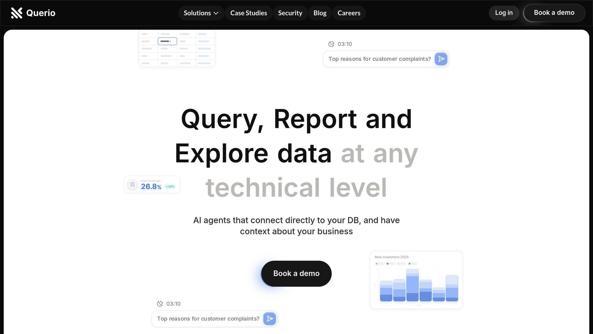
Business Intelligence
How to Design Dashboards for Mobile Users
Learn essential strategies for designing effective mobile dashboards that prioritize user experience, data visibility, and performance.
Did you know 98% of Americans own smartphones, and 63.05% of web traffic comes from mobile devices? Plus, 70% of professionals check business data on their phones daily. Clearly, mobile dashboards aren't just convenient - they're necessary.
Here’s what you need to know to design mobile dashboards that work:
Focus on Key Insights: Prioritize essential data, avoid clutter, and use progressive disclosure to show details only when needed.
Thumb-Friendly Design: Place key actions within easy thumb reach and ensure touch targets are at least 48x48 pixels.
Simple Visuals: Use clear, minimal charts (e.g., limit bar charts to 5–7 bars) and high-contrast colors for readability.
Responsive Layouts: Use grid-based designs that adapt to different screen sizes, with a focus on vertical stacking for smaller devices.
Fast Performance: Optimize data loading with caching, aggregation, and progressive loading to keep things smooth.
Interactive Features: Add tooltips, swipes, and zoom options for easier navigation without overwhelming users.
Want a quick win? Tools like Querio offer AI-powered layouts, voice commands, and dynamic KPI insights to make mobile dashboards even more user-friendly.
In short, designing for mobile means balancing simplicity, usability, and performance. Start with the user in mind, and you’ll create dashboards that are both functional and intuitive.
Designing Dashboards for Mobile
Mobile User Needs and Limitations
Designing mobile dashboards comes with its own set of challenges that require thoughtful decisions. With mobile phones accounting for 58% of global website traffic in Q1 2023 [2], addressing these constraints isn't just smart - it's a necessity.
Working with Small Screens
Mobile screens force a sharper focus on content priorities. Unlike desktops, which can handle multiple visualizations at once, mobile dashboards need to deliver the most important information up front. This calls for a well-defined KPI dashboard layout.
Take Coinbase, for example. They adapted their desktop dashboard by moving its panel to a bottom navigation bar, which aligns with the natural "Z" scanning pattern users often follow.
To make the most of limited screen space:
Cut down on text and grid elements in charts to avoid clutter [6].
Use contrasting colors to highlight key metrics at a glance [6].
Apply progressive disclosure, showing additional details only when necessary [2]. This is a core principle of AI-powered dashboards that simplify complex data for mobile consumption.
Another key consideration? Ensuring the interface works seamlessly for one-handed use, which is explored next.
Thumb-Friendly Design
Mobile design needs to accommodate natural thumb movements. Studies reveal that 49% of users favor one-thumb navigation, and 94% hold their phones in portrait mode [5].
A healthcare dashboard project offers a great example of this principle in action. Developers replaced desktop hover-state tooltips with tap-activated displays, reduced visible data points for easier interaction, and included clear instructions like "Tap bar to see data" [2].
Understanding screen zones is crucial for thumb-friendly design:
Zone | Location | Usage Recommendation |
|---|---|---|
Natural | Lower half & middle | Ideal for primary actions and frequent interactions |
Stretching | Upper middle | Best for secondary functions |
Hard to reach | Top corners | Reserved for rarely used features |
To enhance usability:
Ensure touch targets are at least 48x48 pixels[7].
Place primary actions within the natural thumb zone[7].
Space out interactive elements to reduce accidental taps [7].
These small but impactful adjustments make mobile dashboards more intuitive and reduce user strain, especially during prolonged use. Every tap should feel deliberate and effortless, keeping users engaged and helping them complete tasks efficiently.
Mobile Dashboard Design Basics
Designing a mobile dashboard that works well for users means focusing on touch-friendly elements and ensuring everything is visually clear and easy to use. A good design balances functionality with simplicity, keeping the unique needs of mobile users in mind.
Touch Target Sizing

Touch targets on a mobile dashboard should be large enough to accommodate the average fingertip, which ranges from 0.6 to 0.8 inches (1.6–2 cm). This helps prevent accidental taps and improves usability. Here are some recommended minimum sizes:
Element Type | Minimum Touch Target Size |
|---|---|
Primary buttons | 48 × 48 dp |
Interactive charts | 44 × 44 px |
Navigation items | 1 × 1 cm (0.4 × 0.4 in) |
To further reduce errors, maintain at least 8dp spacing between interactive elements. A great example of this in action is the Target app, which uses large, easy-to-tap buttons - like the product search and barcode scanning options - measuring around 0.8 × 0.8 inches. This makes the app more convenient for users on the go.
Visual Organization
A visually organized KPI dashboard is key to making data easy to interpret. Here are some principles to follow:
Use larger, bold fonts for titles and primary metrics to grab attention.
Stick to a consistent color scheme across all elements.
Add whitespace strategically to separate sections and avoid clutter.
Group related data points together to create logical connections.
"Effective dashboards present data and convey the underlying story to prompt informed actions." [8]
Make sure text is easy to read by maintaining strong contrast between text and backgrounds. If you're using color to represent data, include additional markers like labels or patterns to ensure accessibility for all users [8].
Content Focus
A mobile dashboard isn't just about layout - it’s about delivering clear, actionable insights. The content should be streamlined to highlight what matters most. For instance, a healthcare dashboard project achieved this by reducing visible data points and introducing tap-activated tooltips with clear instructions [2].
Here’s how to prioritize content effectively:
Primary Information Display
Show key metrics using simple visuals like gauges or indicators, tailored to the user's role
[9].
Progressive Disclosure
Begin with high-level metrics and let users explore more detailed information through deliberate interactions
[10].
Performance Optimization
Separate external tools and embedded content from the main dashboard. This ensures smooth performance, even when handling large datasets
[9]. This is particularly important when you build fast-loading dashboards to maintain a smooth user experience.
Understanding these basics is essential when evaluating modern BI tools for your organization. These principles lay the groundwork for more advanced features, which will be explored further in the Querio tools section.
Mobile Data Visualization
Designing effective mobile visualizations is all about balancing the need to present meaningful information with the constraints of smaller screens.
Simple Charts
Charts for mobile devices need to be straightforward and easy to understand at a glance. Studies reveal that visuals are processed 60,000 times faster than text [11], making clarity in design a top priority for mobile users.
Here’s how to optimize common chart types for mobile:
Chart Type | Best Use Case | Mobile Optimization Tips |
|---|---|---|
Bar Charts | Comparing data points | Limit to 5–7 bars; use horizontal bars |
Line Charts | Showing trends | Highlight key trends; reduce excess points |
Pie Charts | Displaying percentages | Keep categories under 7 for better clarity |
For example, in a healthcare project [2], designers made these adjustments to improve usability:
Reduced the number of visible bars for better readability.
Added clear instructions for accessing detailed data.
Removed unnecessary elements like grid lines and extra labels.
These thoughtful adaptations ensure that simplified charts remain functional while conveying critical information.
Flexible Visualizations
Simplicity is just the starting point - visualizations also need to adapt seamlessly to different screen sizes. This is crucial, considering that 70% of employees keep their phones within reach at work [12].
Smart Scaling
Use responsive design to build live dashboards that adjust charts automatically for various screen sizes.
Follow touch-friendly guidelines for spacing and sizing.
Opt for high-contrast color schemes to accommodate different lighting conditions.
Interactive Elements
Incorporate tooltips to provide additional details without overcrowding the screen.
Stick to 3-4 colors to maintain visual clarity.
Enable landscape mode for more complex charts when needed.
Take Statista’s approach as an example: they converted intricate line graphs into horizontal bar graphs for mobile devices, making user statistics easier to digest [11].
With 91% of corporate employees using at least one mobile app [12], it’s clear that optimized visualizations are no longer optional. To achieve this:
Present only essential data points upfront.
Load additional details as needed with on-demand features.
Use progressive disclosure to avoid overwhelming users. This approach allows teams to create analyst-grade dashboards that remain accessible on any device.
Test designs across multiple devices to ensure consistency.
Mobile Layout and Navigation
When it comes to mobile dashboards, getting the layout and navigation right is non-negotiable, even when using the best AI dashboard generators, especially when using AI that generates dashboards automatically. With mobile devices accounting for 58% of global web traffic, ensuring your dashboard is optimized for smaller screens is essential for usability and success.
Grid-Based Layouts
Grid systems are the backbone of responsive and well-structured dashboards. According to Material Design, column-based grids are ideal because they adapt seamlessly to different screen sizes. Here’s a breakdown:
Screen Type | Margin Size | Grid Columns | Best Practice |
|---|---|---|---|
Phone | 16dp | 4 columns | Stack widgets vertically |
Tablet | 32dp | 8 columns | Use 2x2 or 2x1 layouts |
Laptop | 200dp | 12 columns | Opt for multi-column arrangements |
"Grid: A visual made up of columns, gutters, and margins that provide a structure for the layout of elements on a page." - Kelley Gordon, NN/g [13]
For example, a major retailer implemented a responsive grid layout, which improved their inventory monitoring and boosted sales by 15% during peak shopping seasons [3].
Tips for effective grid layouts:
Stick to 8px spacing increments for consistent scaling.
Maintain a clear visual hierarchy by aligning elements properly.
Keep content within columns and avoid placing items in gutters.
Adjust grid density based on the screen size to maintain readability.
Once the layout is structured, navigation should follow suit to create a seamless user experience.
Mobile Navigation Options
Navigation on mobile devices requires a careful balance between ease of use and conserving screen space. Some of the most effective patterns include:
Bottom Navigation Bar: Ideal for dashboards with 3–5 primary sections. Place essential features within thumb reach, adhering to platform-specific touch target guidelines:
iOS: Minimum size of 44×44 pt
Android: Minimum size of 48×48 pt
Progressive Disclosure: For secondary actions, use a kebab menu (three-dot icon) to keep the main interface clean. Additional options can appear contextually as needed.
For more complex dashboards, consider adding gesture-based navigation. Just make sure to include clear visual cues and tutorials to guide users.
Navigation optimization tips:
Place critical actions within easy thumb reach.
Use icons that are instantly recognizable and pair them with clear labels.
Add subtle animations to provide feedback on user actions.
Highlight the search feature prominently for quick access.
Limit the primary navigation options to only the most essential features.
Sticking to consistent navigation patterns throughout the interface helps users develop muscle memory, making your dashboard quicker and easier to use. Whether you go with bottom bars, hamburger menus, or gestures, uniformity ensures a smoother experience for everyone.
Mobile Performance and Interaction
Focusing on performance and user interaction is key to delivering a seamless mobile dashboard experience. A responsive interface with smooth gestures can significantly boost user satisfaction and engagement.
Touch Gestures
Incorporating intuitive gestures makes interacting with mobile dashboards easier and more enjoyable.
Key touch gestures and their applications:
Gesture | Use Case | Best Practice |
|---|---|---|
Tap | Select a data point | Minimum size: 48x48 pt |
Swipe | Navigate between views | Include clear visual cues |
Pinch | Zoom in/out of charts | Provide a reset zoom option |
Long Press | Access detailed tooltips | Show a loading indicator |
These familiar gestures ensure users can interact effortlessly with the dashboard. However, smooth gestures alone aren’t enough - handling data efficiently is equally important.
Loading Large Datasets
Mobile dashboards must process data smartly to stay responsive and avoid overwhelming devices. Using a data dashboard planner can help you identify which efficient data loading techniques are essential for maintaining speed and usability.
Ways to optimize performance:
Use SQL views to work with pre-filtered and aggregated data. Alternatively, AI-powered no-code dashboards can automate these optimizations for non-technical users.
Implement progressive loading to fetch data in smaller chunks.
Cache frequently accessed data for quicker retrieval.
Fine-tune queries to reduce response times.
For better performance, consider these strategies:
Data Aggregation: Display summary metrics first, with options to drill down for detailed insights.
Smart Filtering: Use role-based filters to show only relevant information.
Background Processing: Offload complex calculations to Web Workers for smoother interactions [14].
A good approach is to start with current month metrics and let users load additional data as needed. This keeps the dashboard fast and efficient while giving users control over their data exploration.
Querio Mobile Dashboard Tools
Creating mobile dashboards that work seamlessly is easier with tools designed specifically for mobile-first experiences. Querio offers features that streamline dashboard design and interaction, ensuring a smooth user experience for those on the go.
Smart Layout Adjustment
Querio uses an AI-powered layout system that adapts dashboards automatically to different screen sizes. This system reflows components, resizes charts, and adjusts touch targets to maintain usability without requiring manual tweaks. It ensures the most relevant information is front and center, while secondary details stay accessible through easy-to-navigate menus. The result? Dashboards that remain functional and user-friendly, no matter the device.
Voice and Text Commands
Querio includes voice and text command capabilities, making it easier to explore data naturally and efficiently. In fact, voice functionality has been shown to boost user retention by up to 30% [15]. These tools allow for hands-free operation and simplify complex navigation tasks.
How natural language interactions improve usability:
Interaction Type | Main Advantage | User Benefit |
|---|---|---|
Voice Commands | Hands-free operation | Perfect for multitasking |
Text Queries | Quick data filtering | Speeds up navigation |
Natural Language | Reduces cognitive load | Makes data approachable |
Mobile KPI Updates
For modern businesses, staying updated on key metrics is non-negotiable. Querio's mobile KPI tracking system ensures users are always in the know with features like:
Push notifications for critical metric changes
In-app alerts when thresholds are breached
Customizable KPI dashboards
Performance summaries for quick insights
Speed matters - just a one-second delay in load times can reduce conversion rates by up to 20% [16]. Querio prioritizes essential metrics through efficient data streaming, allowing users to dive deeper into the details only when needed.
Additionally, the platform integrates in-app messaging, enabling teams to discuss KPI changes directly within the dashboard. This combination of communication tools and data visualization fosters collaboration and ensures that mobile dashboards aren't just for viewing data - they're tools for making real-time, informed decisions.
Conclusion
Mobile dashboards play a crucial role in enabling data-driven decisions while on the move [4]. To create effective dashboards, it's important to balance user needs with technical limitations.
Designing a successful mobile dashboard means focusing on essentials like proper touch target sizes [1] and a well-structured visual hierarchy [17]. A great example of this is Bytepad's mobile dashboard redesign, which led to a 230% increase in user engagement and boosted its Google App Store rating from 2 to 4 stars [17].
Here are some key principles for crafting effective mobile dashboards:
Highlight important daily metrics[18]
Use contrasting colors to enhance KPI visibility[1]
Simplify navigation for ease of use[1]
Ensure responsive design for various devices[2]
"A dashboard that frustrates is a dashboard that fails. Make it engaging, and users will never look away." - Aparna K S, Aufait UX [19]
Querio's mobile dashboard tools exemplify this approach by integrating AI-powered layout adjustments, natural language interactions, and real-time KPI tracking. When paired with mobile-first design strategies, these features empower teams to make quick, informed decisions no matter where they are.
FAQs
How can I design mobile-friendly dashboards that work well on different screen sizes?
To design dashboards that work smoothly across different screen sizes, start with responsive design principles. This approach ensures the layout adapts automatically to various devices, keeping everything readable and accessible. Use flexible grids and scalable visuals so that even smaller screens display data clearly.
Keep the interface simple by prioritizing key metrics and eliminating unnecessary elements. Group related data visually and establish clear hierarchies to draw attention to the most critical information. To make the dashboard more user-friendly on mobile devices, include touch-friendly features like larger buttons and gesture-based navigation.
For an efficient way to create mobile dashboards, check out tools like Querio. Powered by AI, Querio makes it easy to build dynamic, interactive dashboards, helping teams access insights and make decisions from anywhere.
How can I make my mobile dashboard faster and easier to use when working with large datasets?
To make sure your mobile dashboard handles large datasets efficiently, focus on cutting down data load and fine-tuning visual elements. Start by filtering data at the source to include only the most relevant information. This reduces the amount of data being transferred, which helps improve speed and responsiveness. Switching to data extracts instead of live connections can also lighten the load on servers and boost performance.
Keep the dashboard layout simple by limiting the number of charts and visuals. Opt for clear, straightforward visualizations that deliver insights without overwhelming users. Another useful technique is implementing caching strategies to reuse previously processed data, which can further enhance speed. By combining these methods, you can design a mobile dashboard that's quick, efficient, and easy to navigate.
How can I design mobile dashboards to make touch interactions easy and prevent accidental taps?
Creating Touch-Friendly Mobile Dashboards
When designing mobile dashboards, prioritizing touch-friendly elements is key to ensuring a smooth user experience. Start by making touch targets large enough - aim for at least 48x48 pixels. This size helps users tap accurately without frustration.
It’s also essential to space out interactive elements. Crowding buttons or controls increases the chances of accidental taps, so leave enough room between them to make navigation easier.
Another important consideration is thumb-friendly placement. Since most users interact with their phones using one hand, positioning frequently used controls in the lower half of the screen keeps them within easy reach.
Finally, keep the interface clean and uncluttered to minimize confusion. Adding visual or haptic feedback for interactions can further enhance usability, letting users know their actions have been successfully registered.
Related Blog Posts


