Mastering the Regression Line Scatter Plot for Product Insights
Transform your product data into actionable strategy. This guide shows how to create, interpret, and use a regression line scatter plot to drive real growth.
published
Outrank AI
regression line scatter plot, product analytics, data visualization, predictive analysis, data for product managers
58810c8d-0d98-4d03-82ee-546a7032f3b4

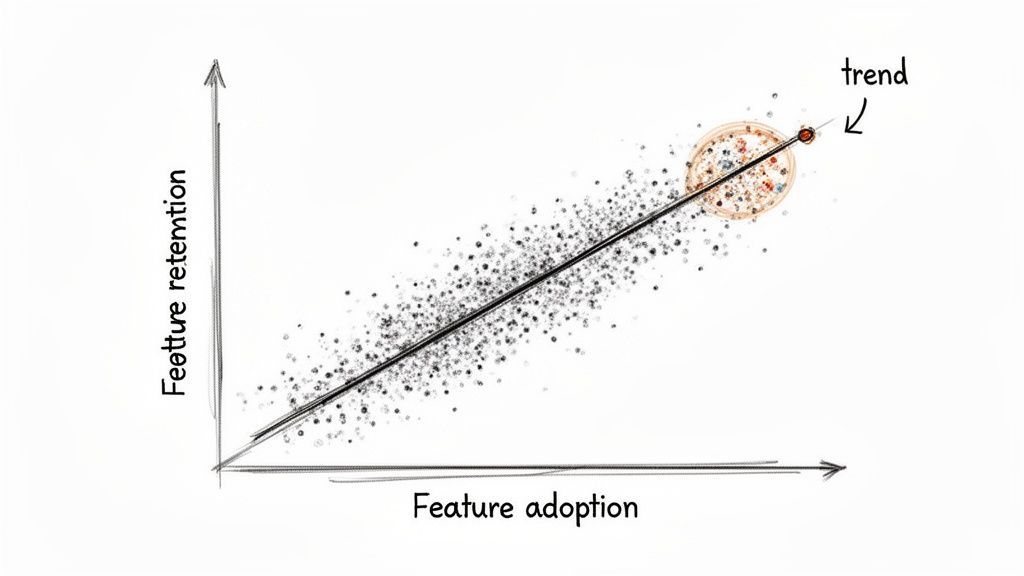
Ever feel like you're drowning in data, trying to connect the dots between two different metrics? A regression line scatter plot is your best friend here. It cuts through the noise, giving you an immediate visual read on the relationship between two variables—showing you both the strength and direction of a trend.
From Raw Data to Strategic Foresight
For anyone in product or analytics, this isn't just another chart. It's how you graduate from simply watching user behavior to actually predicting it. It's the tool that helps you answer fundamental questions like, "If we get users to adopt this new feature, will they actually stick around longer?" By plotting the data, you can see in seconds whether you're looking at a positive, negative, or non-existent relationship.
This method has a surprisingly long history, dating all the way back to the 1880s. Francis Galton, a pioneer in statistics, was studying heredity by analyzing the heights of 1,078 father-son pairs. He noticed something interesting: while tall fathers usually had tall sons, their sons' heights tended to be a bit closer to the average. He called this "regression towards the mean," and it laid the groundwork for modern statistics.
Key Components of a Scatter Plot
To build one of these plots, you just need to define two things:
Independent Variable (X-axis): This is the metric you suspect is causing a change. Think of it as your "cause" or input, like 'time spent in the app' or 'number of features a user has tried'.
Dependent Variable (Y-axis): This is the outcome you're measuring. It's the "effect" you want to understand, such as 'user retention rate' or 'customer lifetime value'.
The regression line itself is simply the line of "best fit" that slices through your data points, giving you a clear summary of the trend. It's a cornerstone of any good exploratory data analysis because it helps you spot patterns and form initial hypotheses.
Think of the regression line as a visual representation of your prediction. For any given value on the X-axis, the line shows you the average value you'd expect to see on the Y-axis. It’s the perfect launchpad for any kind of predictive modeling.
Once you master this, you can start layering on more advanced techniques. For instance, combining this visual approach with a cohort analysis can reveal incredibly deep insights into how specific user groups behave over time. It's all about turning those raw numbers into a clear, strategic advantage.
How the Regression Line Gets Its Shape
So, where does that straight line on a scatter plot actually come from? It isn't just a random guess or an eyeball approximation. It's calculated with a powerful statistical method called Ordinary Least Squares, or OLS.
Imagine trying to find the single best-fitting line through a cloud of data points. OLS does this by finding the one unique line that minimizes the total distance from every single point to the line itself.
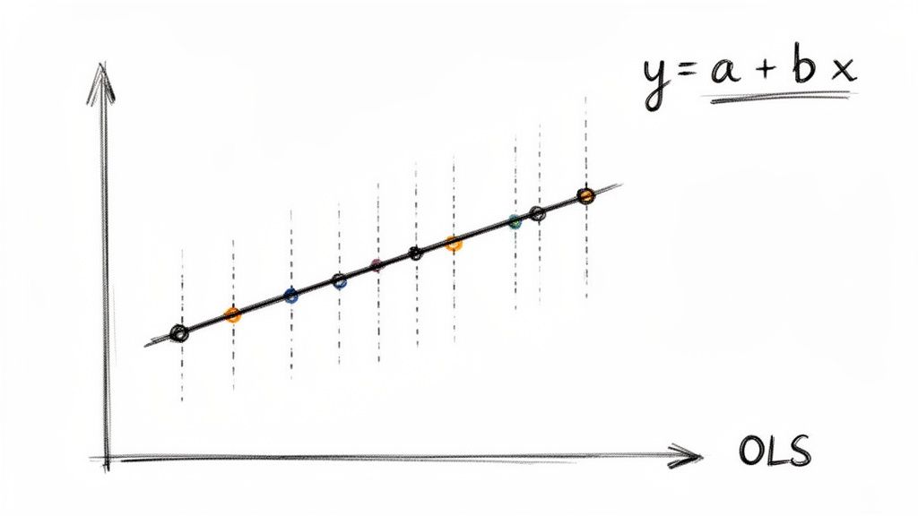
These vertical distances are called residuals. To find the best fit, OLS squares each residual and adds them all up. Squaring them is key—it heavily penalizes outliers, ensuring the line isn't skewed by a few odd points and represents the central trend of the entire dataset.
Because OLS is a standardized method, it removes all the guesswork from trend analysis, which is why it's a trusted tool for analytics and product teams everywhere.
The Formula Behind the Fit
The OLS method ultimately gives us a simple, elegant equation for our line:
y = a + bx
This formula is the engine that drives your analysis. Once you understand what each piece means, you can move from just seeing a trend to actually quantifying it. If you want to get a better handle on the broader concepts behind statistical modeling, our guide on descriptive vs. inferential statistics is a great place to start.
Let's break down the components of the regression line equation and what they mean for your analysis.
Components of the Regression Line Equation
Component | Symbol | What It Represents | Business Example |
|---|---|---|---|
Dependent Variable | y | The outcome you are trying to predict or explain. | Monthly user churn rate |
Independent Variable | x | The factor you believe influences the outcome. | Number of support tickets submitted per user |
Slope | b | How much y changes for every one-unit increase in x. The core of the relationship. | A slope of 0.5 means each extra support ticket is linked to a 0.5% increase in churn. |
Intercept | a | The predicted value of y when x is zero. Your baseline or starting point. | The churn rate you’d expect if a user submitted zero support tickets. |
This breakdown shows how the formula translates abstract data into a concrete, measurable business relationship. The slope, in particular, gives you an actionable number to work with.
The great news is you don't need to do this math by hand. Modern analytics tools like Querio automate these calculations, letting you focus on the "why" behind the numbers, not the complex "how."
The formalization of these methods has a rich history. Karl Pearson, who first described the "scatter plot" in 1906, was instrumental in developing the statistical tools we still rely on. His work created a universal language for data analysis that teams continue to use. You can discover the full history of scatter plots and their evolution to see how these foundational ideas paved the way for modern analytics.
Reading the Story Your Scatter Plot Tells
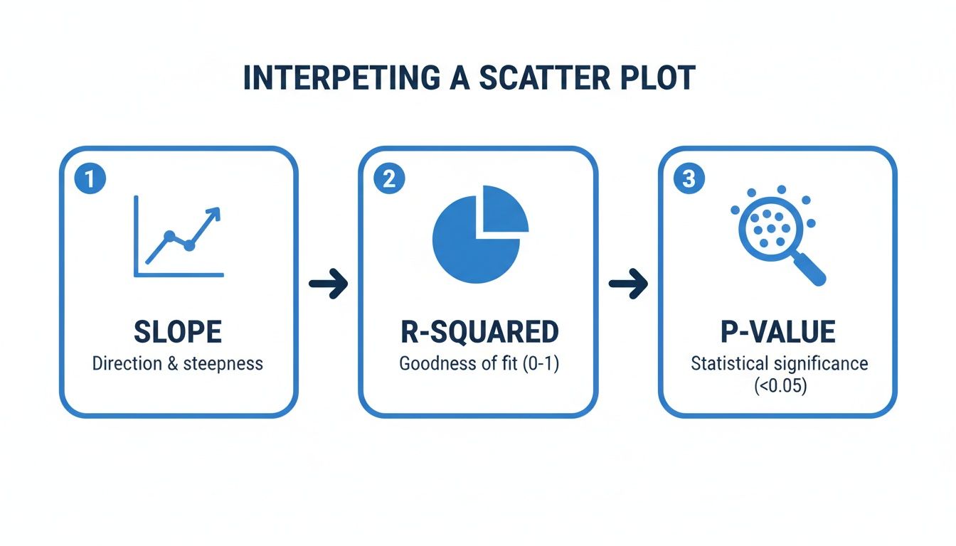
So you've created a regression line scatter plot. A clean line cuts through your data points, and it looks insightful. But what does it actually mean? That simple line is packed with information, and knowing how to decode it is what separates a pretty chart from a powerful business insight.
The real story isn't just the line itself; it's in the numbers that define it. These core statistics—slope, R-squared, and the p-value—tell you everything about the strength, direction, and reliability of the relationship you've uncovered. Let's break down what to look for.
Decoding the Slope
The first and most intuitive piece of the puzzle is the slope (b). It gives you a hard number that quantifies the relationship between your two variables.
Think of it as a simple "for every X, you get Y" statement. For every one-unit increase on your horizontal axis (the independent variable), the slope tells you how much the vertical axis (the dependent variable) is expected to change, on average.
A positive slope means that as one variable goes up, the other tends to go up, too. If you're plotting daily logins (X) against in-app purchases (Y) and your slope is 2.5, it suggests that each additional login is associated with a $2.50 increase in purchases.
A negative slope shows an inverse relationship—as one variable goes up, the other goes down. A slope of -0.2 would mean every extra login is linked to a $0.20 decrease in purchases.
A slope near zero is a red flag that there's probably no meaningful linear connection between your two metrics.
Understanding the slope moves you from a vague feeling ("These two things seem related") to a concrete statement ("This metric changes by exactly this much when the other one moves."). If you're new to creating these visuals, our guide on how to create a scatter plot can help you get the basics down first.
Measuring the Strength with R-Squared (R²)
While the slope gives you the direction of the trend, R-squared (R²) tells you its strength. This metric, formally known as the coefficient of determination, reveals how much of the change in your dependent variable can be explained by your independent variable.
R-squared is always a value between 0 and 1 (or 0% and 100%):
An R² of 0 means your model explains none of the variability in the outcome. The data is just a random cloud.
An R² of 1 means your model explains all the variability—a perfect, predictable relationship.
A higher R² suggests a stronger relationship, with data points hugging the regression line tightly. A lower R² indicates a weaker connection, with points scattered more loosely.
But what counts as a "good" R-squared value is entirely dependent on your field. In a predictable science like physics, you'd want to see an R² above 0.95. In product analytics, where you're dealing with complex human behavior, even an R² of 0.30 can be a huge win and point to a significant, actionable trend.
Confirming Your Findings with the P-Value
Finally, you need a reality check. That's where the p-value comes in. It answers one critical question: Is the relationship I’m seeing real, or did it just happen by random chance?
A small p-value (the standard cutoff is typically < 0.05) is your green light. It indicates your results are statistically significant, meaning you can be reasonably confident that the trend you found in your sample data holds true for the larger population. If the p-value is high, the pattern you see is probably just statistical noise.
For instance, academic research relies heavily on this for validation. One study produced a model with an R² of 0.94 and a p-value < 0.001, which signals an incredibly strong and statistically significant relationship. You can learn more about interpreting these regression outputs to get better at telling a real pattern from a random fluke.
Build Your Scatter Plot in Minutes with Querio
As a product leader, you live and die by the speed of your insights. Understanding the theory behind regression is great, but the real magic happens when you can apply it right now. This is where self-serve analytics tools like Querio can be a game-changer, letting you go straight from a question in your head to a clear, visual answer on your screen.
Let’s be honest: waiting for an overloaded data team to run a simple correlation check is a momentum killer. With Querio, you can plug directly into your company’s data warehouse and use familiar tools, like Python notebooks, to start exploring. Imagine you have a hunch that daily logins are tied to new feature adoption. You can pull that data and generate a regression line scatter plot in just a few minutes.
From Raw Data to Actionable Chart
The whole process is surprisingly direct. Inside Querio, you start by writing a simple query to grab the two variables you want to compare from your product database. For instance, you might pull daily_logins and new_feature_usage for all active users over the last 90 days.
Once that data is loaded into what’s called a pandas DataFrame (a standard for data work in Python), you can use popular libraries like Seaborn or Matplotlib to visualize it instantly. It only takes a few lines of code to create a polished scatter plot with the regression line already drawn in.
Once you have your plot, you’ll want to interpret the key statistical outputs to understand what you're really seeing.
This workflow zeroes in on the three numbers that matter most: the slope tells you the direction of the relationship, the R-squared measures its strength, and the p-value confirms whether your finding is statistically significant or just random noise.
Making Your Chart Tell a Story
Just creating the plot is step one. The real value, especially for a product leader, comes from making that chart communicate a clear finding to your team or to executives. This is where thoughtful customization comes in.
Here are a few tweaks I always make to ensure my charts have an impact:
Label Your Axes Clearly: Get rid of the generic
variable_xandvariable_y. Change them to something descriptive that anyone can understand, like "Average Daily Logins" and "Monthly Spend ($)."Write a Powerful Title: Your title should be the headline of your discovery. Instead of "Logins vs. Spend," try something like "Higher Daily Logins Strongly Correlate with Increased Monthly Spend."
Show the Confidence Interval: That regression line is just an estimate. Showing the confidence interval—the shaded area around the line—is a transparent way to visualize the uncertainty in your prediction.
Adding a confidence interval is a total pro move. It demonstrates that you've considered the statistical uncertainty, which immediately builds trust in your analysis. It helps everyone understand the trend is a probable range, not a single, perfect line.
By making this kind of analysis accessible, you empower your product team to find their own answers. This, in turn, frees up your data specialists to focus on the heavy-duty infrastructure and complex modeling that really moves the needle.
If you're curious to see how this self-serve approach could speed up your own team's decision-making, you can explore Querio with an interactive demo. Turning analytics from a bottleneck into a strategic advantage is what this is all about.
Common Mistakes That Invalidate Your Analysis
A regression line can feel like you've unlocked a secret insight, but it's only as good as the assumptions you make. It's surprisingly easy to get things wrong, and a few common missteps can turn a sharp analysis into misleading fiction. If you want your decisions to be based on solid ground, you have to know what to watch out for.
The classic trap, and the one most people fall into, is mixing up correlation and causation. Just because your plot shows a strong, clear relationship between two variables doesn't mean one is actually causing the other.
For example, a product team might see that users who complete the onboarding tutorial have a much higher retention rate. The immediate conclusion? The tutorial must be causing better retention. But what if a lurking variable—like a user's initial motivation—is the real story? Highly motivated users are naturally more likely to finish the tutorial and stick around long-term. In this case, the tutorial isn't the cause; it's just another symptom of user motivation.
Forcing a Line Where It Doesn't Belong
Another critical error is trying to fit a straight line to data that isn't linear. It sounds obvious, but it happens all the time. Linear regression, by its very nature, draws a straight line, but the real world is rarely that simple. Your scatter plot might be telling you a different story, perhaps with a clear curve.
Trying to force a straight line onto curved data gives you a model that doesn't fit well and, worse, makes terrible predictions. Think about the relationship between ad spend and new signups. At first, more spending might bring in a flood of new users. But eventually, you'll hit a point of diminishing returns where each extra dollar brings in fewer and fewer signups, creating a curve. A straight line would completely miss this nuance.
Never blindly trust the numbers without looking at the plot. Your eyes are your first and best defense against fitting the wrong model. If the data points form a "U" shape or a curve, a straight regression line is the wrong tool for the job.
The Dangers of Predicting the Future
It's tempting to take your shiny new regression line and use it to predict outcomes far beyond your original data set. This is called extrapolation, and it's a very risky move. Your model is only reliable within the range of the data used to create it.
Let's say your data shows a steady, linear increase in user engagement for people with 1 to 10 daily sessions. You can't just extend that line outward and assume it holds true for someone with 50 daily sessions. The relationship could completely change—it might flatten out, or even go down.
Finally, always be on the lookout for outliers. A single, extreme data point can have a huge effect, dragging the entire regression line toward it. This can seriously skew your slope and intercept, making the model a poor representation of the actual trend. Always investigate outliers. Sometimes they’re just data entry mistakes, but other times they represent a truly unique event that deserves its own analysis. Ignoring them can undermine everything.
A Few Common Questions
Once you start building regression line scatter plots, a few questions always seem to come up. This kind of analysis is incredibly powerful, but it comes with its own quirks. Let's walk through some of the most common questions I hear from product managers and analysts so you can run your own analyses with confidence.
When Should I Not Use a Linear Regression Model
A linear regression model is only as good as the data you feed it. Your first and most important check should be visual: just look at the scatter plot. If your data points obviously form a curve, a U-shape, or any other pattern that isn't a straight line, then a linear model is the wrong tool for the job. Forcing a straight line onto a curved relationship will only give you misleading results.
Another major red flag is the presence of significant outliers. These are extreme data points that can literally drag the regression line toward them, warping the entire analysis. You also need to watch out for inconsistent variance in your data points (a pattern called heteroscedasticity). If you see any of these issues, you're better off exploring other models, like polynomial regression, that can better capture the true nature of the relationship.
What Is a Good R-Squared Value
This is the million-dollar question, but the honest answer is: it depends entirely on your context. There is no magic number for a "good" R-squared.
In a highly predictable field like physics, you might see R-squared values well above 0.95 because the relationships are governed by strict laws. But in product analytics or the social sciences, you're analyzing human behavior, which is far messier and less predictable. In that world, an R-squared of 0.30 (or 30%) could be a huge discovery, pointing to a meaningful trend that's well worth investigating.
Don't get hung up on chasing a high R-squared. The real question is whether the relationship is statistically significant (check your p-value!) and if the model is useful enough to inform a business decision. A model with a low R² can still be incredibly insightful.
How Do I Handle Outliers in My Data
When you spot an outlier, your first job is to play detective. Is it a genuine, interesting data point, or did someone just make a typo during data entry? If it's a clear mistake, you should correct it or, if that's not an option, remove it.
If the outlier turns out to be legitimate data, you have a couple of paths forward. One of my favorite techniques is to run the analysis twice—once with the outlier included and once without. This quickly shows you just how much that single point is influencing your results. If the regression line shifts dramatically, you have a responsibility to call that out in your findings.
Alternatively, you could turn to more robust regression methods designed to be less sensitive to outliers. The most critical thing is to be transparent. Never just delete a data point without a solid reason and a clear note explaining what you did and why.
Ready to stop waiting on data teams and start finding your own answers? With Querio, you can connect directly to your data warehouse and build your own regression line scatter plots in minutes, not days. Explore your product data and get the insights you need to make faster, smarter decisions. Find out how at querio.ai.

