Tableau Dual Axis: Master Charts & Sync Axes
Create, customize & troubleshoot Tableau dual axis charts. Master syncing axes, avoid pitfalls, and discover alternatives for impactful data visuals.
https://www.youtube.com/watch?v=xhpSLW-3ajI
published
Outrank AI
tableau dual axis, tableau tutorial, data visualization, business intelligence, chart types
3eb7b405-9e6d-4dcb-a5f0-86c9ae6b2559

You're probably in the same spot most Tableau users hit sooner or later. You have two metrics that clearly belong in the same conversation, but they don't belong on the same scale. Sales sits in large currency values. Satisfaction, conversion rate, or profit ratio lives on a much smaller range. Put them on one axis and one series disappears. Split them into separate charts and the relationship gets harder to see.
That's where the tableau dual axis chart earns its reputation. It's one of the most useful chart patterns in Tableau, and also one of the easiest to misuse. The true skill isn't clicking “Dual Axis.” It's deciding whether the chart helps the reader compare trends accurately, whether the axes should sync, and whether the entire setup should be replaced with two simpler charts.
Table of Contents
Why Compare Metrics on a Tableau Dual Axis
Monday's dashboard review is a common place to see this chart used badly. Revenue is rising, margin is wobbling, and someone overlays both on one view to save space. The chart looks efficient, but the key question is whether those two measures belong together at all, and whether the axis setup helps the reader accurately judge the relationship.
A dual-axis chart is useful when two measures share one dimension and the comparison matters more than reading each measure in isolation. Sales and Profit by month is a classic example. Orders and Conversion Rate can also work. The point is not just to fit more into one chart. The point is to help the viewer answer one question with one glance: do these metrics move together, diverge, or break pattern at specific moments?
Value Beyond Saving Space
Space savings are a side benefit. The stronger reason to use a Tableau dual axis is that it can reveal timing and interaction between measures that would be harder to spot in separate charts. A bar for volume and a line for rate often makes this clear fast, especially across time.
That benefit comes with a trade-off. Dual-axis charts are easy to overstate. If the two metrics are only loosely related, or if each needs precise reading, layering them creates noise instead of insight.
The decision usually comes down to intent. Use a dual axis when the audience needs to compare movement, not just inspect values.
Decide before you build
A quick check helps avoid the usual mistakes:
Shared dimension: Both measures should line up on the same date, category, or geography.
One analytical question: The chart should answer a single comparison, such as volume versus rate or revenue versus target.
Scale mismatch: One measure would dominate or flatten the other on a single axis.
Readable relationship: The viewer can explain why these two metrics belong in the same sentence.
Syncing is part of that decision, not just a formatting step. If both measures use the same unit and the same numeric meaning, syncing often improves honesty because equal vertical distance means the same thing on both series. If one measure is currency and the other is a percentage, forcing them into a synced view either will not work or should not work. Tableau also will not let you synchronize certain dual axes when the data types differ, which is a useful constraint rather than an annoyance.
Sometimes the right call is to avoid a dual axis entirely. If the chart needs two legends, two units, heavy annotation, and a long explanation, separate views are usually clearer. Small multiples or a simple paired layout often do a better job. If you are still deciding whether a trend view is the right starting point, this guide on when to use a line graph can help you choose the base chart before adding a second measure.
Building Your First Dual Axis Chart
A good first tableau dual axis chart should be boring. That's not an insult. It means the structure is obvious, the marks don't fight each other, and the reader immediately understands what belongs to which metric.
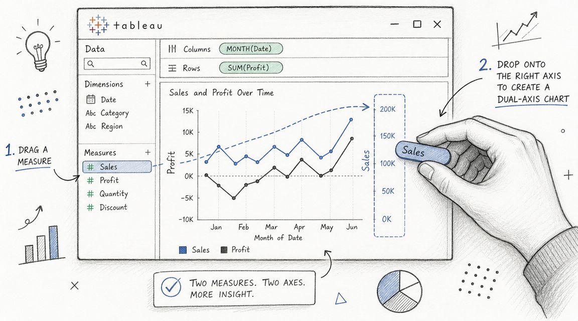
Start with a strong primary view
Begin with one dimension and one measure. A common pattern is:
Put your time field on Columns.
Put the first measure on Rows.
Choose the mark type that best fits that measure.
If your first metric is Sales, bars often work well because they show magnitude clearly. Build that single-measure chart first. If the base chart is weak, the dual-axis version won't save it.
Next, add your second measure. Tableau lets you create the dual-axis view by dragging the second measure to the right side of the view, or by right-clicking the measure and selecting Dual Axis, as described in Tableau Help's guidance on multi-measure views.
Add the second measure the right way
The easiest workflow looks like this:
Build measure one first: Don't drop two measures into the view at once if you're still deciding the chart form.
Drag measure two to the existing axis area: Watch for the placement cue on the right side.
Convert to Dual Axis: Use the drop target or the context menu.
Read the result before formatting: Tableau will layer the marks, but the first draft usually looks rough.
At this point, many users panic because the chart looks cluttered or mismatched. That's normal. The first draft only proves that the mechanics worked.
Choose marks that do different jobs
The strongest dual-axis charts usually assign different mark types to each measure. Bars and lines are a classic pair because they separate roles visually. Bars hold the heavier magnitude signal. The line shows movement and direction.
If you use the same mark type for both measures, the chart can turn into visual noise fast. Two lines can work, but only if they're clearly styled and the comparison is the point.
A nearby chart type can also help you think about whether the relationship is even worth layering. If what you really need is to compare how two variables relate to each other directly rather than across time or categories, a scatter plot in Tableau may be the more honest view.
Here's a good default setup for a first build:
Element | Better default |
|---|---|
First measure | Bars |
Second measure | Line |
Shared dimension | Month or another ordered category |
Color use | One color per measure, clearly distinct |
Labels | Minimal at first |
A quick visual walkthrough helps if you want to see the drag-and-drop flow in action:
Build the relationship first. Polish second. Users often spend too much time styling a chart that shouldn't have been a dual axis to begin with.
Customizing and Syncing Your Axes
A tableau dual axis chart becomes useful only after customization. The default view is just Tableau proving it can layer two measures. Your job is to make the relationship readable without smuggling in a misleading visual message.
Expert guidance on dual-axis charts emphasizes that they work best for comparing trends, and recommends synchronizing axes when trend comparison is the goal, using distinct mark types such as line and dot, and formatting each Marks card separately for color, labels, and tooltips in Pluralsight's Tableau dual-axis line chart playbook.
Use the separate Marks cards deliberately
The moment you create a dual axis, Tableau gives you independent Marks cards for each measure. That's one of the feature's biggest strengths. You're not forced into a one-style-fits-all chart.
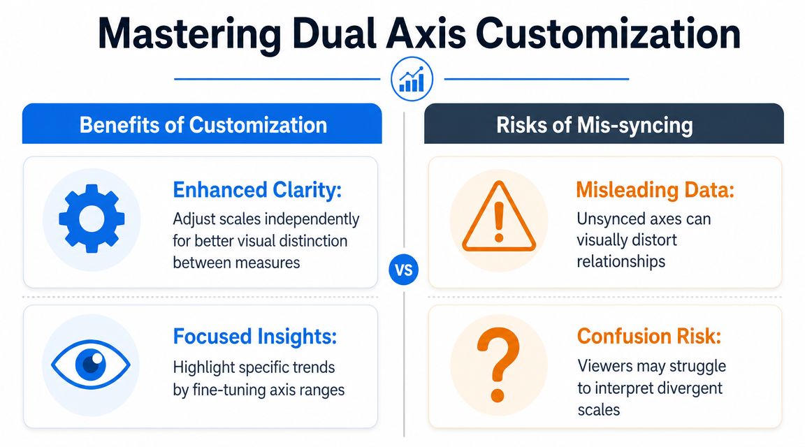
Use that control with intent:
Set different mark types: A line over bars is often easier to parse than line over line.
Adjust color carefully: Distinct colors help, but too much saturation makes the pane feel crowded.
Edit tooltips separately: Each measure needs its own wording and formatting.
Control labels selectively: Label one series fully, and the other only at endpoints or key points.
A chart with two series but one generic tooltip feels unfinished. A chart with labels on everything feels desperate.
When syncing improves the chart
Syncing matters when the reader should compare movement on the same visual scale. If both measures are conceptually close enough for direct trend comparison, synchronized axes prevent one series from looking more dramatic because its axis range is tighter.
Good candidates for syncing usually share these traits:
Comparable meaning: The two measures tell related parts of the same story.
Trend over precision: The goal is to see whether they rise and fall together.
Compatible interpretation: The reader won't confuse the series just because they share visual height.
If you sync, make the chart say that clearly. Keep one visible axis if you want a cleaner look, but only after you're sure the chart remains interpretable.
Decision check: Sync when shared height should imply shared comparative movement. Don't sync just because the button is there.
When not syncing is the honest choice
Sometimes separate scales are exactly the point. If one measure is a rate and the other is a raw count, syncing can flatten the important behavior of one metric or imply a comparison that isn't real.
This is also where calculations matter. If you're plotting something like profit ratio, retention, or a custom index, the logic behind that field affects whether synchronization makes sense. In those cases, careful metric design matters as much as chart design, and resources on Tableau calculated fields can help tighten the underlying definitions before you format the view.
A few signals that you should keep the axes independent:
One measure is primarily contextual.
The units are different in nature.
The audience might assume one shared numeric meaning from one shared visual height.
You need each metric to retain its own shape.
When that happens, make the dual-axis setup visibly explicit. Keep axis titles, use distinct mark forms, and don't hide the fact that the scales differ.
Good and Bad Use Cases for Dual Axis Charts
A dual-axis chart often gets requested in a familiar situation. One stakeholder wants revenue and conversion on the same view. Another wants calls handled and average handle time in one compact panel. The request sounds efficient. Sometimes it is. Sometimes it compresses two separate stories into one chart and makes both harder to read.
Tableau warns that dual axes can mislead when the secondary axis is adjusted to suggest a stronger or weaker relationship than the data supports, and recommends separate graphs when measures use different units or when clarity matters most, especially for executive audiences, in Tableau's guidance on spotting misleading charts by checking axes.
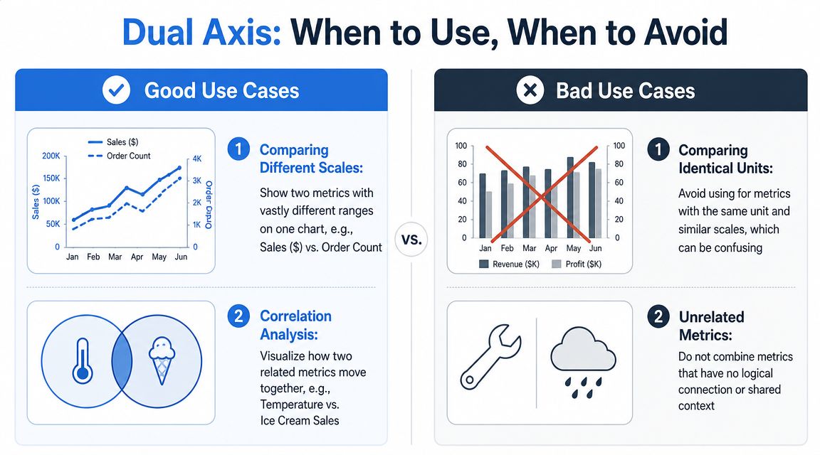
Use it when the metrics support one decision
Good dual-axis charts answer a single business question with two measures that belong together. One metric provides context for the other, and the audience benefits from seeing timing, movement, or divergence in the same frame.
These combinations usually work well:
Leading and lagging indicators: Ad spend and pipeline created, or product launches and support tickets, help show whether an input is followed by an outcome.
Volume plus quality signal: Unit sales and return rate can show whether growth is healthy or hiding a quality problem.
Workload plus performance: Tickets closed and average resolution time can reveal whether throughput improved because the team got more efficient or because complexity dropped.
The test is simple. If a viewer can describe both metrics in one sentence, the chart has a good chance of working.
Avoid it when compactness becomes the goal
Many poor dual-axis charts are built for layout, not analysis. They save space on a dashboard, but they cost accuracy.
Common bad use cases include:
Unrelated measures: Revenue and employee satisfaction might both matter, but they do not belong on one set of marks unless the chart is answering a specific question about their relationship.
Different units with high risk of overreading: Executives and non-analyst audiences often read shared visual height as shared meaning, even when the axes measure completely different things.
Metrics that can be visually manipulated by rescaling: A small change to the secondary axis can make two lines appear tightly linked when they are not.
Two measures that each need their own interpretation: If both metrics require careful reading, layering them forces unnecessary cognitive work.
If you need to compare how two variables relate to each other directly, a scatterplot is often more honest than a dual-axis time series. If you need examples of charts that look polished but distort interpretation, review these bad data visualization examples and why they fail.
Better alternatives when clarity matters more
A dual axis is not the default. It is a trade-off.
Need | Better alternative |
|---|---|
Compare two trends honestly | Two aligned line charts |
Show same metric across categories | Small multiples |
Let each measure stand on its own | Separate panels |
Emphasize exact values | Side-by-side charts with shared layout |
I usually avoid dual axis charts when one metric is explanatory but not comparable, or when a viewer might infer a relationship from overlap alone. In those cases, separate views are less flashy and more trustworthy.
Tooling can help with that decision. Teams working in notebook-first analytics setups often prototype the dual-axis option and at least one alternative before publishing the dashboard. Querio uses AI coding agents on the data warehouse with custom Python notebooks, which can make that comparison easier before the final view reaches Tableau.
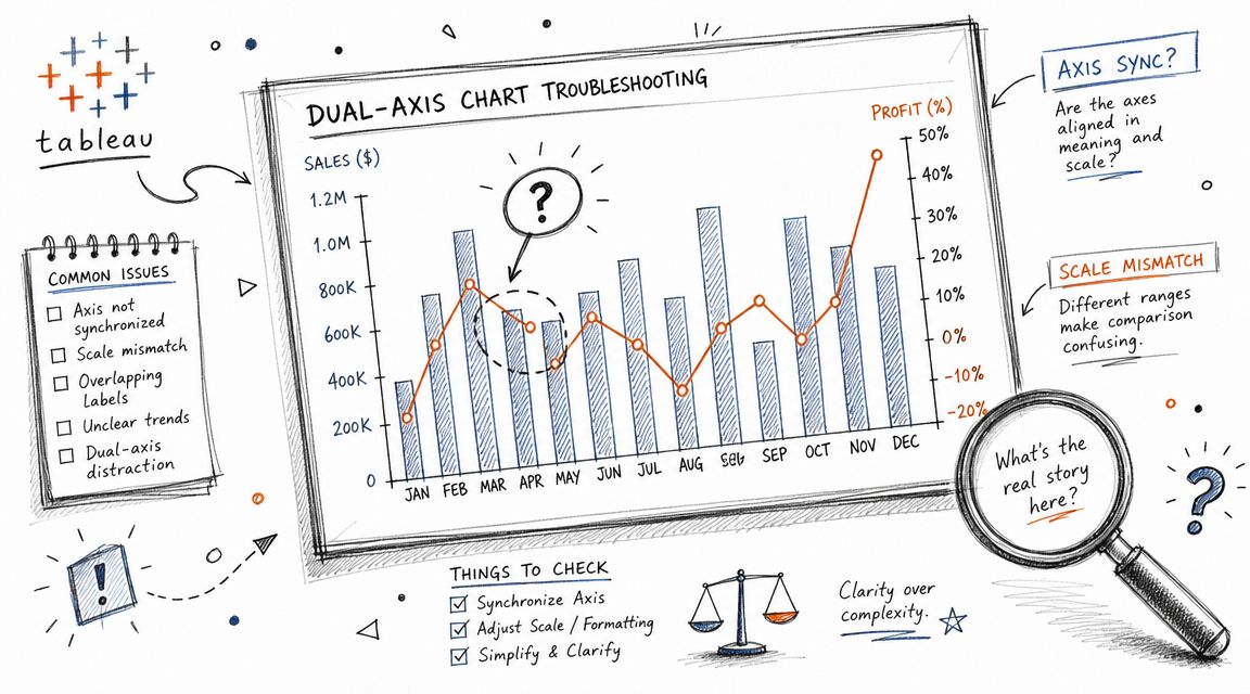
Troubleshooting Common Dual Axis Problems
Most dual-axis frustration comes from one of three places. The axes won't sync, the marks overlap into mud, or the chart technically works but tells the wrong visual story.
The sync problem is the most common one, and it usually isn't a formatting issue.
Why Synchronize Axis is greyed out
Tableau cannot synchronize dual axes when the measures use different data types, such as integer versus decimal, as explained in The Data School's note on why dual axes sometimes won't synchronize.
That's why this problem often survives endless formatting attempts. The fix usually sits in the data source pane, not in the worksheet.
Try this sequence:
Check the data type of both measures.
Make sure they match.
If needed, change the field type or adjust the calculation so both measures resolve consistently.
Rebuild or refresh the view, then test synchronization again.
Common mistake: Users debug the viz layer when the real problem lives in field typing.
When the chart becomes unreadable
Even a correctly built dual axis can become messy fast. Usually the issue is too many competing signals.
Look for these failure modes:
Marks hide each other: Reduce size, add transparency, or switch one measure to a line.
Too many labels: Keep labels for the priority series only.
Confusing legends: Rename measures clearly and avoid decorative color choices.
Overplotted categories: If the pane is dense, separate charts may be cleaner.
If your chart starts to resemble examples of visual clutter or distorted comparisons, it helps to review broader patterns in bad data visualization examples. Many dual-axis problems are really general chart honesty problems in disguise.
A quick debugging checklist
Before you publish, inspect these items:
Axis titles: Are both measures named explicitly?
Mark contrast: Can a reader distinguish the series without effort?
Tooltip clarity: Does each tooltip identify the metric and unit?
Scale logic: If unsynced, is that obvious? If synced, is that justified?
Reader goal: Does the chart support comparison, or just squeeze two metrics into one view?
A dual-axis chart that passes all five checks is usually solid. One that fails two or three should probably be rebuilt.
Quick Answers to Advanced Dual Axis Questions
Dual axis looks simple until you start pushing it into more complex dashboard work. Then the edge cases show up.
Historically, dual-axis charting became a standard Tableau technique for comparing two measures across a single dimension, especially in time series analysis such as Sales versus Profit, as described in InterWorks' early write-up on multi-measure dual-axis charts. That history matters because it explains the pattern's sweet spot. It was built for relationship comparison, not for every possible multi-metric display.
Can you use more than two measures
Yes, but restraint matters. Tableau supports up to four layered axes in a single view, with two on Columns and two on Rows, as noted earlier from Tableau Help. Just because the platform allows layered complexity doesn't mean the reader will parse it cleanly.
My rule is simple: if you need to explain the chart mechanics before the business message, you've gone too far.
Can dual axis work with maps
It can. Dual axis is often used on maps to layer one geographic mark type over another, such as a base filled map with symbol marks on top. The same principle applies as in standard charts. Layer only when the two measures answer one geographic question together.
If the layers compete for attention, split the views.
How should you label a crowded view
Start sparse. Label the most important series, or only the latest point. Let tooltips carry the detail.
Good label discipline usually follows this order:
First choice: Endpoint labels
Second choice: Highlight labels for selected marks
Third choice: Tooltip-only detail
If every point needs a label, the chart probably needs a different structure.
If your team is spending too much time moving between dashboard tools, SQL requests, and ad hoc chart debugging, Querio is worth a look. It gives teams a file-system approach with AI coding agents and custom Python notebooks directly on the warehouse, which can help analysts, product teams, and executives test metric definitions, compare chart options, and build self-serve analytics without treating the data team like a human API.

