Choose the Right Product Analytics Platform for 2026
Learn what a product analytics platform is, its features (funnels, cohorts), & how to choose. Our 2026 guide covers all you need.
published
Outrank AI
product analytics platform, product analytics, user behavior analytics, product management, growth marketing
57e29ec4-896e-4242-9790-81550097ebda

You shipped a feature two weeks ago. The release went smoothly, support tickets are quiet, and usage logs show activity. But a key question persists. Did people adopt it? Did it help them reach value faster, or did they click into it once and bounce?
That's the moment when a product analytics platform stops being a nice-to-have and becomes operating infrastructure. Founders feel it when growth stalls for no obvious reason. PMs feel it when every roadmap discussion turns into opinion. Data teams feel it when they become a ticket queue for basic behavioral questions.
The environment has also changed. Traditional event dashboards still matter, but many teams now run into a ceiling: siloed data, rigid schemas, and analytics that describe clicks without capturing intent. If your product includes personalization, copilots, recommendations, or automated workflows, counting events alone often isn't enough.
Table of Contents
What Is a Product Analytics Platform Anyway
A product team usually starts with the wrong data. Early on, you have page views, sign-ups, maybe a few revenue reports. Those tell you that something happened. They rarely tell you why users moved forward, where they got stuck, or which behavior predicts retention.
A product analytics platform exists to answer those questions inside the product itself. It turns user interactions into a behavioral system you can inspect, compare, and act on. Not just traffic. Not just reporting. Behavior.
The difference between activity and understanding
Say you launch a new onboarding checklist. Your general reporting stack might tell you how many users saw the checklist page. A product analytics platform should tell you which users completed the first task, which skipped it, which segment returned later, and whether the users who engaged with the checklist adopted the core feature afterward.
That's the practical shift. You stop measuring outputs like “visits” and start measuring progress toward value.
Teams usually discover this the hard way. A founder asks why conversion dropped. A PM asks whether a feature is sticky. Engineering asks whether users who hit a broken state ever recover. Without behavioral instrumentation, everyone ends up debating anecdotes.
If you want a broader view of the tooling category around behavior tracking, this guide to user behavior analytics tools is a useful companion.
Practical rule: If your team can't answer “what did retained users do differently in their first few sessions?” you don't have product analytics yet. You have logging and dashboards.
What the platform is really doing
The best way to think about a product analytics platform is as a translation layer between messy user activity and product decisions.
It helps teams answer questions like:
Adoption questions: Are people using the feature we built, or just noticing it?
Journey questions: Where do users abandon onboarding, checkout, setup, or collaboration flows?
Retention questions: Which behaviors show real habit formation versus one-time curiosity?
Experiment questions: Did the product change improve the user path, or just move clicks around?
That's why this category matters so much in modern software. Digital products no longer live or die on simple traffic reporting. They win when teams can see patterns in usage, tie those patterns to outcomes, and respond quickly.
A good product analytics platform doesn't just give you charts. It gives your team a shared language for product health.
The Core Capabilities of Product Analytics
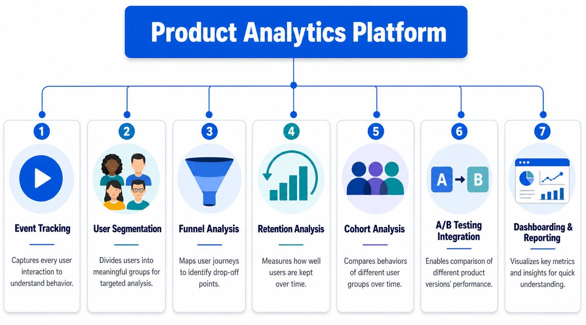
Think of a product analytics platform as a detective's kit. Each tool answers a different kind of question. One tells you what happened, another tells you where users disappeared, and another helps you compare one group's behavior against another.
Here's the visual version of that toolkit.
From raw actions to usable questions
Everything starts with event tracking. An event is a user action such as signing up, creating a workspace, inviting a teammate, or using a feature. If the event design is weak, every downstream analysis becomes unreliable.
From there, the platform should support a few core forms of analysis:
Funnels help you inspect a sequence. Sign-up to activation. Search to cart. Trial to paid. They answer one of the most important product questions: where do people drop off?
Segmentation lets you compare behavior across user groups. New users versus returning users. Mobile versus web. Self-serve versus sales-assisted accounts.
Cohorts help you compare groups over time, usually based on when users started or what they did early.
Retention analysis shows who comes back after an initial action and whether product changes improve that pattern.
Dashboarding and reporting turn recurring questions into visible operating metrics for product, growth, leadership, and support.
Experimentation links matter because analytics without a way to test changes usually becomes passive reporting.
One useful way to assess these capabilities is to compare them against the broader standards found in modern business intelligence tool features. Product analytics is narrower than BI, but the best platforms borrow some of the same usability and governance patterns.
The metrics that actually travel across teams
The reason these capabilities matter is that they standardize core product health metrics. Heap highlights metrics such as DAU, retention rate, feature adoption, session length, and conversion rates as core mobile and product analytics measures in its overview of product analytics metrics.
Some metrics become especially useful because everyone understands them the same way. One example is the DAU/MAU stickiness ratio, defined as DAU ÷ MAU × 100. In the same overview, and in related industry explanations cited in the verified data, a ratio at or above 20% is generally considered a healthy retention signal.
That matters because product teams need shared definitions. If one PM calls a feature “adopted” after one click and another expects repeat use, the dashboard turns into politics.
A practical capability checklist looks like this:
Capability | Useful question it answers |
|---|---|
Event tracking | What did users actually do? |
Funnel analysis | Where does the journey break? |
Segmentation | Who behaves differently? |
Cohort analysis | Are newer users getting better over time? |
Retention analysis | Are people coming back after first value? |
Experimentation link | Did the change improve behavior? |
Reporting layer | Can the team monitor this without rebuilding analysis every week? |
A product analytics platform earns its keep when these answers are available without sending every question to the data team.
Common Use Cases and KPIs for Teams
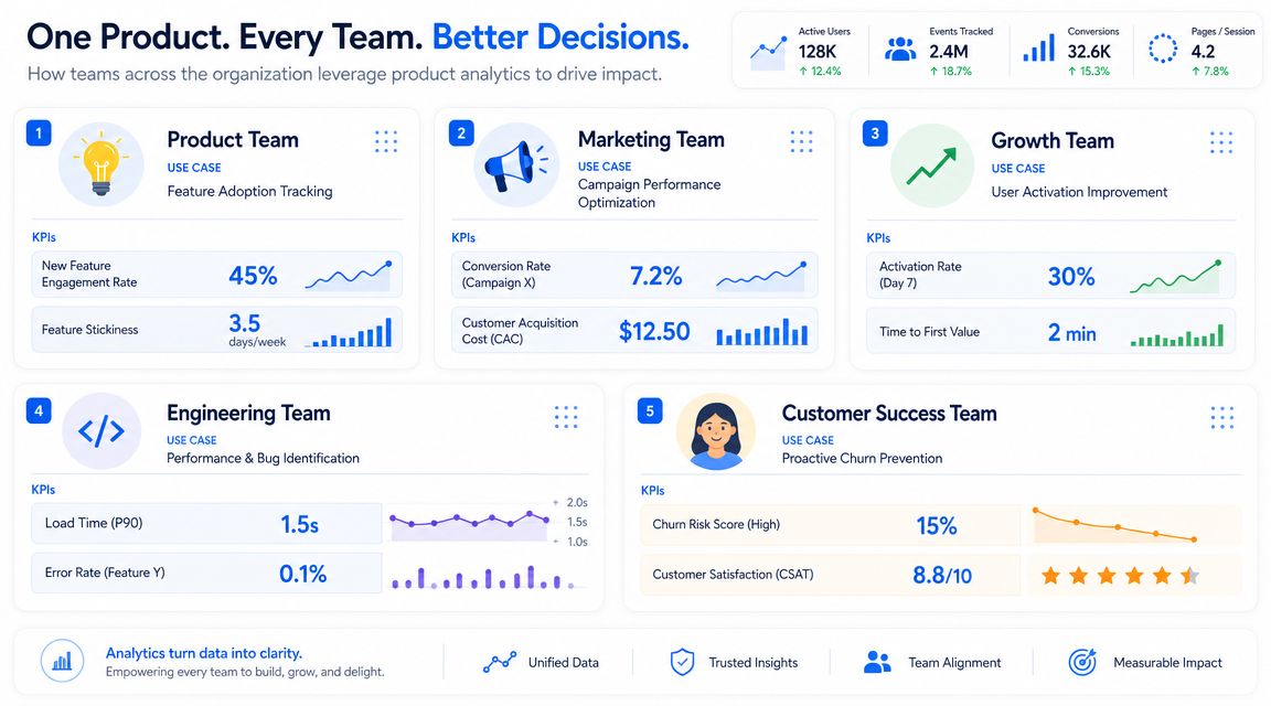
Teams often don't buy a product analytics platform because they want more charts. They buy it because specific jobs keep getting blocked. A PM can't prove whether onboarding works. Growth can't tell which activation path matters. Engineering can't connect product friction to user fallout.
At this stage, analytics becomes operational.
What product teams actually do with it
A product manager working on onboarding usually starts with a simple question: where are new users failing to reach first value? Funnel analysis helps isolate the step with the heaviest drop-off. Segmentation then shows whether the problem is broad or concentrated in a specific segment, such as mobile users or smaller accounts.
A growth lead uses the platform differently. They often care less about one feature and more about the chain from acquisition to activation to retention. A campaign may bring in users who convert nicely in week one but never establish repeat behavior. That's not a marketing win. It's a leaky product loop.
Customer success teams also get value from behavioral analytics, especially in B2B products. They can watch for accounts that stop using a key workflow, fail to onboard additional users, or return only for shallow activity. Those are often the accounts that look fine in a CRM until renewal gets close.
For teams thinking through their measurement layer, these KPI examples are useful because they force the conversation away from vanity reporting and toward decision-making.
A good KPI doesn't just move. It tells a team what to do next.
The KPIs that matter by function
Different teams should look at different indicators, even when they share the same platform.
Product managers: Feature adoption, onboarding completion, retention, repeat usage, path completion.
Growth teams: Activation, conversion through key steps, return behavior after first session, segment-level performance.
Engineering teams: App crashes, broken journey points, failed actions after releases, recovery after errors.
Customer success or account teams: Multi-user adoption, key workflow frequency, declining engagement, expansion signals.
A few metrics tend to matter across almost every product context:
Team | Strong KPI examples |
|---|---|
Product | Feature adoption, retention rate, session depth |
Growth | Conversion rate, activation milestones, return frequency |
Engineering | App crashes, error-linked drop-offs |
Customer success | Account engagement patterns, usage consistency |
The trap is copying someone else's KPI stack. A collaboration product should not be measured like a transactional checkout tool. A copilot feature should not be measured like a static settings page.
Use the platform to answer live business questions, not to decorate a weekly review deck.
How to Evaluate and Choose a Platform
A team usually feels the pain of a bad analytics choice six months after purchase. The demo looked polished. The funnel chart worked. Then growth wants campaign attribution, product wants cross-device identity, engineering wants server-side events, and finance wants costs to stay predictable. That is when the underlying operating model matters more than the dashboard.
Start with the operating model, not the feature grid
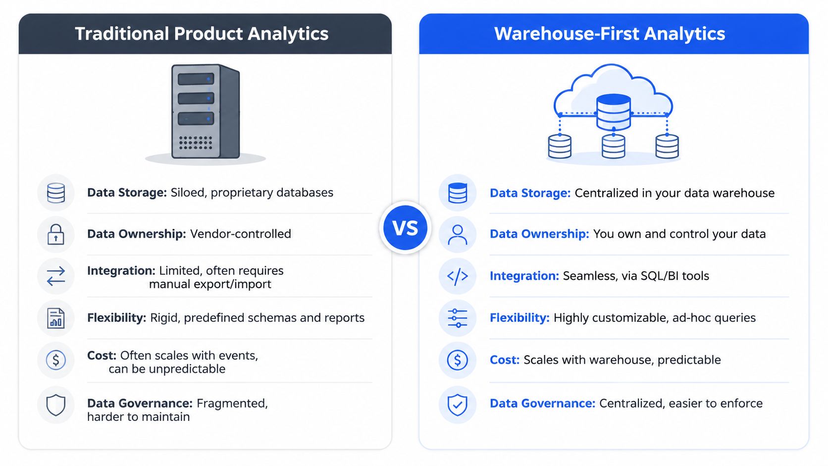
The first decision is not which tool has the nicest charts. It is whether you want a traditional event-based system that stores and models data inside the vendor, or a newer setup that treats the warehouse as the source of truth and layers analysis and AI on top.
That distinction shapes everything that follows. Traditional tools are often faster to stand up for a single product team. Warehouse-first tools tend to make more sense once your product data needs to join billing, CRM, support, experimentation, and account data without constant exports or duplicate definitions.
The market reflects those different models. According to Pendo's comparison of top product analytics tools, Pendo is positioned as a product experience platform, Mixpanel is centered on behavioral event analysis, Amplitude is known for journey analysis, and Heap is associated with retroactive event capture. Those are not just branding differences. They imply different trade-offs in setup speed, governance, and how much control your data team keeps.
Pendo is usually a fit when analytics, in-app guidance, and feedback collection need to live in one place.
Mixpanel is a practical choice when PMs and growth teams need fast event exploration without a heavy data workflow.
Amplitude often fits teams that care about user journeys, segmentation, and behavioral analysis across complex flows.
Heap appeals to teams that value broad capture early, then refine definitions later.
Pricing deserves the same level of scrutiny as features. Packaging across this category ranges from free entry plans to usage-based enterprise contracts, and small differences in how vendors count events, users, or seats can create large cost swings later. If you are comparing analytics tools against broader reporting platforms, this business intelligence tools comparison helps clarify where product analytics ends and BI begins.
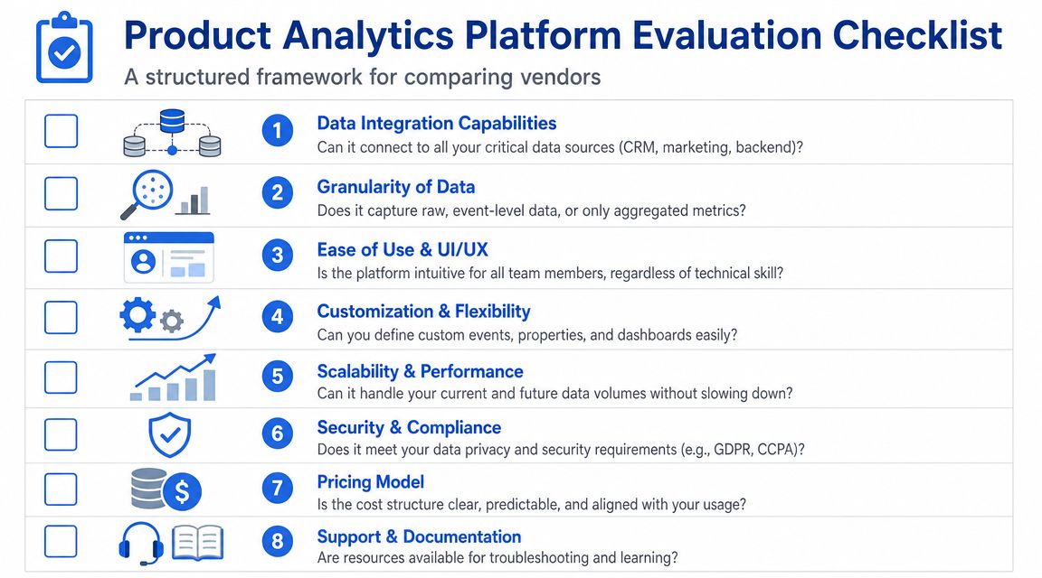
Questions worth asking every vendor
Skip the canned demo checklist. Every vendor can show funnels, retention curves, and cohorts.
Ask questions that reveal how the tool will behave once your product, team, and data model get messier.
Where does raw data live? If the vendor stores the only usable copy, you are accepting lock-in from day one.
How hard is identity resolution? Anonymous users, logged-in users, workspace accounts, and cross-device behavior get complicated fast.
Can definitions change without breaking history? Teams refine events and properties over time. The platform should support that without forcing constant rework.
Who controls metrics and governance? If every team can create its own version of activation or retention, reporting drifts within weeks.
How well does it connect to the rest of the stack? Product analytics gets more useful when joined with revenue, support, lifecycle, and experiment data.
What happens to cost as volume grows? Does pricing rise predictably with your usage model, or can one noisy event stream create budget pain?
What does AI analysis depend on? Some vendors add AI summaries on top of weak data models. Others use your warehouse context and governed metrics, which is far more useful.
One rule helps here. Buy for the questions your team will ask in 12 months.
A seed-stage startup can accept more constraints if speed is the priority. A scaling company usually cannot. Once multiple teams depend on the same numbers, warehouse alignment, governance, and flexible analysis stop being nice extras. They become the difference between a tool people trust and a dashboard people ignore.
Common Pitfalls to Avoid
Most analytics failures don't come from choosing the “wrong” logo. They come from sloppy implementation and weak habits after the tool is installed. Teams think they have clarity because the dashboard looks polished, but the underlying model is unstable.
That's more dangerous than having no analytics at all. At least with no dashboard, people know they're guessing.
Bad instrumentation creates fake confidence
The first expensive mistake is inconsistent event naming. One team tracks “Signup Completed,” another sends “user_registered,” and a third logs the same action server-side with slightly different properties. Now your funnel is split across multiple definitions, and nobody trusts the conversion numbers.
The fix is boring but essential:
Define a tracking plan: Agree on event names, properties, ownership, and intended use.
Limit event sprawl: Track meaningful business actions, not every possible UI twitch.
Assign owners: Product, engineering, and data should each know who approves changes.
Another common mistake is over-relying on autocapture without cleanup. It feels fast early on, then turns into noise. Retroactive capture can be helpful, but only if someone curates it into a stable taxonomy.
Too many charts, not enough decisions
The second mistake is mistaking dashboard production for product insight. Teams build dozens of views, pipe them into Slack, and still can't answer simple operating questions.
A healthier approach is to tie every recurring chart to a decision:
If you track this | Someone should do this |
|---|---|
Onboarding drop-off | Redesign or test the failing step |
Feature adoption | Decide whether to invest, improve discoverability, or remove |
Retention by cohort | Compare release periods and inspect behavior changes |
Crash-linked exits | Prioritize engineering fixes tied to user fallout |
The third mistake is chasing vanity metrics. Total sign-ups, page views, or raw event volume can look impressive while the core experience remains weak. Strong teams care more about repeat behavior, completed workflows, and retained usage.
A final pitfall is cultural. If analytics lives only with the data team, PMs and founders keep making decisions by instinct. If analytics is self-serve but unguided, everyone creates their own truth.
The middle ground works best. Shared definitions. Self-serve access. Clear ownership.
Treat instrumentation like product design. Small naming decisions create large downstream consequences.
The Modern Alternative Warehouse-First Analytics
A team ships a new AI assistant, sees prompt submits, retries, and completions go up, and still cannot answer the basic product question: is the feature helping users get value, or creating a longer path to the same outcome? That is the point where many teams realize their analytics problem is not charting. It is architecture.
Where traditional tools start to break
Classic product analytics platforms were designed for a simpler setup. Capture events in the vendor's SDK, send them to the vendor's database, then analyze them in the vendor's UI. That still works well for many early teams, especially if the product is mostly one app, one user model, and a stable set of flows.
The cracks show up when behavior no longer lives in one place.
A modern product might span web, mobile, backend jobs, CRM actions, billing systems, support conversations, and AI-generated outputs. In that setup, event counts alone stop being enough. PMs need to connect behavior with account context, revenue impact, service issues, and model performance. Traditional tools can ingest some of that context, but they often make complex joins, custom definitions, and sequence-heavy analysis harder than they should be.
Conviva argues in its piece on why event analytics doesn't fully understand customers that stateless event-based analytics struggles to capture sequential and cumulative intent. That matters in practice. Repeated searches, revisits to the same pricing page, or a pattern of prompt-edit-retry-success can tell you more than a single conversion chart.
This is a real shift in how products behave. AI features are probabilistic. User paths change from session to session. The same job can involve human input, model output, and system-side actions that happen minutes later. A rigid event taxonomy starts to lag behind the product.
When warehouse-first is the right move
Warehouse-first analytics changes the center of gravity. Product data lives in the company's warehouse first, and analysis tools sit on top of that shared data layer instead of pulling teams into a separate analytics silo.
That approach makes sense when a few conditions are true:
Product data needs business context. You want usage tied to subscriptions, expansion, support load, or sales activity.
Behavior is hard to model as fixed events. AI workflows, multi-step jobs, and account-level activity need logic that can change often.
Different teams need the same definitions. PMs, analysts, and leadership should not be debating whose retention number is correct.
Governance matters. Access rules, PII controls, and metric definitions are easier to manage in one place.
The trade-off is straightforward. Warehouse-first gives you flexibility, ownership, and a better shot at consistent metrics across teams. It also asks more from your data foundation. Identity resolution, modeling, and event quality still need discipline. A warehouse does not clean up weak instrumentation by itself.
Tools in this category do a different job from classic dashboard products. Querio, for example, runs AI coding agents directly on the company's data warehouse and uses a file-system approach with custom Python notebooks, so teams can query and analyze owned data without exporting it into another reporting layer. For a PM or founder, the value is not another prebuilt funnel. It is faster answers on top of the same data the business already trusts.
Packaged SaaS analytics is still the right choice for many startups. It is faster to implement, easier for basic funnels, and often good enough for an early-stage product. Warehouse-first becomes the better option when product questions depend on joined data, custom logic, and analysis of AI-driven behavior that standard event dashboards flatten or miss.
Frequently Asked Questions
How is a product analytics platform different from a BI tool
A product analytics platform is built around user behavior inside the product. It focuses on journeys, adoption, retention, and feature usage. A BI tool is broader. It's usually better for finance, sales, operations, and cross-functional reporting across many systems.
In practice, product analytics answers questions like “where do users fail to activate?” BI answers questions like “how did revenue change by segment?” Mature companies often use both.
Can you build product analytics in-house
Yes, but only if you're honest about the maintenance burden.
Building in-house gives you control over schema, storage, governance, and analysis logic. It also means your team owns instrumentation quality, identity resolution, modeling, dashboarding, permissions, and support for every internal stakeholder who wants an answer by tomorrow morning.
For many teams, the right answer is hybrid. Use an existing platform when speed matters. Shift more logic into your warehouse when flexibility and ownership become more valuable than convenience.
How technical do you need to be
It depends on the platform and the role.
A PM should be able to build a funnel, compare segments, inspect retention, and answer common product questions without SQL. A data analyst or analytics engineer should still be able to model complex logic, validate definitions, and handle edge cases. If a tool is only usable by analysts, self-serve fails. If it hides too much from technical users, trust eventually fails.
A healthy setup usually looks like this:
PMs and growth leads use guided exploration, saved reports, and common dashboards.
Data teams own event design, governance, semantic definitions, and deeper analysis.
Executives and founders consume a smaller set of trusted metrics tied to decisions.
The practical test is simple. Can a non-technical stakeholder answer a common behavior question without filing a ticket, while the data team still controls definitions? If yes, the platform is doing its job.
If your team is hitting the limits of siloed dashboards and wants product analytics to run directly on top of warehouse data, Querio is worth a look. It lets teams query live warehouse data with AI assistance and custom Python-based workflows, which is useful when product, growth, and data teams need flexible self-serve analysis without turning the data team into a bottleneck.

