Tableau Calculated Field: A Guide to Advanced Analytics
Master the Tableau calculated field with our comprehensive guide. Learn syntax, functions, debugging, and how to build advanced analytics dashboards.
https://www.youtube.com/watch?v=a3u3S3vi648
published
Outrank AI
tableau calculated field, tableau, data analytics, business intelligence, tableau tutorial
4f561df6-0b64-409f-862a-66d99c93ac44

You need one metric for a product review, board update, or growth decision. The raw data exists. Tableau is connected. But the answer still sits behind a queue, a Slack thread, or a dashboard that almost works.
That’s why the tableau calculated field matters. It’s not just a feature in the left sidebar. It’s the point where Tableau shifts from showing stored data to creating business logic on demand.
Used well, calculated fields let product managers, founders, and analysts answer their own questions without changing the source table. Used poorly, they create slow dashboards, broken metrics, and the familiar “why doesn’t this number match?” spiral. The difference comes down to understanding where the calculation runs, how to test it, and when manual BI work stops being worth it.
Unlocking Your Data Without the Wait
Teams generally don't face a data shortage. They have an access problem.
A PM wants average order value by segment. A founder wants to isolate high-value purchases. A growth lead wants a discount ratio by region. None of those questions is hard in principle. They become hard when every new metric requires a ticket, a warehouse change, or analyst time.

A calculated field is the fastest way to break that pattern inside Tableau. In practical terms, it’s a new field you create from existing fields without altering the source data. That sounds simple. In practice, it’s the foundation of self-serve analytics.
A simple metric that changes how teams work
The cleanest example is Average Order Value. In Tableau’s Sample Superstore example, the formula SUM([Sales])/SUM([Orders]) produces $459 per order from $2,297,201 in sales and 5,009 orders, as shown in this Tableau calculated field walkthrough from Concord.
That’s the point. The original source doesn’t need an “AOV” column. You create the business metric when you need it.
A few practical details matter right away:
Formatting matters: Tableau won’t automatically display that result as currency. You need to set the number format yourself.
Aggregation matters more: If you leave out
SUM(), Tableau may calculate at the row level first and then aggregate, which can produce the wrong answer.Speed matters to decision-making: A metric you can create in minutes gets used. A metric that depends on a request queue often doesn’t.
Practical rule: If a stakeholder asks for a metric that can be derived from fields already in the model, start with a calculated field before asking for a schema change.
This is one reason Tableau remains common across business teams. The same Concord article notes that Tableau holds ~20% BI market share in major markets, which helps explain why so many operators still need to know how to work effectively inside it.
For teams evaluating the broader analytics stack, it’s also useful to understand who’s funding the category and where tooling is moving. This list of leading data visualization investors gives a helpful market view.
Why this matters beyond dashboards
A tableau calculated field is less about formulas than control. It lets the business define logic where the question appears.
That means you can:
Segment value quickly: Flag orders above a threshold for a sales or pricing review.
Clean categories on the fly: Standardize text, merge labels, or map messy values into usable groups.
Create ratios without warehouse work: Build metrics like profit ratio or discount percentage right inside the workbook.
When teams don’t have to wait for every derived metric, reporting gets faster and exploration gets broader. That’s where Tableau is strongest. It’s also where its manual limits start to show once the logic gets layered.
The Three Levels of Tableau Calculations
Most Tableau calculation mistakes start before anyone writes a formula. The problem is choosing the wrong computation level.
Tableau gives you three primary types of calculated fields: row-level, aggregate, and table calculations. Tableau’s documentation is explicit about those categories, and it also notes common aggregate functions such as SUM, AVG, MIN, MAX, and COUNTD in its guide to creating calculated fields.
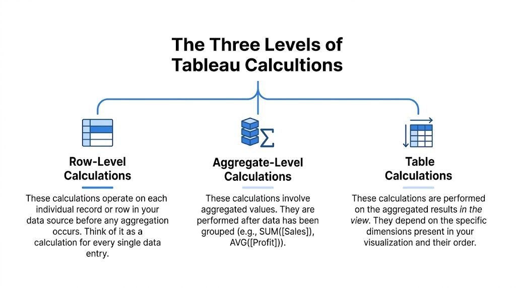
If you keep one mental model, use this:
Row-level calculations behave like a new column in the raw data.
Aggregate calculations summarize records into marks in the view.
Table calculations run on the already-aggregated results you see in the visualization.
Row-level means one record at a time
This is the closest thing to spreadsheet logic. Tableau evaluates the expression for each underlying row before aggregation.
A useful example from the Tableau docs is CONTAINS([Category], 'Office'), which flags 6,011 of 9,994 records in the Superstore dataset. That’s a row-level test because each record gets checked individually before any chart is built.
Use row-level calculations when you need to:
Classify records: “Enterprise” vs “SMB”, “Renewed” vs “Churn Risk”.
Clean strings: Join region and city into one label.
Create conditional flags: Mark transactions that match business rules.
This is usually cheap to understand and easy to validate. It can become expensive when you stack too many nested conditions into one field.
Aggregate means one result per mark
Aggregate calculations work after Tableau groups data according to the dimensions in the view.
If you put Region on rows and SUM([Sales]) on columns, each bar is an aggregated mark. The calculation doesn’t care about one row at a time anymore. It cares about all rows contributing to that mark.
Ratio logic often goes right or wrong depending on the chosen aggregate. SUM([Profit])/SUM([Sales]) is usually a sane aggregate calculation. [Profit]/[Sales] may not be, depending on what you intend.
Aggregate calcs answer grouped questions. Row-level calcs answer record questions. Mixing the two without intent is how dashboards drift out of trust.
Table calculations mean one result over the visible table
Table calculations run last. They operate on the result set in the view, not directly on source rows.
That’s why they’re ideal for things like running totals, rank, percent difference, and moving averages. If you know SQL window functions, the analogy is close enough to be useful. This explanation of window functions in SQL is a good mental bridge if you switch between warehouse logic and Tableau often.
Table calculations are also the most likely to confuse otherwise capable users because they depend on partitioning and addressing. In plain language, Tableau needs to know what group to reset within and what direction to compute across.
Tableau calculation types compared
Calculation Type | Computation Level | Typical Use Case | Performance Impact |
|---|---|---|---|
Row-Level | Individual source rows | Flags, text cleanup, segmentation, per-record logic | Usually straightforward, but nested logic can add complexity |
Aggregate | Grouped rows per mark in the viz | Ratios, averages, totals, KPI cards | Often efficient for standard summaries |
Table Calculations | Aggregated results already shown in the view | Running sum, rank, moving average, period comparisons | Can be efficient because they operate on the virtual table in the view |
A quick way to choose
When deciding what to build, ask the question in this order:
Is this logic about each record? Use row-level.
Is this logic about each grouped mark? Use aggregate.
Is this logic about the values already displayed? Use a table calc.
The right tableau calculated field starts with the right layer. If the layer is wrong, the syntax can still be valid and the answer can still be useless.
Building Your First Calculations Step-by-Step
The fastest way to get comfortable with a tableau calculated field is to build a few small ones and inspect the output in a simple table. Don’t start with the dashboard. Start with the logic.
Start with a ratio you can explain
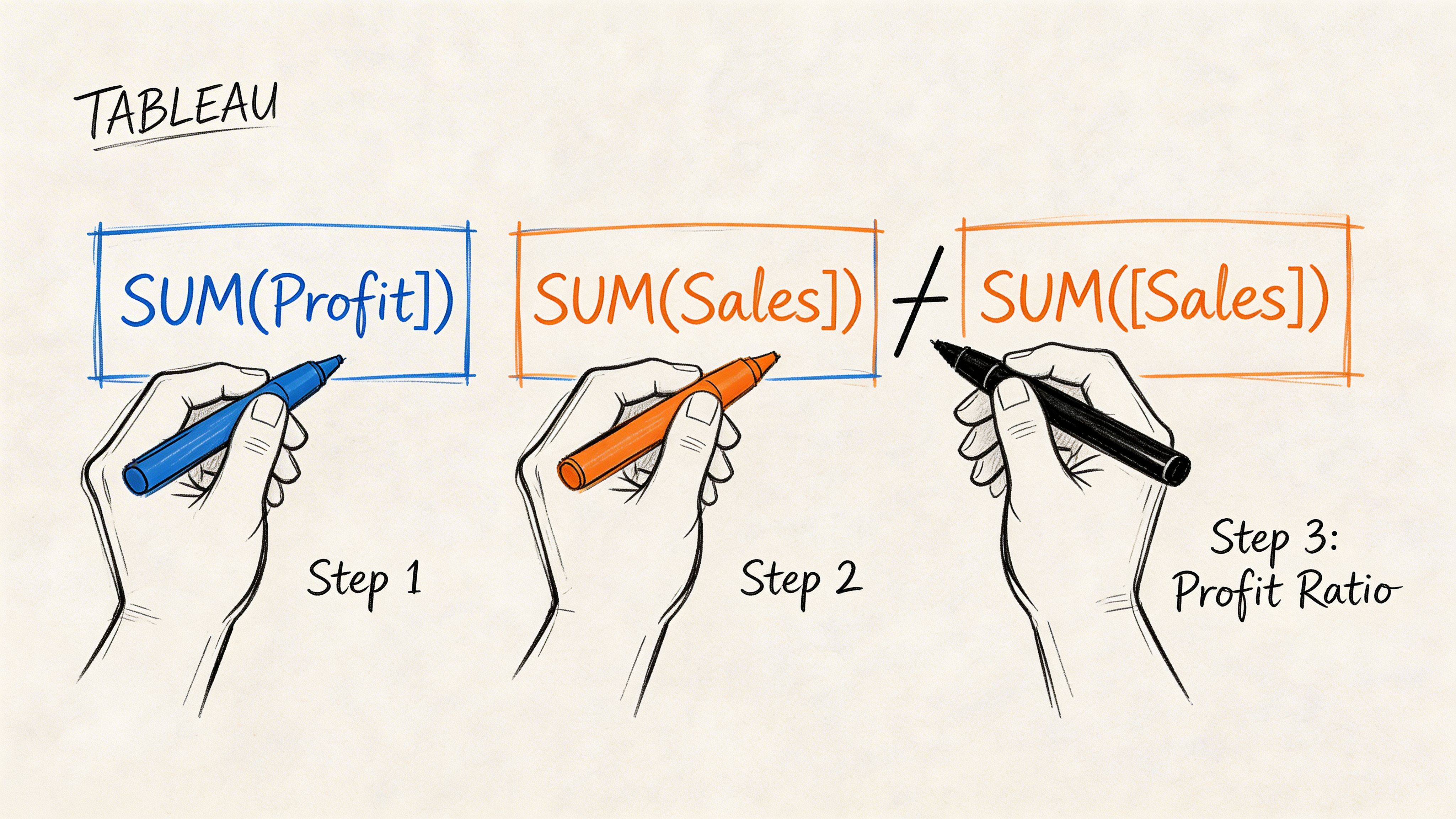
Create a new calculated field and name it Profit Ratio.
Use:
SUM([Profit]) / SUM([Sales])
This is a good first formula because it forces the right habit. You’re telling Tableau to divide aggregated profit by aggregated sales, not to divide each row and hope the final sum means something.
After you save it, drag the field into a basic text table with a dimension you know well, such as Region or Category. Look at the results before you put it into a polished chart.
A simple workflow helps:
Write a small formula: One idea per field.
Use Apply before closing: Check syntax and output immediately.
Inspect in a table first: Tables reveal bad logic faster than pretty visuals.
Add business meaning with logic
Arithmetic is only half the story. The more useful calculated fields classify data.
Create a field like Profit Status:
If you want the logic to classify each record before aggregation, build it on row-level profit instead of SUM([Profit]). That choice depends on the question.
Analysts often proceed too quickly here. They write a long IF statement, drop it onto color, and move on. Then someone asks why a category is labeled profitable when some orders clearly lost money. The answer is usually granularity.
Build the smallest version that answers the question. Then test whether the business meaning matches the computation level.
Clean and combine text fields
Calculated fields also help when the source isn’t modeled the way people want to read it.
A common pattern is combining fields into one display label:
[Region] + " - " + [City]
That’s not advanced, but it’s practical. It improves filtering, labeling, and quick ad hoc analysis.
You can also use string logic for cleanup and grouping. If your data has values that need categorization, CONTAINS, LEFT, RIGHT, and conditional statements do a lot of work before you ever touch the warehouse.
One reason SQL knowledge still helps here is that Tableau formulas map to the same analytical habits. If you want a refresher on the warehouse-side patterns behind common analysis, this guide to the top SQL queries for analytics pairs well with basic Tableau build work.
Use the editor like a test bench
The calculation editor isn’t where you prove you’re clever. It’s where you reduce risk.
A practical build pattern looks like this:
Create one field for one idea.
Put it in a plain table with the source dimensions.
Scan for obvious outliers or blanks.
Only then combine fields into the final metric.
That approach feels slower at first. It’s faster by the second revision.
For a visual walkthrough of the editor and formula setup, this short demo is useful:
What usually goes wrong first
New Tableau users don’t struggle because formulas are hard. They struggle because the software accepts logic that isn’t aligned with the question.
The first checks I make are simple:
Aggregation mismatch: Did someone combine
SUM([Sales])with an unaggregated dimension or measure?Wrong data type: Is a number stored as text or a date stored as a string?
Null behavior: Are blank values causing false classifications or missing labels?
Formatting confusion: Does the value calculate correctly but display in a misleading way?
Once you adopt that habit, building a tableau calculated field becomes less about syntax and more about thinking clearly under real business constraints.
Unlocking Deeper Insights with LODs and Table Calcs
Teams commonly encounter a barrier after basic ratios and IF statements. They need a metric at one level of detail and a chart at another. That’s where Tableau gets powerful and where it starts confusing people.
The two features that matter most are Level of Detail expressions and table calculations. They solve different problems, and using the wrong one creates numbers that look fine until someone asks one more question.
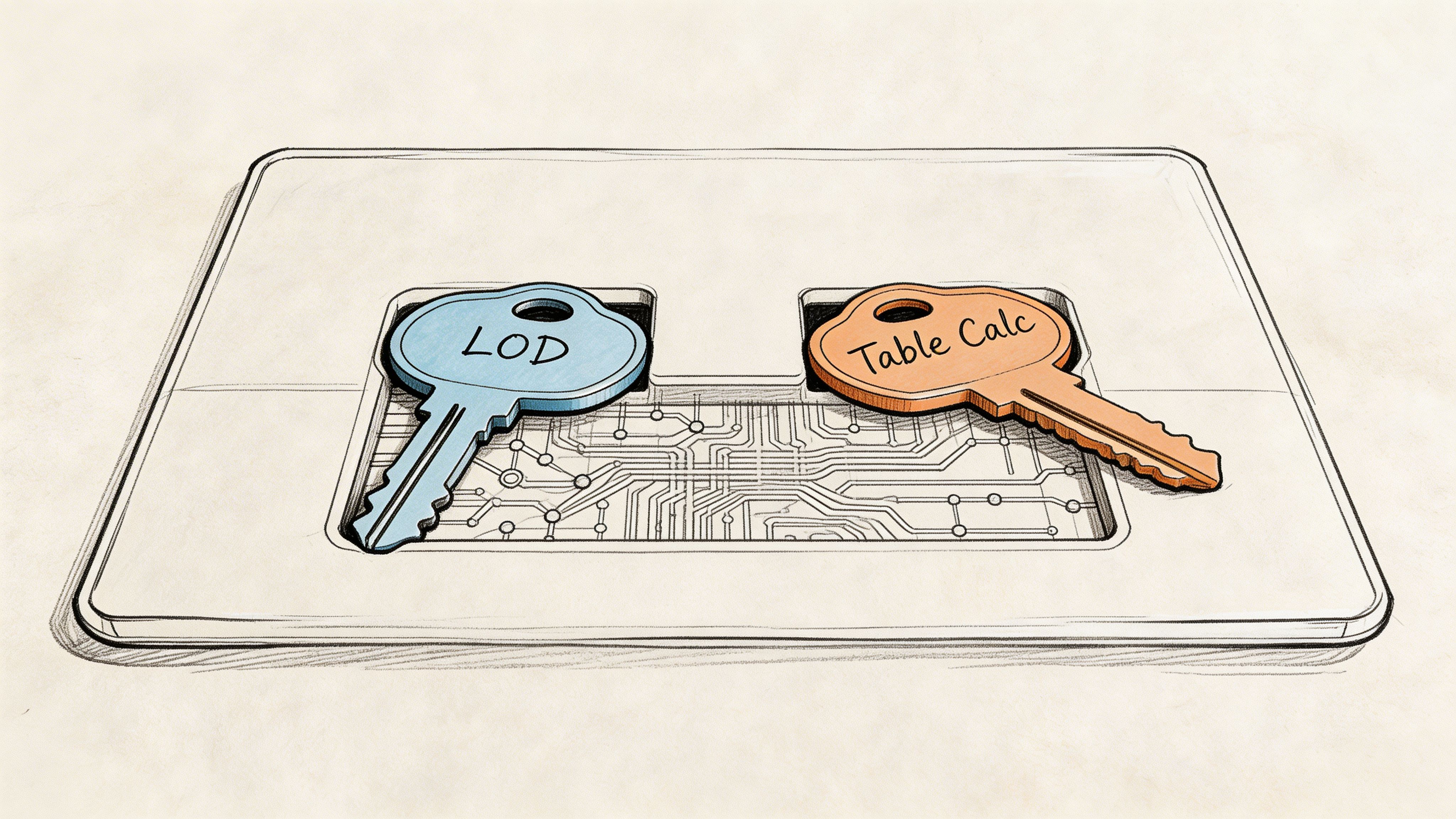
LODs change the grain of the calculation
A Level of Detail expression lets you calculate at a different granularity than the current view.
Suppose you want to see individual orders, but also show each customer’s total sales or average sales. A standard aggregate tied to the visible marks won’t give you stable customer-level logic if the view is at the order level.
That’s where something like FIXED [Customer Name] becomes useful. It tells Tableau to compute at the customer grain even if the chart is showing something else.
Think of LODs this way:
FIXED: Lock the calc to a chosen grain.
INCLUDE: Add a lower grain into the calculation.
EXCLUDE: Remove a grain from the current view’s logic.
LOD expressions are often the right answer when the business question is stable but the dashboard view changes.
Table calculations respond to the view itself
Table calculations don’t reshape the grain of the source. They work over the already-aggregated values visible in the chart.
That’s why they’re ideal for:
Running totals
Rankings
Moving averages
Period-over-period comparisons
They’re also why people get tripped up by partitioning. Tableau notes in its documentation on table calculations that table calcs operate on aggregated visualization data rather than source rows. The same source notes that 60% of Stack Overflow posts about wrong calculated field results misdiagnose partitioning issues.
That tracks with real-world use. A running sum restarting by Region often isn’t a broken formula. It’s a compute direction problem.
If the result changes when you rearrange the view, you’re probably dealing with a table calc problem, not a source-data problem.
LOD vs table calc in practice
Here’s the simplest decision rule I use:
Need | Better fit |
|---|---|
Stable metric regardless of what’s on the chart | LOD |
Metric that depends on chart layout or visible sequence | Table calculation |
Customer-level summary shown with order-level detail | LOD |
Running total across months in the visible table | Table calculation |
That distinction also shows up in chart-building work. For example, a waterfall chart often mixes base calculations, directional logic, and view-aware running totals. If you build those in Tableau regularly, this walkthrough on a waterfall chart in Tableau is a useful companion.
Why table calcs feel harder than they should
Row-level and aggregate calculations are easier to reason about because the computation context is closer to how people already think. Table calculations force you to think like Tableau.
You need to answer:
What is the partition?
What is the addressing path?
Does the calc restart within Region, Month, or Category?
Did sorting alter the result?
That’s not a trivial burden for a PM or founder trying to answer one growth question before a meeting.
A business example that clarifies the split
Say a product team wants to rank cities by sales within each region, then compare each city to the average city sales in that region.
The average city sales by region can work well as a table calculation because it operates on the visible city-level aggregated results. Tableau documents this pattern with WINDOW_AVG(SUM([Sales])) in its calculated field guidance cited earlier.
But if that same team wants a customer-level metric that must remain stable whether the dashboard is sliced by product, city, or month, an LOD is the safer choice.
The more a metric needs to survive changing views, the more likely it belongs in an LOD or upstream in the warehouse.
A Framework for Debugging and Optimizing Formulas
Complex Tableau work doesn’t fail because teams lack formulas. It fails because the logic becomes impossible to inspect.
A dashboard with many interdependent calculated fields can still be reliable, but only if the build process is modular. Experts who build advanced Tableau logic recommend a consistent process: decompose into small fields, build incrementally, number dependencies, and test in a simple table. The Flerlage Twins outline that method in their piece on complicated calcs, noting that it prevents errors in 80% of complex builds and that 65% of LOD calc errors stem from unintended aggregation.
The modular pattern that actually scales
When a metric gets complicated, don’t write the final formula first.
Build a chain:
Create the base field
If you need a final retention metric, start with the event flag, cohort assignment, and date bucket as separate fields.
Name the next dependency clearly
If there’s a second layer, label it in a way that exposes what it depends on. Some teams number them. That’s not elegant, but it works.
Test each layer in a text table
Don’t trust the final viz as your first validation step.
Promote only validated fields into the final metric
If the base logic is wrong, the polished dashboard just hides the error better.
This feels disciplined because it is. It’s also the only workable way to maintain complex logic across a team.
Common errors and the root cause behind them
Most debugging sessions come down to a small set of patterns.
Cannot mix aggregate and non-aggregate
Tableau is telling you the field grains don’t match. Fix the grain first. Don’t patch it with random aggregation unless it matches the business question.
Type mismatch
A string that looks like a number is still a string. Convert deliberately before comparing or calculating.
Null breaks the result
Handle nulls explicitly. If a field can be blank, assume it will be.
LOD returns a number that “looks wrong”
Check filters and intended grain. LODs often fail because the analyst expected view-aware behavior from a fixed-grain expression.
A broken formula is usually a broken assumption about grain, scope, or null handling.
Performance is part of correctness
A tableau calculated field can be logically correct and still be the wrong implementation.
A few trade-offs matter:
Nested calculations cost comprehension first, performance second: If no one can trace the dependency chain, the field is already too expensive.
View-dependent logic can be fragile: Table calcs are powerful, but every sort, partition, and filter decision changes behavior.
Some work belongs upstream: If the same expensive transformation appears in multiple workbooks, it’s often a modeling problem, not a dashboard problem.
When performance becomes the issue, go inspect the underlying query path. Warehouse-level tuning usually matters more than workbook micro-optimizations. This guide on optimizing a query is a strong reference if you need to move from Tableau symptoms to SQL causes.
What works better than heroics
The worst Tableau environments depend on one person who understands all the calculations. The best ones make every field inspectable.
Use this checklist before publishing:
Can another analyst tell what grain this field uses?
Can the output be validated in a simple table?
Would a PM understand the field name?
Does the logic belong in Tableau, or has it become source-model logic in disguise?
If the answer to the last question is “source model,” trust that instinct. Tableau is good at derived analysis. It’s less good as a substitute for a maintainable semantic layer.
Real-World Scenarios for Product and Growth Teams
Monday morning, the PM wants to know which new users are slipping after week one, growth wants a clean funnel by channel, and revenue wants a list of accounts worth saving before renewal. The questions are simple. The Tableau work behind them usually is not.
Calculated fields stop being textbook exercises and start acting like a small metric system you have to maintain. Product and growth teams rarely need a single SUM([Sales]) style formula. They need layered business logic, with one field feeding the next, often across different grains and time windows. If that chain is poorly designed, the dashboard still loads, but the decisions built on it get shaky.
Customer segmentation for account prioritization
A common request is to rank accounts by risk and value so success or sales teams know where to spend time first.
In practice, that often means combining recency, frequency, depth of use, contract value, or expansion signals into one segment. The trap is obvious to analysts and invisible to stakeholders. Recency may be calculated at the account level, product usage at the event level, and revenue at the order or invoice level. If you collapse all of that into one final label too early, you get a neat-looking segment field that is hard to audit and easy to misread.
A better build uses separate helper calculations for each component, then a final classification field with clear thresholds. That takes longer up front, but it pays off the first time someone asks why an account was tagged “high priority” and you can answer in two minutes instead of reverse-engineering your own workbook.
Cohort analysis for retention
Retention analysis looks clean in the final chart and messy in the calculation layer.
A useful cohort model usually needs four distinct pieces of logic: the first qualifying event, the cohort month, the elapsed period since that start, and the retained-user flag. Product teams then add more conditions. Paid users only. Activated users only. Exclude internal traffic. Reset the cohort definition after a pricing change. Each condition is reasonable on its own. Together, they create a dependency chain that can fail unnoticed.
The challenge lies not in writing one formula. It is keeping the cohort definition stable while the rest of the view changes around it. That is why retention work in Tableau often pushes analysts toward LODs, supporting dimensions, and a lot of validation tables before anything reaches an executive dashboard.
Funnel conversion for product decisions
Funnels look straightforward until the team wants answers by device, campaign, region, and release version in the same workbook.
Now you need stage definitions that hold up across segments, conversion rates that do not shift because someone reordered the view, and date logic that reflects the business process rather than whatever timestamp happened to be easiest to grab. For product teams, this usually turns into a mix of conditional fields for stage membership, aggregate calculations for counts, and view-aware logic for rate comparisons.
Good funnel work is mostly definition work. What counts as “entered onboarding”? What qualifies as “activated”? Can a user repeat a stage? Tableau can compute all of that, but the analyst still has to make the business logic explicit.
Product analytics rarely breaks because Tableau lacks a function. It breaks because the metric definition lives across six calculated fields and no one can explain the dependencies quickly.
For teams that also support planning, pipeline, or revenue reporting, adjacent use cases can sharpen how you structure these models. This roundup of sales forecasting models is a useful reference when you need to turn historical behavior into forward-looking operational logic.
Where manual BI starts to slow teams down
Across segmentation, cohorts, and funnels, the same pattern shows up. The business question arrives in one sentence. The Tableau implementation turns into multiple intermediate fields, repeated validation steps, and recurring arguments about grain, filters, and naming.
An experienced analyst can absolutely build this well. The trade-off is time and maintainability. Every new stakeholder request adds another branch to the logic tree, and every branch increases the chance that two dashboards define the same metric differently.
That is the gap modern AI BI tools are trying to close. Instead of hand-assembling metric logic across workbooks, teams can move faster when the semantic layer and question answering are handled in one place. Tableau still does a lot well, especially for flexible visual analysis, but for product and growth teams with constant follow-up questions, manual calculated-field work becomes expensive faster than many teams expect.
Frequently Asked Questions About Calculated Fields
When should I use a tableau calculated field instead of changing the source data?
Use a calculated field when the logic is local to the analysis, easy to explain, and unlikely to be reused across many models. If multiple dashboards depend on the same transformation, push it upstream.
Why does Tableau say I can’t mix aggregate and non-aggregate arguments?
Because the formula combines fields evaluated at different grains. One part is operating at the record level and another at the grouped-mark level. Fix the logic by aligning the computation level first.
Why does my running total restart unexpectedly?
That’s usually a table calculation partitioning issue. Tableau is computing across the view, not across source rows, so the result depends on how dimensions are arranged and where the calc restarts.
Should I use LODs or table calculations for advanced metrics?
Use an LOD when the metric needs to stay stable regardless of the view. Use a table calculation when the result should respond to the visible chart layout, sequence, or partition.
How should I test a complex calculated field?
Put the source fields and the calculation into a simple text table. Don’t validate logic only in the final dashboard. It’s much easier to spot grain problems, blanks, and odd categories in a plain table.
What should I do with null values?
Handle them deliberately. If blanks are possible, write the field as if they already exist. Nulls often cause category mismatches, dropped marks, or broken labels.
Are long nested formulas a bad sign?
Usually, yes. They may still work, but they’re harder to maintain and debug. Break large logic chains into smaller fields with clear names.
Why does the number look right in one sheet and wrong in another?
The view may be changing the grain, filter context, or table calculation direction. In Tableau, the same formula can behave differently when the visualization changes.
If your team is spending more time managing calculation context than answering business questions, it may be time to move beyond manual BI logic. Querio lets teams query warehouse data through AI coding agents and Python notebooks, so product managers, analysts, and data leaders can explore metrics without turning the data team into a request queue.

