Guide: waterfall chart tableau for 2026 — Build compelling visuals
Learn how to create a waterfall chart tableau in Tableau with practical steps, visuals, and expert tips to uncover key business insights.
https://www.youtube.com/watch?v=HFNkQZ8W_KM
published
Outrank AI
waterfall chart tableau, tableau data visualization, tableau tutorial, business intelligence, gantt chart
7d2175a7-1cce-420a-be8c-de0505066ba8

A waterfall chart is one of the most powerful tools in your data visualization arsenal. It's designed to show how an initial value is affected by a series of positive and negative changes over time. When you build a waterfall chart in Tableau, you're not just plotting numbers; you're crafting a clear, compelling story about what’s driving your business.
Why Waterfall Charts Tell a Better Business Story

Most standard charts are great at showing you what happened. A bar chart might show that revenue dropped from $100k to $85k, but it won't tell you why. That's where the waterfall chart shines. It visualizes the entire journey from the starting value to the ending one, breaking down every gain and loss along the way.
Think about a finance team trying to explain a profit and loss (P&L) statement. Instead of just showing the final net income number, they can use a waterfall chart to walk stakeholders through the story. It starts with gross revenue, then subtracts the cost of goods sold, marketing spend, and other expenses, ultimately landing on the final profit.
Visualizing the Narrative
This sequential storytelling is what makes waterfall charts so incredibly useful for business analysis. Imagine a SaaS company trying to understand its Monthly Recurring Revenue (MRR) changes. A waterfall chart can perfectly illustrate:
The opening MRR at the beginning of the month.
The positive impact of new customer sales and upgrades.
The negative hits from customer downgrades and churn.
The final closing MRR at the end of the month.
With a single glance, you can see if high churn is negating strong new sales or if a surge in upgrades saved the month. It immediately focuses the conversation on the most important drivers of performance.
The real magic of a waterfall chart is its ability to transform a complex dataset into an intuitive, step-by-step story. It isolates each contributing factor, making it almost effortless to pinpoint what’s truly moving the needle.
Understanding how to tell these stories with data is a crucial skill. For example, the right tools and visuals in business intelligence for retail can directly connect data to profit. This same principle holds true for any industry; clearer visuals always lead to smarter strategies.
Knowing how to choose the right chart for your data unlocks a deeper level of analysis. By learning to build a waterfall chart, you're not just making another graph—you're adding a powerful narrative tool to your belt for explaining performance and driving decisions.
Preparing Your Data for Tableau
Any great visualization begins with solid data preparation. Before we even open Tableau, let's make sure our dataset is properly structured for a waterfall chart. Getting this right from the start saves a ton of headaches later on.
For this walkthrough, we'll use a common business scenario: analyzing monthly revenue changes. You can follow along by creating a simple file in Excel or Google Sheets. All you really need are two columns: one for the change category and another for its value.
This simple structure is the foundation of our entire chart. The category column will become the "steps" in our story, and the value column will determine how much each step moves the total up or down.
Structuring Your Sample Dataset
To get a clear picture, let's imagine we're looking at the revenue flow for a small company. We'd want to track not just the money coming in, but also the money going out. It's crucial to represent decreases—like returns or costs—as negative numbers. This detail is what tells Tableau to draw the bars going down instead of up.
Here’s what that looks like in a table.
Sample Revenue Analysis Dataset
Change Category | Amount |
|---|---|
Opening Balance | 20000 |
New Sales | 15000 |
Returns | -4500 |
Service Fees | 2500 |
Operating Costs | -8000 |
With this data ready, go ahead and connect to it in Tableau. Once your data source is loaded, our first move is to build the basic skeleton of the chart. We're going to start with a Gantt Bar chart type, which is the perfect canvas for a waterfall.
Drag your 'Change Category' dimension onto the Columns shelf and the 'Amount' measure onto the Rows shelf. It won't look like a waterfall chart yet—not even close. But this step correctly places your categories along the horizontal axis, setting the stage for the cumulative calculations we'll add in a moment.
The real trick to a good waterfall chart is using the Gantt Bar mark type. It lets you control both the starting and ending point of each bar, which is exactly what we need to create that classic floating, step-by-step visual.
This initial layout might feel almost too basic, but it's the most important step. Understanding how Tableau is arranging the data here makes the next, more complex steps much more intuitive. These same data principles apply whether you're using a simple spreadsheet or pulling from a massive database. If you're dealing with larger datasets, you can prepare your data for visualization using some powerful SQL queries.
Now that our basic structure is in place, it's time to create our first calculated field. This is where the magic starts to happen, as this calculation will define the size of each bar and begin to form the "waterfall" effect.
Bringing the Waterfall Chart to Life, Step-by-Step
Alright, with our data loaded and the basic chart framework in place, it's time to actually build the waterfall. This is where the magic happens, and it all boils down to two key calculated fields that work in tandem. The first one will control the size of each bar, while the second dictates its vertical position on the chart.
The real secret to building a waterfall chart in Tableau is to think outside the box and use a Gantt Bar mark type. A standard bar chart always starts its bars at the zero line. A Gantt bar, however, is more flexible—we can tell it where to start and how big to be, which is exactly what we need for those classic "floating" bars that define a waterfall.
This diagram gives you a high-level look at the workflow, from the initial data to the calculated fields we’re about to create.
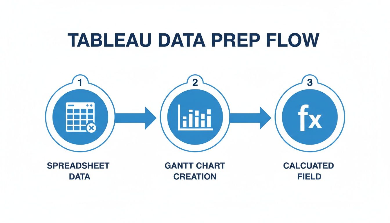
As you can see, we're taking spreadsheet data, switching our visualization to a Gantt chart, and then applying our calculations to build the final waterfall structure.
Creating the Sizing Calculation
First up, we need to tell Tableau how big to make each individual bar. The size should simply be its value—whether that's a positive gain or a negative loss. To get this working, we’ll create a calculated field that just inverts our 'Amount' measure.
Go ahead and right-click in the Data pane, choose Create Calculated Field, and give it a memorable name like 'Bar Size'. The formula itself couldn't be simpler:
-[Amount]
So, why the negative sign? It’s a little counter-intuitive, but it's a quirk of how Gantt charts work. A positive number on the Size shelf actually makes the bar extend downward from its starting point. By using -[Amount], we flip this. Now, positive 'Amount' values will create bars that go up, and negative values (like costs or returns) will create bars that go down. It's a small but absolutely critical tweak.
Building the Running Total
The second piece of the puzzle is the running total, and this is arguably the most important part. This calculation determines the starting point for each Gantt bar on the vertical axis. The goal is for each new bar to begin right where the previous one left off, showing that cumulative story.
You won’t need to create a new calculated field from scratch for this one. Instead, we can lean on one of Tableau’s most powerful built-in features: table calculations.
Find the SUM(Amount) pill that's on your Rows shelf, give it a right-click, and navigate to Quick Table Calculation > Running Total.
You'll see your chart instantly change. It’s no longer just a series of disconnected bars; you now have a step-like progression. We're close, but it’s not quite a waterfall yet—right now, the bars are just points without any height.
To fix that, find the 'Bar Size' field you just created and drag it directly onto the Size shelf on the Marks card. And just like that, the waterfall shape appears! Each bar now correctly starts at the cumulative total of the preceding categories and extends up or down based on its own value.
A common pitfall here is getting the table calculation wrong. If your chart looks like a mess of overlapping bars or just doesn't make sense, the
RUNNING_SUMis the first thing you should double-check. It's the engine that powers the entire cumulative effect.
Configuring the Table Calculation
The final touch is making sure that running total is being calculated in the right order. We need to explicitly tell Tableau how to "walk" through our data.
Right-click the SUM(Amount) pill on the Rows shelf one more time (it should now have a small triangle on it, indicating it's a table calculation) and select Edit Table Calculation.
In the dialog box that appears, make sure your settings are:
Compute Using: Select Specific Dimensions.
Check the box for your main category field (in our case, 'Change Category').
This tells Tableau to run the calculation sequentially across each category you have on the Columns shelf. If you leave it on the default 'Table (Across)', it can sometimes get confused, especially if you add more dimensions later. With this final configuration, your waterfall chart in Tableau is now structurally complete and ready for formatting.
Refining Your Chart for Clarity and Impact

Getting the basic structure of a waterfall chart right is one thing. Turning it into a polished, persuasive tool that drives decisions is another skill entirely. Now that you have a functional chart, let's dial in the details. These formatting touches are what separate a technical exercise from a clear business story.
Color is your first and most powerful ally. A good waterfall chart in Tableau should instantly signal whether a change is good or bad. We can set this up to happen automatically with a quick calculated field.
Adding Dynamic Color
Go ahead and create a new calculated field; I usually call it something like Bar Color. The logic here is super simple—we just need to check if the value is positive or negative.
IF SUM([Amount]) > 0 THEN 'Positive' ELSE 'Negative' END
Now, drag that new Bar Color field right onto the Color shelf in your Marks card. Tableau will drop in its default colors, but you’ll want to customize them. Just click on the Color shelf, hit "Edit Colors," and assign your own. Green for positive and red for negative is the standard for a reason—it’s an immediate, universal visual cue.
With colors sorted, let's add some labels. It's frustrating for stakeholders to have to guess the exact value of each change by squinting at an axis. To fix this, just drag your Amount measure onto the Label shelf. From there, you can click the Label shelf to format the numbers—maybe you need to show currency, or just shrink the font a bit for a cleaner look. It’s a small tweak that makes a big difference.
Grounding Your Start and End Totals
One of the most common snags I see people hit with waterfall charts is getting the start and end totals to behave. Right now, your 'Opening Balance' bar probably starts at zero and floats up, and you might not even have a final total bar yet. For real clarity, these total bars need to be anchored to the zero axis. They act as visual bookends for the whole story.
Fixing this requires us to get a bit more creative with our calculations and tell Tableau to treat the "total" categories differently from all the intermediate changes.
Isolate the Totals: First up, create a calculated field named
Waterfall Start. This formula is designed to make the intermediate bars start where the previous one ended, but it forces our special "total" bars back down to the zero line.IF MIN([Change Category]) = 'Opening Balance' THEN 0 ELSE PREVIOUS_VALUE(0) + LOOKUP(SUM([Amount]), -1) ENDAdjust the Bar Size: Next, we need a calculated field to control the bar height, which I’ll call
Waterfall Size. This is the key to making sure our total bars represent their full value, not just the change.IF MIN([Change Category]) = 'Opening Balance' THEN SUM([Amount]) ELSE -SUM([Amount]) END
Once you have those two fields, replace the running sum on your Rows shelf with Waterfall Start, and then replace the calculation on the Size shelf with Waterfall Size. This is a crucial step that gives your chart the proper grounded structure it needs.
The power of a great waterfall chart lies in its ability to tell a sequential story. For example, one company used this exact method to show how various sales deductions, returns, and production costs slowly chipped away at their gross revenue. Seeing the profit erode step-by-step turned abstract numbers into a clear call to action for the leadership team.
You can find some fantastic inspiration for this kind of visual storytelling by reviewing these data storytelling examples.
These refinements ensure your chart isn't just technically correct but also visually compelling. Applying these principles aligns with broader AI chart building best practices, where the ultimate goals are always clarity and impact.
Advanced Techniques for Interactive Analysis
A static waterfall chart tells a great story, but an interactive one invites your audience to find their own stories within the data. By adding filters and parameters, you can transform your visualization from a fixed report into a dynamic analytical tool. This is how you empower product managers, finance teams, and executives to explore the data on their own terms, without needing to request a new report for every question.
Let’s walk through a common scenario. A product manager wants to understand how revenue changes are driven by different business segments. Instead of building separate charts for each one, a parameter is the perfect solution. You can create a parameter listing all your segments—for instance, 'Enterprise', 'SMB', and 'Startup'—and then use it in a calculated field. This gives the user a simple dropdown to instantly switch their view.
This same logic works beautifully for time periods. You could build a parameter that lets users toggle between a monthly, quarterly, or yearly view, providing both a high-level and granular perspective on what’s driving performance.
Enhancing Your Tooltips for Deeper Context
The default tooltip in Tableau is functional, but it's a huge missed opportunity for providing deeper insights without cluttering your main view. An effective waterfall chart in Tableau uses tooltips to reveal more detailed data on hover, adding crucial layers of context.
For example, when a user hovers over the "New Sales" bar, your tooltip could show much more than just the dollar amount. Think about including:
The total sales value (the main metric).
The number of deals that were closed.
The average deal size.
The top contributing sales representative.
This adds incredible depth. A user might see a large revenue increase, but the tooltip could reveal it came from a single massive deal rather than broad-based growth. That kind of detail is what separates a pretty picture from a tool for making informed business decisions.
Navigating Common Pitfalls
As you start adding these interactive layers, you’re bound to run into a few common snags. Incorrect dimension sorting, for example, can completely jumble the logical flow of your waterfall. Always double-check that your "Change Category" dimension is sorted correctly to tell a coherent story, starting with the opening balance, followed by the changes, and ending with the closing balance.
Another frequent headache is a misconfigured table calculation. If your bars seem to be starting from the wrong points or floating in space, the culprit is often the running total. Make sure it’s set to "Compute Using" your specific category dimension.
I've seen waterfall charts completely change conversations in a room. In one analysis, a chart revealed a price-to-profit gap so significant it triggered immediate action from both sales and product leadership. They are strategic instruments, not just visuals, especially for quick P&L analysis or showing cumulative effects. You can explore how top analysts build these visuals by reading more about wonderful waterfall charts on playfairdata.com.
By mastering these interactive elements, your waterfall chart becomes a powerful, self-service analytics dashboard. For those interested in pushing the boundaries even further, you might want to look into how to use AI in Tableau to automate and speed up your analysis. This approach allows stakeholders to answer their own questions, which frees up analysts to focus on higher-impact work.
Common Questions About Waterfall Charts in Tableau
Even after you've built a few waterfall charts, some tricky questions and roadblocks always seem to pop up. Nailing these specific details is what separates a confusing visual from a powerful, readable one. Let's walk through some of the most common snags I've seen people hit and how to fix them.
A persistent challenge is getting the start and end totals to display correctly. A frequent mistake is treating them like any other part of the waterfall, which makes them float awkwardly instead of anchoring the chart to the zero axis.
The trick is to create distinct logic just for your "total" bars. They need to be grounded to provide a solid visual start and end point for the story your chart is telling. Without these anchors, the narrative just feels incomplete.
This means you’ll need a calculated field for the bar's starting position that specifically resets your 'Total' or 'Opening Balance' categories back to zero. At the same time, the other bars continue to build on the previous value. You'll also need a separate sizing calculation to ensure the total bars reflect their true, absolute value.
Can I Make a Horizontal Waterfall Chart?
Absolutely. In fact, switching to a horizontal waterfall is often a great idea for wider dashboards or presentations where you have more horizontal real estate to work with. The switch is surprisingly simple.
All you have to do is swap the pills on your Columns and Rows shelves in Tableau.
Your running total calculation moves over to the Columns shelf.
Your category dimension (like 'Change Category') goes onto the Rows shelf.
The Gantt bars will now flow from left to right, telling the same sequential story but in a horizontal layout. The best part is that your underlying logic and calculations don't need to change at all—just the final orientation.
Why Are My Bars Not Aligning Correctly?
This is probably the most frequent source of frustration I hear about. If your bars are overlapping, starting from the wrong points, or just not creating that classic "floating" waterfall effect, the issue is almost always in your table calculation setup.
When you create the running total, you have to tell Tableau the exact order in which to sum the values. If that isn't configured correctly, the cumulative logic completely breaks down.
To fix it, just right-click your running total pill on the Rows (or Columns) shelf and select "Edit Table Calculation." Make sure it’s set to "Compute Using" your specific dimension on the other shelf (e.g., 'Change Category'). The default 'Table (Across)' setting often fails here, especially with more complex charts, causing the misaligned bars you're seeing. Getting this computation path right is the key to a perfectly rendered waterfall.
For teams looking to move beyond manual chart building and empower everyone with self-serve analytics, Querio offers an AI-powered platform that turns natural language questions into accurate answers and visualizations instantly. You can go from raw data to deep insights in seconds, not weeks. Learn how to centralize your business intelligence.

