Mastering Negatively Skewed Distribution Data
Understand what a negatively skewed distribution means for your metrics. A practical guide to spot, visualize, and effectively handle left-skewed data.
https://www.youtube.com/watch?v=U0NZu6f5TMI
published
Outrank AI
negatively skewed distribution, data analysis, skewness, statistical modeling, product metrics
3ebe56c5-6deb-4d8f-8647-c5456eceab04

A product dashboard can look stable while the underlying behavior is anything but. You check a KPI, see an average that seems reasonable, then talk to users or inspect a few cohorts and realize the “typical” case looks very different from the mean. That mismatch is often your first sign that the metric isn’t distributed symmetrically.
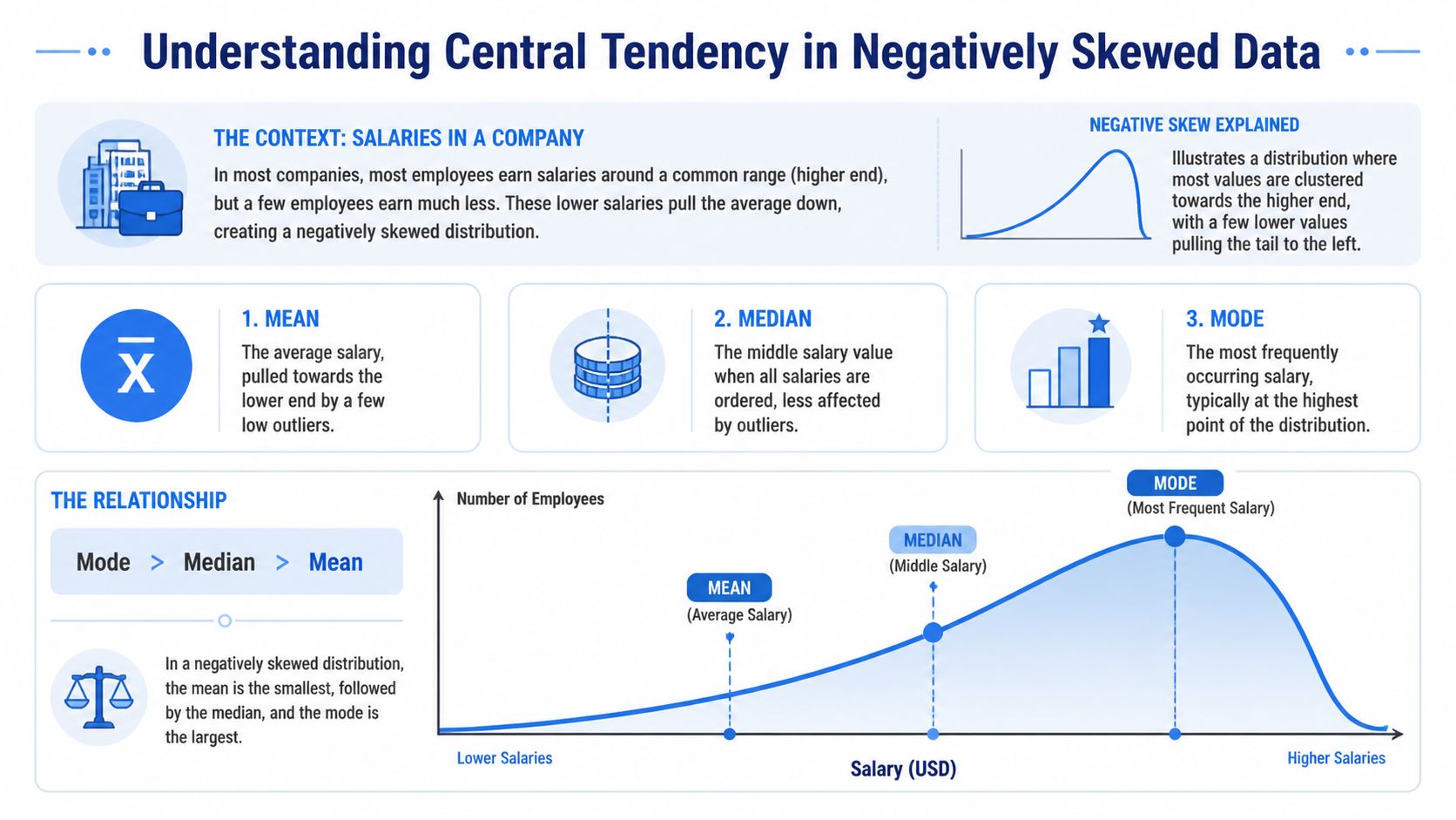
A negatively skewed distribution creates that exact problem. Most values cluster on the high end, while a smaller set of unusually low values stretches the tail to the left and drags the average down. In product analytics, that shows up in retention, satisfaction, quality scores, revenue growth, and any metric with a natural ceiling plus a painful failure mode.
Table of Contents
Why Average Metrics Can Be Deceiving
Teams default to the average because it’s easy to calculate and easy to explain. That works fine when the distribution is roughly balanced. It breaks when a few extreme low values pull the mean away from what most customers encounter.
That’s the practical meaning of a negatively skewed distribution. The data bunches near the upper end, but a left tail of low outliers drags the average downward. If you only report the mean, you can make a healthy product look weaker than the typical user experience, or mask a concentrated operational problem inside one segment.
The dashboard says one thing, the users say another
A product manager might see average satisfaction, average session quality, or average delivery reliability and assume that average equals normal. It doesn’t. In left-skewed data, the average gives disproportionate weight to bad outliers.
That matters outside product analytics too. In trading and portfolio review, teams often look at summary metrics without checking whether downside events are concentrated in a tail. Resources like metrics for disciplined trading are useful because they frame performance around risk-aware measurement instead of a single headline number.
Practical rule: If the average and lived experience keep disagreeing, stop arguing about the KPI and inspect the distribution.
A quick descriptive pass usually catches the issue. If your team needs a refresher on the basics before digging into shape and asymmetry, Querio’s guide to descriptive analytics in business reporting is a good starting point.
Why this matters for decisions
Negative skew changes what “normal” means. A roadmap discussion based on the mean can lead to the wrong benchmark, the wrong alert threshold, and the wrong story about customer behavior.
The fix isn’t complicated. First, recognize the pattern. Then choose summaries and models that reflect the shape of the data instead of pretending the shape doesn’t matter.
Understanding Mean Median and Mode in Skewed Data
The cleanest way to understand a negatively skewed distribution is to compare mean, median, and mode. In this shape, the mean is less than the median, and the median is less than the mode. That relationship comes from low outliers pulling the mean leftward while the median and mode stay closer to where most values are concentrated, as summarized in this explanation of negative skew and central tendency.
What the three measures are really telling you
The mean answers, “What’s the arithmetic average?” It uses every value, so it’s the first measure to move when a few bad outcomes appear.
The median answers, “What sits in the middle when I sort the data?” It’s much more stable when the tail contains unusual low values.
The mode answers, “What value occurs most often?” In a negatively skewed distribution, that peak often sits near the high end because most observations are clustered there.
Here’s the business implication:
Measure | What it reacts to | What it’s good for | What can go wrong |
|---|---|---|---|
Mean | Every value, especially outliers | Budgeting, aggregate totals, some models | Can understate the typical case |
Median | Rank order, not distance between values | Typical customer experience | Can hide tail severity if used alone |
Mode | Most common value | Understanding the peak of behavior | Often less useful for continuous metrics |
A lot of teams only compare mean to target. That skips the more important comparison, mean to median.
A simple business example
Use a salary analogy because it’s intuitive. Suppose most employees in a team earn in a fairly tight higher band, but a smaller group of interns or temporary staff earn much less. The low end stretches the left tail. The average salary drops more than the midpoint salary does.
That same pattern appears in product metrics with ceilings. Think of retention where most cohorts are strong but a handful collapse after a market shock. The verified example here is specific: 90% of monthly retention is 95%+ while 10% of cohorts drop to 20%, and using median-based forecasting instead of mean-based forecasting reduced prediction error by 25% to 40% in self-serve notebooks compared with traditional BI tools like Looker, according to the same negative skew overview.
When the business asks what a “typical” customer looks like, median usually answers that question better than mean in left-skewed data.
If you’re explaining this visually to non-technical stakeholders, a histogram does more work than a table of summary stats. Querio’s explainer on when to use a histogram vs bar graph helps teams pick the right chart for exactly this discussion.
How to Spot Negative Skew in Your Datasets
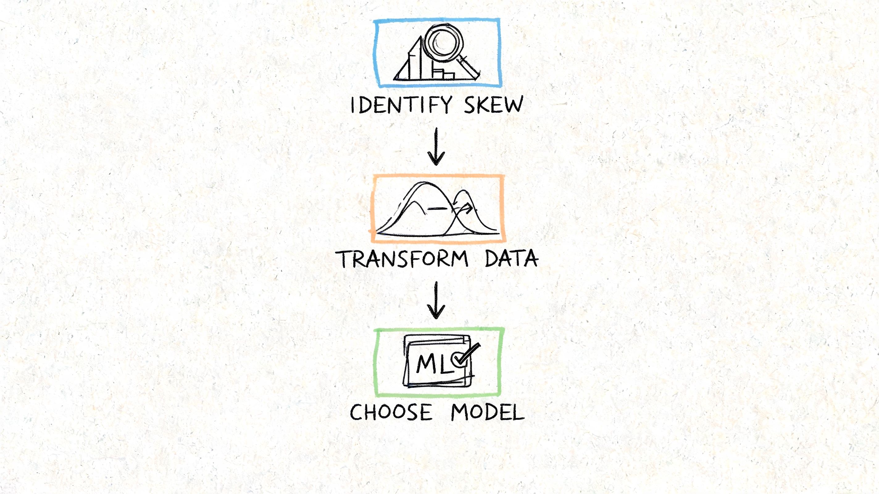
You don’t need a formal statistics review to catch negative skew early. In practice, two methods work well together. First, look at the shape. Then calculate a skewness value so the call is repeatable.
Start with the shape
A negatively skewed distribution usually looks like a hump near the right side with a long left tail. Histograms and density plots are the fastest way to spot it.
Look for these clues:
Most observations near the ceiling: Ratings, uptime, compliance scores, or retention often pile up near the top.
A sparse but important low tail: A small number of severe failures stretches the distribution leftward.
A mean that seems “too low” relative to what teams observe: That’s often your first sanity-check failure.
For spreadsheet-heavy teams, a plain-language walkthrough of understanding data skewness can help translate the concept before moving into code.
If you’re still in exploratory mode, Querio’s guide to exploratory data analysis workflows is a useful companion because skewness is usually something you discover while profiling a metric, not something you save for the end.
Then quantify it
Visual inspection is good for intuition. It’s not enough when different teams need a rule they can automate.
The verified threshold here is practical: use scipy.stats.skew() and treat values below -0.5 as a trigger for review or transformation, based on this summary of measures of shape and skew detection. The same source notes that negative skew can be measured with Pearson’s coefficient or the standardized third moment.
A short visual explanation can help if you’re presenting this to a mixed audience:
A notebook workflow that works
This is a practical pattern for a modern Python notebook.
This workflow is enough for most product metrics. Plot the shape, compare mean and median, compute skewness, then decide whether the metric needs a reporting adjustment or a modeling transformation.
Real-World Examples of Negatively Skewed Data
Negative skew isn’t rare or academic. It appears whenever a metric has a practical upper bound and occasional low-end failures.
A textbook example that still matters
A classic example is human finger counts. About 99.9% of the global population has 10 fingers, while about 0.1% has fewer, which produces mean = 9.98, median = 10, mode = 10, and skewness around -2.5, as described in this summary of positive and negative skewness examples.
It’s a memorable example because the logic is obvious. Most observations sit at the high end. A small minority on the low side pulls the average down.
The shape matters more than the label. If most outcomes cluster high and only failures extend downward, treat the metric as a candidate for negative skew.
Where it shows up in business metrics
Business data produces the same geometry all the time.
Take startup age at first unicorn status. The verified pattern is negatively skewed, with median = 7 years, mean = 6.2 years, and mode = 6 years across 1,200+ unicorns from 2005 to 2025, where 80% reach that milestone in 5 to 9 years, 10% do so in under 3 years, and 10% take more than 12 years. Fast outliers pull the mean lower than the median.
SaaS growth metrics can also lean this way. In the verified example, 5,000 SaaS firms tracked by ProfitWell from 2020 to 2025 show 75% growing 20% to 50% YoY, with mode = 35%, median = 42%, and mean = 28%, plus skewness = -1.1. That gap matters because an executive looking only at the mean would tell a different story than one looking at the median.
A few product-adjacent patterns are worth checking in your own warehouse:
Satisfaction scores: Many users give high ratings, while a smaller set of very poor experiences drags the average down.
Reliability metrics: Most services run close to expected performance, but rare incidents create a low tail.
Cohort retention: Strong steady cohorts can coexist with a handful of severe drop-offs.
These aren’t identical metrics, and they shouldn’t be handled identically. But they share the same operational lesson. If the low tail carries business risk, don’t summarize it with one average and move on.
The Dangers of Ignoring Negative Skew in Analytics
When teams ignore negative skew, they usually don’t fail in the math first. They fail in the interpretation. The metric looks simple, so people use it as if it were symmetric.
Bad KPI narratives
The first problem is reporting. A mean taken from a negatively skewed distribution often makes performance look worse than what most customers experience. That can trigger the wrong response from leadership.
Common mistakes look like this:
Setting targets from the wrong center: Teams benchmark against the mean when the median better represents the typical case.
Misreading product quality: A concentrated tail problem gets mistaken for a broad product problem.
Rewarding the wrong fixes: Broad optimizations get funded while a specific failure segment remains untouched.
A chart review often catches this. If your stakeholders need a sharper eye for how summaries distort visuals, Querio’s guide on how to interpret charts and graphs is useful for tightening that discipline.
Broken statistical assumptions
The second problem is inference. The verified guidance is explicit: unaddressed negative skew can violate normality assumptions in t-tests and contribute to Type I errors in A/B tests, based on this discussion of statistical shape and skew correction.
That’s not an abstract concern. Product teams run experiments on conversion, satisfaction, and engagement metrics that often have hard ceilings plus downside failures. If the model assumes symmetry and the data doesn’t cooperate, the p-value can look more trustworthy than it is.
A/B testing discipline doesn’t start with p-values. It starts with checking whether the metric behaves like the test expects.
Biased forecasts and planning mistakes
The third problem is prediction. If you train or forecast directly on raw left-skewed values, the model learns from a distorted center. That can bias churn forecasts, staffing plans, and expected-value scenarios.
Business judgment matters. Sometimes the tail is the story, and smoothing it away would be a mistake. But if the goal is parametric modeling, forecasting, or standardized KPI comparison, leaving negative skew untreated often produces a model that looks clean on paper and drifts in production.
Actionable Strategies for Handling Skewed Data
The right treatment depends on what you’re trying to do. Reporting, experimentation, and forecasting don’t need the same fix.
Choose the summary that matches the decision
If the question is “What does a typical customer experience?”, use the median first. In verified retention examples, median-based forecasting outperformed mean-based forecasting because a small group of low-retention cohorts distorted the mean.
A simple reporting template works well:
Use case | Better default | Why |
|---|---|---|
Executive KPI summary | Median plus mean | Shows typical case and tail effect |
Customer experience review | Median | Less sensitive to low outliers |
Finance or aggregate planning | Mean with distribution view | Totals still matter |
For dashboarding, I prefer reporting both mean and median side by side when the skew is material. That stops teams from overreacting to one number.
Transform data when the model requires it
If you need parametric modeling, the verified recommendation is to quantify skew precisely and then consider a transformation. Practical options include Box-Cox or a log variant, and the verified example shows a transformation can shift skewness from -0.8 to -0.1 while post-transformation models can improve R² by 0.15 to 0.25 in predictive churn analytics, according to the same ABS summary on measures of shape.
One option for notebook users is to automate a rule: if scipy.stats.skew() is below -0.5, flag the feature for review before modeling. In tools that support warehouse-connected Python notebooks, including Querio, that rule can sit inside the data prep layer rather than living in someone’s memory.
Here’s a practical example:
This doesn’t mean every skewed feature should be transformed. It means every skewed feature should be evaluated on purpose.
Know when not to force symmetry
Sometimes the skew contains the business signal. If your low tail represents outages, severe churn cohorts, or compliance failures, transforming the data for a dashboard can make the problem harder to see.
Use this decision pattern:
For communication, report reliable summaries and show the distribution.
For formal tests or predictive models, transform if assumptions require it.
For operational monitoring, keep the raw metric visible so failure tails stay visible.
Decision test: If changing the scale would hide the operational problem, don’t use the transformed version as the primary business view.
The trap is treating every skewed distribution as something to “fix.” Sometimes the correct action is to acknowledge the shape and pick the right statistic for the question.
Building Robust Analytics with Skewness in Mind
A negatively skewed distribution is more than a textbook curve. It’s a common reason product teams misread dashboards, mis-set targets, and trust shaky model outputs. The practical pattern is straightforward. Check the shape, compare mean and median, quantify skew, then decide whether you need a different summary, a transformation, or just a clearer explanation.
That discipline improves reporting quality as much as it improves modeling quality. If your team is tightening data hygiene across dashboards and alerts, this guide to stopping inaccurate reports is a useful complement because distribution mistakes often surface as reporting mistakes first.
Querio helps teams work directly on warehouse data with AI-assisted notebooks and self-serve analysis workflows, which is useful when you need to inspect distribution shape, compare summary statistics, and standardize how skewed metrics are handled without turning the data team into a ticket queue. Explore Querio if you want a more flexible way to operationalize this kind of analysis.

