What is descriptive analytics? A Practical Guide to Data Insights
Explore what is descriptive analytics and how it reveals patterns in your data with practical examples and actionable steps.
published
Outrank AI
what is descriptive analytics, business intelligence, data analysis, analytics guide, data dashboards
32bebb87-a3ab-4cf6-91d5-44bd63dc830c

Descriptive analytics is all about looking at your data to understand exactly what happened in the past. It’s the process of taking raw, jumbled numbers and turning them into clear reports, dashboards, and charts that tell a straightforward story about your business.
What Is Descriptive Analytics Really About?
Think of your business as a car on a long road trip. Descriptive analytics is your dashboard. It shows your current speed, how much fuel you have left, and the engine temperature. It doesn't tell you why the engine might be getting hot or predict a traffic jam up ahead—it just gives you the facts as they are right now.
That's the core of it. Descriptive analytics provides a factual, easy-to-understand summary of past events. It’s the essential first step in any data strategy, laser-focused on answering one simple question: "What happened?"
Instead of sifting through thousands of individual sales transactions, descriptive analytics gives you a clean report showing your total monthly revenue, your most popular products, or which regions are driving the most sales. It makes the data make sense.
The Foundation of All Data Insights
Trying to predict the future or figure out the root cause of a problem without first understanding what happened is like navigating without a map—it's pure guesswork. Descriptive analytics provides that map by creating a single source of truth based on historical performance.
Descriptive analytics isn't just about looking backward; it's about establishing a clear understanding of the present by reviewing the past. It turns a sea of data into a comprehensible story that everyone in the organization can understand and act upon.
It's easily the most common and fundamental type of data analysis out there. Focusing on standard reporting and dashboards, it represents the largest slice of the business analytics market, accounting for 32.7% of revenues in its reporting year. You can discover more insights about the business analytics market here.
Here’s a quick look at what this type of analytics helps you do.
Component | Description |
|---|---|
Main Question | "What happened?" |
Goal | To summarize and describe past events and performance. |
Techniques | Data aggregation, summary statistics (mean, median, mode), frequency counts. |
Outputs | Reports, dashboards, charts, scorecards, and data visualizations. |
Time Focus | Historical (past and present). |
Complexity | Low. It's the simplest and most widely used form of analytics. |
This table shows just how foundational this type of analysis is. It's not about complex forecasting; it's about getting the basics right.
In short, descriptive analytics is perfect for:
Tracking Performance: Keep an eye on Key Performance Indicators (KPIs) like revenue, user engagement, or customer churn rates.
Identifying Trends: Spot patterns as they emerge, like seasonal sales spikes or a slow decline in website traffic.
Generating Reports: Create standard summaries that everyone needs, from weekly sales figures to monthly financial statements.
By getting a firm handle on this first step, you create the context you need to move on to more advanced analytics. It ensures your future strategies are built on a solid understanding of reality, not just assumptions.
Understanding the Four Levels of Data Analytics
To really get a handle on descriptive analytics, you first need to see where it fits in the bigger picture. I like to think of data analytics as a journey with four key stages. Each stage answers a more complex question than the last, and you can't skip ahead—each one builds on the insights from the one before it.
A simple analogy I often use is a visit to the doctor's office.
When you first arrive, the nurse takes your vitals—temperature, blood pressure, weight. They ask about your symptoms. This initial check-up is Descriptive Analytics. It's all about understanding what's happening right now by answering the question, "What are the symptoms?"
Next, the doctor tries to figure out what's causing those symptoms. This is Diagnostic Analytics. They're digging deeper to answer, "Why are these symptoms happening?" It’s about moving past just knowing the facts to understanding the relationships between them.
Once they have a diagnosis, the doctor can forecast what might happen next. That’s Predictive Analytics, which uses historical data to answer, "What is the likely outcome?" Finally, they recommend a treatment plan. This is Prescriptive Analytics—it tells you, "What should we do about it?"
You can't get a treatment plan (prescriptive) without a forecast (predictive), which is useless without a diagnosis (diagnostic). And none of it can happen until you know the basic symptoms (descriptive). It’s a logical progression.
The Foundational Role of Descriptive Analytics
For any company looking to make smarter decisions, descriptive analytics is the non-negotiable starting point. It's the most common type of analysis for a reason: it lays the factual groundwork for everything else. This isn't just theory; the numbers back it up. Descriptive analytics accounts for a massive 32.7% of all business analytics revenue, making it the single largest segment in the market. You can explore more on these business analytics market findings on Mordor Intelligence.
The process itself is pretty straightforward, as this flow chart shows. You start with a question, apply some basic analytical methods, and get clear outputs like dashboards and reports.
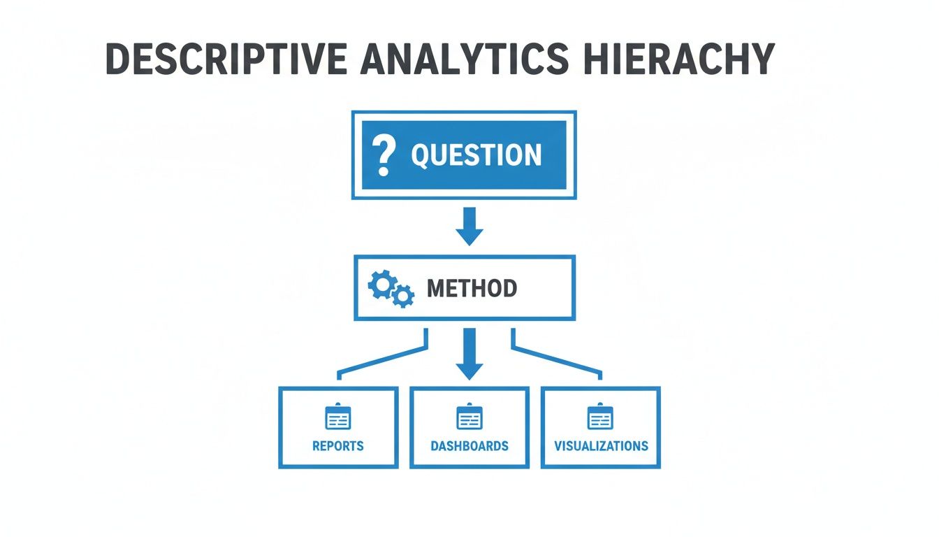
It’s all about taking raw data and turning it into a clear, shared story of what has already happened in your business.
Comparing the Four Types of Analytics
While all four types of analytics have their place, they serve completely different functions and require different tools and skill sets. Getting these distinctions right is crucial for building a solid data strategy. If you want to dive even deeper, we have a whole guide covering descriptive, predictive, and prescriptive analytics.
To make it crystal clear, let's put them side-by-side.
Type of Analytics | Key Question | Goal | Example |
|---|---|---|---|
Descriptive | What happened? | To summarize historical data into understandable reports and dashboards. | Creating a weekly sales report that shows total revenue and top-selling products by region. |
Diagnostic | Why did it happen? | To uncover the root causes of past events or trends by drilling down into the data. | Investigating a sales drop in one region and discovering it correlates with a new competitor's launch. |
Predictive | What will happen? | To forecast future outcomes and trends based on historical patterns and statistical models. | Using past customer behavior to predict which users are most likely to churn in the next 30 days. |
Prescriptive | What should we do? | To recommend specific actions to achieve a desired outcome or mitigate a future risk. | Automatically offering a personalized discount to a customer who is predicted to churn. |
As you can see, each level adds a new layer of value, but they all depend on the one before it.
By mastering descriptive analytics first, you establish a solid data foundation. This ensures that when you advance to diagnostic, predictive, and prescriptive analytics, your decisions are based on an accurate and shared understanding of your business's past performance.
Without a clear picture of "what happened," any attempt to explain "why" or predict "what's next" is really just guessing. It all starts with describing reality.
How Top Teams Use Descriptive Analytics Every Day
It's one thing to talk about theory, but the real magic happens when you see descriptive analytics at work in the real world. Across every department, the best teams aren't just swimming in data—they're using it to get a clear picture of what's already happened so they can make smarter decisions today.
It’s not about mind-bending algorithms. It’s about creating clarity from the past.

Whether you're a product manager or a finance lead, the goal is the same: answer the fundamental question, "What happened?" This simple query is the launchpad for growth, efficiency, and getting everyone on the same page.
Product Teams Driving User Engagement
For anyone in product, understanding user behavior is the name of the game. Descriptive analytics gives them a direct window into how people are actually using their product, replacing gut feelings with hard evidence.
They’re laser-focused on metrics that summarize user activity. This isn’t about predicting what users will do next; it's about getting a firm grasp on what they’re doing right now.
Common metrics include:
Daily Active Users (DAU): A straightforward count of the unique users who show up each day. It’s a vital sign for engagement.
Feature Adoption Rate: The percentage of users who have tried a new feature. This tells you if that big launch actually landed.
Session Duration: The average time users spend in the app per visit. Are they captivated or just stopping by?
By keeping an eye on these KPIs, a product team can spot trouble immediately. Did a UI change cause session times to drop? Is that new feature being ignored? This historical data provides the context needed for any follow-up investigation or change of plans.
A product manager might notice that DAU has been flat for three straight weeks. That simple descriptive insight—just knowing "what happened"—is the trigger for asking the next logical question: "Why did it happen?" This is where a deeper diagnostic analysis begins.
Operations Teams Optimizing for Efficiency
Operations teams are the engine of a business, and their job is to keep that engine humming. Descriptive analytics is their go-to for monitoring performance, spotting bottlenecks before they become disasters, and putting resources where they're needed most.
They rely on historical trends to manage the day-to-day grind. A customer support manager doesn't just guess when things will get busy; they look at the data.
An operations dashboard will almost always track:
Support Ticket Volume: Charting the number of new tickets per day or week reveals peak times, which is essential for smart staffing.
Average Resolution Time: Summarizing how long it takes to close an issue is a key indicator of team efficiency.
First Contact Resolution (FCR): Reporting the percentage of issues solved in the first interaction shines a light on agent effectiveness.
This kind of reporting allows an ops leader to see that ticket resolution times jumped by 15% last month. That single data point is the catalyst for figuring out what changed. Was it a new software rollout? A shift in team structure? To dig deeper, many teams will even perform ad-hoc analysis to explore unexpected trends on the fly.
Finance and Marketing Teams Tracking Performance
Both finance and marketing departments are built on a foundation of descriptive analytics. For finance, it’s about summarizing the company's financial health. A monthly Profit & Loss (P&L) statement is a classic example—it doesn't predict the future; it tells you exactly what happened with the money.
Marketing teams use it in much the same way to understand their audience and campaign results. For instance, a common practice is to use an example of demographic segmentation to group customers by age, location, or interests. This answers the question, "Who are we talking to?" and helps tailor future campaigns for a much bigger impact.
Building Your Descriptive Analytics Foundation
So, you're ready to move from theory to action? That's great. Building a solid descriptive analytics foundation isn't about needing a massive budget or super-complex technology. It's really about following a clear, intentional process.
This roadmap will walk you through the essential steps to turn raw data into a clear picture of your business reality.

The goal here is simple: create a system that can reliably and efficiently answer, "What happened?" Get this right, and it sets the stage for every other type of analysis you'll ever want to do.
Start with Your Business Questions, Not Your Data
This might sound counterintuitive, but the biggest mistake teams make is diving headfirst into a pile of data without a clear purpose. Before you touch a single spreadsheet, you absolutely must define the questions that actually matter to your business.
Start by asking your team:
What are the most critical activities we need to keep an eye on?
What information would genuinely help us make better decisions every week or month?
If we could only track five numbers to gauge the health of the business, what would they be?
Asking these questions first prevents you from getting lost in a sea of irrelevant data. It focuses your efforts on finding insights that can drive real, tangible action.
Identify the Right Key Performance Indicators
Once you have your questions locked down, the next step is to translate them into measurable metrics, also known as Key Performance Indicators (KPIs). A good KPI is specific, measurable, and directly tied to a business goal.
For instance, if your business question is "Are our customers actually engaging with our new product?", your KPIs might look something like this:
Daily Active Users (DAU): A straightforward measure of how many people are showing up.
Feature Adoption Rate: The percentage of users who have tried a specific new feature.
Average Session Duration: How long people are sticking around in the product each time they visit.
Building a solid foundation means knowing how to measure content marketing ROI and other critical metrics. This ensures you're not just tracking numbers for the sake of it—you're tracking what matters to the bottom line.
A well-chosen KPI doesn't just track a number; it tells a story about a specific part of your business performance. Focusing on a handful of meaningful KPIs is far more effective than trying to monitor dozens of vanity metrics.
Gather and Prepare Your Data
With your KPIs defined, it's time to roll up your sleeves. This is where you locate and prepare the necessary data, and honestly, it's often the most time-consuming part of the whole process. But it's also absolutely critical for accuracy.
First, you'll need to consolidate data from all the different places it lives—your CRM, payment processor, product database, you name it. Then comes the cleanup. You have to handle all the messy stuff like missing values, duplicate entries, and typos. In fact, some reports show that data professionals spend nearly 80% of their time just on data preparation.
This step is a beast, but you can't skip it. If you want to dive deeper, we've got a great guide on how to clean up data.
Choose the Right Tools for the Job
Your tools should empower your team, not create bottlenecks. While it’s tempting to start with spreadsheets, they quickly become unmanageable and riddled with errors as your data grows. Modern business intelligence (BI) platforms are built to automate a lot of this heavy lifting.
When you're shopping around, look for tools that offer:
Direct Data Connectors: You need an easy way to pull data directly from your existing systems without a bunch of manual exporting and importing.
User-Friendly Dashboards: The whole point is to visualize KPIs clearly. Your dashboards should be clean, interactive, and easy to understand at a glance.
Self-Serve Capabilities: This is huge. You want non-technical team members to be able to explore data and find answers without having to wait in line for an analyst.
This approach puts data into the hands of the people who need it, fostering a culture where anyone on the team can confidently answer, "What happened?" without needing to write a single line of code.
How Querio Makes Data Analysis Effortless
We all know building a solid descriptive analytics foundation is important, but let's be real—the traditional process can be a drag. It often feels like a painful cycle: you write a complex SQL query, wait for the data team to pull a report, and then realize your original question was slightly off. So, you start all over again.
This friction creates a bottleneck that keeps valuable insights locked away from the very people who need them most.
That's where modern tools completely change the game. A platform like Querio is built to tear down these common hurdles. The goal is to make descriptive analytics less of a technical chore and more of an intuitive, company-wide habit, putting data in the hands of everyone, not just the experts.
Instead of wrestling with code or filing tickets, anyone can just ask questions in plain English and get immediate, accurate answers. This shift empowers product managers, operations leads, and founders to explore data on their own terms, finally making a self-serve data culture a reality.
From Complex Queries to Simple Questions
The tricky part of descriptive analytics isn't understanding the "what happened" concept; it's the actual work of getting the answer. It shouldn't take a data science degree to get a simple summary. Querio bridges this gap with a natural language interface that understands your business questions just like a human analyst would.
Let's say you want to know, "What were our top 5 selling products in California last month?" Instead of hammering out a multi-line SQL query, you just type that question. The platform translates your plain English into the necessary code, runs it against the database, and serves up a clear chart in seconds.
This completely changes the speed and accessibility of insights. You can learn more about how Querio brings natural language chat to every major data platform in our detailed guide.
It’s more than just a convenience—it sparks curiosity. When answers are instant, team members are encouraged to dig deeper, ask follow-up questions, and uncover trends that would have otherwise stayed hidden behind a wall of technical jargon.
Centralize Insights with Dynamic Dashboards
A one-off answer is great, but keeping an eye on your most important metrics calls for something more permanent. This is where dashboards—or 'Boards' in Querio—come in. They act as a centralized, single source of truth for your team's most critical Key Performance Indicators (KPIs).
Here’s what it looks like to ask a question and instantly see the data visualized in the platform.
The real magic of these Boards is that they're dynamic. They aren’t static reports that are out of date the minute you export them. They are live views plugged directly into your data sources, making sure everyone is looking at the most current information. This puts an end to the chaos of having multiple versions of the same spreadsheet floating around.
With Querio, you can:
Build Custom Boards: Easily spin up dashboards that track the specific metrics that matter to your department, whether it’s user engagement for the product team or ticket volume for operations.
Share Across the Organization: Make your insights visible and accessible to everyone, ensuring the entire company stays aligned and focused on the same goals.
Set Up Automated Alerts: Get pinged when a key metric crosses a certain threshold, so you can react to business changes proactively, not after the fact.
Embed Analytics Directly into Your Product
For many software companies, the natural next step is to give these same powerful insights to their own customers. Querio lets you embed white-label analytics right into your application. This means you can offer your customers their own dashboards, charts, and even an "Ask your data" feature, all without having to build a complex analytics engine from scratch.
By embedding analytics, you transform your product from a simple tool into a strategic partner for your customers. You're not just providing a service; you're giving them the data-driven insights they need to succeed with your platform.
This is all handled with enterprise-grade security, including multi-tenant data isolation and row-level security to guarantee customers only ever see their own information. By making descriptive analytics effortless—both for your internal team and your customers—you turn data from a technical challenge into your company's most valuable asset.
Common Mistakes to Avoid in Your Data Journey
Getting your hands on data is one thing; actually using it to make smart decisions is another game entirely. As you dip your toes into descriptive analytics, it’s all too easy to stumble into a few common traps. These missteps can quietly sabotage your efforts, leading to flawed conclusions and a lot of wasted time.
Let's talk about the big one first: chasing vanity metrics.
These are the numbers that look great in a presentation but don't actually tell you anything meaningful about the health of your business. Think celebrating a massive jump in website traffic, only to ignore that your bounce rate also shot through the roof. Sure, more people showed up, but none of them stayed for the party.
Instead of getting distracted by feel-good numbers, you need to anchor your analysis to metrics that have a direct pulse on what matters.
The Dangers of Fragmented Data
Another huge headache is dealing with data silos. This is what happens when crucial information gets locked away in different departments, each using its own set of tools that don’t talk to each other. Marketing has their data, sales has theirs, and product has its own separate stash. The result? A fractured, incomplete picture of what’s really going on.
Imagine the sales team sees a dip in conversions and immediately points a finger at marketing's lead quality. Meanwhile, marketing is looking at their data and seeing nothing but high-quality leads. The real culprit—a bug in the new sign-up form—is sitting in the product team's logs, completely invisible to everyone else. Without a unified view, you just get a lot of finger-pointing.
Data silos don't just create inefficiency; they create competing versions of the truth. Breaking them down by integrating your data sources is fundamental to creating a single, reliable narrative of what happened.
Avoiding Information Overload
Finally, there's the temptation to build cluttered dashboards. In an enthusiastic attempt to track everything, teams often cram their dashboards with dozens of charts, graphs, and KPIs. Instead of creating clarity, this just creates noise. When everything is calling for your attention, nothing truly stands out, and the critical signals get drowned out.
The fix is surprisingly simple: every single chart on a dashboard should answer a specific, important business question. If it doesn't, it doesn't belong there.
Here’s how you can sidestep these common issues and get it right:
Focus on Outcomes: Always tie your metrics back to a core business goal, whether that’s revenue, user retention, or operational costs. If you can't draw a clear line from a metric to a meaningful outcome, question why you're tracking it.
Centralize Your Data: Find tools that can pull data from all your different sources into one place. This builds a single source of truth that the entire company can trust and work from.
Prioritize Ruthlessly: Adopt a "less is more" philosophy for your dashboards. Zero in on the handful of critical KPIs that tell the most important story. You can always tuck secondary metrics away in more detailed, drill-down reports.
Got Questions? We've Got Answers
Even with a solid game plan, you're bound to have questions as you start digging into your data. Let's tackle some of the most common ones we hear from teams just getting started with descriptive analytics.
Descriptive vs. Diagnostic Analytics: What's the Real Difference?
It’s actually simpler than it sounds. Think of it like this: descriptive analytics tells you what happened, while diagnostic analytics digs in to tell you why it happened.
Imagine your sales dashboard shows a 20% drop in new sign-ups last week. That’s descriptive analytics—it’s stating a fact, the "what." Diagnostic analytics is the next step, where you investigate the cause. You might discover that a broken payment gateway was rejecting all credit cards from a specific region, explaining the sudden dip.
Descriptive spots the smoke; diagnostic finds the fire.
Do I Need to Hire a Data Scientist for This?
Nope! That's one of the biggest misconceptions. While you'd absolutely want a data scientist for heavy-duty predictive modeling, descriptive analytics is meant to be accessible. The whole point of modern data tools is to put this power into the hands of the people on the front lines.
Tools like Querio were built for this very reason. They let anyone—from marketing managers to founders—ask questions about their data in plain English. You can get the insights you need without ever touching a line of code.
How Often Should We Be Looking at Our Dashboards?
There’s no magic number here; it all comes down to the rhythm of your business and the specific metrics you’re tracking. The best approach is to match your review cadence to how quickly you need to act on the information.
Here’s a simple way to think about it:
Daily Check-ins: This is for fast-moving operational numbers. Think daily active users (DAU), new support tickets, or website traffic. These are the vitals you want to keep a constant pulse on.
Weekly Reviews: Perfect for tracking progress against your goals. This is where you’d look at things like weekly sales growth, marketing campaign results, or engagement on a new feature you just shipped.
Monthly & Quarterly Views: This is for the big-picture, strategic stuff. Metrics like Monthly Recurring Revenue (MRR), customer churn, and overall profitability don't change drastically day-to-day, so a longer view makes sense.
The most important thing is to be consistent. Find a rhythm that works for your team and stick to it. This helps you stay on top of trends without getting lost in the noise of daily data swings.
Ready to make descriptive analytics a natural part of your team's workflow? With Querio, anyone can ask questions, build dashboards, and find answers in seconds. Explore Querio today and start turning your data into clear, confident decisions.

