How To Make A Heat Map Excel: Step-by-Step Guide
Learn how to make a heat map excel with four practical methods. This guide covers conditional formatting, pivot tables, and geographic maps.
https://www.youtube.com/watch?v=eDJMLuxjA0Y
published
Outrank AI
how to make a heat map excel, excel heat map, data visualization, excel tutorial, conditional formatting
a8e40f39-e5da-4ccd-9524-ffe68b9e5fd0

You’ve probably got a sheet open right now with too many numbers and not enough answers. A product usage table by week. Sales by region. Support volume by team and day. The data is there, but nothing stands out fast enough to guide a decision.
That’s where a heat map earns its keep. Instead of reading every cell, you scan for color. Strong performance jumps out. Weak spots become obvious. Clusters, gaps, and outliers stop hiding inside a grid of values.
If you're searching for how to make a heat map excel, the good news is that Excel is still one of the fastest places to do it. The better news is that you can start with a simple conditional formatting trick, then move into pivot-based and geographic heat maps when your questions get more specific.
Why Heat Maps Are Your Secret Weapon for Data Analysis
A raw spreadsheet asks you to compare cell by cell. That’s slow. It also pushes your brain into bookkeeping mode when what you really need is pattern recognition.
A heat map flips that dynamic. If you’re looking at weekly feature engagement for a SaaS product, the eye goes straight to the darkest or brightest cells. You can spot which features have steady usage, which ones spike after release, and which ones never get traction. You don’t need a dashboard build to get that first layer of insight.
That’s why heat maps work so well in day-to-day analysis. They’re not just prettier tables. They reduce the time between opening a file and seeing a story in the data.
Heat maps are often the fastest way to answer the question behind the spreadsheet, not just document the spreadsheet.
What heat maps reveal quickly
Some charts are better for precise comparisons. A bar chart is still better when you need to compare a handful of values exactly. But heat maps shine when the data is dense and the important thing is distribution.
They help you see:
Concentration: Where values bunch up at the high or low end
Outliers: A single row, column, or cell that breaks the pattern
Consistency: Whether performance is stable or all over the place
Seasonality: Repeated hotspots across time periods
Gaps: Missing activity, dead zones, or underperforming segments
If you’re deciding whether a heat map is the right choice versus bars, lines, or scatter plots, this guide to choosing the right charts for your data is a useful reference.
Where they fit in real work
Heat maps are practical for more than presentation decks. They’re useful in the messy middle of analysis, when you’re still figuring out what matters.
A few examples:
Product teams use them to compare feature usage across cohorts or weeks.
Founders use them to scan regional performance without waiting for a BI refresh.
Operations leads use them to find overloaded shifts or slow response windows.
Data teams use them as a first pass before building something more permanent.
Excel won’t replace a full analytics stack. But for quick directional insight, a heat map is one of the most effective things you can build from a table.
The Quickest Way to Build a Heat Map in Excel
A common analyst workflow looks like this: a CSV lands in your inbox, leadership wants a readout in an hour, and the raw table is too dense to scan line by line. In that situation, Excel’s Conditional Formatting is the fastest way to turn a block of numbers into something you can read in seconds.
It is the quick-and-dirty option, and that is exactly why it matters. You can build a usable heat map straight from a table without modeling the data first. For ad hoc analysis, that speed is hard to beat. For repeatable reporting across large teams, Excel starts to show its limits fast.
Build the first version fast
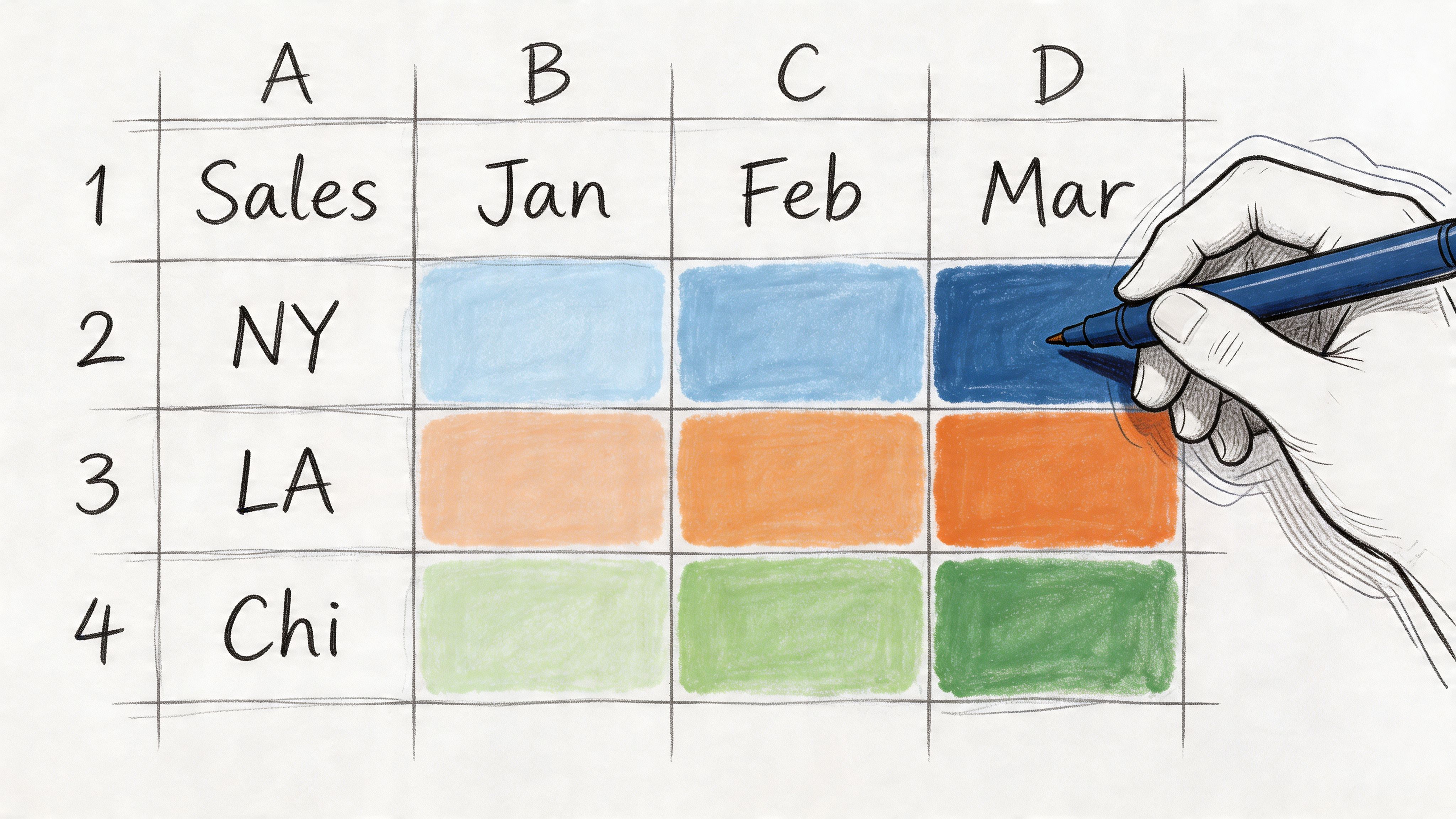
Suppose the sheet tracks weekly feature engagement. Features sit in rows, weeks sit in columns, and each cell holds a usage count.
Use this sequence:
Select only the numeric cells
Exclude row labels, date headers, notes, and totals unless you want them included in the color scale.Open Conditional Formatting
Go to Home > Conditional Formatting.Choose a Color Scale
Start with one of Excel’s built-in gradients. A three-color scale is usually the best first pass because it separates low, middle, and high values.Check the pattern before you tweak it
The first version is just a read on distribution. Look for hot rows, cold columns, and any cells that break the pattern.
That gets you to a useful visual quickly. If the table is clean and every column represents the same metric, this may be all you need.
Use a three-color scale when the midpoint matters
A lot of business data is not just low versus high. You often need to know what counts as normal.
Open Home > Conditional Formatting > Color Scales > More Rules > 3-Color Scale and set the thresholds yourself if Excel’s defaults are not giving you a fair read. A practical setup is:
Minimum:
=MIN(range)Midpoint:
=PERCENTILE(range,0.5)Maximum:
=MAX(range)
That midpoint works better than an arbitrary middle number when the distribution is uneven. I use manual thresholds whenever a built-in scale overstates small differences or hides a cluster in the middle.
Rule of thumb: Use fixed thresholds only when the business already has fixed definitions, such as SLA bands, score cutoffs, or quota tiers.
Hide values only when the pattern is the point
Numbers and color together can become noisy, especially in dashboard-style grids.
If the audience only needs the pattern, keep the cells functional and hide the displayed values with a custom number format:
Right-click the formatted range and choose Format Cells
Go to Custom
Enter
;;;
This is cleaner than changing the font color to match the fill. The underlying values still work in formulas, filters, and references.
The mistake that causes misleading heat maps
Do not apply one color scale across columns that represent different units.
If one column is revenue, another is conversion rate, and another is ticket volume, Excel will normalize them inside one visual range. That makes weak signals look strong and strong signals look ordinary. The result looks polished and reads badly.
Use this rule:
Situation | Better approach |
|---|---|
Same metric across all columns | Apply one scale across the whole range |
Different metrics by column | Format each column separately |
Presentation-first view | Hide values with |
Analysis needs exact values | Keep numbers visible |
If you want a refresher on the mechanics behind Excel visuals before formatting a table like this, this guide on how to graph in Excel is a useful reference.
Where this method works, and where it starts to break
Good fit
Weekly or monthly performance grids
Cohort analysis tables
Team-by-period comparisons
Fast exploratory work before a formal report
Weak fit
Mixed units in the same selected range
Exports with lots of blanks, merged cells, or text in the middle of the data
Reports that need consistent thresholds every week across many tabs
Shared workflows where several people need the same logic to refresh reliably
That trade-off matters. Conditional Formatting is excellent for immediate insight, but it is still spreadsheet logic tied to a workbook. Once the same heat map needs scheduled refreshes, governed definitions, or warehouse-scale data, it usually belongs in a more durable setup such as Querio, where the logic lives closer to the source instead of inside one analyst’s file.
Visualizing Summarized and Geographic Data
A plain cell heat map stops being useful when the question shifts to patterns across categories or patterns across places. At that point, Excel gives you two practical options: PivotTable heat maps for summarized comparisons, and Filled Map charts for regional analysis.
They solve different jobs. A PivotTable heat map helps when raw rows are too detailed to read. A Filled Map helps when location is part of the answer, not just a label.
Use a PivotTable when the raw table is too noisy
Event-level data rarely belongs in a heat map as-is. If you have columns like feature, week, segment, and usage count, color on the raw export usually creates visual noise instead of insight. Summarize first.
Create a PivotTable:
Select the source data.
Go to Insert and choose PivotTable.
Put one dimension in Rows, another in Columns, and your metric in Values.
Click inside the values area and apply Conditional Formatting with a color scale.
This works well for questions like product adoption by segment, support tickets by team and week, or revenue by region and month. Add slicers if the audience needs to switch date ranges or filter business units without rebuilding the view.
Keep the formatting tied to the PivotTable structure
The common failure point is scope. Analysts apply a color scale to the visible cells, refresh the pivot, and Excel leaves the new rows or columns outside the rule.
A few habits prevent that:
Apply the rule from inside the PivotTable so Excel recognizes the field structure
Open Manage Rules and confirm the rule targets the PivotTable, not a fixed cell range
Refresh after source changes to make sure the formatting still expands correctly
Avoid manual touch-ups on extra rows or columns if the file needs to stay repeatable
That last point matters in shared reporting. Manual formatting repairs feel harmless once. They become maintenance debt when the workbook is refreshed every Monday.
If you want more examples of layouts beyond the basic grid, this guide on how to make a heat map in Excel and beyond shows the progression from quick spreadsheet views to more scalable reporting setups.
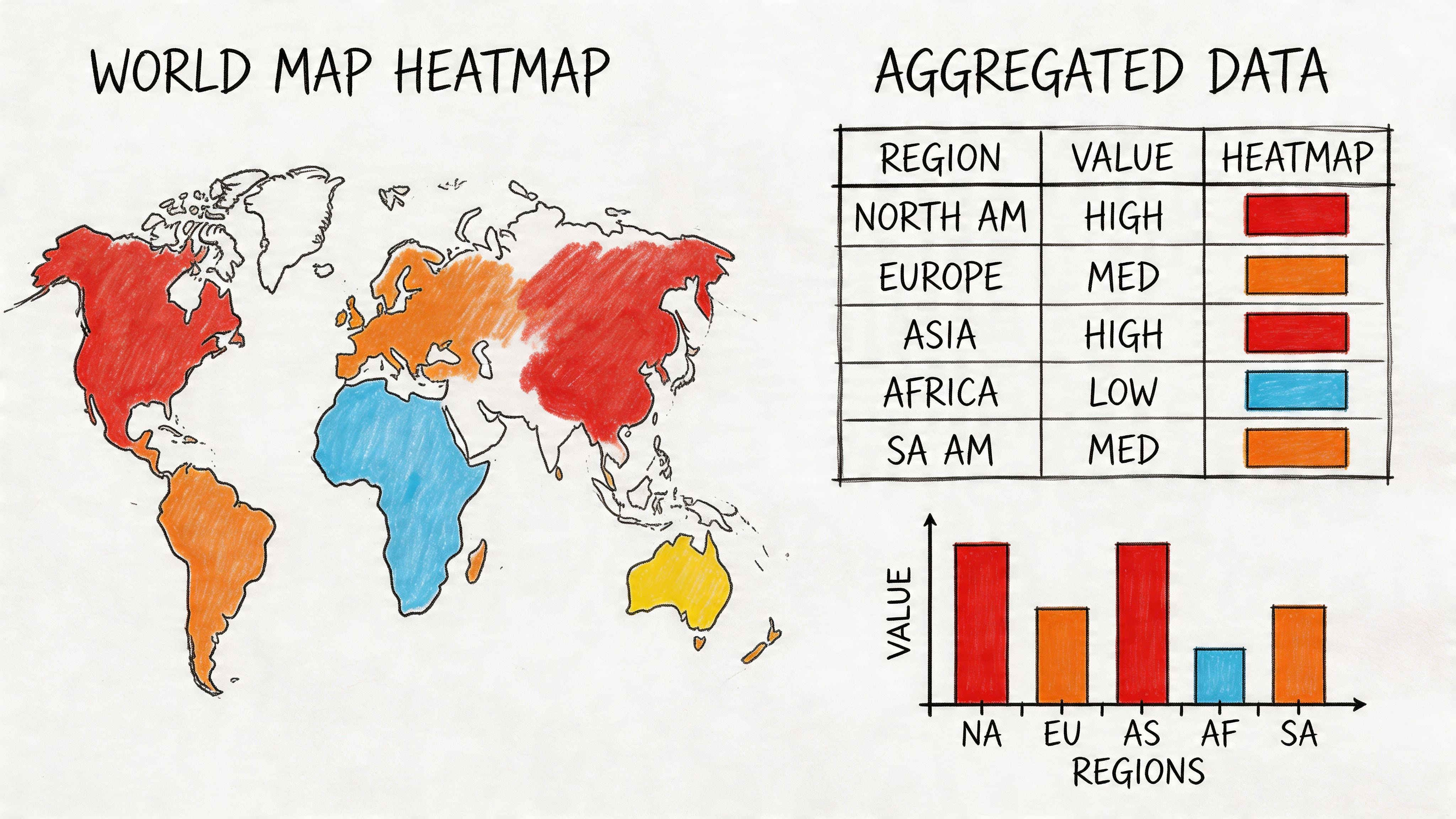
Use Filled Map when location is the point
Some questions need spatial context. Sales by state, users by country, and support load by territory all read faster on a map than in a ranked table.
To build a Filled Map:
Create a table with one geographic field and one metric.
Select the table.
Go to Insert.
Choose Maps.
Select Filled Map.
Excel will try to identify the geography automatically. It usually handles countries, states, and other standard regions well if the source values are clean and specific.
What Filled Map is good at
Filled Map works best when regional concentration matters more than exact rank.
Typical use cases:
Sales by US state
Active users by country
Support volume by region
Market penetration by territory
The chart highlights clusters fast. That makes it useful for questions like where demand is concentrated, where adoption is thin, or which territories need follow-up. If your audience needs precise comparisons between similar values, a sorted bar chart is often clearer. Good chart choice still follows basic data visualization best practices, especially when geography adds visual appeal but not analytical value.
What usually goes wrong with map heat maps
Filled Map is convenient, but it is easy to misuse. The biggest problem is ambiguous geography, followed closely by over-granular data that should have been aggregated first.
Problem | What it looks like | Better fix |
|---|---|---|
Ambiguous place names | Excel maps the wrong location | Use more specific labels such as state plus country |
Dirty geography fields | Some regions don’t render | Standardize spelling and naming before insert |
Overdetailed point data | Map becomes cluttered or misleading | Aggregate before mapping |
Wrong chart choice | You need exact comparison, not spatial context | Use a sorted bar chart instead |
One practical rule helps here. If the business question starts with "where," try a map. If it starts with "which is highest" or "how do these categories rank," start somewhere else.
Choosing between PivotTable and Filled Map
Use a PivotTable heat map for category-against-category comparison. Use a Filled Map when geography is the variable you need to interpret.
A quick guide:
Choose PivotTable heat map for feature by segment, product by month, team by day
Choose Filled Map for state by sales, country by usage, region by support load
Choose neither when exact numeric ranking matters more than pattern detection
Excel handles both well for ad hoc work. The limit shows up when data cleanup, aggregation, and refresh logic keep happening by hand. That is usually the point where analysts move the workflow closer to the warehouse in a tool like Querio, so the map or matrix is driven by reusable logic instead of one workbook that only one person fully trusts.
Fine-Tuning Your Heat Map for Clarity and Impact
A heat map usually fails for a simple reason. The colors are doing more work than the data preparation.
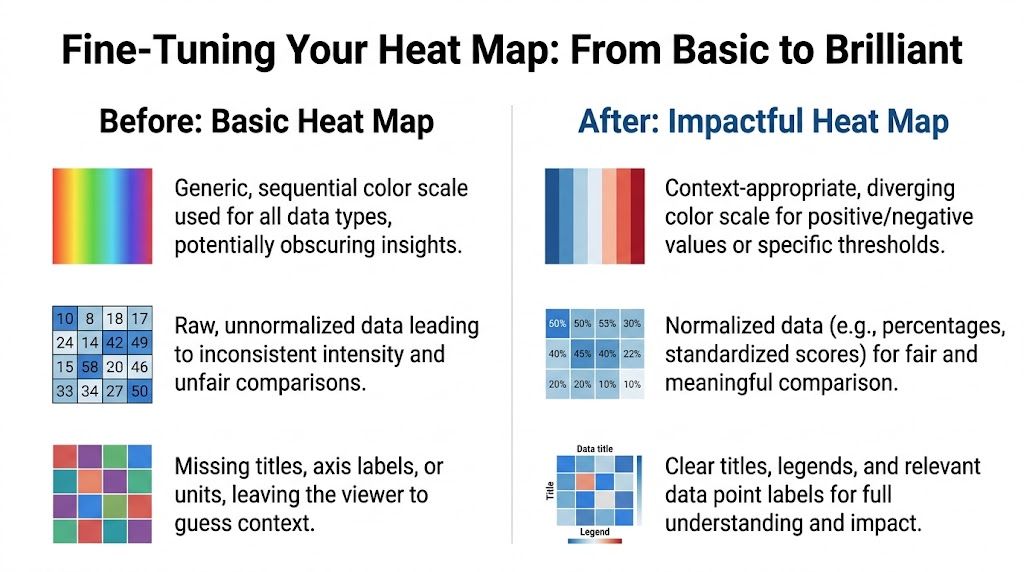
In Excel, it takes seconds to apply conditional formatting and much longer to make that formatting honest. If the range mixes percentages, counts, blanks, and placeholder zeros, the result looks polished but answers the wrong question. Good tuning starts with comparability.
Start with normalization, not cosmetics
Use color scales only after the values belong on the same scale. If one row shows conversion rate and another shows raw volume, a shared gradient creates false comparisons. Split those into separate ranges or standardize the numbers first.
A 3-Color Scale is often the right starting point because it lets you define low, midpoint, and high values based on the actual range in the table. Formula-based thresholds such as =MIN(range) and =MAX(range) keep the rule tied to the selected data instead of whatever preset Excel picked. Hiding displayed values with ;;; can also clean up a dashboard when the pattern matters more than the cell contents.
Use the rule that matches the decision:
Midpoint matters: use a three-color scale
Positive vs. negative matters: use a diverging palette
Columns use different units: apply separate rules
Stable benchmarking matters: set fixed thresholds instead of relative min and max
That last trade-off matters more than many teams expect. Relative scales are great for quick pattern detection, but they can distort week-over-week comparisons because the same value may change color as the range shifts.
For a broader reminder that chart design should follow the decision, not the decoration, these data visualization best practices from DataTeams are a useful reference.
Handle zeros and blanks deliberately
Under these conditions, many spreadsheet heat maps become misleading.
Excel treats zero as a valid low value. Sometimes that is correct. Sometimes zero means no activity yet, missing data, or not applicable. Those are different business states, and they should not share the same color treatment.
Decide what the cell means before you format it:
True low value: keep it in the scale
No data recorded: convert it to blank if that fits the business logic
Not applicable: exclude it from the rule
Temporary missing result: preprocess it before formatting
A practical custom rule is:
That pattern formats only nonblank cells above zero, which keeps empty or irrelevant cells from muddying the view.
Working rule: If a stakeholder could read “zero” as “poor performance” when it really means “no record,” fix the cell logic first.
Here’s a practical comparison:
Data condition | Wrong treatment | Better treatment |
|---|---|---|
Zero means no sales yet | Color it as the lowest performer | Exclude or neutralize if business logic requires |
Blank means missing input | Let scale ignore it inconsistently | Clean blanks before formatting |
Mixed metric columns | One shared scale | Separate rules by column |
Dashboard display | White font over colors | Custom number format |
Choose a palette that matches the question
Default red-yellow-green works, but only when the business meaning lines up with it. In many operating dashboards, red implies failure even when a lower value is good, such as cost per ticket or defect rate. That color choice can bias the read before anyone looks at the labels.
Sequential scales work better for showing intensity. Diverging scales work better for showing movement above and below a target. Strong rainbow gradients usually create visual boundaries that do not exist in the data.
Labels matter too. Add units. Add a clear title. If needed, add a legend or note the threshold logic beside the table. Heat maps are fast to scan, but they are also easy to misread when the reader has to guess whether a cell shows revenue, margin, rate, or variance.
If you want a stronger checklist for titles, labels, and visual hierarchy, Querio's guide to data visualization best practices is a useful companion.
A quick video can help if you want to see rule editing and heat map setup in action:
Treat conditional formatting like analysis logic
The best heat maps come from a simple question: what comparison should be obvious within two seconds?
That changes how you build them. You stop picking colors first and start defining thresholds, handling missing values, and separating metrics that should not share a scale. Excel is good at this kind of fast, hands-on analysis. Once the same heat map needs repeatable logic, shared definitions, and scheduled refreshes, the better move is usually to push the prep work closer to the warehouse and let a tool like Querio handle the repeatable part.
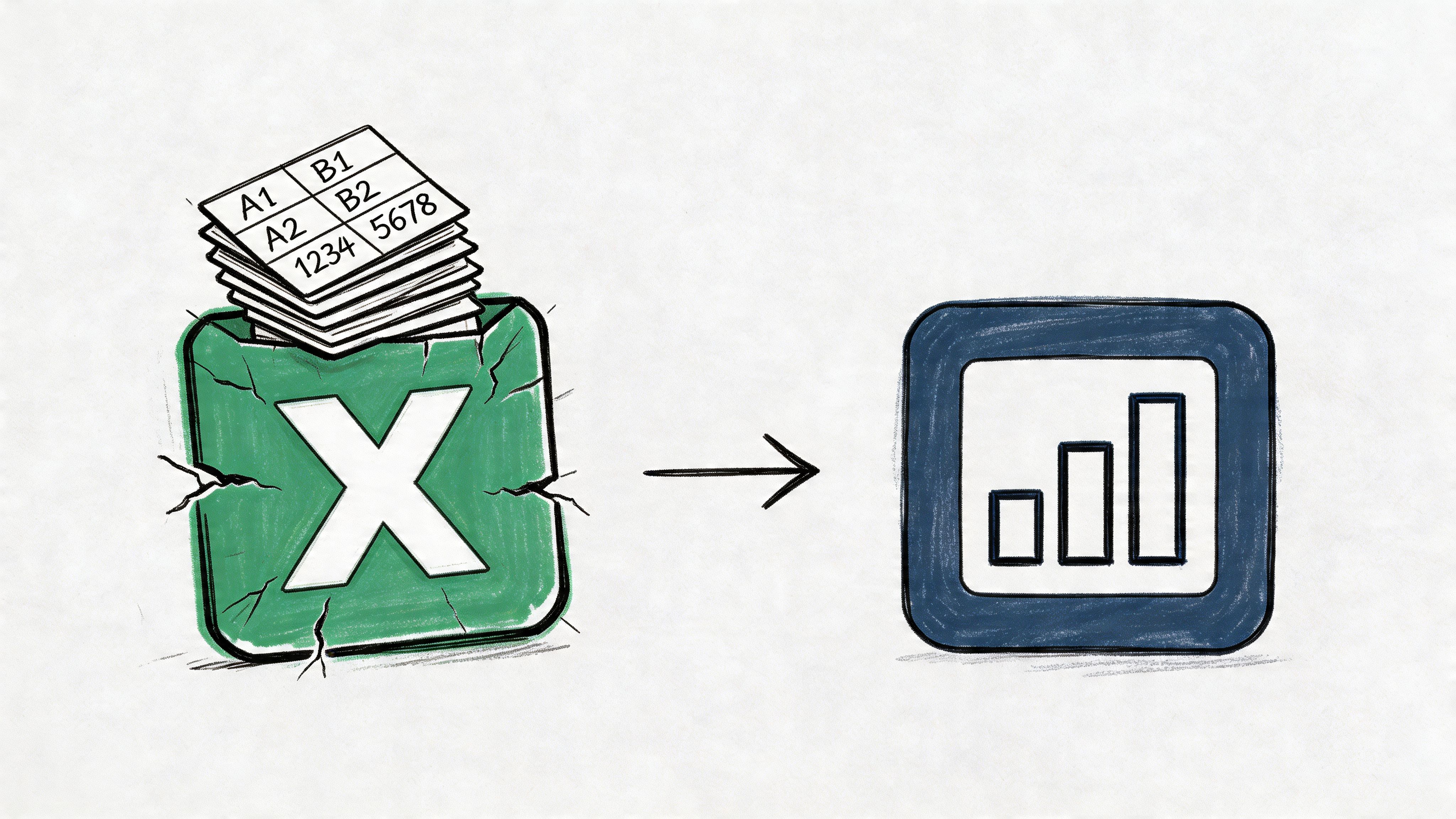
When to Move Beyond Excel for Heat Map Analysis
Excel is excellent for quick analysis. It’s less excellent when the heat map becomes a recurring workflow instead of a one-time investigation.
The shift usually happens gradually. First, someone exports data from the warehouse into CSV. Then another person cleans columns manually. Then conditional formatting gets copied over. Then a stakeholder asks for the same view every Monday, but filtered slightly differently. That’s when the spreadsheet starts acting like a fragile reporting pipeline.
Signs Excel is hitting its ceiling
A few signs show up repeatedly:
Refreshes are manual and depend on one analyst remembering each step
Files become slow when too much shaping and formatting lives in one workbook
Definitions drift because different people duplicate and tweak versions
Collaboration gets messy when teams pass around attachments instead of working from one source of truth
Self-serve stalls because business users still need someone technical to prepare the file
None of these mean Excel is bad. They mean the process around Excel has become the bottleneck.
What changes in a warehouse-native setup
A more scalable model keeps the data in the warehouse and moves analysis logic closer to it. That matters because repeatable heat maps usually need more than formatting. They need stable joins, consistent definitions, refreshable inputs, and a way for multiple people to ask adjacent questions without rebuilding the workflow from scratch.
In practice, that gives teams a better split of responsibilities:
Need | Excel approach | Warehouse-native approach |
|---|---|---|
Quick one-off analysis | Fast and flexible | Also possible, but more setup |
Repeatable reporting | Manual refresh burden | Automated and consistent |
Shared definitions | Easy to drift | Centralized logic |
Large, evolving datasets | Fragile workbook process | Better operational fit |
Excel is strongest when one person needs an answer quickly. It weakens when a whole company starts depending on the same manual file.
That doesn’t mean abandoning spreadsheets. It means using them where they shine, then promoting stable analyses into a system that can handle recurring demand, broader access, and warehouse-scale data without turning the data team into a human relay layer.
Putting Your Data to Work with Heat Maps
A good heat map does something simple and valuable. It shortens the distance between data and judgment.
You can start small. Apply a color scale to a weekly metrics table and see what jumps out. Move up to a PivotTable when the raw export is too detailed. Use a Filled Map when geography matters. Fine-tune the rules when zeros, blanks, and mixed metrics start distorting the story.
That progression matters because it matches how analysis usually works in real teams. You begin with a quick question. Then the same question comes back with more nuance, more stakeholders, and more need for consistency.
If you want to sharpen the design side of that work, these proven data-driven design strategies from DesignGuru are a useful complement to the Excel techniques above.
The practical goal isn’t to make a colorful spreadsheet. It’s to make patterns visible early enough that someone can act on them. When your heat map does that, it’s doing its job.
If your team has outgrown manual spreadsheet workflows and wants self-serve analysis directly on warehouse data, Querio is worth a look. It gives teams a way to move from one-off Excel heat maps to repeatable, warehouse-native analysis with custom Python notebooks, without forcing every question through an analyst queue.

