Stacked Bar Graph Tableau: Create Stunning Visuals That Drive Insights
Learn how to create a stacked bar graph tableau in Tableau, from data prep to advanced visuals that reveal clear insights and boost engagement.
published
Outrank AI
stacked bar graph tableau, tableau data visualization, tableau for beginners, tableau charts, business intelligence
955035a3-4d72-454a-b91a-4dd8e74fc2c0

A stacked bar graph in Tableau is one of the most practical charts you can master. It’s perfect for showing how different pieces contribute to a whole—think of breaking down total revenue by product line or seeing which marketing channels make up your quarterly spend.
Essentially, you're stacking segments on top of each other inside a single bar. This lets you compare the totals at a glance while also digging into the composition of each bar. It’s a core skill for turning a dense spreadsheet into a clear, compelling story.
The Power of a Stacked Bar Graph
Before we get into the nuts and bolts of building one, it's worth understanding why this chart type is such a staple in business intelligence. It’s not just about making data look good; it’s about providing multiple layers of insight in a single view. The demand for these skills is exploding—the global Tableau Services market is expected to jump from USD 1.5 billion in 2025 to a massive USD 5.4 billion by 2035, as detailed in this Tableau Services market research.
A great stacked bar graph tells two stories at once. The total length of the bar shows the big picture (like total sales per region), while the colored segments inside reveal the details (like which product category drove those sales). This dual perspective is what makes it so effective for business reporting.
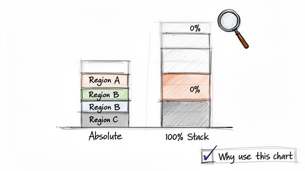
Standard vs. 100% Stacked Bars
In Tableau, you’ll be working with two main types of stacked bars. Knowing which one to use is crucial.
Standard Stacked Bar Graph: This is your best bet when the absolute totals matter just as much as the breakdown. You can see that Q3 had higher total revenue than Q2 and see that a new product launch was the reason. The focus is on comparing both the overall size and the internal composition.
100% Stacked Bar Graph: This chart is all about proportion. It normalizes every bar to 100%, so you can easily compare the relative mix of segments across different categories. It’s perfect for answering questions like, "What is the percentage breakdown of our customer segments in North America versus Europe?" The actual total number of customers in each region doesn't affect the visual.
So, how do you decide? This table breaks it down for common business scenarios.
Choosing Between Standard vs. 100% Stacked Bars
This table will help you decide which stacked bar graph is the right choice for your specific analytical needs.
Scenario | Best Chart Choice | Why It Works |
|---|---|---|
Comparing total quarterly revenue broken down by three product lines. | Standard Stacked Bar | You need to see if total revenue is growing and which product lines are contributing to that growth. |
Analyzing the shift in subscription tier mix (Basic, Pro, Enterprise) over time. | 100% Stacked Bar | The goal is to see if the proportion of Enterprise customers is increasing, regardless of total subscriber count. |
Showing departmental budget spending across an organization. | Standard Stacked Bar | Comparing the absolute spending of the Engineering department vs. the Marketing department is important. |
Visualizing survey responses ("Agree," "Neutral," "Disagree") by age group. | 100% Stacked Bar | You want to compare the distribution of sentiment between age groups, not the number of respondents in each. |
Ultimately, your choice depends entirely on the question you're trying to answer for your audience.
Key Takeaway: Use a standard stacked bar to show part-to-whole relationships alongside total values. Switch to a 100% stacked bar when you only care about comparing the proportional mix of segments across your categories.
Getting this right is a fundamental part of effective data storytelling. While stacked bars are a workhorse, they're just one option in your toolkit. To explore other visuals, check out our data visualization guide on choosing the right charts for your data.
Setting Up Your Data for Flawless Tableau Charts
Every great stacked bar graph begins long before you drag a single pill onto the canvas. The real magic happens in the data prep stage. A few minutes spent structuring your data correctly will save you a massive headache later and ensure your chart is actually telling the right story.
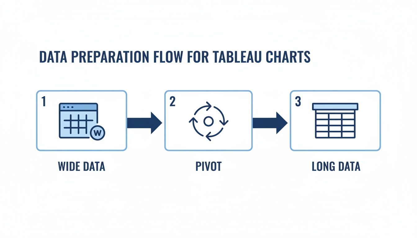
I can't tell you how many times I've seen a chart go wrong because the data was in the wrong shape. Tableau, and most BI tools for that matter, strongly prefer "long" data. This means you have one column for your numbers (like Sales) and other columns that describe what those numbers are (like Region or Date). The problem is, data often comes to us in a "wide" format, especially from Excel, where every time period or category has its own column.
Transforming Your Data from Wide to Long
Let's say you're looking at product sales, and your spreadsheet has columns like Jan Sales, Feb Sales, and Mar Sales. While this makes sense in a table, it’s a non-starter for building a proper stacked bar chart in Tableau.
This is where Tableau's built-in Pivot feature is a lifesaver. You don't need to mess with complex formulas or external tools. Just go to the Data Source page, hold down Ctrl (or Command on Mac) to select all your wide columns (Jan Sales, Feb Sales, etc.), right-click, and hit "Pivot."
Tableau immediately works its magic, creating two new columns:
Pivot Field Names: This will contain your original column headers. You should rename this right away to something intuitive, like "Month."
Pivot Field Values: This contains all the sales numbers that were previously spread out. A good new name would simply be "Sales."
Just like that, your data is in the perfect "long" format, ready for visualization.
Pro Tip: Don't skip renaming your pivoted fields. Leaving them as "Pivot Field Names" and "Pivot Field Values" is a recipe for confusion once you get to the worksheet. Give them meaningful names now while it's fresh in your mind.
Quick Data Cleaning Fixes
With the structure sorted, a few final checks can prevent common pitfalls. Before you jump into building the chart, take a second to scan for inconsistencies that could throw off your numbers.
For example, having both "USA" and "United States" in a country field will cause Tableau to treat them as two separate places, splitting your bars incorrectly. You can fix this in a snap by right-clicking a value and using "Edit Alias" to standardize them.
Also, double-check that your data types are correct. Your sales figures should be a Number (decimal) or Number (whole), and your categories should be set to String. Getting these basics right is crucial for accurate charts. If you need a more thorough guide, you can learn more about how to clean up data here. These small steps ensure a smooth build process and a final visualization you can actually trust.
Building Your First Stacked Bar Graph
Once your data is clean and properly structured, you’re ready for the fun part: building the visual. We're going to create your first stacked bar graph in Tableau. The real goal here isn't just to follow steps, but to understand the logic behind how Tableau builds these charts. It's actually quite intuitive.
Let's use a classic business scenario. Imagine you need to visualize total sales by region, but you also want to see the breakdown of which product categories contribute to those sales. This is a perfect use case for a stacked bar graph.
You’ll start by building a basic bar chart. First, drag your primary category—the Dimension Region—onto the Columns shelf. Then, pull your numerical value—the Measure Sales—onto the Rows shelf.
Just like that, you have a simple bar chart showing the total sales for each region. Now, let's add the "stacks."
Creating the Stacks with Color
To break each bar down into segments, you simply need to introduce another dimension. This second dimension tells Tableau how to slice up the total sales within each bar.
Find your Product Category dimension in the data pane and drag it directly onto the Color button on the Marks card. Instantly, those solid bars will transform into a multi-colored stacked graph. Each segment’s color represents a specific product category, while the total height of the bar still shows the total sales for that region.
This drag-and-drop magic is possible because of how Tableau handles data. The chart below shows why getting your data into a "long" format first is so critical—it unlocks this kind of powerful, flexible analysis.
This process, moving from a wide spreadsheet to a clean, long structure, is the foundation for creating flexible charts like this. It’s no surprise that major companies rely on these visuals. In fact, there are 52,790 verified companies using Tableau, including giants like Walmart and Apple, which shows just how essential these charts are for clarifying complex business metrics. You can learn more about Tableau's widespread industry adoption on data.landbase.com.
Converting to a 100% Stacked Bar
But what if your goal is to compare the proportion of sales, not the absolute totals? For instance, you might want to know if the 'Technology' category makes up a larger percentage of sales in the West compared to the East. For that, you’ll want a 100% stacked bar.
You don't have to rebuild your chart from scratch to do this. It’s a simple one-click change using a Quick Table Calculation, which makes it easy to flip between absolute and proportional views.
To make the switch, here's what you do:
Locate the
SUM(Sales)pill, which should be on your Rows shelf.Right-click it to open the context menu.
From there, go to Quick Table Calculation and select Percent of Total.
Your chart will immediately reconfigure, with each bar stretching to a full 100% and the segments showing their relative contribution.
You might notice the calculation seems off at first—that's a common "gotcha." To fix it, right-click the SUM(Sales) pill again, choose Edit Table Calculation, and under the Compute Using option, select Table (down). This tells Tableau to calculate the percentage within each bar (i.e., for each Region), giving you the accurate proportional view you were looking for.
Customizing Your Chart for Impact and Clarity
Getting a basic stacked bar graph in Tableau on the screen is the easy part. The real magic happens in the details—the small tweaks and thoughtful customizations that transform a simple data plot into a compelling story. This is how you go from just showing numbers to guiding your audience toward a specific, unmissable insight.
So, where do you start? I almost always begin with sorting. Tableau’s default alphabetical sort is rarely the most insightful view. A much better approach is to arrange the bars by their total value. This immediately draws the eye to the biggest contributors, whether that's top-performing regions or most profitable products.
It’s a quick fix: just right-click the dimension pill on your Columns shelf (e.g., Region), navigate to Sort, and switch the Sort By dropdown to Field. From there, you can pick your measure (like Sales) and set the order to Descending. Just like that, your most important bar is front and center.
Strategic Sorting and Ordering
Beyond the main bars, you also have control over the order of the segments within each bar. This is a subtle but incredibly effective way to shape the narrative.
Think about what you want to compare. If your goal is to show how the 'Technology' category is doing across all regions, you need to place it at the bottom of every stack. This gives it a consistent baseline (the x-axis), making it easy to see if that segment is growing or shrinking from one bar to the next. The other segments become harder to compare directly, so always put your most important category at the base.
To do this, you don't need a complicated menu. Just find your color legend and manually drag the items up or down. It’s a simple drag-and-drop that gives you full control over how your story unfolds.
Using Color and Labels Deliberately
Color is communication. Don't let Tableau’s default rainbow palette make decisions for you—use color with purpose.
Brand Alignment: Pull in your company’s brand colors. This not only looks professional but also makes the visual instantly recognizable when embedded in reports or presentations.
Highlighting a Category: This is a classic technique for a reason. Color one key segment in a bold, saturated hue and turn everything else a neutral gray. This immediately tells your audience, "Look here. This is what matters."
Sequential Palettes: If your segments have a natural progression (like customer satisfaction scores from "Poor" to "Excellent"), use a sequential color palette that goes from light to dark. This visually reinforces the inherent order in the data.
By thoughtfully applying color and sorting, you move from simply presenting data to actively guiding your audience through a story. The goal is to make the key insight obvious within the first three seconds of viewing the chart.
Next up is labeling. Too many labels create an unreadable chart, but too few can leave your audience guessing. I find a good balance is to either label only the most critical segments or add a grand total to the top of each bar.
To add totals, drag your measure (like Sales) onto the Label mark on the All Marks card. If you only want to label certain segments, you can do the same thing but on the Marks card for that specific field. For a deeper dive into these techniques, our guide on the best practices for data visualization has a ton of great advice.
Finally, don’t forget to clean up your Tooltips. The default tooltip is functional, but you can make it so much better. Edit it to include extra context without cluttering the main view—think percentages, year-over-year changes, or related data points. This empowers curious stakeholders to dig deeper on their own, right inside your stacked bar graph.
Where Stacked Bars Get Really Interesting
Once you’ve nailed the basics, you can start asking much more interesting questions with your data. This is where stacked bar charts really begin to shine—when you combine them with other Tableau features to build visuals that tell a deeper, more nuanced story.
We're moving beyond simple part-to-whole charts now. Let's dig into a few practical, advanced scenarios I use all the time: showing a total trend alongside its components, tracking customer cohorts, and making sense of survey data. These techniques are what separate a standard report from a true analytical tool.
Combining Totals and Breakdowns with a Dual-Axis Chart
One of the most powerful things you can do with a stacked bar is pair it with a line graph. This technique, called a dual-axis chart, is perfect for when you need to show both the composition of a number and its overall trend at the same time.
Think about tracking quarterly revenue. A stacked bar is great for showing how much Software, Hardware, and Services each contributed. But what if total revenue is flat? Or growing? Adding a line graph for Total Revenue over the top instantly gives you that big-picture context. You can see both the internal mix and the overall trajectory in one glance.
Building this is pretty straightforward:
First, create your standard stacked bar with your date on Columns, your measure on Rows, and the dimension you're segmenting by (like
Product Category) on the Color mark.Now, drag that same measure pill (e.g.,
SUM(Sales)) onto the Rows shelf again, placing it to the right of the first one.Right-click this new pill and select Dual Axis. You’ll probably see two overlapping charts. To fix this, right-click the axis on the right side and choose Synchronize Axis.
Finally, head to the Marks card for your second measure and change the chart type from Automatic to Line.
With this one visual, you can now answer two critical business questions: "How is our total performance changing over time?" and "Which segments are driving that change?"
A Tip from Experience: I always make the line graph a darker, bolder color and a bit thicker. This helps the total trend line pop against the colored segments of the bars, making it much easier to read and avoiding a cluttered look.
Visualizing Customer Retention with Cohort Analysis
You might not immediately think of a stacked bar for cohort analysis, but it's actually one of my favorite ways to visualize customer retention. A cohort is just a group of people who share a common starting point—think of them as a "graduating class." For example, everyone who signed up for your product in January 2024 is one cohort.
Using a 100% stacked bar chart is the key here. It allows you to track the activity of these groups over subsequent months.
Each bar can represent a different sign-up cohort (January, February, March). The segments within each bar then show the percentage of those original users who were still active in Month 1, Month 2, Month 3, and so on.
For instance, the "January" cohort bar would show 100% were active in their first month. The next segment might show only 45% came back in their second month, and 30% in their third. By creating a bar for each monthly cohort and placing them side-by-side, you can spot retention trends instantly. Is the product getting stickier for newer users? Or is retention getting worse? The visual pattern makes the answer jump right out.
Making Sense of Likert Scale Survey Data
Here’s a less common but incredibly useful application: analyzing survey feedback. When you're working with a Likert scale (the classic "Strongly Disagree" to "Strongly Agree" options), a 100% stacked bar chart is a fantastic tool for seeing the distribution of sentiment at a glance.
Instead of staring at a spreadsheet of responses, you can create a single bar for each survey question. Then, use the colored segments to show the percentage of people who chose each response.
This immediately turns rows of raw data into a comparative visualization. You can quickly see which questions elicited the strongest positive or negative feelings and easily compare sentiment across different topics or even demographic groups. It’s a simple but effective way to find the real story in your survey data.
Common Stacked Bar Graph Mistakes to Avoid
A stacked bar graph in Tableau is a fantastic way to show how different parts contribute to a whole. But I’ve seen them go wrong in so many ways, leading to charts that are more confusing than insightful. Knowing the common traps is the best way to make sure your visuals tell a clear and honest story.
One of the most common missteps is cramming too many segments into one bar. This creates what I call the "rainbow effect"—a messy sliver of colors where it’s impossible to track any single category, let alone compare them. Your chart quickly becomes a visual mess instead of a source of clarity.
My rule of thumb: If you have more than five to seven segments, your stacked bar is probably doing more harm than good. A simple fix is to group the smallest, least important categories into an "Other" bucket.
This small change instantly cleans up the chart, letting your audience focus on the segments that actually drive the narrative. It’s all about guiding their attention, not overwhelming them.
The Comparison Challenge
Here's another classic trap: it’s nearly impossible to accurately compare any segment that isn't sitting on the bottom baseline. The first segment is easy to track across bars because it always starts at zero. Every other segment, however, starts at a different, floating point.
For example, look at a chart showing sales by region. You can’t easily tell if the 'Corporate' segment (the middle slice) is bigger in the West or the East just by eyeballing it. Our brains are terrible at judging the length of an object that’s floating in the middle of other objects.
If your main goal is to compare the performance of individual segments, you’re probably using the wrong chart. To dig deeper into choosing the right visual for your data, our guide on when to use a bar graph vs. a histogram has some great pointers. A grouped bar chart, for instance, puts every segment on the same baseline, making direct comparison easy, though you do lose that at-a-glance total.
Hiding the Truth with Percentages
Finally, be really careful with the 100% stacked bar. While it's perfect for showing shifts in proportion or mix, it completely hides what's happening with the absolute totals. A region could show a growing percentage of high-margin sales—which looks fantastic—but the chart won't reveal that the region's overall sales are actually plummeting.
You might see 'Software' sales jump from 20% to 40% of the total mix. But is that 40% of $1 million or 40% of $100,000? Those are two very different stories.
Before you commit to a 100% stack, ask yourself if the total value is a critical part of the narrative. If it is, stick with a standard stacked bar, or better yet, use a dual-axis chart to show both the percentage mix and the total trend line.
Answering Your Top Tableau Stacked Bar Questions
Even after you've built a few stacked bars, some specific challenges always seem to pop up. Over the years, I've seen the same questions come from both brand-new Tableau users and seasoned pros. Let's walk through a few of the most common ones.
Think of these as the finishing touches that can take your chart from good to great.
How Do I Sort the Segments Inside Each Bar?
This is probably the most frequent question I get, and thankfully, it has a simple answer. The quickest trick is to just drag and drop the items directly in your color legend. If you want 'Technology' at the bottom of the stack, just drag it to the bottom of the legend. Tableau updates the chart instantly. Easy.
For more fine-grained control, you'll want to head over to the Marks card. Right-click the dimension you have on Color and choose 'Sort'. This opens up a world of possibilities. You can sort:
Alphabetically: A simple A-Z or Z-A sort.
By Data Source Order: This just uses the default order from your database.
By Field: This is where the magic happens. You can sort the segments based on another measure, like
Sales. I almost always sort descending by sales value, which pushes the largest segment to the bottom of the bar. This creates a stable baseline and makes comparisons much more intuitive.
Can I Show Both the Value and the Percentage in My Labels?
Yes, you can, but it requires a bit of creative thinking. Tableau doesn’t let you drag two different measures onto the Label mark, so we have to combine them ourselves into a single string using a calculated field.
Here’s a formula I use all the time to show both the raw sales number and its percentage of the total for that bar:
STR(SUM([Sales])) + " (" + STR(ROUND(SUM([Sales])/TOTAL(SUM([Sales]))*100, 1)) + "%)"
Once you create this calculation, just drag it onto the Label shelf. Suddenly, your audience gets the full story—the absolute value and its relative contribution—without having to hover for a tooltip.
A quick tip on this: clean formatting is crucial. Combining numbers can get messy. Using parentheses, as I did in the formula, helps separate the values and makes the final label much easier to read.
When Is a Grouped Bar Chart a Better Choice?
This is a critical strategic question. The answer depends entirely on the question you want your audience to answer. A stacked bar is fantastic for showing a whole and its parts, but it's not great for comparing the absolute size of those parts across different bars.
For instance, it’s nearly impossible to tell if the 'Office Supplies' segment (stuck in the middle of your stack) is bigger in the East region versus the West region. Your eyes just can't make that comparison accurately.
So, here's the rule of thumb:
Use a stacked bar graph when the main goal is to compare the totals across categories and understand the composition of each total. (e.g., "What were our total sales in the East, and which product category contributed the most?")
Use a grouped bar chart when the main goal is to compare the absolute values of the individual segments against each other. (e.g., "Did we sell more 'Furniture' in the West or the South?")
Ready to move beyond manual chart building and empower your entire team with self-serve analytics? Querio deploys AI agents that allow anyone, regardless of technical skill, to ask questions and get insights directly from your data warehouse. See how you can get faster, more flexible answers by exploring Querio.

