Mastering Bullet Graph Tableau: 2026 Guide
Master the Bullet Graph Tableau in 2026! Our guide covers data prep, targets, formatting, & best practices for powerful KPI visualization. Learn step-by-step.
https://www.youtube.com/watch?v=pKljwpKsbic
published
Outrank AI
bullet graph tableau, tableau tutorial, data visualization, kpi dashboard, tableau charts
a1e9c3be-967a-4d6c-8132-a459d2946b76

You're probably staring at a dashboard where every region has a bar, every bar has a number, and none of it answers the one question your team cares about, are we hitting the goal or missing it? That's the gap a Bullet Graph in Tableau closes. It keeps the chart compact, but adds the context that turns a raw value into a performance decision.
Table of Contents
Why Bullet Graphs Matter Beyond Basic Bars
A product manager can usually get a bar chart on a slide in minutes. The problem is that a bar chart shows size, not judgment. If you're comparing user engagement across regions, a tall bar might look impressive, but it doesn't tell you whether the region is above plan, below plan, or barely holding the line.
That's where a bullet graph earns its keep. Tableau's own quick-start guidance shows it as a standard chart type inside Show Me, where users connect to the World Indicators data source, multi-select Tourism Inbound and Tourism Outbound, then choose Bullet Graph and place Region on Rows. Tableau mirrors the same workflow in localized help pages, which is a strong signal that this isn't a niche trick. It's part of Tableau's core chart vocabulary, and that matters when you're teaching analysts how to communicate performance clearly. Tableau's bullet graph quick-start documentation
The strategic value is simple. A bullet graph compares one primary measure against a target or benchmark, while adding just enough visual context to make the result interpretable at a glance. That's why it works better than a standard bar chart when the business question is about attainment, not ranking. If you're choosing between chart types, this is the kind of chart that belongs in a KPI dashboard, not a decorative report. A useful companion framework for deciding when to use it is this chart-selection guide.
Practical rule: use a bullet graph when the audience needs to compare performance against a goal, not when they just need to sort categories.
Preparing Your Data and Understanding the Components
A bullet graph only works cleanly when the data model is already aligned with the visual logic. At minimum, you need one dimension for the category, such as product, region, or team, and at least two measures, usually an actual value and a target or benchmark. Tableau's bullet graph guidance describes it as a bar chart with extra encodings that show progress toward a goal or performance against a reference line, and it also notes the need for at least two measures for actual-versus-target comparison. Tableau's bullet graph overview
What belongs in the source table
A clean dataset for bullet graph Tableau work usually looks like a performance table where each row is a category and the measures sit side by side. For a sales example, that might mean Product Category as the dimension, plus Sales Actuals and Sales Target as measures. If your target is derived, calculate it before you start building the view so the logic stays traceable.
The chart itself has three conceptual layers:
Primary measure bar, the actual performance value.
Comparative measure marker, the target or reference point.
Context bands, the shaded regions that help people interpret whether performance is poor, acceptable, or strong.
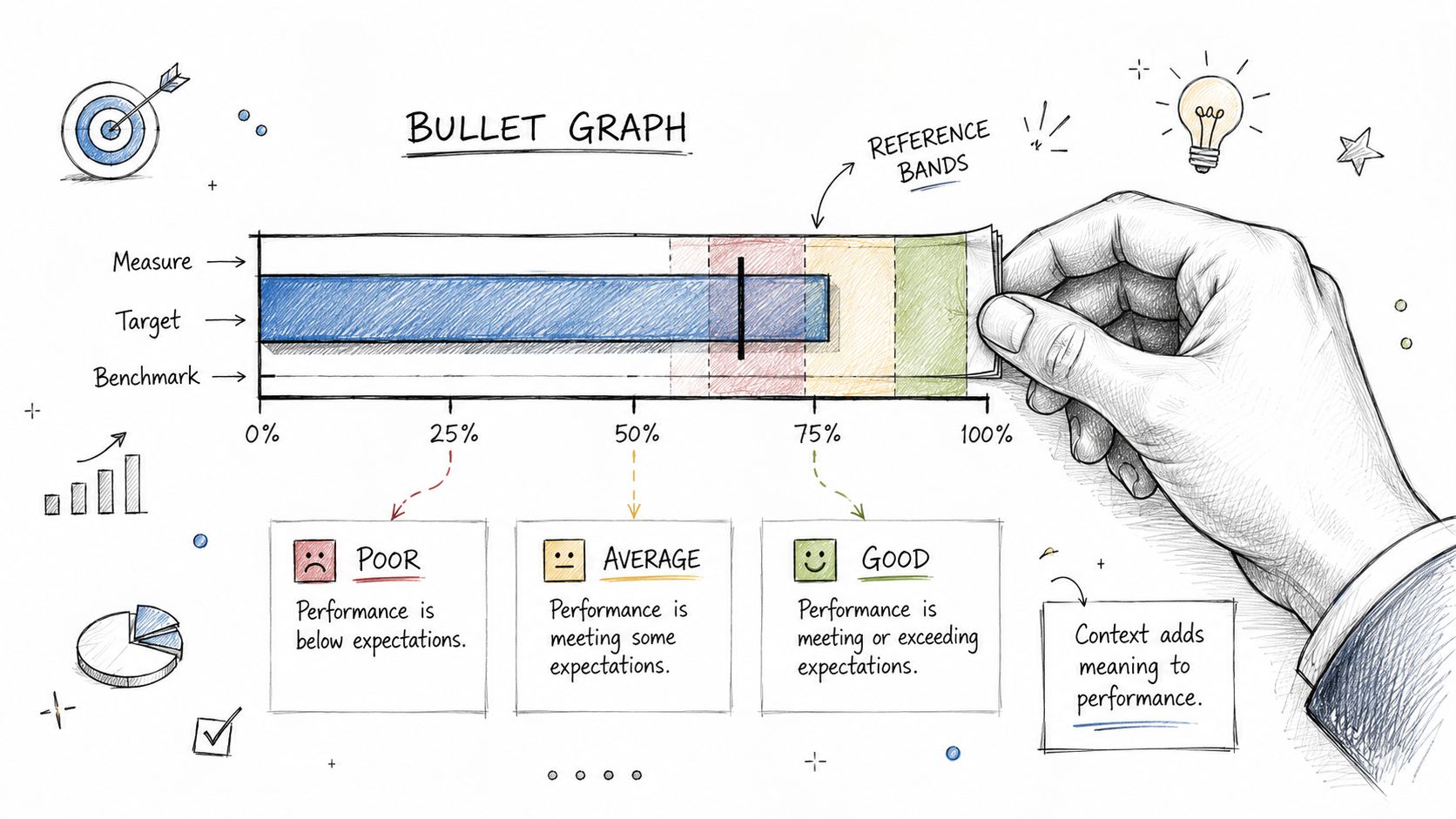
Those context bands matter because they let the chart communicate more than pass-fail status. Tableau's documentation and tutorials show examples built around thresholds like 60% and 80% of a reference value, or shaded bands at 50%, 75%, 100%, and 150% of budget. Those thresholds aren't decoration. They're how the chart compresses performance tiers into a single view. If you want to keep your field calculations organized while prepping the data, this Tableau calculated-field reference is a useful companion.
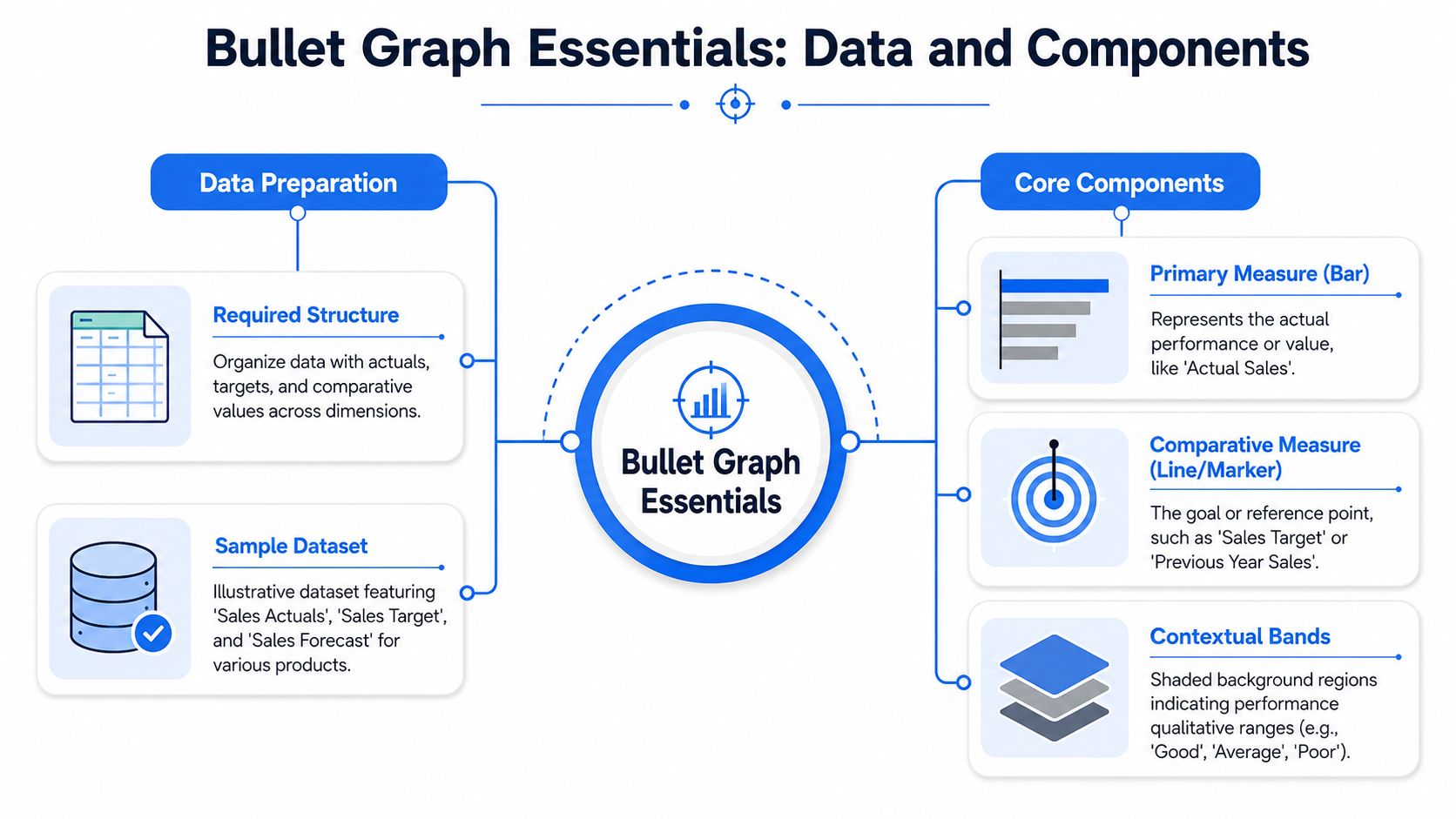
A common mistake is to treat the target as just another number. It isn't. The target defines the frame of reference, so if that measure is inconsistent across categories, the chart becomes hard to defend in a review.
The Core Build Creating Your First Bullet Graph
Start with the dimension that defines each row of comparison. In Tableau, that usually means dragging Region, Category, or another business grouping onto Rows, then bringing the actual measure into the view so the chart has something concrete to draw. From there, the bullet graph pattern emerges by adding the target measure as the comparison layer, not as a separate chart.
The most reliable build for a true comparative overlay uses a dual-axis structure. That lets Tableau render the bar and the target marker on the same categorical row while keeping both measures on a shared scale. Once the second measure is in place, synchronize the axes and hide the extra header. If you skip that synchronization, the overlay can drift, and the chart may look precise but be misleading.
A short workflow that keeps the build stable:
Place the dimension first, so each mark represents one business category.
Add the primary measure, then format it as the main bar.
Add the target measure, then convert the view to a dual axis.
Synchronize the axes, so both measures share one scale.
Hide the redundant axis header, which keeps the view clean.
The reason this matters is practical, not cosmetic. A dual-axis chart can be dangerous if the two scales don't match, because a target marker may appear to sit above or below the actual value incorrectly. That's one of the most common failure modes in Tableau bullet graphs, along with using the wrong aggregation for the target. A walkthrough of the same pattern, including the warning about Per Cell scope for benchmarks, is captured in this dual-axis and sync-focused tutorial.
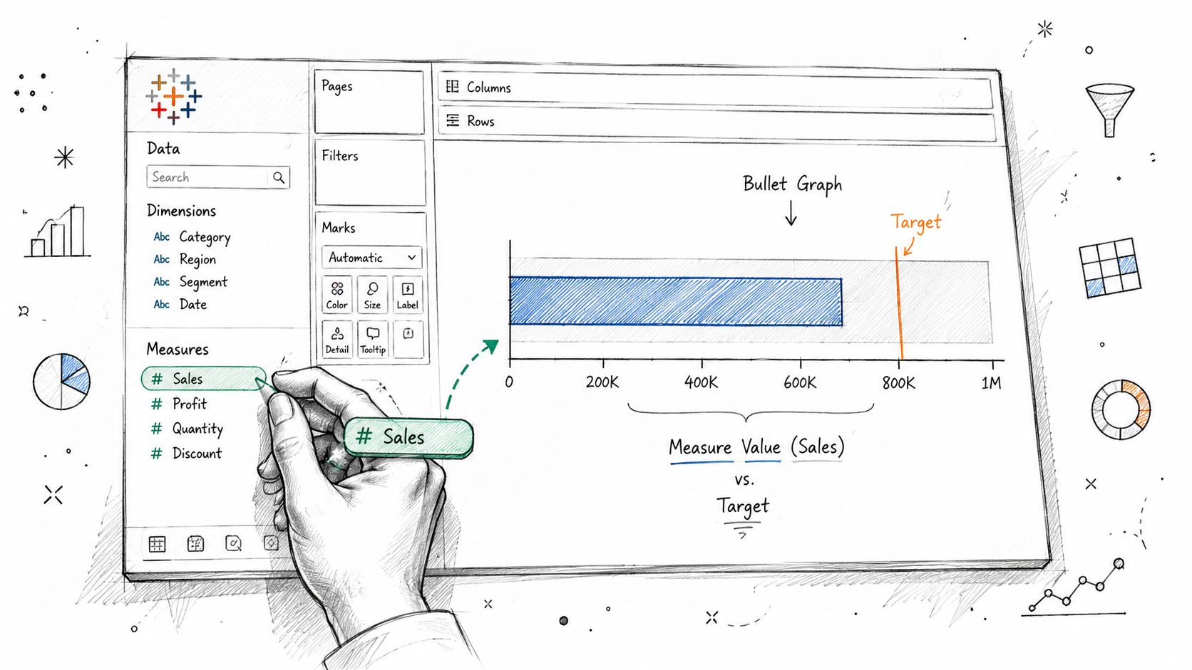
Watch the scope carefully: if the reference line or band is set at the wrong level, Tableau may apply a pane-wide value where each category needs its own benchmark.
A useful habit is to keep the first version ugly but correct. Get the scale, overlay, and target relationship right before you spend time polishing colors or labels. If the structure is off, no amount of formatting will save the chart.
For teams coming from stacked bars, the build feels familiar at first and then diverges fast. A stacked bar emphasizes composition, while a bullet graph emphasizes attainment, so the fields may look similar but the analytical intent is different. That difference is why a stacked-bar mindset can lead you into a misleading target overlay, and a side-by-side comparison like this stacked-bar Tableau reference helps reinforce the distinction.
Adding Context with Reference Lines and Bands
A target line tells the audience where the goal sits. A band tells them how to interpret the gap. That distinction is what makes a bullet graph more than a narrow KPI marker, because the background stops being neutral and starts acting like a performance rubric.
In Tableau, the cleanest approach is to add reference bands or a distribution band to each category rather than to the whole pane. That's where Per Cell scope matters. If the scope is left at Per Pane, Tableau can treat the benchmark as a single aggregated context for the whole view, which is useful in a few layouts but dangerous when each row needs its own threshold. The effect is subtle and easy to miss, especially in dense dashboards.
A disciplined setup usually looks like this:
Use one line for the target, when you only need a single benchmark.
Use bands for qualitative ranges, when the audience needs context like poor, acceptable, or strong.
Keep the scope at Per Cell, when each category should be judged on its own target.
Verify the thresholds, rather than accepting defaults that may not match the business definition.
The third item is where many dashboards go wrong. If the band is set too broadly, a category that should look underperforming can appear safe. If it's too narrow, the visual turns noisy and alarms people who don't need to be alarmed.
The best bullet graphs don't just answer “how much.” They answer “how much relative to what, and how should I read that gap?”
The thresholds themselves can be constant values or percentages of a baseline, depending on how your organization defines performance. Tableau examples commonly show thresholds built from percentages such as 60% and 80% of a reference value, or as layered bands at 50%, 75%, 100%, and 150% of budget, which turns the chart into a compact performance diagnostic. The key is consistency, not decoration.
Advanced Formatting and Common Variations
Once the structure is correct, formatting should make the chart easier to parse, not more dramatic. Use muted colors for the background bands and a stronger, more saturated color for the primary measure so the eye lands on the actual value first. If the target marker is too bold, the comparison point can visually compete with the thing you're trying to measure.
Small refinements that make the view feel intentional
Bar size matters more than people expect. Too thin, and the chart feels brittle. Too thick, and multiple rows start to blend together, which defeats the whole point of quick comparison.
Tooltips deserve the same restraint. Keep them focused on the actual value, the target, and any derived variance that your audience needs. If the tooltip starts repeating the whole worksheet logic, people stop trusting the view and start reading the raw table instead.
A few practical formatting choices hold up well in executive dashboards:
Use one strong accent color for the main bar.
Keep background bands quiet, so they support the reading rather than dominate it.
Trim unnecessary labels, especially when the target is already visible as a marker.
Test the chart in a dashboard layout, because spacing changes the reading speed.
There are also legitimate variations. A vertical bullet graph can work when the dashboard already has narrow columns or when you want to stack KPIs in a tight panel. Dynamic targets are another useful pattern, especially when you need a benchmark to change with a parameter selection rather than staying fixed. That's helpful for scenario review, but it's also easy to overcomplicate, so only use it when the business question really needs a moving target.
A polished bullet graph should look quiet. If people notice the styling before they notice the performance gap, the design is doing too much work.
Design Best Practices and Dashboard Integration
Bullet graphs work best when they're treated as comparison tools, not as mini posters. Use them for KPIs that need a clear target, a current value, and immediate context. If the question is which category is biggest, a standard bar chart is often cleaner. If the audience needs a fast sense of attainment, the bullet graph is the better choice.
When you place several bullet graphs on one dashboard, align the scales and keep the visual grammar consistent. That way a reader can compare across regions, teams, or product lines without re-learning the chart each time. A cluttered dashboard usually fails because each chart is technically correct but visually inconsistent.
Bullet Graph Best Practices | |
|---|---|
Do | Don't |
Keep the benchmark tied to the correct category | Apply a pane-wide target when each row needs its own reference |
Use restrained color and clear labels | Turn the chart into a decorative heatmap of every possible threshold |
Align multiple bullet graphs on one dashboard | Mix scales so the audience has to re-interpret every row |
Check the scope and axis synchronization carefully | Assume the default setup is valid without reviewing it |
For a broader set of presentation habits, ThirstySprout's data visualization best practices is a good external reference point, especially if you're standardizing dashboards across a team. A companion internal reference on presentation standards is Querio's data visualization best practices.
The final test is simple. If someone can look at the dashboard for five seconds and say what's ahead, what's behind, and what needs attention, the bullet graph is doing its job.
A CTA for Querio.