Business Intelligence
How to create graph using AI
Learn how AI tools simplify graph creation from data, enabling quick insights and easy visualizations for everyone.
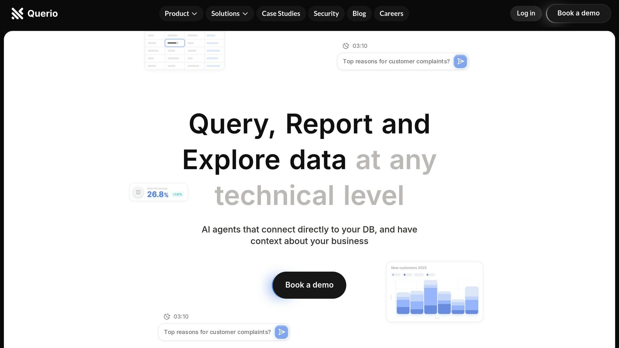
Want to create graphs effortlessly? AI makes it simple. Here's how AI tools like Querio transform data into clear, actionable graphs:
Save Time: AI automates data analysis and visualization, reducing manual work.
Easy for Everyone: Use plain English queries like "Show me last year's sales trends."
Smart Suggestions: AI recommends the best chart types for your data.
Customizable: Tailor colors, fonts, and styles to match your brand.
Predict Trends: Add forecasts and trend lines to plan ahead.
Interactive Features: Drill down into data with filters and clickable elements.
Quick Comparison: AI Tools vs. Traditional Methods
Feature | Traditional Methods | AI-Powered Tools |
|---|---|---|
Data Analysis | Manual, time-consuming | Automated, real-time |
Insight Generation | Reactive, past-focused | Predictive, forward-looking |
User Accessibility | Requires expertise | Easy for non-technical users |
Task Automation | Minimal | Extensive |
Visualization Suggestions | Rare or none | AI-driven recommendations |
Next Steps: Connect your data to a tool like Querio, ask specific questions, and let AI handle the rest. Start with simple queries and refine your graphs with annotations, filters, and branding. AI-powered visualization is your shortcut to faster, smarter decisions.
How to Create Charts and Graphs with AI in Seconds! | Best AI Tool
Getting Started with Querio for AI Graph Creation
Querio makes creating AI-powered graphs straightforward, especially for small and mid-sized businesses. It’s built to simplify data visualization, even for teams without technical expertise.
Connecting Your Data Sources to Querio
Querio integrates directly with major databases and data sources, removing the hassle of setting up complex data pipelines. It works seamlessly with popular business databases and cloud-based platforms. If your data lives in spreadsheets, you can easily upload CSV files or connect to Google Sheets and Microsoft Excel stored in the cloud.
To ensure security, Querio uses encrypted connections for data transmission. You can link multiple databases at once, enabling you to generate detailed and comprehensive graphs. Once your data is securely connected, you’re ready to explore it through Querio’s easy-to-use AI agent interface.
Using Querio's AI Agent Interface
Querio’s AI agent interface lets you interact with your data using plain English. Simply type a query like, "Show me monthly sales trends for the past year," and the AI will analyze the relevant data, interpret your request, and suggest the best visualizations. This approach makes data analysis accessible, even for those without a technical background.
Setting Up Visualization Preferences
Querio allows you to tailor visualizations to meet your business needs and match your branding. You can configure default chart types based on the kind of analysis you perform most often. Here’s a quick guide to choosing the right chart:
Data Type | Best Chart Options | When to Use |
|---|---|---|
Numerical (Trends) | Line Charts, Area Charts | Tracking changes over time |
Categorical | Bar Charts, Pie Charts | Comparing categories or proportions |
Numerical + Time | Line Charts, Stacked Areas | Highlighting time-based patterns |
Geographic | Choropleth, Heat Maps | Visualizing location-based data |
Additionally, you can customize the color schemes and fonts to reflect your company’s branding. Upload your brand colors and set default fonts so every graph aligns with your visual identity. Querio also supports collaboration through user permissions, shared dashboards, and approval workflows. To keep your dashboards fresh, you can schedule automatic updates to reflect real-time metrics.
Step-by-Step Guide to Creating AI-Generated Graphs
Querio's AI agent takes the complexity out of graph creation by using natural language processing. Here's a breakdown of how you can go from writing a query to annotating a graph without needing any technical expertise.
Writing Queries in Natural Language
With Querio, you can write queries in plain English - no need to learn SQL for BI and analytics. For instance, you can ask "What orders are on hold?" or "Show me the sum of order totals by product line" [4]. For better results, aim for specific queries. Instead of saying, "Show me sales data", try something like, "Display monthly sales revenue for Q4 2024 by region." The more detail you provide, the more accurate and relevant the graph will be.
Querio scans all accessible data to generate visualizations [4]. If you're just starting out, keep it simple with queries like "Show me total customers by month" or "List top 5 products by revenue." As you gain confidence, you can move to more complex queries involving multiple variables, longer time periods, or comparative data.
Reviewing and Adjusting AI-Suggested Graphs
After you submit your query, Querio's AI evaluates your data and suggests visualization options based on detected patterns. For more intricate queries, it even auto-recommends solutions [5]. Take a moment to review these suggestions to ensure they fit your needs. Whether it's a line chart, bar graph, or area chart, choose the format that best communicates your message.
Once you've selected a graph type, refine it further. Adjust filters, tweak date ranges, and double-check the data for accuracy. If you spot outliers, address them right away. This step ensures your graph is both precise and tailored to your audience.
Adding Context and Annotations
A graph without context is just numbers on a page. To make your visualizations meaningful, add clear titles, descriptions, and annotations. Instead of a generic title like "Sales Data", go for something specific, such as "Monthly Recurring Revenue Growth – January to December 2024."
Highlight key data points with annotations. For example, if November sales show a spike, you could note, "Black Friday promotion impact" [2]. Comparisons also help contextualize your data - mention how the current quarter's performance is 15% higher than the same period last year. Including these details ensures stakeholders can easily grasp the insights your graph delivers [6].
Advanced Customization and Optimization of AI-Generated Graphs
Taking your AI-generated graphs to the next level means transforming them from simple visuals into powerful tools that can influence business decisions. With Querio's advanced features, you can turn standard charts into dynamic assets that align with your brand and provide deeper insights.
Customizing Visual Elements and Branding
Tailoring your graphs to match your company’s branding can make them feel more professional and cohesive. Adjusting colors, fonts, and layouts to reflect your organization’s identity is a great place to start [7][8].
Begin with your color palette. Ditch the default options and incorporate your company’s signature colors. For instance, if green represents growth metrics or red signifies alerts in your branding, use these consistently across all visualizations.
Typography also matters. Stick to fonts that align with your company’s style guide. If your brand leans on a clean, modern sans-serif font, ensure your graphs follow suit. This consistency across presentations, dashboards, and reports creates a unified experience for your audience.
Don’t overlook layout design. Spacing, legend placement, and visual hierarchy all play a role in how easily someone can interpret your data. A well-structured graph naturally directs the viewer’s attention to the most critical information first. Look for tools that provide flexibility in customizing these elements [7], so your graphs are as polished as they are informative.
To take things even further, consider incorporating predictive analytics to transform your visualizations into forward-looking business tools.
Adding Predictive Analytics and Trends
While static graphs show past performance, predictive analytics bring in the power of foresight. By using machine learning, AI can analyze historical data to forecast future trends, making your graphs more than just reports - they become planning tools [10].
Before diving into predictive analytics, ensure your data is clean and well-organized [10]. When you add trend lines or forecasts, be upfront about the methodology and confidence levels behind the predictions. While AI can deliver faster insights compared to traditional methods, it’s essential to recognize its limitations, such as over-reliance on historical data in rapidly changing industries [10].
"Think of predictive analytics as your data's way of whispering the future in your ear."
Spencer Lanoue [9]
Practical applications of predictive analytics abound. For example, a small retail business used forecasting tools to analyze past holiday sales data. This allowed them to predict high-demand products for the upcoming season, helping them streamline inventory and minimize both shortages and overstock [9].
Similarly, subscription-based companies can use predictive analytics to tackle customer churn. By analyzing usage patterns and engagement data, one subscription service identified key factors contributing to churn and implemented targeted retention strategies to keep at-risk customers onboard [9].
Creating Interactive and Multi-Layered Visualizations
Interactive graphs take data visualization to a whole new level by allowing users to explore the data themselves. Features like clickable elements, sliders, and filters encourage engagement and deeper analysis [11].
For example, adding drill-down options lets users click on high-level metrics, such as "Q4 Revenue", to see a detailed breakdown. Filters and tooltips can help users focus on specific time periods, regions, or categories. These interactive elements make data more accessible and actionable [11].
Multi-layered visualizations can also combine different types of data into one cohesive view. Overlaying metrics like sales performance with marketing spend or economic indicators can uncover relationships that might not be apparent in separate charts.
The real-world impact of interactive visualizations is substantial. Companies that use AI-powered dashboards often report quicker decision-making and improved sales performance due to better data exploration [12].
To create effective interactive visuals, start by cleaning and organizing your data for accuracy [11]. Choose analytics software that offers a variety of interactive features, and design your charts with user-friendly layouts that make navigating the data intuitive [11].
As data volumes continue to grow - expected to hit 180 trillion gigabytes by 2025 [13] - the demand for advanced visualization tools will only increase. Emerging technologies like augmented reality and virtual reality are already paving the way for immersive, next-level data visualization experiences [12].
Best Practices for Effective AI-Generated Visualizations
AI visualization translates complex data into straightforward insights. However, even the most advanced AI tools can produce misleading visuals if basic design principles are ignored.
Choosing the Right Graph for Your Data
The type of chart you choose should align with both your data and your purpose. Are you comparing categories, tracking trends, or showing proportions? Each goal calls for a specific chart type. For example:
Bar charts are great for comparing values across categories.
Line charts work well for showing trends over time.
Pie charts should be reserved for illustrating parts of a whole.
Scatter plots are ideal for exploring correlations between variables.
Here’s a quick guide to match your data type with the best visualization:
Data Type | Best Chart | Example Use |
|---|---|---|
Time Series | Line Chart | Track monthly trends |
Categorical Comparisons | Bar Chart | Compare department revenue |
Part-to-Whole | Pie/Donut Chart | Show market share |
Correlations | Scatter Plot | Analyze spend vs. frequency |
Rankings | Horizontal Bar | Display top products |
Keep your audience in mind when designing your visuals. Simple, clear charts are often better for non-technical viewers, while analysts may prefer detailed, layered visuals. It’s also important to think about the context - charts meant for large presentation screens might require different formatting than those included in detailed reports.
Avoiding Common Visualization Mistakes
Even minor design missteps can obscure your data’s message. Avoid these common pitfalls to ensure your charts inform rather than mislead.
Start the Y-Axis at Zero: Unless clearly marked, starting the y-axis anywhere other than zero can exaggerate or downplay differences in data. If you must truncate the scale, use a visible break to indicate this choice.
"A well-crafted chart can make complex insights instantly understandable. But a poorly designed one can mislead, confuse, or even distort the message entirely." - Juliet Ofoegbu [14]
Use a Limited Color Palette: Stick to 5-6 colors per chart. Use warm and cool tones to highlight contrasts, and test your palette in grayscale to ensure clarity for colorblind viewers.
Avoid 3D Graphics: While they might look flashy, 3D elements often distort data and make comparisons harder. Stick to 2D charts for clarity, or use bubble charts if you need to represent multiple dimensions.
Don’t Overload Charts: Too much data in a single chart leads to clutter. If necessary, break your data into multiple visualizations for better readability. And remember, correlation doesn’t imply causation - always question the relationships your charts suggest.
By adhering to these principles, your visualizations will remain clear and trustworthy.
Keeping Visualizations Updated
Outdated charts can lead to bad decisions. Keeping your visualizations current requires ongoing effort and a structured approach.
AI tools like Querio not only create clear visuals but also help maintain their accuracy by automating updates. Set regular refresh schedules based on how often your data changes. For instance, sales dashboards might need daily updates, while quarterly reports can be updated less frequently. Automating these updates reduces manual work and minimizes the risk of outdated information.
Regularly validate your data sources to catch anomalies, missing values, or formatting issues before they appear in your charts [6]. Businesses that use effective visualization techniques report faster decision-making and improved collaboration [6].
Stay alert to shifts in context - economic changes, seasonal trends, or internal business dynamics can all impact how your data should be interpreted. Add annotations to explain significant events or changes that may influence your trends.
Finally, design your charts for accessibility. Use readable font sizes (at least 12pt for labels), ensure proper color contrast (a 4.5:1 ratio), and limit data density to 6-8 points per view. Allocate about 20% of your chart area to white space to maintain clarity.
Element | Best Practice | Why It Matters |
|---|---|---|
Font Size | Use at least 12pt for labels | Ensures readability across devices |
Color Contrast | Maintain a 4.5:1 ratio | Makes charts accessible to everyone |
Data Density | Limit to 6-8 data points | Reduces cognitive overload |
White Space | Allocate 20% of chart area | Improves focus and clarity |
Your visualizations should go beyond just presenting data - they should tell a story. Use titles that highlight key insights, label axes with clear units, and create simple, intuitive legends. If your charts include filters or interactive elements, ensure the filter names clearly describe what they control. By focusing on clarity and relevance, you’ll make your data resonate with your audience.
Conclusion: Using AI for Data Visualization
AI-powered visualization takes raw data and turns it into actionable insights at lightning speed, making it accessible and meaningful for everyone on your team. This shift from manually creating charts to using intelligent, automated tools isn't just a tech upgrade - it's a game-changer for how quickly and effectively you can make sense of your data.
Key Takeaways
The advantages of AI in data visualization go far beyond saving time. AI-driven tools automate data analysis [1], while also boosting predictive analytics, enabling businesses to anticipate trends [1]. This is especially impactful when you consider that knowledge workers spend about 20% of their time searching for and gathering information [3].
Querio's natural language interface makes data accessible to everyone, not just technical experts. By processing large datasets with precision, AI can spot anomalies and inconsistencies [3] that might otherwise go unnoticed. Instead of writing complex queries, you can simply ask, "What are our quarterly sales trends?" and get immediate, clear insights - turning everyone into a capable data analyst.
What’s more, AI visualization tools adapt over time [1]. They learn from your preferences and behavior, tailoring dashboards to highlight the information that matters most to your role. This ensures your tools become smarter and more helpful as you use them.
Modern AI tools like Querio also integrate seamlessly with technologies like natural language processing (NLP) [1]. This smooth interaction makes exploring data feel intuitive, almost like having a conversation.
Next Steps
Ready to bring AI-powered visualization into your workflow? You don’t need to overhaul everything. Start by identifying the pain points in your current process - those time-consuming reports or dashboards that are rarely updated because they’re too tedious to manage.
Connect your existing data sources to Querio and try out simple, plain-English queries. Ask straightforward questions to see how the AI interprets and visualizes your data. This hands-on approach will show you just how transformative natural language querying can be.
Companies using AI to personalize insights have seen sales increases of 6-10%, far outpacing those that don't use AI [16]. As Daniel Kahneman, a Nobel laureate, once said, "No one ever made a decision because of a number. They need a story" [15]. Querio’s natural language interface excels at turning raw numbers into clear, compelling narratives. These benefits highlight the benefits of AI-driven business intelligence.
The financial impact is enormous - AI is projected to contribute over $4 trillion to the global economy [3]. By adopting AI visualization tools now, your organization can position itself to capture a significant share of this value.
Start small, let AI handle the complex tasks, and focus on uncovering the insights that matter most. Tools like Querio make it easier than ever to find the stories hidden in your data.
FAQs
How does Querio protect my data when connecting to different data sources?
How Querio Safeguards Your Data
Querio takes data security seriously, employing a multi-layered strategy to protect your information when connecting to various data sources. Here's how your data stays secure:
Encryption Everywhere: Querio encrypts data both at rest with AES-256 encryption and in transit using HTTPS/TLS 1.3. This ensures sensitive information remains protected whether it's stored or being transferred.
Secure Connections: Advanced methods like SSH tunneling and IP whitelisting are used to establish secure connections, adding extra layers of protection.
Access Control: Permissions are tightly managed with fine-grained access controls, allowing only the right users to access specific data based on their roles.
Querio also adheres to privacy regulations such as CCPA and GDPR, ensuring compliance with global standards. Regular vulnerability assessments are conducted to proactively identify and mitigate potential risks.
On top of this, Querio is actively pursuing certifications like SOC 2 Type II and ISO 27001, further emphasizing its dedication to upholding the highest security standards.
Can Querio update graphs with real-time data and ensure accuracy?
Querio makes real-time data updates effortless by automating tasks like data collection, cleaning, and analysis. This means your graphs and dashboards always stay current - no manual effort required.
To ensure accuracy, Querio validates incoming data, eliminates duplicates, and fixes inconsistencies as they happen. The result? You get reliable, precise insights to make informed decisions with confidence.
What types of predictive analytics does Querio offer, and how accurate are its forecasts?
Querio offers a variety of predictive analytics tools, such as trend forecasting, pattern recognition, and real-time insights. These features are built to help you predict outcomes and make informed, data-backed decisions effortlessly.
Powered by advanced AI algorithms, Querio delivers impressive results with up to 70% better forecasting accuracy and predictions reaching 90% precision. This level of reliability ensures you can confidently use its insights for important decisions. It's a powerful solution for turning your data into actionable predictions.
Related Blog Posts


