What is scatter diagram and how it reveals business insights
What is scatter diagram? Learn how to read scatter plots to spot data patterns, uncover relationships, and drive smarter business decisions.
https://www.youtube.com/watch?v=Ly3NmogR1cU
published
Outrank AI
what is scatter diagram, scatter plot, data visualization, data analysis, business intelligence
2ccba2da-a273-4349-b764-f6d71d8cd8d1

Sometimes, the most valuable insights are hiding in plain sight, trapped within the endless rows of a spreadsheet. So, how do you get your data to talk? One of the simplest yet most powerful ways is with a scatter diagram, often called a scatter plot.
This chart is designed to do one thing really well: show the relationship between two different numerical variables. It takes all that raw data and turns it into a visual story that's easy to understand.
What Is a Scatter Diagram in Simple Terms
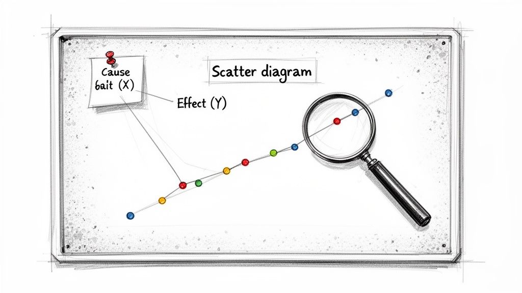
Think of it like a detective's corkboard for your numbers. Each dot on the chart is a piece of evidence, connecting a potential cause (plotted on the X-axis) with a potential effect (on the Y-axis).
For instance, you might suspect that hotter weather leads to more ice cream sales. A scatter diagram lets you plot daily temperatures against daily sales. If you see the dots trending upwards from left to right, you’ve got visual confirmation of that relationship.
By plotting these individual data points on a simple two-dimensional graph, you can instantly see trends, clusters, and strange outliers that would have been impossible to spot otherwise. It’s this clarity that helps you make much smarter business decisions.
Revealing Hidden Data Relationships
A scatter diagram really shines when you suspect one part of your business is influencing another but need the evidence to back it up. It’s the perfect starting point for asking deeper questions.
You'll find them incredibly useful when you need to:
Check for correlations: Does spending more on ads actually lead to more website traffic? Plot them together and see.
Identify trends: Is there a positive or negative pattern developing over time? The direction of the dots will tell you.
Spot outliers: Find those odd data points that don't fit the pattern. These could be a one-time error, or they might signal a unique opportunity or a serious problem to investigate.
Ultimately, the main job of a scatter diagram is to visualize the relationship between paired data. It's an essential first step in any exploratory analysis, giving you the visual proof needed to form a solid hypothesis before you commit to more in-depth research.
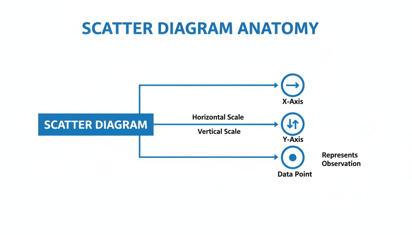
Understanding the Anatomy of a Scatter Diagram
To really get what a scatter diagram is telling you, you first need to know its basic parts. It’s less of a complex chart and more of a simple map for your data, built from a few core pieces that work together.
Every scatter diagram is built on two axes. The horizontal X-axis shows your independent variable. This is the thing you're changing or observing to see what happens—like how much you spend on ads each month. The vertical Y-axis shows the dependent variable, which is the outcome you're measuring, like your monthly sales.
A good way to remember it: the independent variable (X) is what you control, and the dependent variable (Y) is what happens as a result.
The Key Components of the Chart
Each dot, or marker, you see on the diagram is a single data point where your two variables meet. For instance, one dot might represent a month where you spent $5,000 on ads (the X value) and brought in $50,000 in sales (the Y value). The real magic happens when you see all these dots together, as their collective pattern reveals the story.
So, the essential components are:
The X-Axis (Independent Variable): This is your "cause" or the input you're curious about.
The Y-Axis (Dependent Variable): This is the "effect," or the outcome you're tracking.
Data Points (Markers): These are the individual dots, each one representing a single pair of X and Y values.
This simple but powerful structure isn't new. While its core principles go all the way back to the 17th-century Cartesian plane, it was Karl Pearson who popularized the term 'scatter diagram' back in 1906. He built on earlier work to give data detectives a fantastic new tool. You can learn more about its origins in this deep dive on scatter plots.
Getting a handle on this basic anatomy is your first step. It’s the foundation for any good analysis and is one of the core best practices for data visualization. Once you know how each part works, you can go from just looking at a chart to actually understanding what it’s trying to tell you.
How to Read the Story Your Scatter Diagram Is Telling
A scatter diagram does more than just plot data points; it tells a visual story about the relationship between two variables. Learning to read one is like learning to see the narrative hidden in your numbers. Each dot represents a piece of information, but the collective pattern they form reveals the real plotline.
The idea of using these plots to find hidden stories goes way back. In fact, one of the first known scatter plots was created by astronomer John Frederick William Herschel way back in 1833. He used it to map the orbital paths of double stars, discovering relationships that were invisible in tables of raw data. You can dig into the history of these charts, which grew from early astronomical studies on Wikipedia.
Decoding the Main Plot Lines
When you first look at a scatter diagram, you’re looking for the overall direction of the dots. They’ll usually fall into one of three main patterns, each telling you something different about how your two variables interact.
Positive Correlation: Do the dots generally sweep upwards from left to right? That’s a positive correlation. It means that as your first variable (on the X-axis) goes up, your second variable (on the Y-axis) tends to go up too. Think of advertising spend versus website traffic—more spend often leads to more visitors.
Negative Correlation: Here, the dots trend downwards from left to right. This shows an inverse relationship: as the X-axis variable increases, the Y-axis variable tends to decrease. A great example would be plotting the hours of safety training an employee receives against the number of on-the-job accidents. More training, fewer accidents.
No Correlation: The dots look like they’ve been thrown at the chart randomly, with no clear upward or downward trend. This tells you there’s likely no relationship between the two variables. For instance, if you plotted employee height against their monthly sales figures, you probably wouldn't find any connection.
The diagram below breaks down the basic anatomy that makes these visual stories possible.
Once you’re comfortable with how the X-axis, Y-axis, and data points work together, you can start spotting more subtle details in your data's narrative.
Identifying Plot Twists: Outliers and Clusters
Beyond the main trend, a good scatter diagram often reveals a few “plot twists.” These are the outliers and clusters that don't quite fit the main pattern.
Outliers are those lone data points that sit far away from the rest of the pack. It's tempting to dismiss them as mistakes, but don't. An outlier could be a simple data entry error, but it could also represent a truly unique event, a special case, or a segment of your audience you didn’t know existed. It's always worth investigating.
Clusters are dense groups of dots that huddle together in one area of the chart. These suggest that you have distinct subgroups within your data. For example, if you plotted customer spending against the number of items they purchased, you might find separate clusters representing high-value bulk buyers and low-value casual shoppers. Spotting these patterns is a fundamental part of exploratory data analysis.
Crucial Reminder: Correlation does not equal causation. This is the single most important rule when reading a scatter diagram. Just because two variables move together doesn’t mean one is causing the other. A scatter diagram is brilliant at showing you what is happening, but it can’t tell you why.
Putting Scatter Diagrams to Work in Your Business
The real magic of a scatter diagram isn't just in the theory—it's in how you can apply it to solve real-world business puzzles. This simple chart is a workhorse, helping teams turn a sea of raw data into a clear picture that answers critical questions.
It’s one of the cornerstones of good descriptive analytics, a practice focused on understanding what's currently happening in your business. By plotting two variables against each other, you can uncover hidden relationships that lead to smarter strategies. You can learn more about this foundational analytics approach by checking out our guide to descriptive analytics.
Let's look at how a few different teams might put scatter diagrams into action.
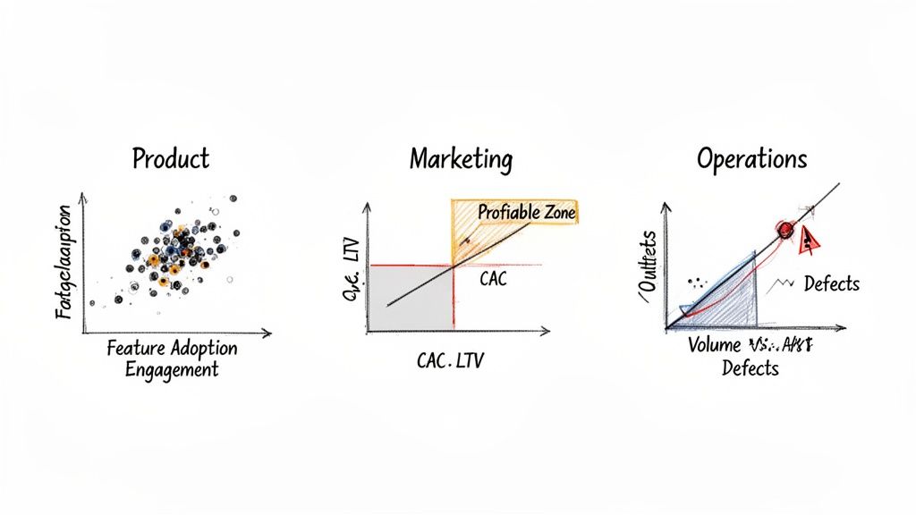
Pinpointing High-Impact Product Features
Imagine you're on a product team trying to figure out which features keep users coming back. You can plot feature adoption (how often a feature is used) on the X-axis and user engagement (like daily logins or session time) on the Y-axis.
A tight cluster of dots in the upper-right corner is your gold mine. These points represent features that are heavily used by your most active customers—the "sticky" features you should double down on.
Optimizing Marketing Spend
Every marketing leader is obsessed with ROI. A scatter diagram is perfect for visualizing this. Just plot the Customer Acquisition Cost (CAC) for each marketing channel on the X-axis and the Customer Lifetime Value (LTV) on the Y-axis.
You'll quickly see which channels are winners. Anything in the upper-left quadrant (low CAC, high LTV) is a star performer. Meanwhile, channels stuck in the lower-right (high CAC, low LTV) are likely draining your budget and need a rethink.
Improving Operational Efficiency
Let's say you're an operations manager for a factory. You can use a scatter diagram to keep an eye on quality control by plotting production volume on the X-axis and defect rates on the Y-axis.
A sudden outlier—a single dot showing an unusually high defect rate on a high-volume day—is an immediate red flag. This could signal a machine breakdown or a process failure that needs immediate attention before it becomes a bigger problem.
When you observe a potential relationship in your scatter diagram, the next step is to confirm its significance. This often involves checking if it stands up to rigorous statistical scrutiny with techniques such as hypothesis testing in statistics.
How to Create Your First Scatter Diagram in Minutes
Alright, enough theory. Let's get our hands dirty and build one. You’ll be surprised at how quickly you can create a meaningful scatter diagram, especially with the business intelligence (BI) tools available today.
No matter if you're working in a spreadsheet like Excel or firing up a sophisticated BI platform, the core steps are always the same. Think of it as a simple recipe.
First, pick your two ingredients. These are the two variables you want to see in action. For example, you might grab your monthly marketing spend and the website traffic that resulted from it.
Next, set the stage. You'll assign one variable to the X-axis (your independent variable) and the other to the Y-axis (your dependent variable). In our example, marketing spend is the independent X-axis, and the traffic you hope to influence is the dependent Y-axis.
Finally, plot the points. Just tell your software to create a scatter diagram. It will do the heavy lifting, instantly placing dots on the graph and giving you that first "aha!" visual of the relationship.
The AI-Powered Shortcut
While the old-school way still works, a new wave of AI-powered tools has completely streamlined this process. It’s a significant leap forward. In fact, a 2026 Forrester study found that BI platforms with dynamic scatter tools increased decision speed by 50% in mid-market firms. You can explore more insights on advanced charting tools to see how deep the rabbit hole goes.
Instead of clicking through menus, you can now simply ask for what you need. This conversational approach to data analysis is a game-changer for teams that need answers quickly without deep technical expertise.
This is where tools like Querio really shine. By embedding AI agents directly into the analytics workflow, you can skip the manual setup entirely. A user can simply type a question in plain English, like, “Show me a scatter diagram of customer lifetime value versus acquisition cost.”
The AI agent gets to work immediately, generating the exact visualization you asked for. What used to be a multi-day task that sat in an analyst's queue is now something you can do yourself in just a few minutes.
For a more detailed walkthrough, check out our guide on how to create a scatter plot using these modern capabilities.
Common Questions About Scatter Diagrams (Answered)
As you start using scatter diagrams to get a feel for your data, a few common questions almost always come up. Getting these sorted out will help you build better charts and, more importantly, avoid some common pitfalls in your analysis.
When Should I Use a Scatter Diagram Instead of a Line Chart?
This one trips a lot of people up, but the distinction is actually pretty simple. It all comes down to what you're trying to compare.
Use a scatter diagram when you need to see the relationship between two different numerical variables. Think ad spend vs. revenue, or customer satisfaction scores vs. repeat purchases. You're looking for a connection.
Use a line chart when you're tracking a single numerical variable over a continuous period, like time. A line chart is your go-to for showing something like monthly user growth over the past year.
In short, scatter diagrams reveal correlation. Line charts show trends over time.
What Is the Difference Between a Scatter Diagram and a Bubble Chart?
Think of a bubble chart as a scatter diagram with a bonus feature. A standard scatter plot maps out two variables (one on the X-axis, one on the Y-axis). A bubble chart, on the other hand, adds a third variable to the picture.
How? The size of each dot is used to represent that third data dimension, turning the points into "bubbles." This lets you pack three layers of information into a single view. For example, you could plot ad spend (X-axis) against sales (Y-axis) and then have the bubble size represent the number of new customers acquired from each campaign.
How Many Data Points Are Ideal for a Scatter Diagram?
While there's no single magic number, you need enough data to see a real pattern emerge.
As a rule of thumb, scatter diagrams work best with at least 30 data points. With too few points, any pattern you see could just be random chance. But if you have thousands, the dots can pile up and hide the underlying trend—a problem called "overplotting." Thankfully, most modern BI tools can use transparency to make even crowded plots readable.
Can a Scatter Diagram Prove That One Thing Causes Another?
No. This is easily the most critical point to remember. A scatter diagram is fantastic at showing correlation—it tells you that two variables seem to move in a related way. It cannot prove causation—that a change in one variable is making the other one change.
The classic example is ice cream sales and drowning incidents. A scatter plot would show a strong positive correlation, with both rising together during the summer. But eating ice cream doesn't cause drowning. The real cause is a third factor: hot weather, which drives people to both swim more and buy more ice cream. Always look for those hidden variables before jumping to conclusions.
Ready to stop waiting for analysts and start exploring your data yourself? Querio deploys AI agents directly on your data warehouse, allowing you to generate charts, run analyses, and get answers in minutes, not days. Learn more about Querio's self-service analytics.

