Master Your e commerce kpis in 2026
A complete guide to 10 essential e commerce kpis for data teams. Includes formulas, SQL snippets, benchmarks, and implementation tips for real growth.
https://www.youtube.com/watch?v=yy4xibY9cRU
published
Outrank AI
e commerce kpis, data analytics, product management, e commerce metrics, business intelligence
c1544221-7b2a-411a-bf74-5eba29ecb097

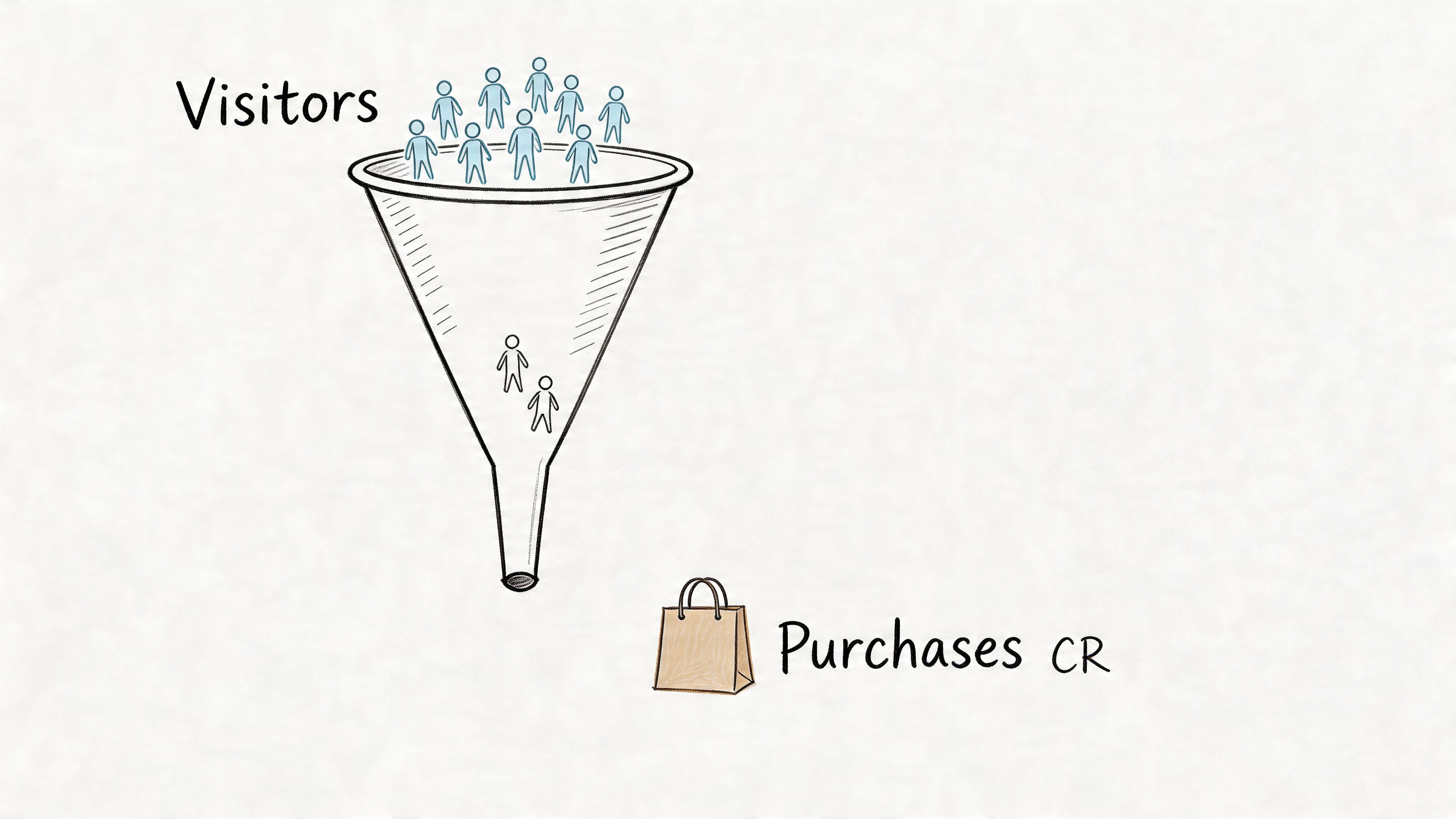
Raw traffic is easy to celebrate. Revenue-quality traffic is harder. That’s why conversion rate remains one of the foundational e commerce kpis, defined as the percentage of visitors who complete a purchase using the formula (Total Transactions / Total Visitors) x 100, and why mature online stores often hover around average conversion rates of 2.5 to 3%, according to Saras Analytics on eCommerce KPIs.
Many teams don’t have a data shortage. They have a prioritization problem. Dashboards overflow with sessions, clicks, followers, and campaign snapshots, while the metrics that determine whether the business is healthy get buried under reporting noise.
That’s where a tighter KPI system helps. A useful KPI doesn’t just describe activity. It tells a product manager what to fix, gives marketing a clear trade-off to manage, and gives finance a clean view of whether growth is durable. If a metric can’t change an operating decision, it probably belongs lower on the page.
The strongest brands tend to rally around a small operating layer of metrics tied to profitability, retention, and customer experience. If you need a simpler framing, this overview of the essential KPI in ecommerce is a good companion. The version here goes deeper on implementation.
This guide stays practical. Each KPI includes the practical trade-offs teams run into, plus examples of how to instrument events, structure warehouse models, and build self-serve analysis in modern workflows. In practice, that means event naming that survives product changes, SQL that an analyst can trust, and notebooks that let a PM answer a funnel question without waiting three days for the data team.
1. Conversion Rate (CR)
A small change in conversion rate can outweigh a large increase in traffic. That is why CR sits near the top of the operating stack. It answers a hard commercial question fast: are visits turning into orders, or are you paying to fill a leaky funnel?
The basic formula is straightforward: transactions divided by visitors, expressed as a percentage. The work starts after that. A single sitewide CR is useful for executive reporting, but it is too blunt for diagnosis. It can hide strong repeat-customer behavior, weak first-purchase intent, mobile checkout friction, or low-quality paid traffic in the same number.
How to instrument CR correctly
Start by choosing the denominator on purpose. Session conversion rate is useful for marketing and landing page analysis. User conversion rate is better for product questions tied to account creation, repeat visits, and longer consideration cycles. Teams get into trouble when they compare a session-based CR in one dashboard to a user-based CR in another and call it a trend.
I usually model both, then label them aggressively in the warehouse and BI layer.
The harder part is event integrity. Purchase events often fail in predictable ways: cross-domain checkout breaks session continuity, ad blockers suppress client-side events, payment processors send confirmations late, and cancelled or duplicate orders slip into the numerator. If the event stream does not reconcile to the order system, the metric is not ready for decision-making. This guide on how to measure key performance indicators is a good reference for setting up that reporting discipline.
Segment before you act. Device, traffic source, landing page, geography, new versus repeat customer, and discount exposure usually explain more than the blended number does.
The practical trade-off is speed versus accuracy. Product managers want same-day reads after a checkout release. Finance wants conversion tied to settled orders. Both are reasonable. The cleanest approach is to maintain two views: a near-real-time operational CR for product monitoring, and a reconciled CR for business reporting. Call them different things, document the difference, and stop teams from arguing over numbers that were built for different jobs.
A useful funnel view breaks CR into browse-to-cart, cart-to-checkout, and checkout-to-purchase. That makes root cause analysis faster. If browse-to-cart falls after a category page redesign, the issue is likely merchandising or page performance. If checkout-to-purchase drops after adding a payment step, the issue is probably friction, not demand. In practice, notebook workflows and self-serve tools such as Querio help analysts and PMs test those cuts without waiting for a custom dashboard rebuild.
2. Customer Acquisition Cost (CAC)
CAC tells you how expensive growth is becoming. The formula is simple: total marketing and sales spend divided by the number of new customers acquired. The operational reality is not simple at all.
Most CAC debates are really data-model debates. Should brand spend be included? How do you handle affiliates? What counts as a new customer when someone first buys on a marketplace and later purchases direct? Teams often think they disagree on performance when they disagree on definitions.
What good CAC analysis looks like
Start by calculating CAC at the channel level, then roll upward. A blended number is useful for board reporting, but it’s too coarse for budget allocation. Search, paid social, creator campaigns, email capture, and offline promotions should each have their own acquisition logic and attribution assumptions.
What works is consistency. What doesn’t work is changing attribution rules every quarter and pretending the trend still means something. I’d rather have an imperfect but stable CAC definition than a “more accurate” one that resets history every time a new tool gets installed.
There’s also a strategic trade-off. Some channels look expensive on first purchase but bring in customers who reorder, complain less, and return fewer items. Others produce cheap first orders that never become a healthy customer base. That’s why CAC alone is not enough. It needs a direct link to LTV, retention, and margin.
A practical pattern in self-serve environments is monthly CAC reconciliation. Pull ad platform costs into the warehouse, standardize campaign naming, map first-order customers by acquisition window, and publish a governed model that marketing can explore without rewriting logic. That avoids the familiar cycle where finance, growth, and data each report a different CAC.
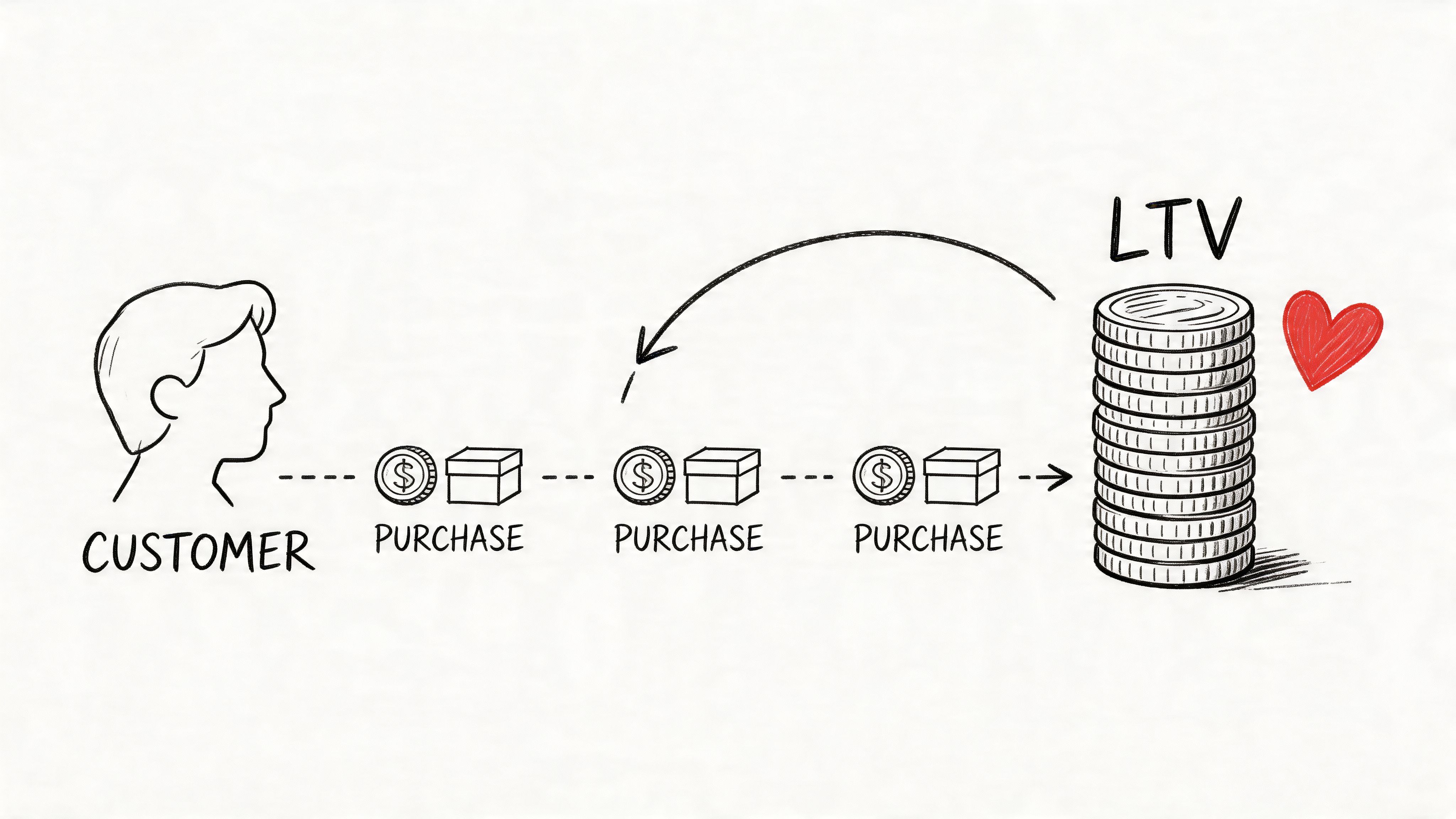
3. Customer Lifetime Value (LTV)
Acquisition costs hit you on day one. LTV decides whether that spend was justified six months later.
Customer lifetime value works best as an operating metric, not a slogan. Teams often say “LTV” when they mean four different things: realized revenue to date, predicted future revenue, contribution-margin LTV after returns and support costs, or product-specific LTV for a category or SKU family. If those definitions are mixed in one dashboard, finance, growth, and product will make different decisions from the same chart.
The first implementation choice is simple: decide whether your business needs top-line LTV or profit-aware LTV. Revenue-based LTV is faster to ship and easier for self-serve analysis. Margin-based LTV is better for decision-making in categories with heavy discounting, high return rates, or expensive fulfillment. I usually start with both. Publish revenue LTV for broad adoption, then add a governed contribution view for channel and merchandising decisions.
Cohorts are the foundation. Group customers by first order month, first-touch channel, first product, or region. Then measure how revenue and margin accumulate over time. That shows whether a channel brings in repeat buyers, whether a launch cohort matures differently, and whether a product line creates one-and-done customers who look good on first purchase but fade quickly.
That query is a start, not the finished model. In production, teams should decide how to treat refunds, partial returns, canceled orders, subscription pauses, tax, shipping revenue, and identity stitching across guest checkout and logged-in purchases. A technically correct LTV model with weak identity resolution will still mislead the business.
Instrumentation matters more than another formula. Capture a durable customer key at checkout, store first-order attributes in a slowly changing dimension, and snapshot acquisition metadata before ad platforms rewrite history. If the warehouse only stores current campaign mappings, analysts cannot reconstruct true first-touch or first-order cohorts later.
I also recommend publishing an LTV mart with one row per customer and a companion cohort table with one row per customer-month. That gives PMs and analysts two paths. They can inspect individual customer economics in SQL or open a notebook and chart cohort curves without rebuilding business logic. For teams setting up that workflow in a shared analytics layer, this guide to e-commerce growth data analysis tools for LTV, CAC, and cohorts shows the practical pattern well.
One more trade-off is easy to miss. A longer payback window can be rational if the customers are durable and profitable. It can also hide weak merchandising or retention. LTV should therefore sit beside retention, return rate, and Average Order Value (AOV), not replace them.
The best LTV model is the one teams can inspect, explain, and recalculate the same way next quarter.
4. Average Order Value (AOV)
A small AOV change can materially shift revenue. A store that holds order volume steady and raises AOV from $68 to $74 adds sales without asking paid acquisition to do more work.
The formula is simple: total revenue divided by total orders. The implementation is not. Teams regularly publish three different AOVs without realizing it because finance, product analytics, and merchandising each use a different revenue definition. Decide early whether AOV is based on gross demand, net paid orders, or net of returns and cancellations. If that choice stays implicit, every experiment review turns into a metric-definition argument.
Higher AOV also has a cost. Free-shipping thresholds can increase basket size and reduce conversion at the same time. Bundle discounts can raise order value while shrinking contribution margin. Larger baskets can even create more returns in categories with sizing uncertainty. AOV belongs next to conversion rate, margin, and repeat behavior because the same intervention can help one and hurt the others.
Where AOV analysis actually gets useful
Useful AOV work starts at the order-line level. Analysts need item composition, discount allocation, shipping revenue, and customer status on every order. Without that grain, the team can see that AOV changed but not why it changed.
The first pass I usually want is simple: segment AOV by traffic source and customer type, then compare item count, discount rate, and gross margin alongside it.
That query is fine for a dashboard. For decisions, build one layer deeper. Create an orders mart with fields for gross merchandise value, discounts, shipping charged, tax, refunds, returns, and contribution margin. Then PMs and merchandisers can test whether an AOV lift came from healthier basket construction or from discounting that finance will push back on later.
A few patterns tend to produce durable gains:
Bundle from observed behavior: Use order-level affinity data to pair items customers already buy together.
Split new vs. repeat customers: Returning buyers often accept stronger cross-sell logic, while new buyers are more sensitive to friction and price anchoring.
Read AOV with units per order: A higher basket can come from one expensive SKU or from better attachment. Those imply different merchandising actions.
Cut by entry path and device: Paid social mobile traffic often behaves differently from email, search, or desktop sessions.
Self-service matters here. A merchandiser should be able to open a notebook or a Querio workspace, compare AOV by recommendation variant, and trace the change back to category mix or discount depth without waiting for a custom dashboard ticket. That is how teams catch localized wins before the blended store metric hides them.
If checkout teams are testing shipping thresholds or cart prompts, pair the analysis with qualitative feedback using a cart abandonment survey template. That closes a common blind spot. Basket size may stall because the offer is weak, or because customers do not trust delivery timing, fees, or return terms.
For non-technical stakeholders, this explanation of Average Order Value (AOV) is a useful definition. Inside the warehouse, keep the business rule stricter. Exclude canceled orders, align revenue fields to the finance view, and version the metric definition so analysts can reproduce the same AOV next quarter.
5. Cart Abandonment Rate (CAR)
Roughly three out of four carts never become orders. The exact rate varies by device, category, and traffic quality, but the operational takeaway is consistent. Checkout usually hides one of the largest recoverable revenue leaks in an e-commerce stack.
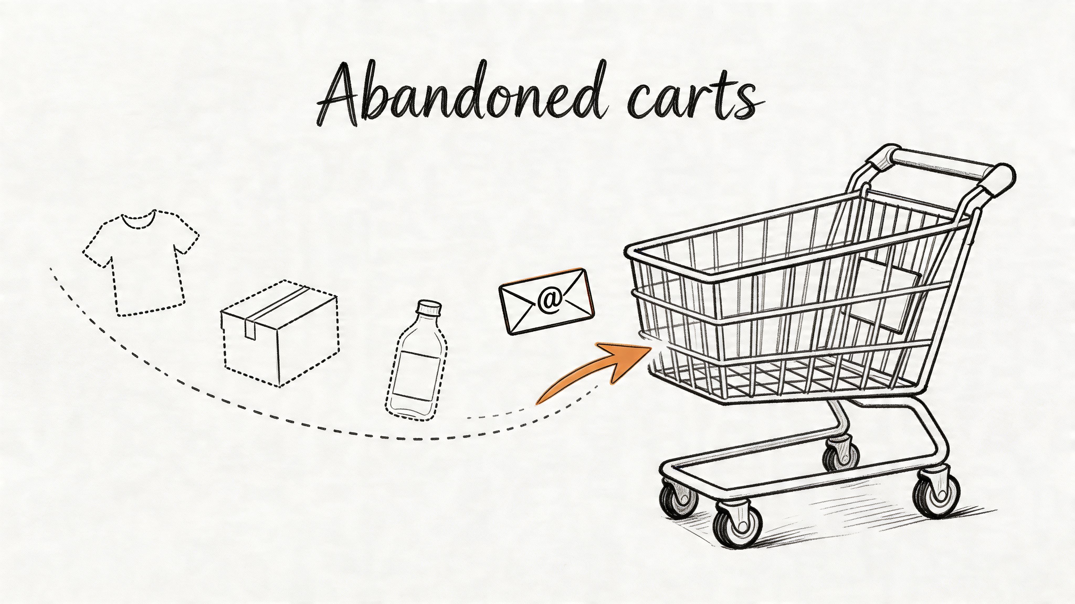
Teams often respond with recovery emails first because they are fast to launch and easy to measure. That can lift revenue at the margin, but it also masks root causes. If abandonment spikes after shipping options appear, the issue may be delivery cost, ETA confidence, or poor option design. If users drop at payment, the problem is usually authorization failure, wallet coverage, or form friction. Different failure points need different owners.
Instrument the checkout as steps, not one blob
A usable event model tracks at least add_to_cart, begin_checkout, shipping_submitted, payment_submitted, and purchase_completed. Include session_id, user_id where available, device type, traffic source, cart value, coupon presence, and a stable checkout attempt identifier. Without that structure, analysts can report a blended abandonment number but cannot explain why it changed.
That query is a start, not the finished model. In practice, teams need to separate true customer abandonment from technical failure. A session that times out after a PSP error should not be grouped with a shopper who saw shipping fees and chose to leave. I usually keep both views. One for product friction, one for system reliability.
For self-service analysis, expose the funnel in a notebook or a Querio workspace so PMs and analysts can cut step drop-off by device, country, payment method, and landing source without waiting on a new dashboard build. That is how teams catch issues like Apple Pay underperforming on one browser version or a mobile shipping form adding friction only in one locale.
A few patterns show up repeatedly:
Mobile deserves first attention: Small form fields, keyboard jumps, and slow address validation create measurable drop-off.
Coupon fields are risky: They can increase completion for deal-seeking shoppers and reduce it for everyone else by triggering discount hunting.
Guest checkout usually wins: Account creation can improve retention later, but forcing it during checkout often lowers immediate conversion.
Shipping clarity beats late surprises: Customers tolerate fees more than uncertainty.
If the event data identifies the failing step but not the reason, collect direct feedback with a short cart abandonment survey template. Use it after the drop-off point is known. Surveys work best when they answer a narrow question, such as whether users left because of delivery timing, payment trust, or unexpected total cost.
A quick walkthrough can help teams align on what “bad” looks like in checkout UX:
6. Return Rate and Return on Ad Spend (ROAS)
Return rate and ROAS should be reviewed together more often than they are. One tells you whether orders stick. The other tells you whether paid media appears to work. If you keep them separate, you can overfund campaigns that generate revenue on paper but collapse after returns, refunds, or low-quality first purchases.
This matters most in categories where post-purchase behavior changes the economics. A campaign can look excellent in-platform and mediocre in the warehouse once you connect product category, fulfillment cost, and return behavior. That’s why I prefer net-revenue ROAS wherever the data allows it.
Build ROAS from warehouse reality
The warehouse model should connect campaign spend, attributed orders, net revenue, and return status. If returns arrive later, expose both an early ROAS view and a matured view. Marketing can optimize the first one. Finance and leadership should trust the second.
The operational trade-off is timing. If you wait for every order to mature, media optimization becomes slow. If you optimize only on immediate purchase value, you can scale the wrong campaigns. The fix is to publish both lenses and label them clearly.
Watchout: A “winning” campaign that drives high returns is often just an expensive sampling program.
On the product side, correlate return rate with size curves, product content quality, fulfillment errors, and acquisition source. When a return spike hits, don’t assume the product is weak. Sometimes the ad set is attracting the wrong customer expectation.
7. Customer Retention Rate (CRR) and Churn Rate
A small lift in retention often matters more than another round of top-of-funnel spend. In most e-commerce businesses, keeping more first-time buyers active changes payback, inventory planning, and contribution margin faster than squeezing another point out of click-through rate.
Retention answers a hard question. Did the first order start a relationship, or did it just close a transaction? Churn measures the same problem from the other side. Teams should track both, but only after they agree on the customer lifecycle they are measuring.
Define retention around buying behavior, not calendar convenience
A generic 30-day or 90-day retention view is easy to publish and easy to misread. A cosmetics brand with a 45-day replenishment cycle should not use the same churn window as a furniture retailer. If the business sells across categories, one global definition will hide actual failure points.
Start with cohorts built from first order date, first product category, acquisition source, and expected reorder window. Then calculate retention against the next meaningful purchase event. That usually means second-order rate first, then third-order rate once the customer has cleared the initial repeat hurdle.
That model is a starting point, not the finished KPI. In practice, I add expected reorder days by SKU family or subscription status so the team can separate true churn from customers who are still inside a normal repurchase window. Without that adjustment, lifecycle marketing starts pushing win-back offers too early and trains healthy customers to wait for discounts.
Instrumentation matters here. Make sure the warehouse can distinguish guest checkout stitched to a known customer, canceled orders, refunded first purchases, and subscription renewals versus manual reorders. Retention breaks quickly when identity resolution is weak.
Self-service analysis also matters. Product managers want retention by first experience. CRM wants it by flow entry point. Finance wants it by gross margin after returns and discounts. Shared models and notebook workflows in tools like Querio make those cuts possible without creating a new dashboard for every question. If customer drop-off is already showing up in your cohorts, this guide on reducing customer churn with practical analysis patterns is a useful next step.
8. Customer Satisfaction Score (CSAT) and Net Promoter Score (NPS)
Satisfaction metrics are easy to dismiss because they feel softer than revenue metrics. That’s a mistake. They often surface retention risk before purchase behavior visibly drops.
For NPS, the formula is straightforward: percentage of Promoters (9 to 10) minus percentage of Detractors (0 to 6). In e-commerce, top-quartile DTC sites average NPS 50 to 70, marketplaces sit around 30 to 50, and 65% of e-commerce executives now track NPS alongside CSAT in real-time dashboards, according to iDrive Logistics on the importance of data in multi-sourcing.
Don’t collect survey data in isolation
The best use of NPS and CSAT is not a monthly scorecard slide. It’s joining survey responses back to customer behavior. Who gave a low score and then never reordered? Which product categories produce promoters? Which fulfillment paths create detractors? Once those links exist, survey data becomes operational.
CSAT is often more transaction-specific. NPS tends to reflect broader brand affinity. Both matter, but they answer different questions. If a shipment arrived late, CSAT may dip while long-term brand loyalty stays intact. If product quality disappoints repeatedly, both will degrade and retention usually follows.
Low scores are only useful if someone owns the follow-up loop.
This is one area where self-serve analysis really helps non-technical teams. Support leaders can inspect low-score themes by category. Product can compare ratings before and after a content change. Growth can check whether promoters produce more advocacy and repeat behavior. The metric becomes powerful when it stops living in a survey tool and starts living in the warehouse.
9. Traffic and Visitor Metrics
A traffic spike is one of the easiest ways to misread e-commerce performance. Sessions can rise while revenue per visitor falls, returning customer share drops, and support tickets climb because the wrong audience is landing on the wrong pages.
Traffic metrics matter because they help teams diagnose demand generation, site experience, and instrumentation quality. They do not work as standalone health metrics. Product, growth, and analytics teams should read sessions, users, bounce rate, device mix, landing pages, and source data alongside conversion, AOV, and retention. Otherwise, a campaign win, a tagging bug, and a discount-driven surge can all look the same in a dashboard.
Measure traffic quality, not just volume
The useful cut is traffic quality by source, device, and landing page. Mobile-heavy traffic often behaves differently from desktop traffic. Paid social often brings different intent than branded search. Affiliate traffic can look strong on sessions and weak on first-order margin. Those differences matter more than topline visits.
Start with a warehouse model that keeps session grain intact and attaches downstream outcomes. That means one row per session, stable channel grouping logic, and joins to orders, customer history, and product context. If the team cannot trace a session to a landing page, device type, campaign, and eventual order behavior, traffic analysis turns into reporting theater.
That query is a start, not the finish line. Add revenue per session, new versus returning visitor mix, and 30-day repeat purchase rate. Those fields change the conversation from "which channel drove traffic" to "which channel brought customers worth keeping."
Instrumentation is usually the failure point here.
Session logic changes between tools. UTMs go missing. iOS privacy rules break attribution. Single-page apps can undercount pageviews if event tracking is sloppy. Before acting on a bounce-rate change, verify that the event schema and sessionization rules did not change last week. I have seen teams spend days debating landing page quality when the actual issue was a tag firing twice on mobile Safari.
Shared analysis patterns help. A growth manager should be able to filter paid social sessions to a single landing page, compare conversion by device, and inspect whether those customers reordered. An analyst should be able to audit the SQL behind that view without rebuilding the metric from scratch. Tools that support warehouse-based self-service analysis, including AI tools for KPI analysis in finance and ecommerce, help teams move faster without splitting definitions across dashboards and spreadsheets.
Traffic metrics are diagnostic metrics. Use them to find where the funnel is breaking, who owns the fix, and whether the incoming audience matches the business you are trying to build.
10. Gross Margin, Profit Margin, and Product-Level Metrics
Revenue can grow while the business gets weaker. Margin metrics prevent that illusion. Gross margin tells you what remains after direct product costs. Profit margin goes further by accounting for the broader cost structure. Product-level metrics explain which categories and SKUs create that outcome.
The implementation challenge is allocation. It’s easy to calculate revenue by product. It’s harder to allocate shipping subsidies, discounts, ad costs, and returns in a way that finance accepts and operators can still use. Many teams stop halfway and end up managing to revenue because margin feels too messy.
Build a product profitability model people will trust
Start with order lines, then attach COGS, discounts, fulfillment costs, and return adjustments. Don’t wait for a perfect enterprise cost-accounting model. A transparent approximation is more useful than an opaque “fully loaded” number nobody can audit.
The trade-off here is granularity versus maintainability. SKU-level profitability is powerful, but only if the cost logic is stable. If every monthly close changes the rules, teams stop trusting the numbers and revert to intuition. Governance matters more than complexity.
For teams trying to make this analysis self-serve instead of analyst-gated, this piece on AI tools for KPI analysis in finance and ecommerce is relevant. The value isn’t flashy automation. It’s getting product, finance, and operations onto the same underlying model so pricing, merchandising, and acquisition decisions stop fighting each other.
Top 10 E-commerce KPI Comparison
Metric | Implementation complexity | Resource requirements | Expected outcomes | Ideal use cases | Key advantages |
|---|---|---|---|---|---|
Conversion Rate (CR) | Low–Medium: set up funnels and event tracking | Web analytics, event tagging, A/B tools | Clear measure of traffic→revenue efficiency | Landing pages, checkout funnels, campaign optimization | Direct indicator of marketing/product effectiveness |
Customer Acquisition Cost (CAC) | Medium: requires multi-touch attribution and cost allocation | Marketing spend, CRM, finance data, attribution tooling | Understand channel efficiency and payback periods | Channel budgeting, growth planning, unit-economics checks | Essential for evaluating ROI and sustainable acquisition |
Customer Lifetime Value (LTV) | High: cohort modeling and projections needed | Historical purchase data, margins, retention metrics | Guide sustainable acquisition spend and retention ROI | Pricing, retention programs, investor modeling | Quantifies long‑term customer value for strategic decisions |
Average Order Value (AOV) | Low: simple revenue/order calculation | Order and revenue data, product metadata | Increase revenue per transaction without new traffic | Bundling, upsell/cross-sell experiments, merchandising | Direct lever to multiply revenue quickly |
Cart Abandonment Rate (CAR) | Low–Medium: track checkout steps and exits | Checkout event tracking, UX analytics, recovery channels | Recoverable revenue and reduced checkout friction | Checkout UX fixes, remarketing, recovery campaigns | Actionable "low-hanging" revenue opportunity |
Return Rate & ROAS | Medium: requires returns tracking and ad attribution | Ad platform data, revenue, returns processing, tagging | Profitability by channel and impact of returns | Campaign allocation, product-quality interventions | Balances ad efficiency with actual net revenue |
Customer Retention Rate (CRR) & Churn | Medium–High: cohort and retention curve analysis | Customer history, engagement/usage data, CRM | Increased LTV and early warning of product issues | Subscription health, loyalty programs, lifecycle marketing | Most cost‑effective growth lever vs. acquisition |
Customer Satisfaction (CSAT) & NPS | Low: survey deployment and analysis | Survey tools, sampling, feedback management | Sentiment insights and leading churn indicators | Support quality, product improvements, loyalty tracking | Qualitative signals to prioritize product/service fixes |
Traffic & Visitor Metrics | Low: standard analytics tracking (with filtering) | Analytics platform, referrer tagging, bot filtering | Awareness and acquisition source quality insights | SEO/SEM strategy, top‑of‑funnel growth, channel tests | Reveals which channels deliver high‑quality visitors |
Gross Margin, Profit Margin & Product-Level Metrics | High: granular cost allocation and SKU analysis | Finance systems, COGS data, SKU sales, inventory data | Profitability clarity and portfolio optimization | Pricing strategy, assortment decisions, inventory planning | Direct measure of business sustainability and unit economics |
From Insight to Action: Building a Data-Driven Culture
Tracking the right e commerce kpis is not the hard part anymore. It's relatively straightforward to pull a conversion rate, export ad spend, or read a returns report. The hard part is turning those metrics into a system that changes decisions quickly and consistently.
That usually breaks down in three places. First, definitions drift. Marketing has one CAC, finance has another, and product is looking at a third version in a BI dashboard nobody fully owns. Second, analysis lives in too many disconnected tools. Survey data sits in one system, checkout events in another, orders in the warehouse, and campaign costs in spreadsheets. Third, access is bottlenecked. Every important question becomes a ticket for the data team.
The strongest operating model is simpler than it sounds. Pick a small KPI layer that maps directly to business decisions. For most e-commerce teams, that’s conversion, acquisition cost, lifetime value, average order value, cart abandonment, returns, retention, satisfaction, traffic quality, and margin. Then define each metric once in the warehouse. Publish the logic. Make sure every team is looking at the same object, not a local copy of the truth.
After that, focus on usage. A dashboard no one trusts won’t change behavior. A governed model that product managers, marketers, merchandisers, and finance can explore will. That’s why self-service matters. Not because every employee needs to write SQL, but because the business moves faster when more people can ask a good question and get an answer without waiting in line.
In practice, that means a few concrete habits.
Standardize event names early: Purchase, add-to-cart, checkout started, return initiated, refund completed, and survey submitted should mean the same thing across every tool.
Model metrics at the warehouse layer: Don’t let each dashboard or spreadsheet recalculate KPI logic from scratch.
Separate directional and financial views: Marketing may need fast readouts. Finance needs mature, reconciled numbers. Both can exist if they’re labeled clearly.
Review KPIs together, not in isolation: High AOV with falling conversion tells a different story than high AOV with stable retention. Strong ROAS with weak net margin is not strength.
Make ownership explicit: Every KPI should have a business owner and a data owner.
A mature KPI culture also accepts trade-offs instead of chasing every number upward at once. You can increase AOV and hurt conversion. You can cut CAC by narrowing your audience and reduce long-term growth. You can drive more first orders through promotion and lower retention quality. The point of measurement isn’t to find one “best” metric. It’s to understand the shape of the business and choose trade-offs deliberately.
If you’re building this system from scratch, start smaller than you think. Don’t try to perfect all ten metrics at once. Pick one acquisition KPI, one conversion KPI, one retention KPI, and one profitability KPI. Reconcile them carefully. Make them visible. Use them in weekly decisions. Once the organization trusts those numbers, the rest gets easier.
Tools can help, but only if they support the operating model instead of adding another reporting surface. Querio is one option for teams that want warehouse-connected self-service analysis with notebooks and shared metric workflows. The underlying principle matters more than the vendor choice: data teams should maintain the infrastructure and definitions, while product, marketing, and finance should be able to explore the business without treating analytics as a ticket queue.
When that shift happens, KPIs stop being retrospective scorekeeping. They become part of how the company runs.
If your team is overloaded by ad hoc KPI requests, Querio can help you move analysis closer to the warehouse and give product, marketing, and finance teams a self-serve way to explore the metrics that run the business.

