Reporting business intelligence: Unlock Clear Data Insights
Discover how reporting business intelligence turns complex data into actionable insights with essential report types, best practices, and AI tools.
https://www.youtube.com/watch?v=FKLr3ft8ea0
published
Outrank AI
reporting business intelligence, bi reporting tools, data visualization, self-service bi, embedded analytics
00a9f4c7-fc26-4f63-b616-73b64e617c9f

Business intelligence reporting is all about turning a mountain of raw data into something you can actually use: clear, straightforward reports and dashboards. The whole point is to tell the story hidden within the numbers, so your team can make smart, evidence-backed decisions instead of just going with their gut. It’s the leap from static, confusing spreadsheets to a world of dynamic, automated insights.
What Is Reporting Business intelligence?
Think about trying to drive a car without a dashboard. You'd have no idea how fast you were going, how much fuel you had left, or if the engine was about to overheat. BI reporting is that essential dashboard for your business, giving you a constant, clear view of how everything is performing.
It's a methodical process of pulling data from all corners of your business—sales, marketing, finance, operations—and arranging it into a format that makes sense. We're not just dumping numbers onto a page here. It’s about building a narrative that shows you what’s working, where the trouble spots are, and what opportunities are hiding in plain sight.
The Goal: From Data to Decisions
The main mission of BI reporting is to get data into the hands of the people who need it, in a way they can understand. It takes complex information that used to be locked away in databases, accessible only to data scientists or IT, and translates it for everyone else.
The ultimate goal is to empower every single person in an organization—from a frontline manager to a C-suite executive—to answer their own questions with confidence. This self-sufficiency dramatically speeds up the entire decision-making cycle.
This journey from raw data to a polished report has a few key steps. By creating a single source of truth, BI reporting ensures everyone is working from the same playbook, which is the bedrock of any data-driven culture. For a deeper dive into the broader field, check out our complete guide on what is business intelligence and analytics.
Why It Matters Now More Than Ever
Not long ago, BI reporting was a painfully slow, manual slog that ended with a stack of static printouts once a month. Today’s BI platforms deliver interactive, real-time dashboards that update on their own. This move from looking in the rearview mirror to seeing what's happening right now lets businesses get ahead of problems instead of just reacting to them.
The demand for this kind of insight has exploded. The global BI market, already valued at USD 31.98 billion, has gone from a niche tool for big corporations to an essential part of the modern business toolkit. Market forecasts show it's expected to nearly double to USD 63.20 billion by 2032, growing at a healthy 8.9% compound annual rate. You can explore the full market research on Fortune Business Insights.
This incredible growth highlights a simple truth: companies that get a handle on their data gain a serious competitive advantage. Good reporting lets them:
Monitor Key Performance Indicators (KPIs): Keep a close eye on progress toward big-picture goals with up-to-the-minute data.
Identify Trends and Patterns: Catch emerging market shifts or internal bottlenecks before they turn into major headaches.
Optimize Operations: Use data to make workflows more efficient, cut costs, and boost productivity everywhere.
Enhance Customer Understanding: Figure out what customers are actually doing to improve products, services, and keep them happy.
Understanding The Core Types Of BI Reports
Just like a mechanic needs different tools for different jobs—a wrench for bolts, a gauge for pressure—BI reporting relies on a variety of report types to answer specific business questions. You wouldn't hand a CEO and a frontline manager the same report; their needs are completely different. Knowing which report to use is the first step in getting the right insights to the right people.
Think of each report type as a specialized lens. One gives you a wide-angle view of the entire landscape, while another zooms in on the fine details. Choosing the right one is the difference between a blurry, confusing picture and a sharp, actionable view of your company's performance.
This is the fundamental flow of business intelligence: raw data is turned into clear reports, which then fuel smart decisions.
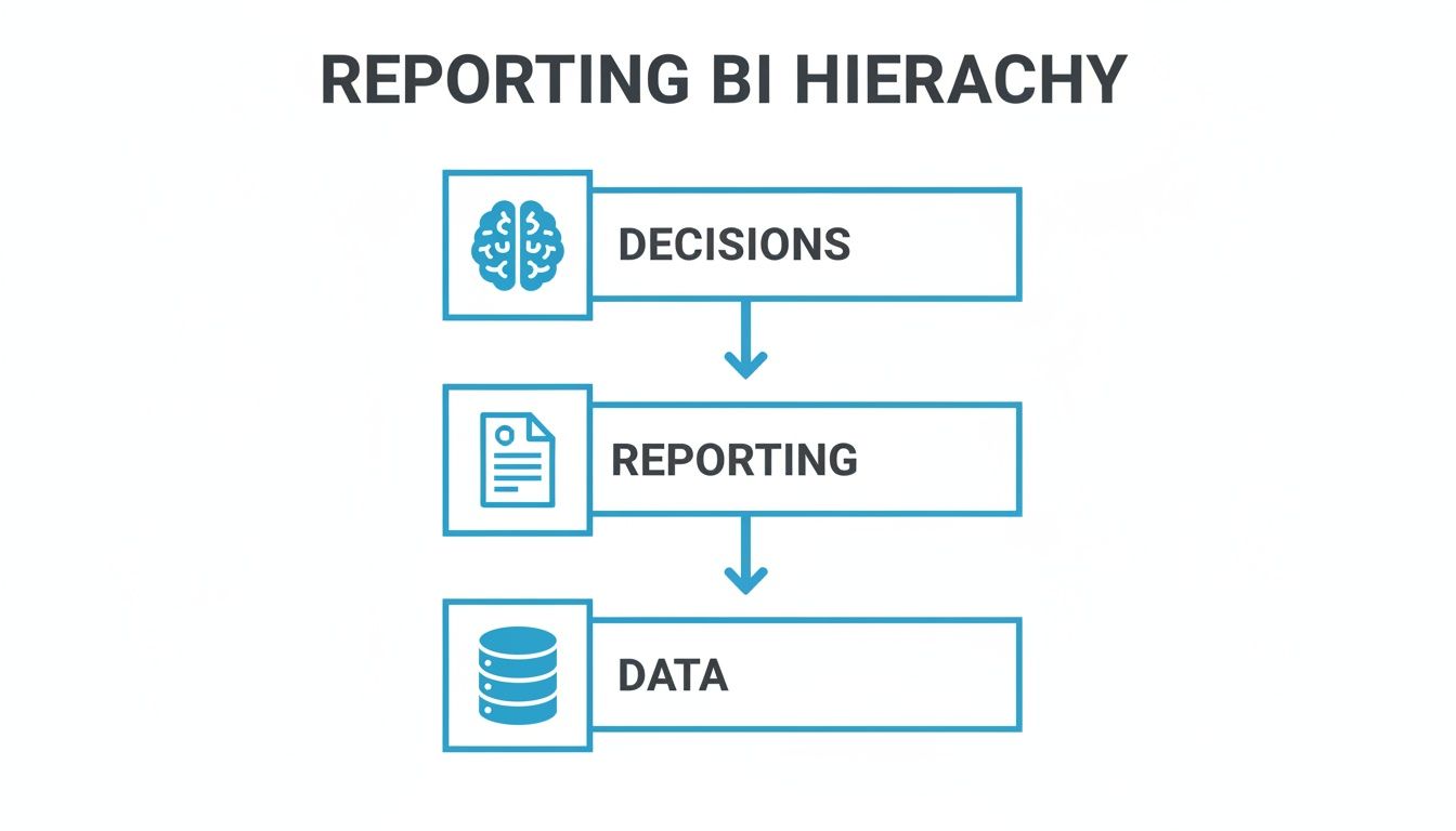
As you can see, great decisions don't happen in a vacuum. They sit at the very top of the pyramid, supported entirely by clear reporting and a solid data foundation.
To help you distinguish between the main types of BI reports, here's a quick comparison of what they do, who they're for, and when they're used.
Comparing Business Intelligence Report Types
Report Type | Primary Purpose | Audience | Data Frequency | Example Use Case |
|---|---|---|---|---|
Operational Report | Monitor and manage daily activities. | Frontline Managers, Team Leads | Real-time or Near Real-time | Tracking daily support ticket volume and response times. |
Executive Dashboard | Provide a high-level snapshot of business health. | C-Suite, Executives, VPs | Daily, Weekly, Monthly | Reviewing Monthly Recurring Revenue (MRR) and Customer Acquisition Cost (CAC) against quarterly goals. |
Ad-Hoc Report | Investigate a specific, urgent question. | Data Analysts, Business Analysts | As Needed (One-off) | Figuring out why user engagement suddenly dropped 15% last Wednesday. |
Analytical Report | Uncover trends, patterns, and root causes. | Strategists, Analysts, Department Heads | Weekly, Monthly, Quarterly | Comparing sales performance to marketing spend over two years to calculate campaign ROI. |
This table gives you a framework for thinking about which report fits your immediate need, ensuring you're not just creating data, but creating clarity.
Operational Reports: The Daily Health Check
Operational reports are the heartbeat monitors of your business. They track what's happening right now and are essential for the teams managing the day-to-day grind. These reports aren’t about long-term strategy; they’re all about immediate action and efficiency.
A customer support manager, for example, lives in these reports. They're constantly checking things like:
Ticket Volume: How many new support requests have we gotten in the last hour?
First Response Time: Are we hitting our SLAs for getting back to customers?
Agent Performance: Who’s closing the most tickets today?
These reports answer the question, "What's on fire?" They let teams spot and fix small problems before they grow, keeping the daily operations running smoothly.
Executive Dashboards: The Strategic Overview
If an operational report is a close-up, an executive dashboard is the 30,000-foot view. Built for leadership and the C-suite, these dashboards boil down oceans of data into a handful of critical KPIs. The whole point is to give a quick, digestible snapshot of the company's health against its biggest goals.
An executive dashboard should pass the 60-second test. A leader needs to be able to glance at it and know instantly if the business is on track, in trouble, or hitting it out of the park.
These dashboards visualize top-line metrics like Monthly Recurring Revenue (MRR), Customer Acquisition Cost (CAC), and Gross Margin. Getting the visuals right is critical here. Our guide on the types of graphs and when to use them can help make sure this high-stakes data is presented with maximum impact.
Ad-Hoc Reports: The Data Detective Work
Sometimes, a standard report just won’t do. An unexpected event pops up—sales take a nosedive, or website traffic suddenly spikes—and you need to know why. That’s where ad-hoc reports come in. These are one-off, custom-built reports designed to answer a specific, often urgent, business question.
Think of your data analyst as a detective. They get a case file that says, "Why did our mobile app engagement drop by 15% last Wednesday?" The analyst then dives into the data, slicing and dicing different variables until they uncover the culprit. Ad-hoc reporting is all about being agile and investigative.
Analytical Reports: The Why And What’s Next
While other reports show you what happened, analytical reports are built to explain why it happened and what might happen next. They go beyond surface-level numbers to explore trends, find patterns, and reveal correlations over time. These are typically the most detailed reports, often pulling data from multiple sources to tell a complete story.
An analytical report might, for instance, map sales performance against marketing campaign spending over the last two years to figure out the true ROI. Or it could analyze customer behavior to see which product features actually lead to higher retention. This is the kind of intelligence that informs real strategy and helps you predict future outcomes.
Building a Strong Data Foundation for Reporting
Let's be honest: the most visually stunning report is worthless if it's built on a foundation of messy, unreliable data. Think of it like a skyscraper—without a deep, solid foundation, the whole structure is compromised. The same goes for reporting business intelligence. Without that essential groundwork, any insights you pull will be shaky at best and dangerously misleading at worst.
You've probably heard the old saying, "garbage in, garbage out." It’s the central truth of all data work. If your reports are pulling from inconsistent, inaccurate, or incomplete information, the charts and metrics you generate will only amplify those flaws, paving the way for poor decisions. Building a solid data foundation is how you guarantee every report is a genuine source of truth.

Architecting Your Data Like a Library
A great way to think about your data architecture is to imagine you're building a well-organized library. Every component has a specific job, all working together to make information easy to find and reliable for everyone in the company. To get your BI reports right, you need a dependable data infrastructure, which often involves using managed relational database services like RDS.
This structure really boils down to three core pillars:
The Data Warehouse (The Library Building): This is your central repository, the massive building where all your structured data lives. It houses all the "books" from different departments—sales, marketing, finance—all under one roof. To dig deeper, check out our complete business intelligence data warehousing guide.
ETL/ELT Processes (The Librarians): Your ETL (Extract, Transform, Load) or ELT (Extract, Load, Transform) processes are the diligent librarians. They’re the ones who go out and collect books from all over, clean them up, standardize the formatting, and then neatly shelve them in the right section of the warehouse.
Data Modeling (The Catalog System): This is the library’s card catalog or modern digital search system. Data modeling organizes all the information logically, mapping out clear relationships between different datasets. It’s what lets a business user quickly find the exact information they need without having to wander aimlessly through every aisle.
Establishing Strong Data Governance
Once the library is built and the books are on the shelves, you need a set of rules to keep things from descending into chaos. This is data governance—the collection of policies, standards, and procedures that ensures your data stays high-quality, secure, and consistent over time.
Data governance is what stops the finance team's "customer churn" metric from meaning something completely different from the marketing team's. It creates a shared language and a single source of truth for the entire business.
Good data governance focuses on a few key areas to protect the integrity of your reporting business intelligence efforts:
Data Quality: This means putting automated checks and manual reviews in place to catch errors and ensure data is accurate and complete. It's your first line of defense against bad insights.
Data Security and Access: Here, you define who can see, use, or change specific datasets. This is non-negotiable for protecting sensitive customer or financial data and staying compliant with regulations.
Metric Consistency: This involves creating a central data dictionary that clearly defines key business terms. When everyone agrees on what "active user" or "net revenue" actually means, your reports become universally understood and trusted.
By putting in the effort to build a thoughtful data architecture and enforce rigorous governance, you create an environment where high-impact reporting can truly flourish. You turn your data from a potential liability into your most valuable strategic asset.
Best Practices for Effective BI Reporting
Creating a BI report that people actually use is both an art and a science. A great report doesn't just throw data on a screen; it tells a compelling story that guides the reader toward a clear conclusion. The difference between a report that gets ignored and one that drives real action often boils down to a few core practices.
These principles are what separate a confusing data dump from a truly valuable business tool. When you focus on the person who will be using the report and the decisions they need to make, you can turn a simple dashboard into something your team can't live without.

Define Your Purpose and Audience First
Before you even think about dragging and dropping charts, stop and ask two deceptively simple questions: "Who is this for?" and "What decision do I want them to make with this?" The needs of a C-suite executive are worlds apart from those of a frontline operations manager.
An executive might need a high-level view with three KPIs they can absorb in under a minute. On the other hand, the ops manager probably needs a granular, detailed report to figure out why a specific workflow is bottlenecked. Tailoring the report’s complexity and content to the audience is the most important step you'll take.
A report designed for everyone is often useful to no one. The real goal is to get the right information to the right person in the right format so they can take a specific, informed action.
Without a clear purpose, dashboards quickly become a cluttered mess of "interesting" metrics that don't actually help anyone. Always start by defining the key business questions the report needs to answer, and then build everything around that.
Choose the Right Visualizations
The way you present data can completely change how it's understood—or misunderstood. Picking the wrong chart can hide important insights or, even worse, lead to the wrong conclusions. Your goal should be to pick a visual that makes the underlying pattern in the data impossible to miss.
Here are a few simple rules of thumb to get you started:
Line Charts: These are your go-to for showing a trend over time. Think website traffic month-over-month or daily sales figures.
Bar Charts: Perfect for comparing different groups or categories. Use them to show sales performance across regions or marketing campaign results.
Pie Charts: Use these sparingly. They're only effective for showing parts of a whole, like market share that adds up to 100%. If you have more than a handful of slices, a bar chart is almost always a better choice.
Scatter Plots: The best way to see if there's a relationship between two different variables, like ad spend vs. new customer sign-ups.
When you match the data's story to the right visual format, you make it incredibly easy for your audience to "get it" at a glance.
Tell a Story with Your Data
The best BI reports do more than just display numbers; they tell a story. A well-designed report naturally guides the user's eye from the most critical, high-level insight down to the supporting details. You can achieve this through a strong visual hierarchy.
Place your most important KPI in the top-left corner—it’s where most people look first. Use size, color, and positioning to draw attention to what matters most. For example, a splash of red can instantly highlight a metric that’s falling short, while green can celebrate a goal being met.
Context is also what turns data into a story. The number "$50,000 in sales" is totally meaningless by itself. Is that good? Bad? Who knows! By adding context—like comparing it to last month's performance (+15%) or its relation to the quarterly goal (80% to target)—the number suddenly has meaning. It tells the user whether to relax or take action.
Avoid creating "data graveyards"—dashboards filled with context-free numbers that just leave users scratching their heads and asking, "So what?"
How Self-Service and Embedded Analytics Are Changing the Game
The entire world of BI reporting is in the middle of a massive shake-up. For a long time, data insights were treated like a precious, locked-away resource. If a marketing manager wanted to know how a campaign was doing, they’d have to file a ticket with the data team and just... wait.
That old, centralized model is falling apart, replaced by two powerful trends that get data into the hands of the people who actually need it. These aren't just minor tweaks; they're a fundamental shift away from BI being a separate, walled-off task. Now, data analysis is being woven directly into daily workflows and even customer-facing products, making insights immediate and useful for everyone.
Empowering Teams with Self-Service BI
At its core, self-service BI is about tearing down the walls between business users and their data. It gives people in departments like finance, marketing, and sales the power to find answers to their own questions, all without writing a single line of SQL or getting stuck in the data team's endless queue.
Think about a product manager trying to figure out how people are using a new feature. Instead of filing a request and waiting days for a report, they can jump into an intuitive tool and ask a question in plain English, something like, "Show me user signups by channel for the last 90 days." In seconds, they get back an accurate chart they can immediately dig into.
This completely changes the speed of decision-making. Curiosity is no longer punished by delays; it’s rewarded with instant answers. That’s how you build a culture where exploring data becomes a natural reflex for everyone on the team.
This "democratization of data" isn't just a buzzword; it's a huge market shift. In fact, self-service and embedded analytics are two of the fastest-growing corners of the entire BI universe. The self-service BI market alone is expected to skyrocket from USD 5.71 billion to USD 20.22 billion by 2030. You can find more details on these growing BI statistics on G2.
Turning Analytics into a Product Feature
While self-service BI is changing how teams work internally, embedded analytics is changing how companies deliver value to their own customers. This is all about building reporting and dashboards directly into a SaaS application, making analytics a core part of the product itself.
Instead of spending a fortune and months of engineering time building an analytics stack from the ground up, product teams can use a flexible SDK to drop white-labeled dashboards and charts right into their app. The payoff is huge.
Increases Product Stickiness: When customers rely on your app for critical insights, they have very little reason to leave.
Creates New Revenue Streams: You can offer premium analytics tiers as an upsell, effectively turning data into a new line of business.
Enhances User Experience: It gives customers the data they need to be successful, right inside the application they already live in every day.
A project management tool, for example, could embed a dashboard showing team productivity metrics. An e-commerce platform could give its sellers real-time sales performance reports. These trends aren't just about new tools; they represent a deeper, more meaningful change in how businesses operate, making BI reporting an essential part of every team's toolkit and every customer's experience.
Using AI to Accelerate Your Business Intelligence Reporting
Let's be honest: traditional BI reporting workflows can be painfully slow. A business user has a simple question, but getting an answer often kicks off a multi-day saga. It starts with a ticket to the data team, followed by SQL queries and a chain of emails just to clarify what was needed in the first place. This lag creates a major bottleneck, forcing teams to make decisions based on gut feelings while they wait for the data to catch up.
Modern, AI-powered platforms are designed to completely demolish this friction. They tackle the age-old problems of long delays, technical hurdles, and inconsistent data by fundamentally changing how we interact with information. The whole idea is to shift from a slow, manual chore to an instant, conversational experience.
From Waiting Weeks to Getting Answers in Minutes
Imagine your marketing manager or operations lead could just ask a question in plain English and get a fully visualized, accurate answer in seconds. That’s the core promise of AI in business intelligence. Instead of filing a ticket and waiting, they can ask, "What were our top-selling products in the Midwest last quarter, and how did that compare to the same period last year?"
An AI agent, armed with the context of your specific business and data model, can instantly translate that request, run the query, and spit back the perfect chart. This turns a week-long reporting ordeal into a task that takes just a few minutes. It gives everyone the power to move from curiosity to confident action without ever writing a line of code. To dig deeper, check out the top benefits of AI-driven business intelligence.
The real shift is from a system where data is a scarce resource managed by a few, to one where insights are abundant and accessible to everyone. AI makes data exploration a natural, conversational part of the daily workflow.
Standardizing Metrics and Building Trust
One of the biggest hurdles in BI reporting is a lack of trust in the data itself. When different departments pull their own numbers, you get conflicting metrics and unproductive debates about whose report is "correct." AI-powered platforms help fix this by creating a single source of truth where all metrics are defined and calculated centrally.
From an organizational standpoint, business intelligence is no longer a niche tool for data specialists; it’s becoming a core competency for everyone. The global BI adoption rate is now at 26%, meaning about one in four employees regularly uses BI tools. This trend highlights the growing demand for professionals who can standardize data and make it accessible across the board.
Seamlessly Embedding Analytics for Your Customers
For SaaS companies, the power of AI isn't just for internal teams. Embedded analytics SDKs give product leaders a secure and efficient way to launch customer-facing dashboards right inside their applications. This means you can offer powerful reporting as a native feature, skipping the massive engineering headache of building an entire analytics stack from the ground up.
To get your data ready for BI reports even faster, you can integrate tools like Intelligent Document Processing (IDP), which use AI to automatically pull and structure information. By embedding AI-powered analytics, you deliver huge value to your customers, make your product stickier, and even open up new revenue streams.
Frequently Asked Questions
Even with a solid plan, you're bound to run into questions as you start building out or scaling up your BI reporting. Here are a few of the most common ones we hear, along with some straightforward answers to help you make better decisions.
Think of this as a quick guide to clearing up some of the subtle but important distinctions in the data world and picking the right approach for your business.
What Is the Difference Between BI Reporting and Data Analytics?
This is a classic point of confusion, but the difference is actually pretty simple when you break it down. Reporting business intelligence is all about looking at what's already happened. It’s descriptive, answering the question, "What happened?" using historical and current data. This is where your dashboards and operational reports live.
Data analytics is a much bigger umbrella. It starts with BI but then pushes into more advanced questions:
Diagnostic Analytics: Why did it happen?
Predictive Analytics: What will likely happen next?
Prescriptive Analytics: What’s the best course of action?
Here’s an analogy: BI reporting is your car's dashboard—it shows you your speed, fuel level, and engine temperature. Analytics is the expert mechanic who uses that data to diagnose a strange noise, predict an engine failure, and tell you exactly what to fix.
How Do I Choose the Right BI Reporting Tool?
This is less about finding the single "best" tool on the market and more about finding the best fit for your team and what you’re trying to accomplish. The right tool for internal self-service reporting is often very different from one designed for delivering analytics to your customers.
The right BI tool should feel less like a complex piece of software to be learned and more like a natural extension of your team's curiosity. It should reduce friction, not add another layer of technical complexity to the process of getting answers.
As you evaluate your options, zero in on these factors:
Ease of Use: Can a non-technical person actually get answers on their own? Look for features like a drag-and-drop builder or, even better, the ability to ask questions in plain English.
Key Integrations: How smoothly does it connect to your data sources? You need it to work with your databases, data warehouses, and any other apps you rely on.
Security and Scalability: Does the tool have solid data governance features? Can it handle your data as it grows without slowing to a crawl?
Embedding Capabilities: This is huge for SaaS companies. Does it offer a flexible, well-documented SDK to seamlessly embed analytics right inside your own application?
How Can We Ensure Our BI Reports Are Trusted and Used?
This is the final, and most important, hurdle. You can build the most technically perfect report in the world, but if your team doesn't trust the numbers or understand why it matters, it’s useless. Trust comes from a combination of accuracy, relevance, and a culture that actually supports using data.
First, you need strong data governance to ensure the data is clean and reliable from the very start. Second, pull your business users into the design process—make sure you're building reports that answer their most pressing questions, not just the ones you think are important. And finally, use a BI platform that makes it crystal clear how every metric is calculated. That transparency is what builds real confidence in the insights you’re sharing.
Ready to make reporting business intelligence instant and accessible for everyone on your team? With Querio, any user can ask questions in plain English and get accurate, visualized answers in seconds. Eliminate reporting backlogs and empower your teams to make smarter, faster decisions.

