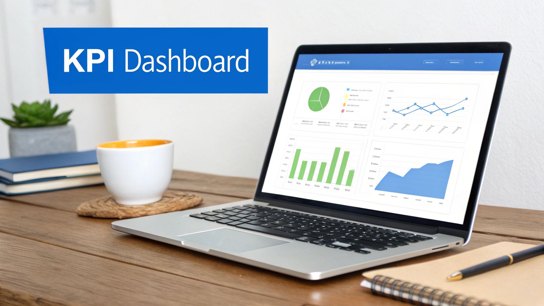
Data Viz Dashboard: Mastering data viz dashboard for decisions
Learn how a data viz dashboard can drive smarter decisions with clear visuals, essential types, and practical, AI-powered features.
https://www.youtube.com/watch?v=pCYzJGVkG8s
published
Outrank AI
data viz dashboard, business intelligence, data visualization, analytics dashboard, dashboard design
3abbfda8-76a5-4d77-8355-f485962a528b

A data viz dashboard is more than just a collection of charts; it’s your business’s command center. It pulls together raw, often chaotic, data from all over the place and transforms it into visual insights you can actually understand and act on.
The whole point is to get all your most important metrics in one spot. This lets your team keep a finger on the pulse of performance, spot trends as they emerge, and make decisions without having to guess.
What Is a Data Viz Dashboard and Why Does It Matter
Think of a data viz dashboard as the cockpit of an airplane. It's not a static, printed report—it's an interactive interface that gives you a live view of what’s happening. It connects to all your critical systems, from databases and SaaS tools to the good old spreadsheet, and presents everything in one unified display.
A pilot wouldn’t fly blind, and your team shouldn't either. This "cockpit" lets them track key performance indicators (KPIs) and navigate the complexities of your business with confidence.
The real game-changer here is how modern dashboards make data accessible to everyone. We've moved away from the old world of slow, manual reporting where you had to wait in line for an analyst. Now, we have dynamic, self-serve analytics that empower people in marketing, finance, and operations to get answers themselves.
A well-designed dashboard tells a story. It doesn’t just throw numbers on a screen; it gives you the context to understand what’s happening, why it’s happening, and what you should do next.
From Niche Tool to Business Essential
It wasn't that long ago that dashboards were seen as a specialized add-on for business intelligence teams. Today, they're a fundamental part of how companies operate. This shift happened because of the sheer explosion of data and the relentless pressure to get insights now, not next week.
The market reflects this reality. Valued at $5.9 billion in 2021, it's expected to hit $10.2 billion by 2026. You can dig into more details about this growth over at Algoscale.
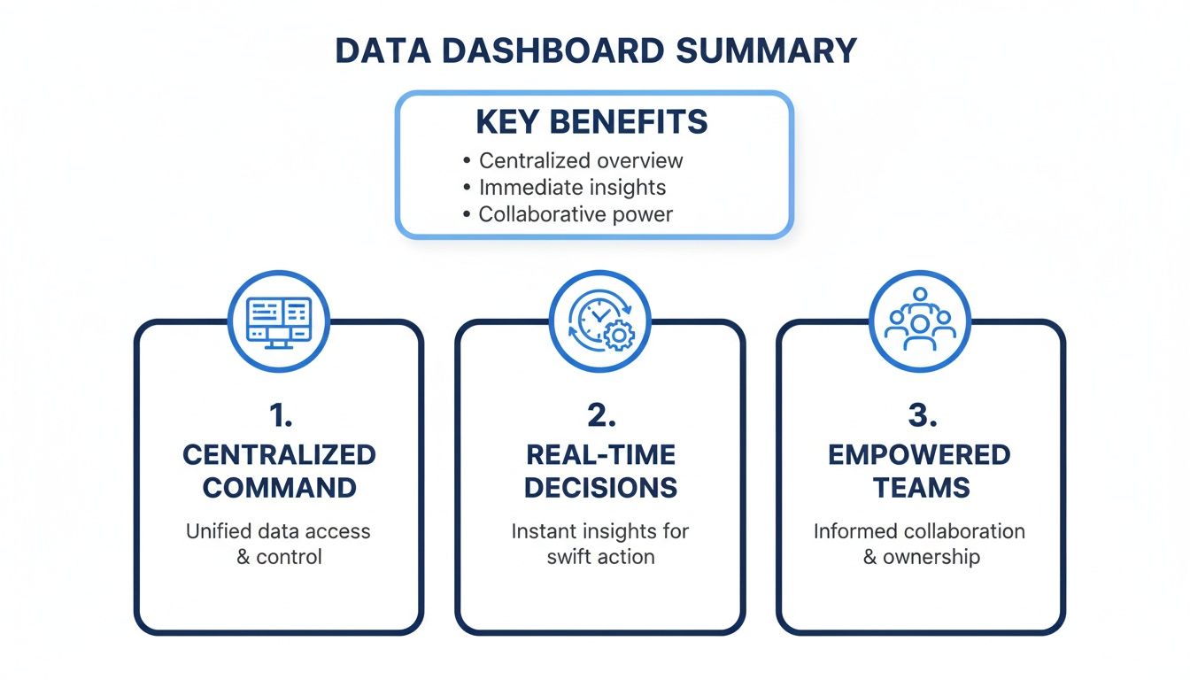
This evolution is fundamentally changing how businesses work by delivering three key benefits:
Faster Decision-Making: Instead of waiting for a monthly report, teams can see opportunities and fix problems the moment they arise.
Increased Transparency: When everyone is looking at the same data, you get alignment. No more arguments based on different spreadsheets.
Greater Accountability: It’s much easier to assign ownership of KPIs when performance is out in the open for all stakeholders to see.
By turning complex data into clear, actionable visuals, a data viz dashboard gives your entire organization the clarity it needs to move forward. For a deeper dive, check out our guide on data visualization and dashboards.
What Are the Four Main Types of Data Dashboards?
A data dashboard isn't a one-size-fits-all solution. The best ones are purpose-built, designed specifically for the person using them and the job they need to get done. Picking the right type is the difference between a dashboard that gathers dust and one that becomes an indispensable part of a team's daily workflow.
In my experience, dashboards generally fall into four distinct categories. Each one serves a unique audience with a very different goal in mind. Understanding these types is the first step to creating a data experience that actually helps people make better decisions.
Strategic Dashboards: The 30,000-Foot View
Think of a strategic dashboard as the executive's command center. It’s designed for the C-suite and leadership teams who need to monitor the long-term health of the business against its biggest goals. This isn't about the minute-by-minute fluctuations; it's about tracking progress toward quarterly and annual objectives.
What would a CEO look at on a strategic dashboard?
Quarter-over-quarter revenue growth
Trends in Customer Acquisition Cost (CAC)
Year-to-date profit margins
The name of the game here is clarity. These dashboards cut through the noise to provide a simple, at-a-glance summary of where the company stands. They are the compass for long-term strategy.
Operational Dashboards: The On-the-Ground Action
If a strategic dashboard is the view from 30,000 feet, an operational dashboard is the view from the factory floor or the support queue. These are for the frontline teams—sales, logistics, customer support—who are managing business processes in real time. The goal is to spot problems and take immediate action.
For these dashboards, the data has to be live. A customer support manager, for instance, needs to see metrics like current ticket volume, average response time, and agent availability update constantly. If wait times suddenly spike, the team sees it instantly and can pull people in to help clear the backlog.
Ultimately, by bringing all the critical information into one place, these dashboards give teams the confidence to act quickly and decisively.
Analytical and Embedded Dashboards: For Deep Dives and Seamless Integration
The other two types of dashboards are all about deep exploration and fitting neatly into existing workflows.
An analytical dashboard is a data analyst's playground. It's loaded with features for digging into the "why" behind the numbers. Think powerful filters, drill-downs, and segmentation tools that let curious minds slice and dice the data to uncover hidden insights.
On the other hand, an embedded dashboard brings analytics directly into the software and apps people already use every day. Instead of making users switch to a separate BI tool, it puts contextual insights right where they're needed most, creating a much smoother experience. To see these concepts in action, check out these powerful data visualization dashboard examples.
Comparing Data Dashboard Types
To make it even clearer, let's break down the core differences between these dashboard types side-by-side.
Dashboard Type | Primary User | Goal | Data Freshness | Example Metric |
|---|---|---|---|---|
Strategic | Executives, Leadership | Monitor long-term goals and business health | Weekly, Monthly, Quarterly | Year-over-Year Revenue Growth |
Operational | Frontline Teams (Sales, Support) | Track real-time processes and take immediate action | Real-time or Near Real-time | Current Customer Wait Time |
Analytical | Data Analysts, Business Analysts | Explore data to find trends, patterns, and "why" | Varies (often historical data) | Customer Churn by Cohort |
Embedded | Customers, End-Users of an App | Provide contextual insights within an existing workflow | Varies (often real-time) | In-App Usage Per Feature |
This comparison highlights how each dashboard is carefully tuned to its specific purpose, from guiding high-level strategy to resolving an immediate operational issue.
The Building Blocks of a Powerful Dashboard
A great data visualization dashboard isn't just a random collection of charts thrown onto a screen. It’s a carefully constructed, interactive experience designed to tell a clear story. Think of it like building with LEGOs—each individual brick has a purpose, but the magic happens when you connect them to create something meaningful.
These core components work in concert to turn passive data viewing into an active, exploratory process. When you get the combination right, anyone on your team can go from a 30,000-foot view down to the nitty-gritty details in just a couple of clicks.
Core Dashboard Components
At the heart of every effective dashboard, you'll find a few fundamental elements that provide structure and immediate clarity. These are the absolute must-haves for translating raw numbers into real-world insights.
Key Performance Indicators (KPIs): These are the big, headline numbers usually sitting right at the top. KPIs are your North Star metrics, giving you an instant gut check on whether you're winning or losing. A sales dashboard, for instance, would almost certainly feature Monthly Recurring Revenue (MRR) or Customer Lifetime Value (CLV) front and center.
Charts and Visualizations: This is where the data's story really starts to unfold. The trick is picking the right tool for the job. Use line charts to show trends over time, bar charts to compare categories, and scatter plots to uncover relationships. The goal is simple: choose the visual that makes the core insight jump off the page.
A dashboard isn’t just for showing people what you already know. Its real power is in enabling discovery. Interactivity is the key that unlocks this potential, inviting users to ask their own questions and follow their curiosity.
Bringing Data to Life with Interactivity
Static reports are fine, but interactive elements are what make a data viz dashboard a true game-changer. They give users the power to dig in, ask questions, and find their own answers without needing to ask a data analyst for help.
Filters: These are the controls that let users slice and dice the data on the fly. A marketing manager might filter a campaign performance dashboard by channel (like Google Ads vs. Organic Search) or by a specific date range to see exactly what’s driving results.
Drill-Downs: This is the feature that lets you click on a high-level number to see what's behind it. Imagine clicking on your total sales figure for North America to instantly see a breakdown by country. Then, clicking on a country to see the numbers by state, and then by city. This capability is often powered by a well-organized data backend, and you can learn more about how it works by understanding what is a semantic layer.
Designing Dashboards People Actually Want to Use
Let’s be honest: a brilliant data visualization dashboard that nobody uses is a complete waste of time and resources. The real difference between a tool that becomes indispensable and one that just gathers digital dust often boils down to thoughtful design and a laser focus on the user experience (UX). It’s about building something that feels natural, not like a chore.
The most common trap I see teams fall into is trying to cram everything onto a single screen. This "kitchen sink" approach creates a cluttered, overwhelming interface that just confuses people and buries the actual insights. The best dashboards do the opposite. They embrace a "less is more" philosophy, presenting only the information needed to answer specific, critical business questions.

Prioritize a Clear and Logical Layout
Structure is your best friend. When someone opens your dashboard, their eyes naturally jump to the top-left corner of the screen. So, put your most important, big-picture KPIs right there. This gives them an instant snapshot of what’s going on before they even think about digging deeper.
From that starting point, the layout should guide the user on a logical journey. Think of it like telling a story. Group related charts together and use plenty of white space to create a clean separation between different ideas. This simple organization prevents that feeling of being overwhelmed and helps people process what they're seeing much more quickly. A well-organized dashboard just feels more credible and easier to trust.
The goal of a dashboard isn’t just to show data; it's to communicate information. Every single element—every chart, color, and number—should have a clear purpose in telling that data's story.
Master the Art of Visual Design
Good design is all about function, not just making things look pretty. It builds trust and makes complex information much easier to understand at a glance. When you're putting together your data viz dashboard, keep these core principles in mind:
Use Color with Purpose: Don't just throw colors at your charts to make them pop. Use color strategically to highlight what matters, show variance (like red for a drop and green for a gain), or group related categories. A limited, consistent color palette is always more effective than a chaotic rainbow of visuals.
Choose the Right Visualizations: You need to match the chart type to the story your data is telling. Line charts are fantastic for showing trends over time. Bar charts are perfect for comparing different categories. Pie charts? Use them sparingly, if at all. For a deeper dive, check out these data visualization best practices.
Tailor Complexity to the Audience: An executive dashboard needs to be clean, simple, and focused on high-level KPIs. On the other hand, an analyst’s dashboard can afford to be more complex, packed with interactive filters for serious exploration. Always, always design for the person who will be using the tool every day.
Deploying Secure and Scalable Dashboards
Taking a dashboard from a beautiful design on your laptop to a live tool your customers rely on is a huge leap. The focus has to shift from pixels and charts to pure infrastructure. When you're building for your own team, the stakes are high enough. But when you embed analytics directly into your product for paying customers, the technical backend becomes absolutely mission-critical.
It's a classic mistake to overlook the architecture. Teams get so focused on the visuals that they forget what’s under the hood, and they end up with slow performance, gaping security holes, or a system that just can't grow with them. The real key is to plan for security and scale from the very beginning. You need to build something that's enterprise-ready from day one.
Building on a Foundation of Trust and Security
When customers give you their data, security isn't just another feature on a checklist—it's the entire foundation of your relationship. This means you have to go way beyond basic password protection and build a tough, multi-layered security model that protects their information at every single level.
For any kind of customer-facing analytics, achieving compliance certifications like SOC 2 Type II isn't optional. This independent audit proves you have airtight controls for handling customer data, which is a powerful way to earn their trust right out of the gate.
Another must-have piece of the puzzle is Single Sign-On (SSO). SSO lets users log in using their company's existing identity provider, like Okta or Azure AD. It makes logging in a breeze for them and gives their IT admins a central place to manage who has access to what.
Ensuring Data Isolation and Granular Access
In any situation where multiple customers use your product, you have to make one simple guarantee: one customer can never, under any circumstances, see another customer's data. That's where a multi-tenant architecture is so critical. It creates a strict, logical wall between each customer's data, ensuring every query and every dashboard is locked down to a single, authenticated organization.
This idea of data separation goes even deeper, right down to the individual user, with something called row-level security (RLS).
Row-level security is a powerful database feature that builds security rules directly into your data tables. Think of it as an automatic, server-side filter that guarantees a user's query only returns the specific rows of data they are authorized to see.
For instance, imagine you have a sales dashboard for all your regional managers. With RLS, you can build just one dashboard, but the policy you set in the database ensures the manager for the West Coast only sees West Coast data. The East Coast manager only sees East Coast data. It's the same dashboard, but the data is automatically filtered for them. This makes development and maintenance so much simpler while enforcing data boundaries that are impossible to breach.
How AI Is Changing the Dashboard Game

The classic data dashboard is getting a serious upgrade. For years, dashboards were passive reporting tools—great for showing you what happened, but not so great at explaining why it happened. That’s all changing. Artificial intelligence is turning these static reports into active, conversational partners in analysis.
This shift is making data accessible to everyone, not just the folks with "analyst" in their job title. Instead of relying on pre-built charts and a fixed set of filters, anyone on the team can now simply ask questions and get answers in seconds. It’s a genuine conversation with your data.
Talking to Your Data with Natural Language Querying
The biggest leap forward is Natural Language Querying (NLQ). You can think of it as a search bar for your company's entire dataset. No more clicking through complicated menus or waiting for an analyst to build a custom report. You just type what you want to know, as if you were searching on Google.
A marketing manager, for example, could just ask, "What were our top-selling products in California last quarter?" The AI behind the scenes figures out what that means, pulls the right information, and builds the perfect chart right then and there. This makes exploring data feel natural and immediate.
This is more than just a novelty; it’s a fundamental change in how we work. AI can even suggest the best way to visualize the data or point out patterns you might have missed. As tools get smarter, business users won't need to ask analysts for custom cuts of data anymore. They can ask the dashboard directly and turn their curiosity into real impact. You can read more about where this is all heading in this article about the future of data visualization on Forsta.com.
An AI-powered dashboard doesn't just show you what happened; it helps you understand why. By interpreting natural language and business context, it becomes an analytical assistant for your entire team.
From Answering Questions to Finding the Answers for You
The next step is even more interesting. AI agents are moving beyond just answering our questions and are starting to act as proactive partners. These systems are designed to learn the context of your business—they know what your KPIs mean, how different metrics are connected, and what a "normal" Tuesday looks like for your sales team.
With that deeper understanding, they can do some pretty amazing things:
Ask for Clarification: If you ask a vague question, the AI won't just guess. It might ask back, "By 'new customers,' do you mean brand new accounts or all user sign-ups this month?" This simple back-and-forth ensures you always get the right answer.
Spot Anomalies Automatically: The AI constantly monitors your data streams and can flag when something is off. You might get an alert like, "Heads up, website traffic from organic search is down 30% compared to the weekly average."
Uncover Hidden Opportunities: By finding connections you'd never think to look for, an AI agent could point out a hidden gem. For instance, it might notice that "Sales of Product X are 50% higher when customers also buy Product Y."
This evolution turns the dashboard from a rearview mirror into a GPS for your business. It’s not just about looking at the past anymore; it's about getting clear, actionable guidance for what to do next.
Answering Your Top Dashboard Questions
Even the best-laid plans run into questions, especially when you're in the trenches building a new data viz dashboard. Let's tackle a few of the most common ones that pop up, so you can move forward with a clear head.
What Is the Main Difference Between a Dashboard and a Report?
The simplest way to think about it is interactivity. A traditional report is static. It’s a snapshot in time—a PDF or a spreadsheet that gives you the numbers but doesn't let you ask "what if?"
A dashboard, on the other hand, is a living, breathing interface. It’s designed for exploration. Users can click, filter, and drill down into the data to chase their own curiosity and find answers to follow-up questions right on the spot.
A report tells you what happened. An interactive dashboard helps you discover why it happened.
How Do I Choose the Right Charts for My Dashboard?
This is a great question, and the answer comes down to one thing: the story you want the data to tell. Your goal should always be instant clarity. You want someone to glance at the chart and immediately grasp the key takeaway.
Here are a few rules of thumb I always come back to:
Use line charts when you need to show how something has changed over time.
Use bar charts for straightforward comparisons between different categories.
Use scatter plots if you're trying to see if there's a relationship or pattern between two different numbers.
Use pie charts sparingly. They're really only good for showing simple parts of a whole, and even then, bar charts are often clearer.
Can I Embed a Dashboard Into My Own Application?
Absolutely, and it’s one of the best ways to deliver value directly to your users. Modern business intelligence platforms are built for this, offering what's called embedded analytics. This lets you take a fully functional, white-labeled dashboard and place it right inside your product’s user interface.
It creates a completely seamless experience for your customers, keeping them inside your ecosystem. If you go this route, just make sure the platform you choose is built for enterprise-grade security with things like multi-tenancy, SSO, and row-level security to keep everyone's data safe and separate.
Ready to build interactive dashboards your team and customers will love? Querio's AI-powered platform lets you embed analytics, ask natural language questions, and get instant answers from your data. Explore Querio's embedded analytics today.

