A Founder's Guide to Reporting and Metrics for Growth
Master reporting and metrics to fuel business growth. This guide covers everything from North Star goals to AI analytics for data-driven decisions.
https://www.youtube.com/watch?v=Cnbdkye0X_8
published
Outrank AI
reporting and metrics, kpi tracking, business intelligence, data analytics, startup growth
3ab531dd-2d13-4330-ad4f-de0b9fe3f38e

Reporting and metrics are how you turn all that raw data your business generates into actual, usable insights. It’s the process of tracking the numbers that matter—your Key Performance Indicators (KPIs)—and then presenting them in a way that helps everyone make smarter decisions.
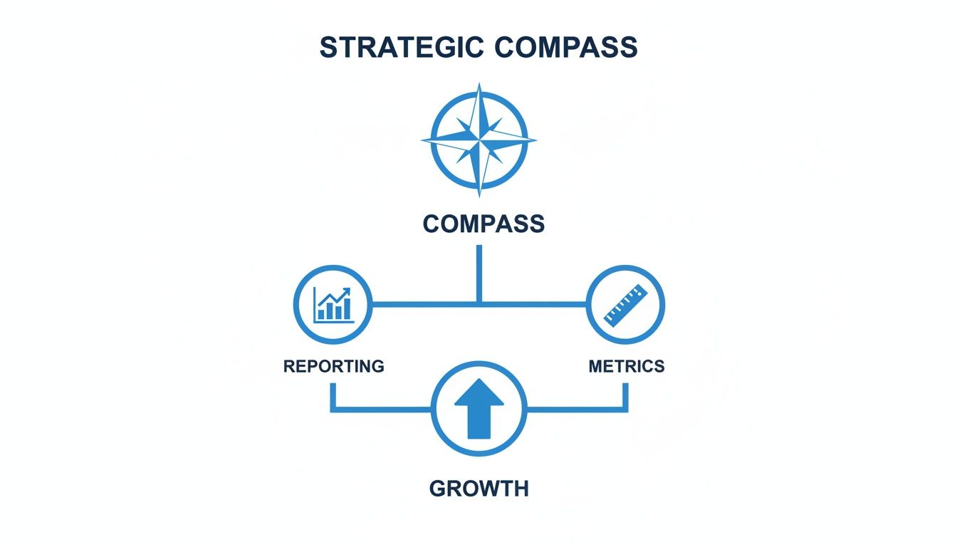
Why Reporting and Metrics Are Your Strategic Compass
Ever tried to navigate a ship in a storm without a compass? You’d be busy, for sure, wrestling with the wheel and trimming the sails. But you'd have no idea if you were heading for safe harbor or straight into a bigger storm. That’s exactly what running a business without a solid reporting strategy feels like.
Many companies get stuck in one of two traps. The first is data blindness—they run on pure gut instinct, making huge calls without any evidence to back them up. The other is data overload, where they're drowning in so many spreadsheets and conflicting numbers that they can't make a decision at all. It's analysis paralysis.
From Data Noise to Decisive Action
Good reporting and metrics cut right through that noise. They take a confusing mess of data and turn it into a clear signal for growth. This isn't about creating more spreadsheet chores; it's about building a framework that gives you and your team confidence and direction.
A strong framework helps you:
Align the entire team. When everyone knows what the key numbers are and what the goals are, they can finally pull in the same direction.
Spot opportunities faster. Clear metrics often reveal a growing trend or a winning tactic long before the competition catches on.
Identify risks early. That slight dip in a key health metric? It’s an early warning sign, giving you time to fix a problem before it becomes a full-blown crisis.
To truly leverage reporting and metrics as a strategic compass, understanding robust performance measurement systems is paramount for informed decision-making. These systems provide the structure needed to translate numbers into a coherent business narrative.
The Modern Advantage
In the past, building this kind of system was a huge, manual slog. It demanded a ton of technical skill and resources, which put it out of reach for most fast-moving companies.
Today, modern tools have completely changed the game. They automate data collection, make analysis shockingly simple, and put powerful insights into the hands of everyone on the team—not just the data scientists. This shift turns reporting from a backward-looking chore into a proactive, forward-looking weapon. By adopting this approach, you give your company the tools it needs to do more than just survive; you give it the clarity to navigate confidently toward real, sustainable growth.
Choosing Metrics That Actually Matter
Let's be honest, we're all drowning in data. There's an endless sea of numbers available, but only a handful truly signal your business's health and momentum. The real skill is separating the signal from the noise—picking the metrics that actually guide smart decisions, not just decorate a dashboard.
Think of your business as a ship navigating the ocean. Some instruments tell you your current speed and direction, helping you predict when you'll reach your destination (leading indicators). Others log the ports you've already visited, confirming your past journey (lagging indicators). And a critical gauge warns you if the engine is overheating, threatening the entire voyage (health metrics). You need all of them to navigate successfully.
Your job is to build a dashboard that gives you a complete, actionable picture of performance. To do that, you need to understand the different types of metrics and how they work together to tell a single, coherent story.
This is all about using reporting and metrics as a strategic compass, pointing your business directly toward sustainable growth.
As you can see, a clear strategy, guided by the right metrics and clear reporting, is the foundation for getting where you want to go.
Find Your North Star Metric
Every great company is obsessed with a single, guiding light. This is your North Star Metric (NSM)—the one number that best captures the core value your product delivers to its users. It’s not about revenue; it’s about your customers' success. For Facebook, it was "monthly active users." For Airbnb, it's "nights booked."
Your North Star Metric should answer a simple question: If this number goes up, does it mean our customers are getting more value and our business is growing as a result?
Choosing your NSM is more than a data exercise; it's a strategic one. It forces you to distill your company’s entire purpose into a single, measurable concept. Once you have it, it becomes the focal point that aligns everyone—from product to marketing to sales—on the same mission.
Distinguish Leading from Lagging Indicators
Next, you need to understand the timing of your metrics. This is the difference between a weather forecast and a history book.
Leading Indicators are forward-looking. They measure the inputs and activities that predict future success. Think about the number of sales demos booked this week or the volume of new free trial sign-ups. They are proactive, giving you a chance to course-correct before it's too late.
Lagging Indicators are backward-looking. They measure outputs—the results that have already happened. This is your quarterly revenue, customer churn rate, or annual profit. They are essential for confirming if your strategy worked, but they don't let you change the past.
A solid reporting framework needs both. Lagging indicators tell you if you won the game, while leading indicators tell you if you're playing well right now. Focusing only on revenue is like driving a car by looking exclusively in the rearview mirror.
Avoid the Trap of Vanity Metrics
Finally, you have to get ruthless about separating metrics that matter from those that just make you feel good. This is the critical difference between health metrics and vanity metrics.
Vanity metrics are those numbers that look impressive on a slide deck but don't actually connect to business success. Total registered users (most of whom might be inactive) or a viral post's view count are classic examples. They’re easy to measure but impossible to act on and can be dangerously misleading.
On the other hand, health metrics (also called actionable metrics) are tied directly to your core business goals. They provide clear insights you can use. We're talking about things like customer lifetime value, funnel conversion rates, or daily active users. For a deeper dive, check out our guide on what metrics really matter and how AI can surface them.
It’s crucial to know the difference. For example, when you compare watch time vs. view counts on social platforms, you see this in action. A million views mean nothing if everyone clicks away after three seconds. True engagement and retention are what actually build a business.
To help clarify these concepts, here’s a quick breakdown of the key metric types.
Key Metric Types Explained
Metric Type | What It Measures | Example | Best For |
|---|---|---|---|
North Star Metric | The core value delivered to customers. | Spotify: "Time spent listening." | Aligning the entire company on a single long-term goal. |
Leading Indicator | Predictive, input-focused activities. | Number of new sales demos booked per week. | Making proactive adjustments to influence future results. |
Lagging Indicator | Historical, output-focused results. | Last quarter's total revenue. | Evaluating past performance and confirming strategy success. |
Health Metric | Actionable data tied to business goals. | Customer churn rate. | Making informed, data-driven operational decisions. |
Vanity Metric | Superficially impressive but non-actionable data. | Total social media followers. | Generating surface-level buzz; avoid for strategic decisions. |
By choosing a North Star, balancing your leading and lagging indicators, and ditching the vanity metrics, you can finally build a reporting system that serves as a true strategic compass, guiding every decision toward meaningful, sustainable growth.
Building a Reliable Data Foundation
Even the most beautiful reports are useless if they're built on a shaky foundation. When data is inaccurate, inconsistent, or just plain wrong, you get flawed decisions and a slow erosion of trust across the entire company. To build a system that people actually rely on, you have to start with the raw materials—your data—and make sure they’re solid.
It all starts with something called data instrumentation. Think of it like installing sensors throughout a factory. You proactively embed data collection points into your product, your website, and your internal systems to capture every important action. This could be anything from a user clicking a button to a new deal closing in your CRM. This isn't a passive activity; it's a deliberate strategy to collect the right information from the get-go.
Without proper instrumentation, your teams will always be scrambling to find data after the fact, which almost always leads to incomplete or messy analysis. A well-instrumented environment, on the other hand, gives you a constant, reliable stream of information to power everything else.

Establishing a Single Source of Truth
Once you have data flowing in, the next big hurdle is consistency. Ever been in a meeting where marketing and sales present completely different numbers for the exact same metric? It's a classic problem, and it usually stems from a lack of a single source of truth (SSOT).
An SSOT is simply a centralized, official data repository that everyone in the organization agrees to use for all their reporting. It’s the final word. This one simple concept eliminates endless debates and ensures everyone is working from the same set of facts.
To make an SSOT work, you need a couple of key governance tools in your belt:
A Data Dictionary: This is your "rulebook" for metrics. It’s a living document that clearly defines every metric your company tracks, explaining exactly what it means, how it's calculated, and where the data comes from. For instance, it would clarify if an "Active User" is someone who logged in today, this week, or this month.
Consistent Naming Conventions: This is about creating and enforcing a standard for how you name events and properties across all your systems. Simple rules—like always using
user_signed_upinstead of a chaotic mix ofUserSignedUp,signedUp, anduser_signup—prevent a ton of confusion and make the data much easier for everyone to query.
The Importance of Data Governance and Quality
As your company grows, keeping data clean becomes a much bigger challenge. This is where data governance enters the picture. Think of it as the overall management of your data as a business asset—covering its availability, usability, integrity, and security. Strong governance is what keeps your data accurate and trustworthy as time goes on.
It’s essentially the quality control process for your data factory. It involves setting clear rules for who can access data, how they can use it, and how you'll monitor its quality. Implementing robust data governance best practices is absolutely critical if you want to build a true data-driven culture. When people trust the numbers, they use them. When they don’t, they just go back to guesswork.
This push for trustworthy data isn't just an internal nice-to-have; it's a global business imperative. The stats show why leaders are so focused on getting reporting right. A staggering 94% of organizations now consider business intelligence 'critical' or 'very important' to their success. After the pandemic, 49% of companies ramped up their BI usage, with the U.S. market alone projected to hit $18.3 billion by 2033. You can find more insights on the growth of business intelligence at Market.us.
Building a culture of data trust is foundational. It’s about creating an environment where every team, from engineering to marketing, can confidently use data to make smarter, faster decisions that move the business forward.
Ultimately, a reliable data foundation isn't just a technical problem to solve; it's a cultural one. Get it right, and you’ll transform your reports from a source of debate into a source of clarity and real strategic advantage.
Designing Reports People Will Actually Use

Let's be honest: the most accurate data in the world is useless if it's buried in a report nobody reads. The final, and arguably most critical, step in any analytics process is turning those raw numbers into a story that makes people do something. This is where effective reporting and metrics stop being a technical chore and become a strategic advantage.
A great report isn't a data dump; it's a conversation. It should guide the reader from a high-level "what's happening?" to a specific, actionable "what should we do next?" To get there, clarity and simplicity are your best friends.
Know Your Audience and Their Needs
This is the golden rule. A one-size-fits-all dashboard is a recipe for failure because different teams are trying to answer completely different questions.
Executive Board: They need the 30,000-foot view. Think high-level, lagging indicators like quarterly revenue, customer lifetime value, and market share. Keep it visual, concise, and focused on the big picture.
Product Team: They're in the trenches every day. They need granular, real-time insights into leading indicators like user activation rates, feature adoption, and conversion funnels. Their reports have to be detailed and interactive.
Operations Team: Their world revolves around efficiency. Dashboards for them should track real-time health metrics like system uptime, ticket resolution times, or inventory levels.
Before you build anything, ask yourself two questions: "Who is this for?" and "What one decision do I want them to make after seeing this?" Answering that will instantly clarify what to include and, just as importantly, what to leave out. For a deeper dive into making your charts clear and impactful, check out these essential data visualization best practices.
The Power of Effective Data Visualization
How you show the data is just as important as the data itself. The right chart can make a trend pop in seconds—something that might be completely lost in a spreadsheet. Your goal is to reduce the mental effort it takes to get to the insight.
A great dashboard tells a story. It should answer the most important questions at a glance, with the ability to drill down for more detail. It's less about showing everything and more about showing the right thing.
This focus on user-friendly design is part of a much bigger trend. We’ve moved away from clunky, static reports that take days to build toward dynamic, interactive dashboards. This shift is happening fast, with the global BI and analytics market growing from $23.9 billion in 2020 to $31.98 billion in 2024, and it's projected to hit a massive $63.20 billion by 2032. You can see the full analysis of this market growth on Fortune Business Insights.
Modernizing Report Distribution
Finally, think about how you get these insights into people's hands. The days of emailing around a massive, static PDF report are over (or at least, they should be). Modern methods are all about putting data directly into a team's daily workflow.
Here are a few ways to do that:
Scheduled Email Digests: Send a quick, automated summary of key metrics to stakeholders’ inboxes every morning. It’s the perfect way to start the day informed.
Real-Time Dashboards: Give teams a live, shareable link to an interactive dashboard so they can check in on performance whenever they need to.
Self-Serve Analytics Portals: This is the future. Empowering non-technical users with tools like Querio lets them ask their own questions in plain English and get instant answers, no analyst required.
By designing for your audience, visualizing data with purpose, and delivering insights in a modern way, you close that "last mile" of analytics. This is how your reporting and metrics transform from a passive task into an active catalyst for smarter, faster decisions across the board.
The Future of Reporting Is AI-Powered
The world of reporting and metrics is changing in a big way. For a long time, getting deep insights from data was a slow, painful process. Every question had to go through a swamped data team, creating a huge bottleneck. That old model is now being turned on its head by artificial intelligence, which is making sophisticated analysis available to everyone, instantly.
Think about it. What if your head of sales could just type, "What were our top 10 deals in Q2, and what was the average sales cycle for them?" and get a perfect chart in seconds? This isn't a futuristic dream anymore. It’s exactly what AI-powered BI platforms are delivering today. They’re changing reporting from a static, backward-glance into a live, interactive conversation with your data.
What used to take weeks of back-and-forth between teams now takes just a few minutes.
From Bottlenecks to Breakthroughs
The old way of working created a frustrating gap between a question and its answer. A non-technical person would have a great idea, file a ticket, wait for an analyst, explain what they needed, and finally get a report days or weeks later. By that time, the moment to act might have already passed.
AI agents are tearing down that entire structure. These tools translate plain-English questions into complex data queries, empowering anyone in the company to act as their own analyst. This opens up data access for everyone, and the impact is massive.
The real power of AI in analytics isn't just about speed; it's about unlocking the collective curiosity of your entire organization. When anyone can ask any question, you discover insights you never would have thought to look for.
This fundamental shift is fueling explosive growth in the business intelligence market. In 2025, the global BI market is valued at a massive USD 33.62 billion, and it's projected to nearly double to USD 63.17 billion by 2034. You can discover more insights about the business intelligence market on Precedence Research. Companies are clearly racing to use data as a competitive advantage, especially with cloud BI tools helping operations teams cut their manual Excel work by up to 80%.
Introducing Embedded Analytics
The next big step goes beyond internal dashboards. It’s about bringing this analytical power directly to your customers through embedded analytics. This means integrating white-label charts, dashboards, and even an "Ask your data" search bar right into your own software product.
Instead of forcing customers to export data and build their own reports elsewhere, you can give them rich, interactive analytics inside your app. This makes your product stickier and adds a ton of value for your users.
Here's a great example from Querio, a modern BI platform, showing how a user can ask a simple question and get an instant visualization.
This shows just how easy it is. A simple, plain-English question generates a complex data chart on the spot—no coding or technical expertise required.
This isn't just a cool feature; it can become a whole new revenue stream. You could offer advanced analytics as a premium tier in your pricing, turning what was once a cost center into a profit-generating part of your business. You can learn more about the future of AI in business intelligence and how it’s reshaping product strategy.
By bringing in AI-powered reporting and embedded analytics, you're doing more than just improving your internal workflow. You're building a smarter organization and creating a more powerful product for your customers.
Bringing Your Metrics Strategy to Life
Okay, the theory is solid, but what does this look like in the real world? This is where the rubber meets the road—where we take these ideas about reporting and metrics and turn them into something tangible that actually helps people do their jobs better. A winning metrics strategy isn't just about the numbers you track; it's about how your teams use that information to make smarter calls, day in and day out.
Let's break down how this plays out in different parts of the business. Every department has unique problems to solve, and the right reports can give them the clarity they need to find solutions and drive growth.
Real-World Reporting Scenarios
Imagine a product team scratching their heads over low user activation. Instead of throwing ideas at the wall, they build a funnel analysis report. This report maps out the entire user journey, from the moment someone signs up to that first magical "aha!" moment. Almost immediately, a glaring problem appears: a 40% drop-off right at the team invitation step. That’s a massive friction point they never would have seen otherwise. Now, they can focus their energy on redesigning that one workflow, knowing it will directly move their North Star Metric.
Or how about an operations team buried in manual supply chain work? They set up automated reports to monitor key logistics metrics like order fulfillment time and inventory turnover. Suddenly, the system is flagging inefficiencies as they happen, allowing the team to reroute shipments and tweak stock levels on the fly. This data-driven approach helps them slash costs by 15% in just one quarter.
And then there's the finance team prepping for the quarterly board meeting. Instead of a dense, static spreadsheet, they build a dynamic board package with a tool like Querio. This report tells a story, connecting financial results directly to operational KPIs. Board members can click into high-level revenue numbers and see exactly which marketing campaigns or product features drove that growth. The conversation shifts from "What are the numbers?" to "What do these numbers mean for our strategy?"
The goal is to get past just showing data. Great reporting gives you the story behind the numbers, empowering every team to see how their work connects to the bigger picture.
A Practical Checklist for Getting Started
To make this even more concrete, here's a simple checklist you can use to build or overhaul your company’s reporting from the ground up:
Define a Single North Star Metric: Get everyone in the company rowing in the same direction by focusing on one ultimate measure of value.
Identify 3-5 Key Metrics Per Department: Give each team clear ownership over the numbers that matter most to their function.
Establish a Single Source of Truth: Centralize your data. This kills confusion from conflicting reports and builds trust across the organization.
Automate Data Collection and Reporting: Get your team out of the spreadsheet mines. Free them up to do what humans do best: analyze and act.
Schedule Regular Review Cadences: Make talking about metrics a habit. Set aside time every week or month to discuss the data and agree on what to do next.
Following these steps will put you on the path to becoming a truly data-driven organization, where insights consistently lead to decisive action.
Frequently Asked Questions About Reporting and Metrics
Even with the best strategy in place, you're going to hit some practical roadblocks when you start overhauling your reporting and metrics. It happens to everyone. This section tackles some of the most common questions and sticky situations leaders run into, giving you clear answers to help you build a data-driven culture that actually works.
Think of this as your quick-start guide for overcoming those initial hurdles and getting some early wins on the board.
Where Do We Start if We Don't Have a Data Team?
This is a classic "chicken and egg" problem, but the answer is simpler than you think: start small and get a win. You don't need a team of data scientists to get going.
Pick one—and only one—critical business problem. Maybe it's figuring out why users aren't sticking around or improving the conversion rate from trial to paid. Now, identify just three to five metrics that tell you if you're making progress on that specific problem.
Use a modern, user-friendly BI tool that lets non-technical folks explore data without needing to write SQL. This approach proves the value of data right away, which builds momentum and makes it much easier to argue for bigger investments down the road.
How Can We Make Sure the Data Is Accurate?
If your team doesn't trust the numbers, they won't use them. It's that simple. Trust is the currency of any data initiative.
The single most important thing you can do is establish a single source of truth. This is usually a central data warehouse that everyone agrees is the official, definitive record. No more conflicting spreadsheets.
Next, create a simple data dictionary. It doesn't have to be complicated—just a document that defines what each metric means and how it’s calculated. Finally, run simple, regular checks on your key reports to spot anything that looks off. The goal here is consistency, not perfection. Building and keeping trust in your data is a marathon, not a sprint.
What's the difference between a report and a dashboard? Think of a report as a deep-dive document—a detailed, often static analysis of a specific topic over a set period. A dashboard, on the other hand, is your live, at-a-glance cockpit view of key performance indicators, designed for quick monitoring.
How Often Should We Be Looking at Our Metrics?
The right review cadence isn't one-size-fits-all. It completely depends on the metric itself and how fast it can realistically move.
Leading indicators—things like daily active users or new leads—are your early-warning system. You should be checking these daily or weekly.
Lagging indicators—like customer lifetime value or quarterly revenue—confirm your long-term strategy is working. Reviewing these monthly or quarterly is plenty.
By matching your review frequency to the metric's natural rhythm, you ensure you’re responding to real trends instead of just chasing random noise. This disciplined approach is a cornerstone of effective reporting and metrics.
Ready to stop the data bottlenecks and give your entire team the power to get instant, accurate answers? Querio is an AI-powered business intelligence platform that lets anyone ask questions in plain English and get insights in seconds. Explore how Querio can transform your reporting today.

