When to Use Pie Charts for Clearer Data Stories
Discover when to use pie charts for maximum impact. This guide explores best practices, common mistakes, and powerful alternatives to tell clearer data stories.
https://www.youtube.com/watch?v=mWZL2ae1l30
published
Outrank AI
when to use pie charts, data visualization, pie chart best practices, chart types, data storytelling
d445efbd-6bf9-43c3-adc8-ba9bdbf1d720

Here’s the thing about pie charts: they have one job, and one job only. The golden rule is simple: use a pie chart only when you need to show parts of a whole for a single point in time.
Think of it like a pizza. Each slice is just a percentage of the total pie, giving you an instant feel for how big one piece is relative to the others. If your data doesn't add up to a meaningful 100%, or if you're trying to show how something changed over time, a pie chart is absolutely the wrong tool for the job.
Understanding Proportions at a Glance
The real power of a pie chart is its ability to communicate compositional data. This is any dataset where individual pieces combine to form a complete, meaningful total.
A marketing team, for example, could use one to show its budget allocation. The slices for "Paid Social," "Content Marketing," and "SEO" all represent a portion of the total quarterly spend. Our brains are hardwired to see the circle and instinctively understand we're looking at the components of a single entity.
This part-to-whole relationship is the absolute, non-negotiable foundation for using a pie chart. It's precisely why they fall flat when you try to compare separate datasets or track trends. A pie chart is a snapshot, freezing a single moment in time to give you a clear picture of its distribution. You can dive deeper into this core concept of comparing a piece of data to the whole in our dedicated guide.
The Core Job of a Pie Chart
So, when should you actually reach for one? The answer is whenever your primary goal is to show the relative size of a few categories compared to each other and to the total they create.
It's the right choice for:
Highlighting Dominant Categories: Quickly see which segment is eating up the biggest share, like identifying your top-selling product line.
Simplifying Complex Percentages: Make fractions and percentages easy to grasp. A slice representing 75% is instantly recognizable without anyone needing to read the label.
Providing High-Level Overviews: They work well on dashboards for a quick summary, like showing the breakdown of new vs. returning customers this month.
To make this crystal clear, here’s a quick guide to help you make the right call every time.
Pie Chart Quick Guide Do vs Don't
Use this table as your go-to reference for deciding if a pie chart is the right fit for your data.
Use a Pie Chart When You Need To... | Avoid a Pie Chart When You Need To... |
|---|---|
Show the percentage breakdown of a single total (e.g., market share). | Compare values across different, unrelated categories. |
Visualize a small number of categories (ideally 3-6). | Track changes or trends over a period of time (e.g., monthly sales). |
Emphasize a simple proportional relationship (e.g., Yes/No survey results). | Display data with many small categories that create clutter. |
Present data for a single, static point in time (e.g., Q3 budget allocation). | Compare the composition of multiple different totals side-by-side. |
Ultimately, it comes down to asking yourself: "Does my data represent 100% of a single thing?" If the answer is yes, a pie chart might just be your best friend. If not, it's time to look for a better alternative.
The Anatomy of a Powerful Pie Chart
A great pie chart is so much more than a colorful circle. It’s a communication tool, and for it to work, the data has to follow two very strict rules: categories must be mutually exclusive, and they must be collectively exhaustive.
In plain English, that just means every piece of data fits into one and only one slice, and all the slices together add up to a complete 100%.
Think about divvying up a marketing budget. You can't put the same dollar into both "Paid Ads" and "Content Creation"—that’s mutually exclusive. At the same time, your chart needs to show the entire budget to be a true picture of the whole, not just a few select spending areas. That’s collectively exhaustive.
If you're ever unsure, this flowchart can help you decide if a pie chart is genuinely the best fit for your data.
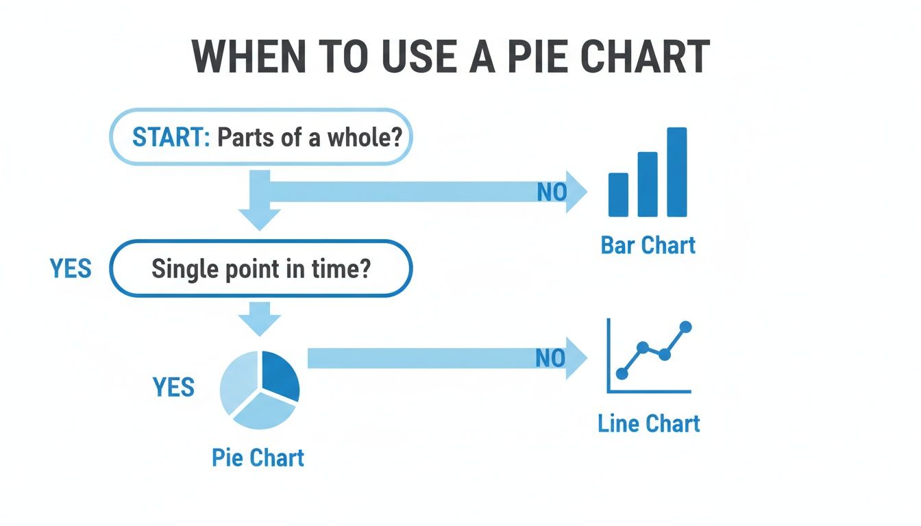
As you can see, it really boils down to this: use a pie chart to show parts of a whole at a single moment. For just about anything else, a bar or line chart will do a much better job.
Keeping It Simple Is Key
The number one mistake I see people make is cramming way too many categories into one pie chart. It’s a classic case of good intentions leading to bad results. Our brains are terrible at comparing the angles of multiple small slices, and what you end up with is a chart that creates confusion, not clarity.
The best pie charts almost never have more than five or six slices. If you have more categories than that, take it as a clear sign that a different chart, like a simple bar chart, will tell your story much more effectively.
This isn’t just a stylistic choice; it's about effective data storytelling. For instance, pie charts are fantastic for showing market share. In 2023, the global smartphone market was a perfect example: Apple held 20.1%, Samsung had 19.5%, and Xiaomi was at 12.5%. With just a few distinct categories, the competitive landscape becomes instantly understandable.
Design That Guides, Not Distracts
Beyond just the data, the actual design of the pie chart can make or break it. A few thoughtful tweaks can make a world of difference in how quickly your audience gets the message.
Here are a few design tips I always follow:
Order Your Slices: This is a small thing that has a big impact. Always arrange the slices from largest to smallest, starting at the 12 o’clock position and moving clockwise. It creates a natural visual flow and makes it easy to spot the most important categories.
Use Direct Labels: Don't make people work to understand your chart. A separate legend forces their eyes to jump back and forth, which is tiring. Instead, put the category names and percentages right on or next to the slices they represent.
Skip the 3D and "Exploded" Views: They might look cool, but 3D effects and exploding slices are your enemy. The tilted perspective warps perception, making the slices closest to the viewer look bigger than they actually are. It’s a surefire way to compromise the integrity of your data.
Crafting great charts often comes down to understanding broader user interface design principles that improve how people interact with information. For a deeper dive into this, you can check out our complete guide to data visualization best practices.
Real-World Examples of Pie Charts Done Right
Theory is great, but let's be honest—seeing how something works in the real world is what really makes it click. To truly get a feel for when a pie chart is the right call, it helps to see them in action, solving actual business problems with a single, clear visual.
Let's look at how different teams can use a well-made pie chart to get that immediate, high-impact insight that a simple table of numbers just can't deliver.

Each of these examples shows how a simple circle can answer a surprisingly complex question in seconds. They all stick to the golden rule: showing parts of a whole, right now.
For Product Teams Understanding the User Base
Imagine you're a product manager at a SaaS company. You need a quick pulse check on the composition of your user base across three subscription tiers: Free, Pro, and Enterprise. A spreadsheet gives you the raw numbers, but it doesn't really give you a feel for the proportions.
This is where a pie chart shines. It tells the story instantly.
Free Plan Users: 65%
Pro Plan Users: 25%
Enterprise Plan Users: 10%
The "aha!" moment is right there. That massive slice for the Free tier immediately tells you the vast majority of your users aren't paying you a dime. This single visual can kickstart critical conversations about conversion funnels, whether you're gating the right features, and if the Pro tier is compelling enough. It’s a perfect snapshot of your user mix today.
The pie chart doesn’t show if the Enterprise segment is growing—that’s a job for a line chart. It simply answers: "Of our entire user base today, what portion does each subscription tier represent?" This is a perfect example of knowing the right question for the right chart.
For Finance Teams Analyzing Operational Costs
Now, picture a finance team prepping for a quarterly business review. Their job is to communicate where the company's money went last quarter. Just listing out expenses like salaries, marketing, and rent in a table is accurate, but it’s dry and lacks punch.
Instead, the finance lead whips up a pie chart to visualize the Q3 operational expense breakdown:
Salaries & Benefits: 55%
Marketing & Sales: 20%
Office & Utilities: 15%
Software & Subscriptions: 7%
Other: 3%
Everyone in the room can instantly see that over half of all operational spending is tied to personnel. That clarity is incredibly powerful. It frames the entire conversation around the biggest cost drivers and helps focus the discussion on where to find potential savings next quarter. The chart makes the financial story resonate with everyone, whether they have a finance background or not.
For Growth Teams Assessing Acquisition Channels
Finally, let's look at a growth marketing team. They just wrapped up a major Q4 campaign and need to report on where new customers came from. The goal isn't a detailed analysis (yet), but a quick, high-level summary of which channels delivered.
A pie chart is the perfect tool for this kind of part-to-whole recap.
The chart shows the source for all new customers acquired during the campaign:
Organic Search: 45%
Paid Social: 30%
Referrals: 15%
Direct Traffic: 10%
The key takeaway is unmistakable: organic search was the star of the show, bringing in nearly half of all new sign-ups. This insight gives the team a clear signal on where to double down their efforts and allocate future budgets. In just a few seconds, raw data becomes a strategic directive.
Common Pie Chart Mistakes and How to Fix Them
It’s surprisingly easy to build a pie chart that ends up confusing people more than it clarifies. Even with the best intentions, a few common mistakes can completely distort the story your data is trying to tell. But here’s the good news: for every common pitfall, there's a simple, much clearer alternative.
Once you learn to spot these traps, you can make sure you’re always picking the right chart for the job.

Knowing when to use a pie chart is half the battle; knowing when not to is the other half. Let's walk through the most frequent errors and their straightforward fixes.
Mistake 1: Using Pie Charts for Time-Series Data
This is probably the biggest and most common mistake out there: using a pie chart to show how something changes over time. A pie chart is designed to be a snapshot of a single moment. When you line up multiple pie charts to show monthly sales or quarterly user growth, you're forcing your audience to do some really heavy lifting.
Think about it—our brains just aren't wired to accurately compare the angles of slices across different circles. It’s a recipe for confusion when you’re trying to show a clear trend.
The Problem: Trying to figure out if the "Q1 Sales" slice is bigger or smaller than the same slice in "Q2 Sales" is nearly impossible without staring, squinting, and probably still getting it wrong.
The Fix: A line chart is your best friend here. It’s the undisputed champion for showing a continuous data series over time, making trends and patterns pop out instantly.
Mistake 2: Distorting Data with 3D and Exploding Slices
They might look flashy, but 3D effects and "exploding" slices are the enemies of data integrity. As soon as you tilt a pie chart, you destroy its proportions. Slices in the foreground automatically look bigger than they really are, while the ones in the back shrink.
This isn't just a design choice; it's an accuracy issue. Any visual effect that makes a 25% slice look larger than a 30% slice is actively misleading your audience. It should be avoided at all costs.
Likewise, pulling a slice away from the center—the "exploding" effect—gives it way too much visual weight. It screams "look at me!" and suggests that category is more important than the others, regardless of its actual value. These stylistic gimmicks completely undermine the goal of representing data honestly. If you want to see more examples of how good intentions can lead to bad charts, check out these examples of bad data visualization.
Mistake 3: Comparing Multiple Pie Charts
Just like you shouldn't use a series of pies for time-based data, you should also steer clear of using them to compare the composition of different groups. Imagine trying to understand market share by placing a pie chart for "Company A" next to one for "Company B." It’s a visualization nightmare.
Your audience has to jump back and forth between the two charts, trying to mentally map slice sizes and angles from one circle to the other. It’s an exhausting process that often leads people to the wrong conclusions.
The Problem: The cognitive load is just too high. The human brain isn’t built for the task of comparing proportions across two separate circles.
The Fix: A stacked bar chart or a grouped bar chart is a far better choice. By putting everything on a common baseline, these charts make direct comparisons between categories and totals both simple and accurate.
Smarter Alternatives to the Pie Chart
Knowing when to use a pie chart is a good skill. Knowing when not to use one is even better. Pie charts are great for one specific job: showing a simple part-to-whole relationship. But for most other data stories, there are smarter, more effective ways to visualize your numbers.
The reason is simple and comes down to how our brains work. We're surprisingly terrible at judging angles and the area of circular wedges. We are, however, incredibly good at comparing lengths along a straight line. This one cognitive quirk is why bar charts often trounce pie charts, even when you're showing parts of a whole.
The Bar Chart: A Clearer Comparison
If your main goal is to let your audience compare the values of different categories, a bar chart is almost always the right call. It trades the pie chart's confusing angles for the simple, intuitive lengths of bars. Suddenly, even tiny differences between categories become crystal clear.
Imagine you're looking at website traffic sources with a bunch of different channels. In a pie chart, this would quickly devolve into an unreadable mess of tiny, indistinguishable slivers.
The Pie Chart Problem: Is "Referral" traffic at 12% really bigger than "Email" at 11%? Good luck telling them apart. The slices will look virtually identical.
The Bar Chart Solution: The moment you switch to a bar chart and sort it from largest to smallest, the difference is obvious. The hierarchy is instantly understood, making the data much easier to process.
That one simple change can turn a confusing graphic into a clear-as-day insight. To dive deeper into chart selection, check out our complete data visualization guide on choosing the right charts.
Handling More Complex Part-to-Whole Data
Okay, but what if you really do need to show that part-to-whole relationship, especially when you have more than just a few categories? While a standard bar chart still works, a couple of other chart types are specifically designed for this.
When a pie chart gets too crowded, don't try to force it. It's time to upgrade your visualization to something built for more complexity, like a stacked bar chart or a treemap. This keeps your data story clean and accurate.
A stacked bar chart is a fantastic alternative. It shows the total as one single bar, with colored segments breaking down each category's contribution. This gives you the best of both worlds: it keeps the part-to-whole context while making it far easier to compare the relative size of each piece.
Another powerful option is the treemap. Treemaps use a series of nested rectangles where the area of each box is proportional to its value. They are brilliant for showing hierarchical data or datasets with many categories, letting you see the big picture and the tiny components all at once, without the clutter of a messy pie chart.
Using Pie Charts Strategically in Dashboards
In data visualization, context is king. This is especially true when you're building a business intelligence dashboard. While pie charts get a bad rap—often for good reason—they can still earn their place on a dashboard if you use them sparingly and for a very specific purpose.
Think of a pie chart on a dashboard as a high-level summary, a quick-glance widget. It’s not there for deep analysis. Instead, it’s perfect for delivering an instant, digestible snapshot of a single, crucial metric’s composition.
A pie chart showing "Revenue by Region," for example, gives a leader an immediate feel for which market is carrying the most weight. They get the big picture without having to read a single number in a table.
Turning Snapshots into Conversations
The real magic happens when a dashboard pie chart isn't just a static image but a gateway to deeper exploration. This interactive potential is the key to using them effectively.
A well-built dashboard should let a user click on a slice to filter everything else. Imagine this:
Someone clicks the “North America” slice on that revenue pie chart.
Instantly, the entire dashboard updates to show data only for that region. A bar chart might then break down sales by country within North America, or a line chart could reveal the region’s growth trend over the past year.
Suddenly, the pie chart isn't just a visualization; it's an intuitive navigation tool. It kicks off a conversation with the data, inviting users to ask the next question and dig deeper.
By making pie charts interactive, you transform them from a potential data visualization weakness into a strength. They become a gateway to more detailed insights, guiding users from a high-level overview to the granular data that drives decisions.
This strategic approach gives the pie chart a clear job to do: simplify the initial view while keeping complex analysis just one click away. Of course, a great dashboard is more than just one chart. To make sure all your visualizations work together, it helps to understand the top dashboard design best practices that guide effective data presentation.
Common Questions (and Straight Answers) About Pie Charts
Even with the best advice, you're bound to run into some specific head-scratchers when you're in the thick of building a report. I've heard them all over the years. Let's tackle the most common questions to clear up any lingering confusion.
Think of this as your final gut check before you decide a pie chart is the right tool for the job. Getting these details right is the difference between a chart that clarifies and one that just confuses.
What’s the Magic Number for Pie Chart Slices?
If you want your chart to be instantly readable, stick to three to six slices. Seriously, this is a golden rule in data visualization for a reason.
Once you start creeping past six or seven slices, they get so thin and the angles become so similar that it’s nearly impossible for anyone to tell them apart. At that point, your chart isn't just unhelpful; it's actively misleading.
Got more than six categories? Don't force it. A simple bar chart, sorted from biggest to smallest, will tell the story much more clearly every single time.
Can I Use a Pie Chart to Show How Things Change Over Time?
Nope. Absolutely not. This is one of the most common mistakes I see, and it’s a big one. Pie charts are designed to show a snapshot of a part-to-whole relationship at a single moment in time.
Placing multiple pie charts side-by-side to show quarterly data, for example, is a classic mistake. You're asking your audience to compare the size of a slice in one circle to the size of a different slice in another circle—a task our brains are notoriously bad at.
If you're showing any kind of data over time, a line chart is your best friend. It’s built specifically to reveal trends, spikes, and dips at a glance.
When Should I Use a Donut Chart Instead of a Pie Chart?
A donut chart is really just a pie chart with a hole in the middle. Some data viz pros argue they're a slight improvement because they get rid of the distracting angles at the center and force you to compare the length of the arcs, which can be a tiny bit easier on the eyes.
That hole isn't just for looks, either. It’s prime real estate for a key number, like the grand total or a headline metric. This makes them a pretty popular choice for dashboard widgets where space is tight.
But don't be fooled—they suffer from the exact same limitations as pie charts. Keep it simple, use them only for part-to-whole data, and stick to a small number of categories.
Ready to move beyond static charts and let anyone on your team get answers from your data? With Querio, you can ask questions in plain English and get accurate, presentation-ready visualizations in seconds. Stop waiting on manual reports and start making faster, data-driven decisions. Learn more at https://www.querio.ai.

