Drive Decisions with data analytics and visualization: From Data to Insights
Discover how data analytics and visualization turn raw data into actionable insights with practical tools, real-world examples, and proven strategies.
https://www.youtube.com/watch?v=Jt10v86bqVU
published
Outrank AI
data analytics and visualization, business intelligence, data-driven decisions, self-serve analytics, ai analytics
4f54f9bd-7df7-4b4a-8a5c-e41b201b0b1d

Data analytics and visualization are two sides of the same coin. Analytics is all about digging into your data to find the hidden "aha!" moments, while visualization is about telling the story of those moments in a way everyone can grasp.
Think of it like this: Analytics is the detective work—sifting through clues, finding connections, and solving the mystery. Visualization is the courtroom presentation—laying out the evidence so clearly that the jury (your team) immediately understands what happened and why it matters. This partnership is what turns raw, messy data into a real competitive edge.
From Raw Data to Real-World Wins
Let's say your company's data is a giant, messy warehouse full of boxes. Each box holds valuable information, but without a system, it's just chaos. Data analytics is the process of opening every box, sorting the contents, and figuring out what you actually have. It's the deep dive that uncovers patterns, trends, and outliers you’d never spot otherwise.
Data visualization, then, is like creating a clean, easy-to-read inventory list and a map of the warehouse. It doesn't just tell you what's in the boxes; it shows you where your most valuable items are, which products are flying off the shelves, and where you might have a supply problem.
Without analytics, your visualizations would be just pretty charts with no real meaning. And without visualization, all those brilliant analytical findings would stay trapped in spreadsheets, impossible for most people to act on.
The Unified Process for Business Outcomes
The real magic happens when you stop thinking of analytics and visualization as separate tasks and start seeing them as one unified process. It’s a journey that takes you from a sea of raw numbers all the way to a smart, strategic decision. The ultimate goal? To transform that data into actionable sales insights that actually move the needle.
This synergy helps teams get past making decisions based on gut feelings and build a culture where choices are backed by solid evidence. You can learn more about making this shift by reading up on how to make data-driven decisions quickly and effectively.
Fortunately, modern tools have made this whole process much more accessible. It’s no longer just the domain of data scientists. Now, leaders across the company can get their hands dirty with data.
For Product Teams: This means building a visual funnel of user engagement to see exactly where people are dropping off. That's how you get data-backed ideas for feature improvements.
For Operations Teams: It's about spotting bottlenecks in real-time on a dashboard, allowing for quick adjustments that keep things running smoothly.
For Finance Teams: This gives them the power to automate KPI reports and use interactive charts for variance analysis, making the numbers much easier for everyone to understand.
The real power of combining data analytics and visualization is how it makes complex information feel simple and intuitive. It closes the gap between seeing the data and understanding what it means for the business, paving the way for faster, smarter actions across the board. This isn't just about looking back at what happened; it's about actively shaping a more successful future.
Navigating the Data Analytics Lifecycle
To really see what data analytics and visualization can do, it helps to follow the path data takes from being a jumble of raw numbers to becoming the foundation for a smart business decision. This journey is often called the data analytics lifecycle. It’s not a one-and-done task but a structured, repeatable workflow that makes sure your insights are solid and genuinely useful.
Think of it like a chef crafting a gourmet meal. You wouldn't just toss random ingredients into a pan and hope for the best. Instead, you carefully select, clean, prepare, and combine them to create something amazing. Every step is vital and builds on the one before it.
This simple diagram shows the big picture: raw data flows into analytics, which in turn leads to real business wins.
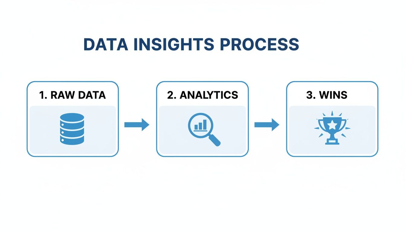
As you can see, it's a clear progression. Disorganized information gets refined through careful analysis until it becomes a valuable business outcome.
The Foundational Stages of Analysis
The whole process kicks off by asking the right question. A vague goal like "let's improve sales" is pretty useless. A much better starting point is something specific, like, "Which marketing channels brought in the most qualified leads last quarter?" Once you have a clear objective, you can get to work.
The lifecycle generally breaks down into a few key stages:
Data Collection: This is where you gather your raw ingredients. Data can come from all over the place—your CRM, website analytics, financial software, or even third-party sources. The goal is to pull in accurate, relevant information that speaks directly to your question.
Data Cleaning and Preparation: Let's be honest, raw data is almost always messy. This stage is all about fixing errors, getting rid of duplicates, dealing with missing values, and getting everything into a usable format. It can be a grind—in fact, nearly 80% of a data analyst's time can be eaten up by this prep work—but you can't skip it. Dirty data leads to bad conclusions. Period.
Data Analysis: This is where the fun starts. Armed with clean data, you can now start exploring. Using different statistical methods and tools, you’ll hunt for patterns, correlations, and interesting trends that start to answer your initial question.
Interpretation and Visualization: The final, crucial step is turning your findings into a story people can understand. This is where data analytics and visualization come together. You translate complex results into simple charts, graphs, and dashboards that make the insights impossible to ignore.
A Real-World Example: A Product Team in Action
Let's say a product team is trying to figure out why users are bailing on a new feature. They can follow the lifecycle to find a clear answer.
First, they’d collect data on user clicks, how long people are spending in the feature, and exactly where they're dropping off. Then, they’d clean the data to make sure they're only looking at relevant user sessions, filtering out any noise.
The real power of the analytics lifecycle is that it’s a continuous loop. Insights from one analysis often spark new questions, kicking off the next cycle. This creates a constant rhythm of improvement and discovery.
Next, the analysis might show that a staggering 75% of users are leaving at one specific step in the workflow. To make this finding hit home, they would visualize this user journey in a funnel chart. Suddenly, it's crystal clear to everyone where the problem is, giving them the evidence they need to push for a targeted design fix.
This structured process keeps teams from making knee-jerk decisions based on gut feelings or incomplete data. A solid lifecycle is the backbone of any good data analytics strategy, ensuring that every move is backed by methodical, reliable work. By getting this cycle right, you can consistently turn your data into real-world improvements and a serious edge over the competition.
Mastering the Art of Visual Storytelling
You've done the hard work of analysis, but now comes the most important part: bringing those insights to life. Great data visualization isn't about making pretty charts; it's about telling a compelling story that guides your audience to a specific conclusion.
Think of yourself as a translator. Your job is to take the dense, often intimidating language of numbers and spreadsheets and convert it into the universal language of visuals. A powerful chart doesn't just show data—it makes an argument, spotlights a critical trend, or uncovers an opportunity that was hiding in plain sight. This is how your analytical effort translates into real business impact.
This Querio dashboard is a perfect example of how clean visuals can track essential business metrics without any fuss.

The magic here is in the clarity. Key figures like Monthly Recurring Revenue (MRR) and customer counts are presented cleanly, making it incredibly easy to understand performance at a glance.
Choosing the Right Chart for Your Data
The bedrock of any good visual story is picking the right chart for the job. Every chart type has a specific strength, and choosing the wrong one can muddy your message or, even worse, lead to the wrong conclusion. The goal is to match the chart to the story you're trying to tell.
Here are a few of the most common workhorses of data visualization:
Bar Charts: These are your go-to for comparing distinct categories. Use them to see which product line is killing it or how different marketing campaigns stack up against each other.
Line Charts: Nothing beats a line chart for showing trends over time. They are perfect for tracking website traffic, monthly sales, or user growth over a few quarters.
Pie Charts: Use these sparingly, but they work well for showing parts of a whole when you only have a few categories—for instance, visualizing market share between three main competitors.
Scatter Plots: Need to see if two things are related? Scatter plots are ideal for revealing correlations between two different variables, like whether there’s a link between a customer's ad spend and their lifetime value.
Getting this choice right means your audience instantly grasps the takeaway without you having to say a word.
Principles of Effective and Accessible Design
Once you have the right chart, solid design principles make sure your message lands clearly and ethically. The aim is to create visuals that are not only informative but also accessible to everyone, including people with visual impairments.
First, get rid of the "chart junk." This is any visual element that adds clutter without adding value—think unnecessary gridlines, distracting 3D effects, or tacky decorations. A clean, minimalist design forces the focus onto the insights. Every pixel on the screen should earn its keep.
Next, use color with purpose. Color isn't for decoration; it’s a tool. Use it to highlight key data points, group related information, or show positive and negative values. And always, always consider color blindness by using palettes that are easy for everyone to distinguish.
Good visualization is about subtraction, not addition. The best designers know that the most powerful insights are often revealed by removing everything that is not essential, leaving behind a clear and compelling story.
Finally, put accessibility first. Use clear, readable fonts and ensure there’s enough contrast between your text and backgrounds. Add descriptive titles and labels so the chart can stand on its own. For a deeper dive, check out our guide on data visualization best practices to really sharpen your skills.
The demand for people who can do this well is exploding. The U.S. data analytics market was valued at USD 29.7 billion in 2025 and is projected to skyrocket to USD 232.9 billion by 2034, according to imarcgroup.com. This incredible growth highlights just how critical it is for professionals to be able to translate raw data into clear visual stories. By mastering these principles of data analytics and visualization, you stop being just a data cruncher and become a storyteller who can drive real, meaningful change in any organization.
Driving Results Across Your Business Functions

Theory is great, but the real magic of data analytics and visualization happens when they solve actual business problems. This is the moment when abstract concepts turn into tangible results, delivering a clear return on investment for individual teams. When departments embrace these tools, they can finally ditch the guesswork and start making strategic moves backed by solid evidence.
The ripple effect is felt across the entire organization. Suddenly, different functions have the power to diagnose issues, spot opportunities, and track performance with a clarity they never had before. This shift does more than just boost efficiency; it builds a culture where accountability and continuous improvement become the norm.
Powering Product Strategy with User Insights
For any product leader, understanding what users are actually doing is paramount. Without data, critical decisions about new features, onboarding flows, or UI tweaks are based on a hunch—and that’s a risky, expensive way to build a product. The real challenge is to translate a mountain of raw user activity into a clear picture of engagement and adoption.
Problem: A product team sees a lot of new sign-ups, but very few of those users stick around. They have a gut feeling that the onboarding process is clunky, but they can't prove where people are getting stuck.
Solution: The team uses data analytics and visualization to map out the entire user adoption funnel in an interactive dashboard. This new view tracks every single step of the onboarding journey, from the moment a user signs up to when they complete key activation milestones.
Outcome: The visualization immediately reveals a massive drop-off at one specific, unintuitive step in the setup process. Armed with this clear insight, the team redesigns that part of the workflow. The result is a 30% increase in user activation within the first month, a win that directly boosts long-term retention and customer lifetime value.
A well-designed dashboard doesn't just present numbers; it reveals a narrative. For product teams, that story is about the user's journey—where they succeed, where they struggle, and why they stay.
This ability to pinpoint problems with such precision is what separates high-growth products from the rest. It shifts the entire development cycle from a reactive, fire-fighting mode into a proactive, data-informed strategy.
Streamlining Operations with Process Visualization
Operations teams are the engine of a business, tasked with making sure everything runs like a well-oiled machine. Their biggest headache is often a lack of visibility into complex internal processes, which makes it nearly impossible to spot the bottlenecks that are quietly draining time and money. Trying to track everything in spreadsheets is slow, riddled with errors, and never gives you a real-time picture.
Here’s how analytics cuts through the fog:
Mapping Workflows: You can visualize the entire lifecycle of a process, like order fulfillment or a customer support ticket from start to finish.
Identifying Blockages: Color-coded dashboards instantly flag stages where tasks are piling up or taking much longer than they should.
Monitoring Performance: You can track essential operational metrics like cycle time, throughput, and error rates as they happen.
By visualizing these workflows, operations managers can stop putting out fires and start preventing them. They get the insight needed to allocate resources more effectively, automate tedious tasks, and fine-tune processes for peak performance. This doesn’t just slash operational costs; it directly improves the quality of service for customers.
Sharpening Financial Acumen and Reporting
Finance teams are always under pressure to deliver accurate, timely insights to everyone from department heads to the board. Manually pulling data for KPI reports and variance analysis is a grind, leaving precious little time for actual strategic thinking. The real goal is to automate the mundane reporting and get to the "why" behind the numbers.
Problem: The finance team spends the first week of every month in a frantic scramble, manually pulling data from different systems to build board reports. By the time the report is done, they have no time left to analyze why performance deviated from the forecast.
Solution: They connect their financial data sources to an analytics platform, creating an automated, interactive KPI dashboard. This dashboard visualizes core metrics like Monthly Recurring Revenue (MRR), Customer Acquisition Cost (CAC), and gross margin in real-time.
Outcome: Board reporting becomes instantaneous. Instead of getting a static report, stakeholders can now drill down into the data themselves to understand what's driving performance. This frees the finance team to focus on high-value variance analysis, pinpointing the exact factors that caused revenue to beat or miss targets. The result is smarter, more agile financial planning.
The strategic weight of these capabilities is clear when you look at the market's growth. The global data analytics market hit USD 69.5 billion in 2024 and is projected to soar to USD 302 billion by 2030—a powerful signal of its central role in modern business. You can read the full report on this explosive market growth and discover more insights on Grand View Research.
Avoiding Common Pitfalls in Your Data Strategy
Giving your team access to data can be a massive win, but the road from raw numbers to real insight is littered with potential tripwires. Without a solid game plan, even the best intentions can produce confusing or downright misleading results. These common mistakes can sink a data initiative before it even gets going, which ultimately kills trust and grinds decision-making to a halt.
One of the easiest traps to fall into is creating misleading visualizations. A poorly chosen chart type, a skewed axis, or just a cluttered design can completely twist the story the data is trying to tell. Another huge risk is confirmation bias—that all-too-human tendency to hunt for data that proves what we already believe, while conveniently ignoring anything that contradicts it. Getting past these hurdles is fundamental to building a data culture you can actually rely on.
Balancing Access with Security
As you start giving more people access to data, you absolutely have to lock down your governance and security policies. It's non-negotiable. The goal is a framework that lets people explore and get answers but also fiercely protects sensitive information.
Without the right controls in place, you’re opening the door to data breaches, compliance nightmares, and a total loss of customer trust. The trick is to strike the right balance: make data easy enough to access for genuine insights but secure enough to ensure it's always used responsibly. This means putting specific technical guardrails in place and sticking to proven industry standards.
The point of data governance isn't to lock data away; it's to enable access safely. When you create clear rules and implement strong security, you give your team the confidence to dig into the data, knowing the right protections are in place for the business and your customers.
For any company handling customer data, a couple of concepts are especially critical:
Row-Level Security (RLS): This is a must-have. RLS ensures that users can only see the specific rows of data they are authorized to see. For a multi-tenant app, this is what prevents one customer from ever accidentally stumbling upon another customer’s private information.
SOC 2 Type II Compliance: This isn't just a logo to put on your website. It's proof, verified by an independent auditor over a period of time, that a company securely manages its data. It shows a serious, ongoing commitment to enterprise-level security.
These elements are foundational for any tool that touches sensitive data. They provide the peace of mind that your analytics environment is both powerful and secure. By getting ahead of these common issues, you can build a more resilient, insight-driven organization. You can discover more solutions by exploring our guide on the 8 common data analysis bottlenecks that teams face.
The Future Is Self-Serve and AI-Powered
Let's be honest: the old way of doing business intelligence is broken. The model where you file a ticket and wait days—or even weeks—for an overworked data team to pull a report just doesn't cut it anymore. The entire world of data analytics and visualization is making a huge pivot toward a self-serve model, putting answers directly into the hands of the people who need them, right when they need them.
Powering this entire shift is artificial intelligence. AI is the engine behind a new breed of analytics tools that are tearing down the technical walls that once guarded precious insights. Suddenly, you don't need to be a data scientist to find your own answers.
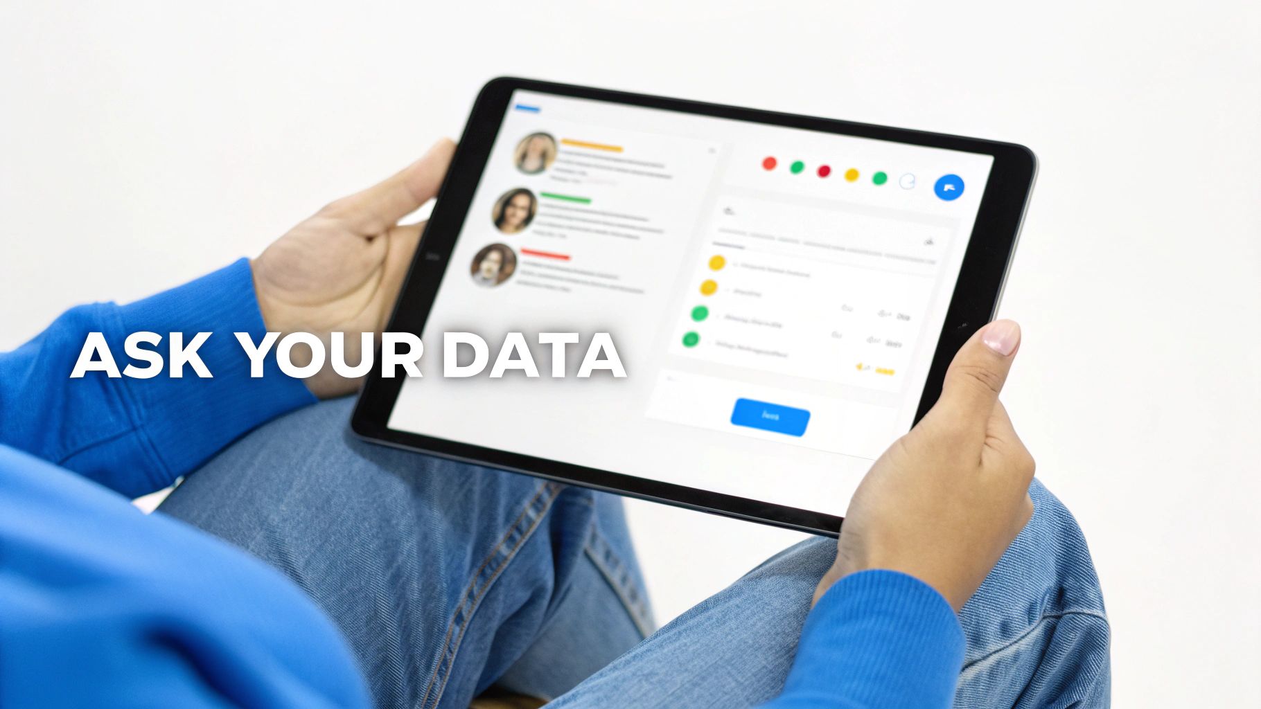
Ask Your Data a Question
The biggest game-changer here is natural language querying (NLQ). Think about it: what if you could just ask your database a question in plain English, the same way you'd ask a coworker? A marketing manager could literally type, "What were our top 5 performing ad campaigns last quarter by conversion rate?"
And instead of writing complex SQL or waiting in a queue, they get a precise answer and a ready-made chart in seconds. This completely changes the game, turning data from a static warehouse of information into an active, conversational partner.
The core idea behind self-serve, AI-powered analytics is to drastically reduce the "time to insight." When anyone in the company can get a reliable answer the moment a question arises, the entire organization becomes more agile, curious, and data-informed.
When data becomes this accessible, it helps build a genuine data-driven culture. It’s a move away from relying on a few gatekeepers and toward a setup where every single person on the team is empowered to make better decisions with real-time facts.
From Internal Tool to Customer-Facing Feature
This new approach to analytics isn't just for internal teams. One of the most powerful moves a company can make is to offer embedded analytics, which means building those same sophisticated dashboards and reports directly into your own product for your customers to use.
This creates incredible value because it lets your users see firsthand the impact your product is having, all through the lens of their own data.
For SaaS platforms: This could be a dashboard showing customers their usage patterns, ROI, or key performance metrics, all without ever leaving your app.
For B2B services: Imagine giving clients interactive reports that visualize the amazing results you’re delivering. It builds transparency and deepens trust.
Embedding analytics turns your product from a functional tool into a must-have insights platform, which is a massive boost for user engagement and retention. This isn't a niche trend, either. The global big data analytics market is expected to hit an incredible USD 609.866 billion by 2033, which shows just how central this has become. You can dive deeper into these numbers and discover insights on Cognitive Market Research.
Ultimately, the right analytics platform does more than just show you charts. It speeds up decision-making for everyone in the company and can even become a core part of your product. It’s all about creating an environment where curiosity is instantly rewarded with answers, effectively turning every employee into an analyst.
Got Questions? We've Got Answers
As you've seen what modern data analytics and visualization can do, you probably have a few questions bubbling up. Let's tackle some of the most common ones to help you think through what a solution might look like for your team.
Do I really need a data scientist to use these tools?
Not anymore. While that was certainly true in the past, today’s best AI-powered platforms are built so that anyone can get answers on their own.
Thanks to natural language querying, your product, operations, or finance folks can just ask questions in plain English. They get back instant, accurate visualizations without having to write a single line of code. This frees up your data team to focus on the heavy-duty strategic work while everyone else gets the insights they need.
What’s the difference between a BI platform and embedded analytics?
Think of it this way: a business intelligence (BI) platform is an internal tool. It's where your own teams go to dig into company data, build dashboards, and make better decisions.
Embedded analytics takes those same powerful charts and dashboards and puts them directly inside your product for your customers to see and use. The best platforms give you both—a robust BI tool for your internal needs and a simple way to add white-labeled analytics right into your customer-facing application.
A truly effective data strategy serves everyone. Your internal teams get the insights they need to operate smarter, while your customers get a product packed with valuable data that makes it indispensable.
How do I keep my company’s data secure with a self-serve tool?
This is a huge, non-negotiable point, and it’s where enterprise-ready platforms really shine. The key is to find a solution that gives you both easy access and tight control.
Look for tools with built-in security features designed for this exact purpose:
Read-only database access ensures no one can accidentally change or delete your source data.
Granular user controls let you decide exactly who sees what.
Row-level security (RLS) is essential for multi-tenant apps, as it keeps one customer's data completely separate from another's.
Independent SOC 2 Type II auditing provides third-party proof that a company is serious about maintaining security over the long haul.
These features let you open up access to data with confidence, knowing that all your sensitive information is still locked down.
How long does it actually take to get started?
Forget the old days of BI projects that dragged on for months. Modern analytics platforms are built for speed. You can often connect your data sources and start asking questions within minutes, not weeks.
The entire experience is designed to be fast and intuitive. That means you see a return on your investment almost immediately and your teams can start making data-backed decisions right away. It’s all about closing the gap between having a question and getting a clear answer.
Ready to give every team the power to explore, visualize, and understand data without writing code? With Querio, you can turn simple questions into clear answers in seconds. Explore Querio's AI-powered analytics platform today.

