Definition of ad hoc reports: A practical guide for teams
definition of ad hoc reports: Explore what they are, why they matter, and how to leverage them for fast, data-driven decisions.
https://www.youtube.com/watch?v=5OxF5P9h07k
published
Outrank AI
definition of ad hoc reports, ad hoc analysis, self-service bi, on-demand reporting, business intelligence
613bbe27-e819-4b41-8c6a-b6ae9d2a6b67

Sometimes, the most important business questions don't arrive on a schedule. You’re in a meeting, a sales number looks off, and you need to know why right now, not next Tuesday when the standard reports are due. This is where ad hoc reporting comes in.
An ad hoc report is a one-off report, created on the fly to answer a specific, immediate question. It’s the difference between waiting for a scheduled update and getting the data you need the moment a question pops into your head.
So, What Exactly Is Ad Hoc Reporting?
Think of it like this: a standard, scheduled report is like a printed bus schedule. It's reliable, consistent, and shows you all the planned routes and times. It’s great for regular, predictable journeys.

An ad hoc report, on the other hand, is like hailing a taxi. You decide the exact destination, you leave right now, and you get taken directly there without any unnecessary stops. It’s all about getting a custom answer for a unique situation.
This on-demand capability is more than just a convenience; it's a competitive necessity. In fact, some studies suggest that as much as 60-70% of business intelligence needs are unplanned. When the majority of your questions are unexpected, you can't rely solely on static, pre-built dashboards.
The real power here is putting data directly into the hands of the people who need it most. Teams in marketing, sales, or operations can investigate issues themselves, without having to file a ticket and wait for a data analyst to get back to them.
The Core Idea: On-Demand Exploration
At its heart, ad hoc reporting is about user-driven exploration. It’s about empowering team members to follow their curiosity, test a hypothesis, or dig into an anomaly they just spotted.
This fundamentally changes the pace of decision-making. Imagine a product manager notices a sudden dip in user engagement with a new feature. Instead of waiting days for a formal analysis, they can build their own report in minutes to see what’s going on. This process is closely related to a broader investigative mindset, which you can explore further in our guide on what is ad hoc analysis.
Key Characteristics That Define Ad Hoc Reports
So, what truly makes an ad hoc report different from the reports you might get in your inbox every Monday morning? It comes down to a few key traits:
Specificity: They are hyper-focused. Each report is designed to answer one precise question, like, "Which marketing channel had the highest conversion rate for new users in Texas last week?"
Timeliness: They are built for the now. The insights are generated in direct response to a current need, making the data instantly actionable.
Flexibility: The user is in the driver's seat. They have full control to select the metrics, filters, and visuals, shaping the report to fit the exact context of their question.
By giving anyone on the team the power to ask "why?" and get a data-backed answer almost instantly, ad hoc reporting shatters information bottlenecks. It shifts the entire organization from relying on scheduled updates to achieving real-time understanding.
Why On-Demand Reporting Is a Game Changer
So we know what ad hoc reports are, but where's the magic? Their real power comes to life when you see how they can completely change the rhythm of a business. The biggest benefit is undoubtedly speed. Forget waiting days or even weeks for a scheduled report to hit your inbox; with ad hoc analysis, your team can get answers in minutes.
This ability to get data on demand turns reactive problem-solving into proactive strategy. A founder can quickly pull numbers to validate a new idea right before a crucial meeting. A finance team can instantly dig into why budget numbers look off, without having to wait for the next reporting cycle. It's about getting answers when you need them, not when the calendar says you can have them.
Empowering Teams with Self-Service Analytics
One of the most profound shifts that comes with ad hoc reporting is the destruction of the data bottleneck. In the old way of doing things, any non-standard question had to be funneled through a specialized IT or analytics team. This created a long queue and brought progress to a grinding halt.
Self-service reporting tools hand the keys over to the people who actually need the answers. By democratizing data access, you empower non-technical users to explore and find insights on their own. This autonomy frees up your data experts from an endless stream of custom requests, letting them focus on bigger, more strategic projects. Organizations often see a huge jump in how fast they can make decisions. You can see more on how this cuts down IT dependency over on Netsuite.com.
Ultimately, this fosters a culture where curiosity isn't just allowed—it's rewarded with immediate answers. When anyone can investigate a hunch with real data, the entire organization becomes more agile.
Ad hoc reporting changes the fundamental relationship between your team and your data. It shifts from a system where data is a guarded resource provided by experts to one where it's an accessible tool for everyday problem-solving.
From Bottlenecks to Breakthroughs
This newfound agility isn't just a concept; it has a real impact on how different departments get work done. Teams can use on-demand insights to tackle specific challenges and spot opportunities that would have been buried in a static, scheduled report.
Product Teams: Instead of waiting for a bi-weekly summary, they can instantly investigate a sudden dip in user engagement or see how a new feature is really performing.
Marketing Teams: They can analyze a new campaign's performance on the fly, quickly reallocating budget to the channels that are actually working.
Operations Leads: They can pinpoint the root cause of a supply chain delay by exploring logistics data in real-time, not after the fact.
To see just how transformative this can be in a specific area, take a look at the world of human resources analytics. By giving teams direct access to data, businesses don't just move faster—they solve problems more effectively and build a much stronger operational foundation.
Ad Hoc Reports in Action
It's one thing to talk about ad hoc reporting in theory, but its real power clicks when you see it solve an urgent, real-world business problem. This is the tool that closes the gap between guessing what happened and knowing why it happened.
Let's walk through a few scenarios where getting answers on the fly makes all the difference.
Investigating a Sudden Drop in User Engagement
Imagine Sarah, a product manager, staring at her screen. Daily active users for a key feature have suddenly cratered by 15% just a week after a new software release. The standard weekly dashboard flags the problem, but it doesn't offer any clues.
Instead of waiting days for the data team to dig in, Sarah jumps into her ad hoc reporting tool with a specific question: "Which user segments are engaging less with the feature since last week's update?"
She quickly builds a report, slicing the data by device type, subscription plan, and geography. The answer comes back in minutes. The engagement drop is almost entirely from Android users on the free tier. Boom. That's the smoking gun. This insight immediately points her team toward a likely bug in the new Android build, saving them from weeks of aimless troubleshooting.
By pulling up a few quick visuals, she can clearly show her team exactly where to focus their efforts. If you're looking for ideas on how to present data like this, check out our collection of powerful data visualization dashboard examples.
Uncovering the Reason for Supply Chain Delays
Now meet Mark, an operations lead. He's got a huge problem: unexpected delays from a major supplier are threatening to shut down the entire production line. His standard inventory reports just confirm what he already knows—stock levels are dangerously low. They don't tell him why.
Mark needs an answer now. His question is simple: "What's the average lead time for our top five suppliers over the past three months, and how does that compare to the last 30 days?"
He runs an ad hoc report comparing supplier lead times. The data is crystal clear. Four of his suppliers are holding steady, but the lead time for one specific supplier has doubled in the last month. Armed with this hard data, he can have a direct, evidence-based conversation with that supplier and start looking for a backup. No more guesswork.
Ad hoc reporting moves teams from simply observing a problem to diagnosing its root cause. It provides the specific evidence needed to take targeted, effective action instead of relying on assumptions.
Explaining Regional Sales Performance Differences
During a mid-quarter review, Emily, a sales manager, notices something odd. The West Coast region is crushing its numbers, outperforming the East Coast by over 40%. Her scheduled sales dashboard highlights the gap but offers zero context. She needs to know what the West Coast team is doing differently so she can bottle it up and share it.
Emily's ad hoc query: "Compare deal size, sales cycle length, and product mix between the West Coast and East Coast sales teams for the current quarter."
The report she generates tells a compelling story. The West Coast team is closing smaller deals 20% faster and is selling a much higher volume of a new, high-margin product. This isn't about luck; it's about strategy. This insight allows Emily to build a new playbook for the East Coast team, focused on accelerating smaller deals and leading with the new product.
This isn't just a hypothetical, either. According to industry data from platforms like Domo, sales organizations that lean on this kind of on-demand reporting often see 20-30% improvements in their deal cycle velocity.
How to Create an Ad Hoc Report
You don’t need to be a data wizard to create a solid ad hoc report. It’s really just about following your curiosity in a structured way. Modern business intelligence tools have thankfully taken the technical headache out of the process, breaking it down into a simple, five-step exploration anyone can follow. The entire point is to get from a nagging business question to a clear, actionable answer—fast.
At its core, the process is beautifully simple: ask a question, build a report to find the answer, and then act on what you’ve learned.
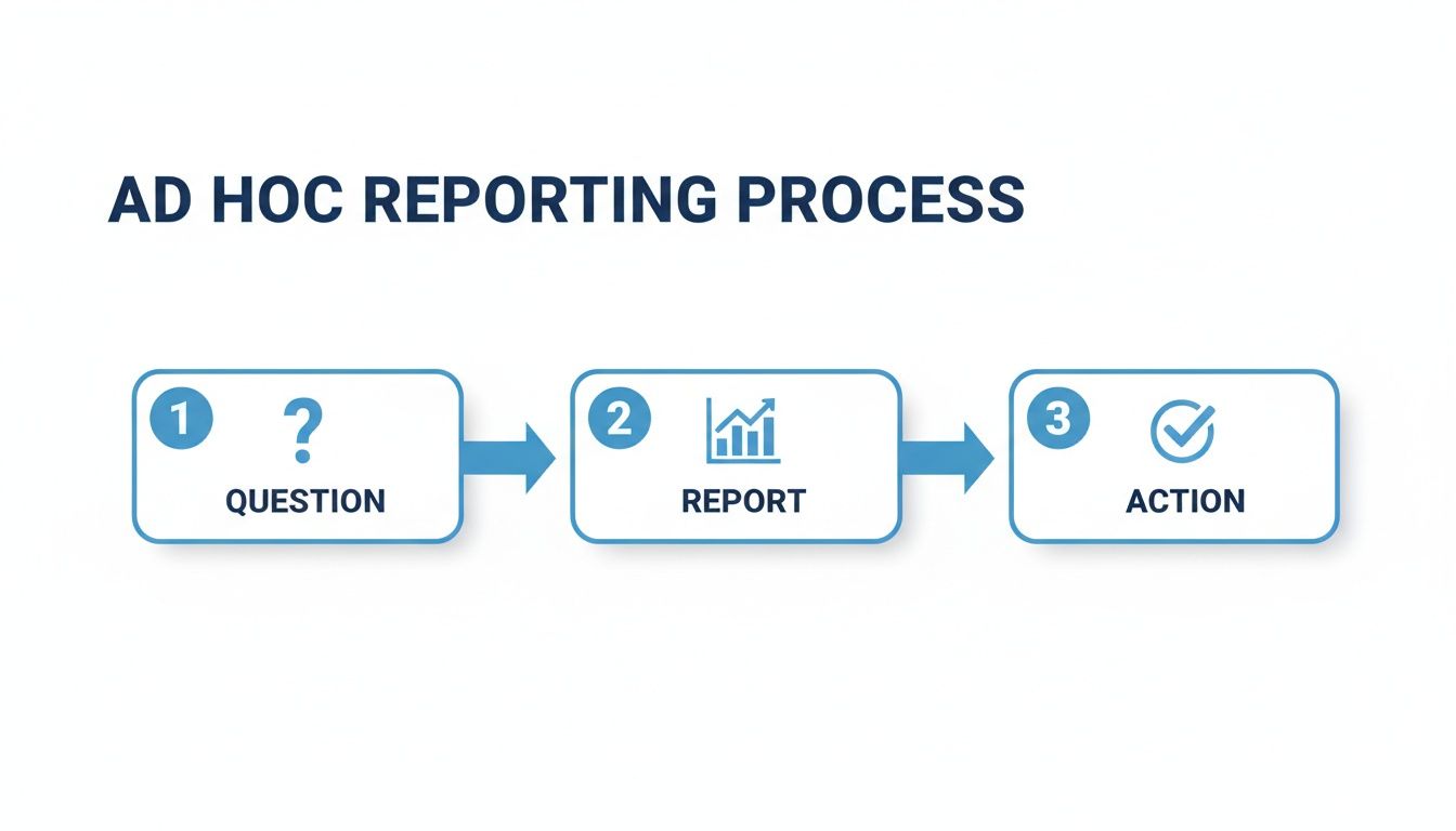
This flow is what makes ad hoc reporting so powerful. It’s a direct line from a spark of curiosity to a data-backed decision that can push the business forward.
Step 1: Start with a Clear Question
The foundation of any useful ad hoc report is a single, specific question. If you start with something vague like, "How are sales doing?" you’ll end up with a messy, unfocused report that doesn’t really tell you anything. You need to get precise.
A great question often starts with a hunch or a hypothesis. Let's see how that works:
Vague Question: "What's up with our new marketing campaign?"
Specific Question: "Did our new social media campaign increase website sign-ups from users under 30 in the last two weeks?"
See the difference? That level of specificity is your roadmap. It tells you exactly what data you need to pull and ensures your analysis stays on track.
Step 2: Connect to Your Data Source
Once you have your question, you have to figure out where the answer lives. This means pinpointing the right data source, whether that’s the company CRM, a production database, or even a humble spreadsheet.
In a well-managed BI environment, this step is often as simple as selecting a pre-approved, trusted dataset from a dropdown menu. This is a huge advantage because you know you’re building your analysis on accurate, up-to-date information. To get a better sense of how modern platforms make this possible, check out our guide on self-service reporting tools, which digs into how they centralize data access.
Step 3: Build Your Query and Explore
This is the fun part—where you actually ask your question to the data. With modern tools like Querio, you don't need to be a SQL expert. You can often just type your question using a natural language interface, almost exactly as you framed it in the first step.
If you prefer a more hands-on approach, you can use a drag-and-drop builder. Here, you'll select your metrics (the numbers you're measuring, like revenue or sign-ups) and your dimensions (the categories you want to slice the data by, like region, date, or customer segment).
Step 4: Choose the Right Visualization
How you show the data is just as important as the data itself. A great chart can make an insight jump off the page, while the wrong one can completely hide it.
The goal of a visualization isn’t just to display numbers; it’s to tell a story. A well-chosen visual should make the answer to your question immediately obvious to anyone looking at it.
Here are a few quick guidelines to get you started:
Bar Charts: Perfect for comparing values across different categories (e.g., sales by region).
Line Charts: The best choice for showing a trend over time (e.g., user engagement over a month).
Tables: Use these when you need to show precise numbers for several related metrics.
And a pro tip: try to avoid pie charts for making comparisons. Our brains have a tough time accurately judging the relative size of angled slices.
Step 5: Share Findings and Decide on Next Steps
An insight sitting in a report is useless. It only becomes valuable when it leads to action. The final step is sharing what you’ve found with the right people. A good ad hoc report should be mostly self-explanatory, but it’s always best to include a quick summary of your findings and, most importantly, a recommended course of action.
Was your hypothesis correct? What does this data tell you to do next? This final step is what closes the loop, turning your quick analysis into a real business outcome.
Navigating Common Ad Hoc Reporting Pitfalls
Opening up data exploration for everyone is a game-changer, but it's not without its challenges. If you just hand over the keys without a map, the freedom of ad hoc reporting can quickly create a mess. Knowing what to watch out for is the first step in building an analytics culture that’s both flexible and trustworthy.
The biggest risk? Waking up one day in the "data wild west." This is what happens when different people pull slightly different data or use inconsistent logic to answer the same question. Suddenly, you have three different answers for "last quarter's sales," and nobody trusts any of them. It's a fast track to confusion and bad decisions.
Another classic problem is performance drag. Give someone the power to query, and they'll get curious—which is great! But without some guidance, they might accidentally run a massive, complex query that brings the whole database to its knees. This can slow everything down, affecting not just analytics but your core business operations.
Taming the Data Wild West
The answer isn't to lock everything down again. It's about creating a single source of truth. When everyone is building reports from the same governed and pre-defined data models in a central BI platform like Querio, you eliminate the guesswork.
This means that when one person looks at "monthly recurring revenue," they're using the exact same calculation as everyone else. It's that simple. A centralized setup gives you consistency and reliability.
Standardized Metrics: Core business KPIs are defined once and reused everywhere, so there are no more arguments about whose numbers are "right."
Access Controls: You can be sure that users only see the data they're supposed to, keeping sensitive information secure.
Version History: Need to know how an analysis has changed over time? A version history gives you that crucial context.
Preventing Performance Bottlenecks
A solid BI platform also acts as a traffic cop for your data systems. Instead of letting every query hit your live production database, users can pull from an optimized data warehouse or a cached data set. This creates a buffer, insulating your critical systems from the heavy lifting of analytics.
The goal is to provide a safe and efficient sandbox for exploration. A governed environment encourages curiosity by removing the fear of "breaking something" while simultaneously protecting the performance of your core infrastructure.
This way, a few power users running complex reports won't grind the entire company to a halt. Your analytics and your day-to-day operations can both run smoothly.
Avoiding Misinterpretation Without Context
Finally, a number on its own is just a number. A chart showing a huge sales spike is interesting, but without context, it's not very useful. Why did sales spike? Was it that new marketing campaign? A seasonal trend? Or just a data glitch? Ad hoc reports need context to tell a real story.
This is where good data visualization comes in. It’s been shown that presenting data in visual formats like charts and tables can boost comprehension by up to 80% for non-technical folks compared to staring at a raw spreadsheet. You can read more about how visualization makes data easier to understand in this ad hoc reporting guide from Netsuite.com. It helps everyone see the story behind the numbers, which leads to much smarter conversations and decisions.
How AI Is Reshaping Ad Hoc Analysis
The way we do ad hoc reporting is fundamentally changing. We're moving away from clunky, traditional drag-and-drop interfaces and stepping into a future where analysis is conversational. AI is spearheading this change, creating tools that let anyone on the team get answers just by asking questions in plain English.
This shift completely redefines what ad hoc reporting is—it's less of a technical chore and more of a natural dialogue with your data.

Just picture it: you ask, "What were our top-selling products last month, and how did that compare to the previous month?" and instantly get a chart answering your exact question. This isn't science fiction anymore. AI-powered tools, like the new Microsoft AI Copilot, are making this kind of instant insight a reality.
This evolution makes data analysis as easy as talking to a colleague, turning curiosity into immediate answers. It democratizes sophisticated analysis, making it accessible to everyone in the organization.
The impact is already measurable. Companies that have mastered ad hoc reporting are seeing their decision-making speed up by a staggering 35-45% compared to those stuck with static, scheduled reports.
AI is poised to push that number even higher. It empowers teams to finally [https://querio.ai/articles/how-to-reduce-ad-hoc-analysis-bottlenecks-with-ai] and act on what they learn faster than ever before.
Frequently Asked Questions About Ad Hoc Reporting
As teams start to get their hands dirty with on-demand data, the same questions tend to pop up. Getting these sorted out early is key to making sure everyone is on the same page and building a solid foundation for a data-driven culture. Let's tackle some of the most common ones.
What Kind of Tools Do I Need for Ad Hoc Reporting?
You could wrestle with a spreadsheet, but that's the hard way. Modern Business Intelligence (BI) platforms are built for exactly this kind of work.
The best tools have a user-friendly, drag-and-drop interface, but the real game-changer is natural language querying. This lets anyone on the team ask questions in plain English—no code required. A good tool will connect securely to all your data sources and give your non-technical folks the power to find their own answers.
Do Ad Hoc Reports Replace Our Standard Dashboards?
Nope, they're two sides of the same coin. They serve different, but equally important, purposes.
Think of your standard dashboard as the speedometer in your car—it gives you a constant, reliable view of your most important metrics (your KPIs). An ad hoc report is more like the diagnostic tool a mechanic plugs in when a warning light flashes. You use it to dig deeper and figure out what’s really going on under the hood.
Standard reports tell you what is happening. Ad hoc reports help you discover why it's happening. You need both for a complete picture of business performance.
How Do We Ensure Data Is Accurate and Consistent?
This is a big one. If you're going to let everyone explore the data, you have to trust the data. The secret is strong data governance, managed through a central BI platform.
By creating a single source of truth with pre-defined data models and clear, standardized metrics, you guarantee that everyone is working from the same playbook. No more "data wild west" scenarios where marketing and sales show up with completely different revenue numbers.
Look for a platform that helps you maintain control with features like:
Shared Data Models: This ensures a term like "revenue" is calculated the same way for every single person in the company.
Access Controls: Guarantees that users can only see the data they're actually supposed to see.
Clear Definitions: A good, old-fashioned data dictionary helps everyone understand what each field means, which cuts down on misinterpretations.
Ready to empower your team with on-demand insights? With Querio, anyone can ask questions in natural language and get instant, accurate answers from your data. Eliminate bottlenecks, foster a data-driven culture, and turn curiosity into action. Explore how Querio makes self-service analytics simple and reliable.

