A Practical Guide to Dashboard Data Visualisation
Learn dashboard data visualisation from the ground up. This guide covers chart selection, design principles, and interactivity to turn raw data into insights.
https://www.youtube.com/watch?v=eaSg0mu6nLM
published
Outrank AI
dashboard data visualisation, data visualisation, dashboard design, business intelligence, data storytelling
5862e584-aeee-4cd7-b229-fae7c5641cf9

Dashboard data visualization is all about telling a story with your numbers. It’s the art of taking dense spreadsheets and complex databases and turning them into a single, interactive screen that anyone can understand at a glance. The goal is to let your team monitor what’s happening, spot trends, and make smart decisions without getting lost in the weeds.
Understanding Dashboard Data Visualisation
Think about the dashboard in your car. It doesn’t flood you with raw data about engine combustion or oil pressure. Instead, it gives you the essentials: your speed, how much fuel you have left, and critical warning lights. You get exactly what you need to drive safely and effectively.
A business dashboard works the same way. It translates massive amounts of data into a clear, actionable narrative. Instead of engine RPMs, you might see website traffic. Instead of a fuel gauge, you're looking at your monthly recurring revenue.
This visual approach is incredibly effective because our brains are wired to process images much faster than text. A simple line chart can instantly show you a sales spike or a sudden dip in user engagement—a pattern that could take hours to find by combing through a spreadsheet. By bringing all the important metrics together, dashboards create a single source of truth for the entire company.
Why It Is More Than Just Pretty Charts
Great dashboard data visualisation isn't about making flashy, colorful graphics. It's about strategic communication. The real purpose is to close the gap between raw data and human understanding, making it possible for everyone—from a marketing intern to the CEO—to connect with the numbers that drive the business.
This move toward making analytics accessible to everyone is fueling huge market growth. The global data visualization market is expected to reach USD 8.2 billion by 2033, growing at a rate of 7.38% each year. This boom is happening because up to 81% of companies now believe data should be at the heart of their decisions, which is completely changing how they operate.
A dashboard is a visual display of the most important information needed to achieve one or more objectives, consolidated and arranged on a single screen so the information can be monitored at a glance.
This focused approach is key. It ensures users aren't overwhelmed. Instead of drowning in a sea of data, they get curated insights that point them toward their next move. This is a foundational idea to grasp as you dive deeper into data visualization and dashboards.
The Core Benefits for Your Business
When a company gets its dashboard strategy right, it unlocks some serious advantages. It helps teams shift from just reacting to problems to proactively building strategy. It fosters a culture where people are curious about data because the answers are right at their fingertips. If you're looking for examples, you can find a variety of platforms and services from companies like Dashboardly Inc that specialize in this space.
Here’s what you stand to gain:
Faster Decision-Making: Teams can see how they’re doing in real-time, catch issues early, and jump on opportunities without waiting days for a report.
Improved Alignment: When sales, marketing, and finance are all looking at the same trusted numbers, it breaks down departmental silos and gets everyone on the same page.
Increased Accountability: It's much easier to take ownership of goals when progress is tracked visually for everyone to see. This naturally builds a culture of responsibility.
Democratized Data Access: Well-designed dashboards let non-technical team members explore data and find their own answers, which frees up your data analysts to focus on more complex challenges.
Choosing the Right Visuals for Your Data
Picking the right chart for your data is a lot like choosing the right tool for a job. You wouldn't use a screwdriver to hammer a nail, and you definitely shouldn't use a pie chart to show a trend over time. The whole point of dashboard data visualisation is to create clarity, and your choice of chart is the biggest single factor in getting that right.
Every chart tells a particular kind of story. Line charts are the natural storytellers for data over time, making them perfect for tracking things like monthly user growth or daily website sessions. Bar charts, on their own, are masters of comparison, letting you instantly see which marketing channel has the highest spend or which product category is bringing in the most revenue.
Making the wrong choice here doesn't just create confusion—it can actively mislead your audience. A poorly chosen visual can completely hide a critical insight or, worse, create a false impression of what the numbers are actually saying. The secret is to match the visual to the core question you're trying to answer with the data.
This simple flowchart shows how raw data becomes a powerful tool for making smart decisions.
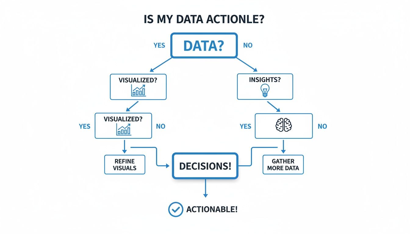
As you can see, data on its own isn't very useful. It only becomes valuable when it's visualized in a way that generates real insights, which then fuel better, faster decisions.
Matching Data Types to Chart Types
A good way to simplify your choice is to think about the relationship you want to show in your data. Are you comparing different values? Showing how something has changed over time? Breaking down the parts of a whole? Or are you trying to find a link between two different variables?
Answering that one question will almost always point you directly to the perfect chart type.
For example, if you want to see if there's a connection between your monthly ad spend and the number of leads you generated, a scatter plot is your best friend. Each dot can represent a month, showing both spend and leads, making it immediately obvious if more spending actually leads to more leads.
A visualization is a story—and the best stories are the ones that are easy to follow. Your chart choice sets the narrative's tone, and a good choice makes the conclusion obvious without needing a lengthy explanation.
To make this even more practical, let's look at the most common chart types and how they map to typical business questions. The table below is a quick reference guide to get you started.
Matching Data Types to Chart Types
A quick reference guide for selecting the optimal chart to represent different types of data effectively.
Data Relationship | Best Chart Type | Common Business Use Case |
|---|---|---|
Comparison | Bar or Column Chart | Comparing sales figures across different regions. |
Trend Over Time | Line Chart | Tracking monthly recurring revenue (MRR) or website traffic. |
Part-to-Whole | Stacked Bar or Pie Chart | Showing budget allocation by department or market share. |
Correlation | Scatter Plot | Analyzing the link between ad spend and customer acquisition. |
Distribution | Histogram or Box Plot | Understanding the spread of customer ages or product prices. |
Geospatial | Map Chart | Visualizing sales density by country or state. |
This table isn't exhaustive, of course, but it covers the vast majority of what you'll need for a typical business dashboard. Keep it handy!
Common Business Scenarios and Their Ideal Charts
Here’s a quick guide that ties common data questions directly to the right visualization:
Tracking Performance Over Time: Always start with a line chart. It's the go-to for showing trends. Think monthly recurring revenue (MRR), daily active users (DAU), or quarterly sales figures. The continuous line immediately highlights trends, seasonality, and any sudden spikes or dips.
Comparing Categories: Your best bet is a bar chart (vertical) or column chart (horizontal). These are perfect for comparing distinct items, like sales performance across different regions, customer acquisition cost (CAC) by marketing channel, or employee headcount by department.
Showing Parts of a Whole: Be careful here. A pie chart or donut chart can work for simple compositions with just a few categories (ideally fewer than five). For anything more complex, a stacked bar chart is often a much clearer alternative. Use these to show market share, budget allocation, or the cost breakdown of a project.
Visualizing Relationships and Correlations: A scatter plot is built for this. It helps you see if two different variables are connected. For instance, you could plot customer satisfaction scores against support ticket response times to see if one impacts the other.
Understanding Geographic Data: A map chart is the obvious choice. This is essential for any data tied to physical locations, like sales by state, customer density by city, or the status of your shipping fleet.
Getting this right is a fundamental skill in dashboard design. For a deeper dive, our data visualization guide on choosing the right charts provides more detailed examples and best practices. When you choose the right visual, your dashboard becomes instantly intuitive, letting users leap from data to insight in a matter of seconds.
Designing Dashboards for Clarity and Impact
You can pick the perfect charts for your data, but if the overall dashboard design is a cluttered mess, it's all for nothing. A great dashboard isn't just a collection of visuals; it’s an intuitive experience designed to get the user from data to insight as fast as humanly possible. The goal is to create a screen that feels less like a dense, overwhelming report and more like a clear, focused conversation with your data.

Think of it like the front page of a newspaper. The biggest, most important headline is right at the top, grabbing your attention immediately. Secondary stories are smaller and placed further down the page. This deliberate structure, what we call visual hierarchy, is the absolute foundation of a clear dashboard.
Create a Strong Visual Hierarchy
Visual hierarchy is all about arranging elements to guide the user's eye where you want it to go. In Western cultures, people naturally scan screens in a "Z" or "F" pattern, starting from the top-left corner. That corner is your prime real estate—don't waste it.
This is where your most important Key Performance Indicators (KPIs) and big-picture summaries should live. These are the top-line numbers that answer the most pressing questions, like, "Are we hitting our monthly revenue target?" or "What's our current customer acquisition cost?" By putting them front and center, you guarantee they're the first thing your audience sees.
From there, you can place less critical, more detailed charts below or to the right. This creates a logical flow, letting users digest the main takeaways first before they decide to dig deeper into the specifics.
Use Color with Purpose
Color is one of your most powerful tools in dashboard data visualisation, but it’s also one of the easiest to get wrong. It's tempting to splash color everywhere to make things "pop," but this usually just creates visual noise that overwhelms the user. A much better approach is to use color with intention.
Start with a muted or even a grayscale palette for your basic charts. Then, use a single, bright, contrasting color to highlight the most important data points. For example, you could show sales figures for all regions in gray but spotlight the top-performing region in a vibrant blue.
Here are a few ground rules for using color effectively:
Be Consistent: If the "Marketing" category is blue in one chart, it needs to be blue in every chart. Consistency is key to avoiding confusion.
Highlight What Matters: Use bold color to draw the eye to outliers, important trends, or any data that demands action. This tells the user exactly where to focus.
Think About Accessibility: Always be mindful of color blindness. The classic red/green combo is a no-go, as it’s the most common form of color vision deficiency. There are plenty of online tools that can simulate how your dashboard will look to people with different types of color vision.
Embrace White Space
What you don't put on your dashboard is just as important as what you do. White space (or negative space) is simply the empty area around your charts and text. It isn’t wasted space; it’s an active design element that prevents your users from feeling overwhelmed.
White space is to visual design what silence is to music. It gives every element room to breathe and helps the user process information without getting lost in the clutter.
A crowded dashboard forces the brain to work harder just to distinguish one element from another. By using white space strategically, you create clear visual separation between charts, improve readability, and give the whole design a clean, professional feel. It’s how you group related items and signal to the user which pieces of information belong together.
To see these design principles in action, check out this guide to build a production-ready personal finance dashboard. It’s a great example of how a thoughtful layout and clear visuals can turn raw numbers into a genuinely useful story.
Tell a Coherent Story
Finally, make sure all your dashboard elements are arranged logically to tell a story. A good dashboard has a narrative flow, starting with the high-level summary and then progressively revealing more detail. This structure gives users the context they need to make sense of the numbers. If you want to dive deeper into the core principles of creating clear visuals, our guide on https://querio.ai/article/data-visualization-best-practices is a great place to start.
By combining a strong visual hierarchy, purposeful color, plenty of white space, and a logical layout, you’ll design dashboards that aren’t just nice to look at—they’re incredibly effective. They become powerful tools for clarity and impact, empowering anyone to understand the data and act on it with confidence.
Making Your Dashboards Interactive
Static charts are great for showing you what happened. But they fall flat when you ask the most important follow-up question: why?
This is where interactivity comes in. It’s what transforms a dashboard from a simple rearview mirror into a powerful exploration tool. Think of it as the difference between being handed a finished report and being given the keys to the entire data warehouse.
An interactive dashboard doesn't just present information; it invites users to become active participants in the analysis. It lets them slice, dice, and investigate the data on their own terms. This shift from static presentations to dynamic, self-serve analytics is a cornerstone of modern dashboard data visualisation.
Instead of just staring at a high-level sales number, a manager can click on a region to see how it's performing. From there, they might filter by product line or drill down into the metrics for a specific salesperson. Each click peels back another layer of the onion, guiding them closer to a genuine insight. The power of discovery is placed directly into the hands of decision-makers.
From Static Views to Dynamic Conversations
The whole idea behind interactivity is to create a conversation with your data. A static dashboard makes a statement, like, "Total sales were $500,000 this quarter." An interactive one lets you ask questions back, like, "Okay, but which products made up most of those sales?" or "How does this compare to last quarter?"
This isn't a luxury feature anymore—it's a standard expectation for any serious analytics platform. In fact, some systems can refresh data as often as every 15 minutes, making real-time exploration a reality.
This move toward dynamic tools also frees up a ton of time for your data teams. Instead of getting bogged down building one-off reports to answer an endless stream of questions, they can build robust, interactive dashboards that empower the entire organization to find their own answers.
Key Interactive Features and Their Uses
So, how do you bring a dashboard to life? You add specific features that let people manipulate the data they're seeing. Each one serves a different purpose, helping users navigate from a bird's-eye view down to the nitty-gritty details.
Here are the most common tools in the interactive toolkit:
Filters: These are the absolute workhorses of interactivity. Filters let users narrow down the data based on specific criteria—think date ranges, geographic regions, customer segments, or product categories. A marketing team, for example, could filter a campaign performance dashboard to see results for just the "Paid Social" channel.
Drill-Downs: This is how you get to the "why." A drill-down lets a user click on a high-level data point to reveal the more granular data that makes it up. Clicking on a bar for "Q3 Sales" might break it down into sales for July, August, and September. It’s essential for understanding what’s really driving your top-level metrics.
Tooltips: These are the small pop-up windows that appear when you hover your mouse over a data point. They provide extra context without cluttering the main view. Hovering over a point on a line chart might reveal the exact value, the date, and a comparison to the previous period.
The goal of interactivity is not to add complexity, but to reveal it gracefully. A well-designed interactive dashboard guides the user on a journey of discovery, offering more detail only when they ask for it.
By weaving these elements together, you create an intuitive and genuinely powerful experience. A sales leader can start with a global overview, filter down to their specific region, and then drill into the performance of an individual team member—all within a single, seamless interface. This is how a dashboard stops being a report and becomes an indispensable tool for daily decision-making.
Ensuring Performance and Trust in Your Data
An insightful dashboard is useless if it’s slow to load or built on shaky data. Let's be honest, the most beautiful charts in the world mean absolutely nothing if the numbers behind them are wrong. This is where the backend—the unseen engine of your dashboard data visualisation—quietly becomes the star of the show.

Slow performance and untrustworthy data are the two fastest ways to kill user adoption. If a dashboard takes more than a few seconds to load, people will get frustrated and simply stop using it. Worse, if they even suspect the data is inaccurate, they'll lose faith in your entire analytics program.
These technical foundations aren't just details you can figure out later. They are the bedrock of any data strategy that hopes to be reliable, scalable, and genuinely valuable.
The Need for Speed and an Optimized Data Model
A dashboard's performance is a direct reflection of its underlying data model. Think of the data model as the filing system for all your company's information. A messy, disorganized system means it takes forever to find anything. But a clean, logical one? It delivers what you need almost instantly.
A slow dashboard is almost always a symptom of an inefficient data model. It means that every time a user loads the page or applies a filter, your queries are grinding away, scanning millions of rows, performing complex joins on the fly, and crunching massive datasets. This creates a painful user experience and discourages the very exploration you're trying to promote.
An optimized data model fixes this by doing the heavy lifting ahead of time. It pre-aggregates data, creates summary tables, and structures information for lightning-fast retrieval. This backend work ensures that when a user asks for something, the system isn't building the answer from scratch. The answer is already prepared and ready to go, resulting in near-instant load times.
Building a Foundation of Trust with Data Governance
Just as important as speed is ensuring the data itself is trustworthy. Data governance is the set of rules, processes, and standards that guarantees your data is accurate, consistent, and secure across the entire organization. Without it, you risk creating a dashboard that looks great but tells lies.
Trust is the currency of data. If users don't trust the numbers they see on a dashboard, they won't use it to make decisions, and the entire initiative will fail.
Effective data governance tackles several critical areas:
Data Accuracy: This means putting checks in place to validate that data from your source systems is correct and complete. It's about ensuring a metric like Monthly Recurring Revenue (MRR) is calculated the exact same way, everywhere, every single time.
Consistency and Standardization: All teams have to agree on the same definitions for key metrics. If your marketing team defines an "active user" differently than the product team, your dashboards will sow confusion, not clarity.
Security and Access Control: Not everyone should see everything. Data governance includes implementing solid security measures to control who can view specific data, which is absolutely essential for sensitive information like financials or customer PII.
Putting these practices into place isn't just a technical exercise; it's about building a company-wide culture of trust in your data. When everyone knows the numbers are reliable and governed by clear rules, they can act on the insights with confidence. This is what transforms your dashboards from interesting pictures into indispensable tools that actually drive the business forward.
Embedding Analytics Directly Into Your Product
Why keep powerful dashboards locked away for your internal teams? What if you could offer those same rich insights directly to your customers as a premium feature? This is the whole idea behind embedded analytics.
You’re essentially integrating dashboard data visualisation right into your SaaS application. It's a strategic shift that transforms your product from a simple tool into an indispensable insights platform. Instead of just helping customers do things, you're helping them understand the impact of their actions.
Think about a marketing automation tool. It’s one thing to help users send emails. It's another thing entirely to show them beautiful, interactive dashboards on campaign performance, open rates, and ROI—all without ever leaving your app. That's how you deliver incredible value and make your product sticky. When customers rely on you for critical business intelligence, you become woven into their daily workflow and much harder to replace.
From Feature to Revenue Stream
Embedding analytics isn't just a nice-to-have feature; it’s a direct path to new revenue. You can bundle customer-facing dashboards into a premium pricing tier or sell them as a paid add-on. Suddenly, you're monetizing the very data your platform already collects, turning what might be a cost center into a profit center.
This also gives your customers a clear upgrade path. As their business grows and their data needs get more sophisticated, they can unlock more powerful analytical tools within the ecosystem they already know and trust.
By embedding analytics, you’re not just selling a tool; you're selling intelligence. You empower your customers to make better decisions based on their own data, which is a value proposition that’s incredibly hard to compete with.
Key Considerations for a Seamless Integration
Of course, a successful implementation is more than just plopping a few charts into your UI. For the experience to feel truly native and professional, you have to nail the execution. Getting it right is what separates a clunky add-on from a polished, integrated feature.
Here’s what you need to focus on:
White-Labeling and Theming: The embedded dashboards must look and feel like they belong in your product. This means full control over colors, fonts, logos, and styling to match your existing design system. It has to be seamless.
Robust Security and Data Isolation: This is absolutely non-negotiable. You have to guarantee that each customer (or "tenant") can only see their own data. Implementing strict row-level security and data isolation is foundational to earning and keeping customer trust.
Performance and Scalability: Your analytics have to be fast. Dashboards must load quickly and feel responsive, even as your user base grows and data volumes increase. The backend architecture needs to handle queries for thousands of tenants without grinding your core application to a halt.
When you get this right, embedded analytics can elevate your entire product. For a much deeper dive into the technical and strategic details, check out our guide on how to embed dashboards in your SaaS product. It's how you go from being a service provider to a strategic partner—one that gives users the insights they can't live without.
Frequently Asked Questions
Even when you've got the principles down, putting them into practice always raises a few questions. Let's tackle some of the most common ones that pop up when you're in the thick of building a dashboard.
What Is the Difference Between a Report and a Dashboard?
Think of it this way: a report is like a photograph, while a dashboard is like a live video feed.
A report is a static document—a deep dive into what has already happened. It's detailed, often dense, and meant to answer a specific set of questions about past performance, like a quarterly financial summary. You read it, you digest it, and it gives you a snapshot from a fixed point in time.
A dashboard, on the other hand, is all about the now. It's a dynamic, at-a-glance view of your most critical metrics, often updating in real-time. It’s built to be interactive, letting you poke around, explore the data, and spot trends as they unfold.
How Do I Choose the Most Important KPIs for My Dashboard?
This is where so many people get stuck. The key is to start with your single most important business objective. Ask yourself, "If I could only track one or two numbers to know if we're winning, what would they be?" That's your North Star Metric. For an e-commerce site, this is almost always something like Total Monthly Revenue.
Once you have that, the rest falls into place. Identify the three to five driver metrics that directly push that top-level KPI up or down. Sticking with our revenue goal, the drivers would be things like:
Average Order Value (AOV)
Website Conversion Rate
New Customer Acquisition Cost (CAC)
Following this method forces you to stay focused. It guarantees every single chart on your dashboard is directly tied to a meaningful business outcome you can actually influence.
What Are Some Common Mistakes to Avoid in Dashboard Design?
I see the same handful of mistakes derail otherwise good dashboards all the time. The biggest one is simply trying to show too much. Cramming dozens of charts onto one screen creates a wall of noise that just paralyzes the user.
The goal of a dashboard is to simplify, not to overwhelm. If a user doesn't know where to look first, the design has failed.
Other classic blunders include picking the wrong chart for the job (please, no more pie charts with ten different slices), using colors inconsistently, and completely forgetting about how it will look on a phone. But honestly, the most fundamental mistake is building a dashboard without a clear audience or purpose in mind. You just end up with a random collection of pretty pictures that don't tell anyone anything useful.
How Can AI Enhance Dashboard Data Visualisation?
AI is fundamentally changing the game, turning dashboards from a passive window into an active partner in analysis. The most immediate impact is through natural language querying. This lets anyone ask questions like, "What were our top-selling products in Germany last month?" in plain English, no code required.
But it goes deeper. AI agents can now proactively flag anomalies in your data before a human even notices something is off. They can forecast future trends based on past performance and even suggest what you should ask next. This kind of automated assistance helps you find the needle in the haystack almost instantly, which is a massive leap forward.
Ready to make high-quality analytics accessible to everyone on your team? With Querio, you can turn curiosity into accurate answers in seconds, not weeks. Build interactive dashboards, ask questions in natural language, and even embed powerful analytics directly into your own product.

