Automate Excel Reporting and Stop Wasting Hours
Learn how to automate Excel reporting using Power Query, VBA, and BI tools. Save time, reduce errors, and focus on analysis instead of manual data entry.
https://www.youtube.com/watch?v=YWJ1OIfQakQ
published
Outrank AI
automate excel reporting, excel automation, power query, excel dashboards, vba macros
3e4ec3dd-0811-4194-b772-0b68cc5c19e3

We’ve all been there. It’s late, you’re staring at a spreadsheet, and a broken VLOOKUP is the only thing standing between you and finishing the monthly report. That familiar dread of manually copying, pasting, and wrangling data isn't just a personal headache—it's a massive bottleneck for the business.
When you finally decide to automate Excel reporting, you're doing so much more than just saving a few hours. You're freeing up your most valuable resource—your team's brainpower—for actual analysis.
The Hidden Costs of Manual Excel Reporting
The "Excel tax" is very real, even if it doesn't show up on a balance sheet. It’s the quiet, accumulating cost of countless hours spent on repetitive, mind-numbing tasks instead of digging into the why behind the numbers. This manual grind doesn't just waste time; it introduces risks and costs that quietly eat away at your bottom line.
Think about a marketing team trying to pull together a weekly campaign performance report. Every Monday morning, an analyst has to export data from Google Ads, Facebook, and the company CRM. They then have to meticulously stitch those CSV files together, clean up the messy data, and build the charts from scratch. That whole routine can easily burn four to six hours. That's half a day gone, just to get the data in one place.
Lost Productivity and Delayed Insights
When your sharpest analysts are forced to act like data janitors, their real talent is completely wasted. Instead of digging into campaign ROI or spotting a new trend, they're stuck in a loop of manual updates.
This creates a serious lag in getting information to decision-makers. By the time that marketing report lands in an inbox on Monday afternoon, the data is already old news. A critical window to tweak a campaign and improve performance might have already slammed shut.
The true cost isn't just the analyst's salary for those hours. It's the missed opportunity—the revenue you didn't capture because a campaign could have been optimized sooner. Manual reporting keeps your team looking in the rearview mirror.
The High Price of Human Error
Let's be honest, manual data entry is a recipe for mistakes. A simple copy-paste error, a misplaced decimal, or a busted formula can throw off an entire report, leading to completely wrong conclusions and bad decisions.
These little errors chip away at the trust people have in the data. The enormous effort required to manually prepare financial statements is a perfect example of this, where one tiny mistake can have huge consequences. Automation practically eliminates this risk by building a reliable, repeatable process.
If your team is still drowning in manual work, our guide on how to build live dashboards is the perfect place to start breaking the cycle.
Choosing Your Excel Automation Strategy
Before you can get back precious hours in your day, you need to pick the right tool for the job. The best approach to automating your Excel reports really boils down to three things: your technical comfort level, the complexity of your data, and what you ultimately want to achieve with your reports.
Instead of just sticking with what you know, it’s worth taking a moment to compare the three main paths you can take. You might find one method is perfect for a quick, personal win, while another is a better fit for a complete reporting overhaul for your entire team. It’s all about matching the tool to the task.
Power Query: The Accessible Data Shaper
For most people looking to automate Excel reporting, Power Query is the perfect place to start. It’s a seriously powerful data tool built right into the newer versions of Excel (you'll find it under the "Get & Transform Data" tab on the ribbon), and the best part? Absolutely no coding required.
Think of Power Query as your personal data assistant. It quietly records every single step you take to clean up and organize your data—things like merging files, deleting unnecessary columns, or pivoting data—and turns it into a repeatable, refreshable process.
It's a game-changer for tasks like:
Consolidating data from a bunch of different sources, whether it's CSV files, entire folders of workbooks, or even databases.
Cleaning messy data by automatically removing duplicates, filtering out irrelevant rows, or splitting columns.
Automating routine data prep for those weekly or monthly reports with just a single click of the "Refresh" button.
A classic example is a marketing analyst who needs to pull weekly ad spend reports from Google Ads and Facebook. Instead of manually copying and pasting, they can use Power Query to automatically grab both exports, combine them, and clean them up into a single, analysis-ready table. Every week, they just hit refresh.
VBA Macros: For Deep Customization
Then there's the old-school workhorse of Excel automation: Visual Basic for Applications, or VBA. This is Excel’s built-in programming language, and it lets you write custom scripts (macros) to do pretty much anything you can imagine inside a workbook, from formatting cells to generating and emailing entire reports based on complex business logic.
VBA is the right move when you need total, granular control over the Excel environment itself. The trade-off is a steeper learning curve, and your macros can sometimes break if the structure of your spreadsheets changes. It really shines when you need to automate very specific, repetitive actions that Power Query can’t quite handle.
I always say VBA is for the power user who needs to build a highly specific, in-workbook solution—like creating a custom button that generates and emails a PDF report based on whatever worksheet is currently active.
This flowchart is a great way to visualize whether your current manual process has become a genuine business bottleneck.
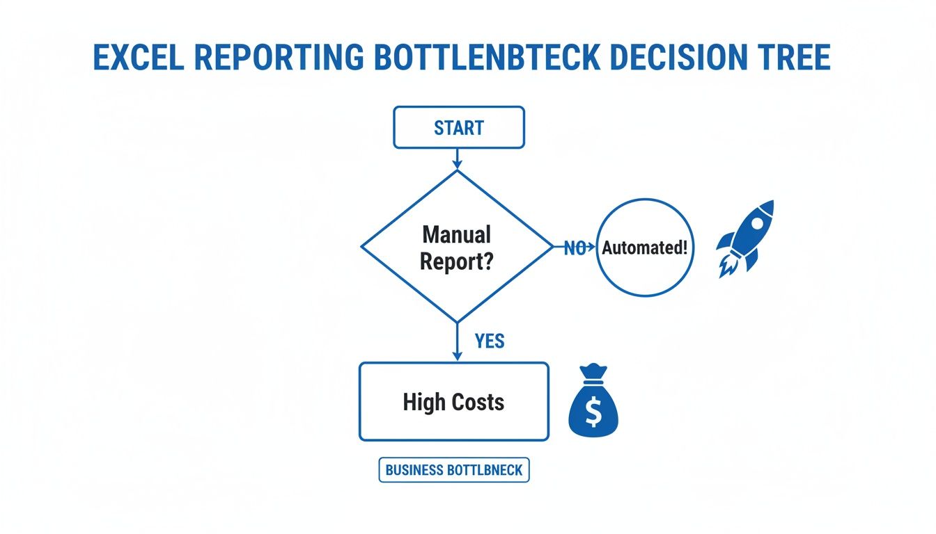
As you can see, sticking with manual reporting almost always leads to higher costs and wasted time, while automation is the clear path to efficiency.
Modern BI Platforms: The Scalable Solution
For teams who have pushed Excel to its absolute limits, a modern Business Intelligence (BI) platform like Querio is the logical next step. These tools are built from the ground up to centralize data, provide stunning interactive visualizations, and offer true self-service analytics for everyone—not just the data experts.
This isn't just a niche trend; it's a massive industry shift. The global office automation market is projected to hit $113.5 billion by 2025, largely driven by this relentless pursuit of efficiency. We've seen firsthand how AI-driven automation can cut data processing times by as much as 30%, which shows just how quickly companies are moving away from manual Excel tasks.
A BI platform is your best bet when:
Your data volumes are simply too large for Excel to handle without crashing.
You desperately need a single source of truth for standardized reporting across the company.
You want non-technical users to be able to ask their own questions of the data using natural language.
The good news is that moving from spreadsheets to a more powerful tool doesn't have to be a nightmare. You can actually level up your data analysis tools without completely disrupting your team's existing workflows.
To help you decide, here’s a quick breakdown comparing these three approaches side-by-side.
Comparison of Excel Reporting Automation Methods
Method | Best For | Technical Skill Required | Scalability | Example Use Case |
|---|---|---|---|---|
Power Query | Analysts and business users needing to automate data cleaning and consolidation from multiple sources directly within Excel. | Low. A user-friendly, visual interface with no coding required. | Moderate. Handles millions of rows well but is still limited by the user's machine and Excel's own constraints. | Combining monthly sales exports from three different regional offices into one master report. |
VBA Macros | Power users needing to automate highly specific, repetitive tasks within the Excel workbook itself, like custom formatting or report generation. | Medium to High. Requires learning the VBA programming language and understanding the Excel Object Model. | Low. Solutions are tied to specific workbooks and can be brittle; difficult to maintain and scale across a team. | Creating a button that generates a customized PDF invoice from a template and emails it to a client. |
BI Platform (Querio) | Teams and organizations that have outgrown Excel and need a centralized, scalable, and secure platform for self-service analytics and reporting. | Low for End-Users. Designed for non-technical users to explore data. (Setup may require some technical help). | High. Built for large datasets, multiple users, and enterprise-wide deployment. | A product team building a real-time dashboard to monitor user engagement metrics, accessible to the entire company. |
Ultimately, the right choice depends on where you are today and where you want to go. Power Query is a fantastic first step for most, VBA is a powerful tool for specific in-app tasks, and a BI platform is the long-term solution for scalable, data-driven organizations.
Connecting and Transforming Data with Power Query
This is where the real work to automate Excel reporting begins, and honestly, it’s where the magic happens. We’re talking about Power Query, Excel’s built-in engine for connecting, cleaning, and reshaping data before it ever hits a cell in your spreadsheet. For anyone who isn't a data engineer, it's the most powerful and accessible tool for building a repeatable data workflow.
Think of it as an assembly line for your reports. You point it to the raw materials (your data sources), define the steps for cleaning and transforming it, and tell it where to drop the finished product.
The best part? Power Query records every single move you make. That entire process—connecting to a folder of files, removing duplicates, adding a calculated column—is saved as a single, refreshable query. What once took you hours of manual copy-pasting every Monday morning can now be done with a single click.
Connecting to Your Data Sources
The first hurdle in any automation project is getting the data into Excel without having to manually download and open files. Power Query was built for this, with connectors for a huge range of sources. You are no longer stuck with just the data already living inside your workbook.
You can pull information directly from:
Individual files: A single Excel workbook, CSV, or text file.
Entire folders: Point Power Query to a shared folder, and it will automatically combine every file inside it. This is a game-changer for consolidating periodic reports.
Databases: Connect directly to sources like SQL Server, Access, or others.
Web pages: Scrape data from tables on a website, which is perfect for tracking public data sets or competitor pricing.
Let’s walk through a real-world example. A sales ops manager has to consolidate monthly reports from three regional teams: North, South, and West. Each team drops their CSV file into a shared folder. Instead of the soul-crushing task of opening each file and manually stitching them together, the manager uses Power Query's "From Folder" connector. In just a few clicks, Power Query grabs all three files and merges them into one clean master table.
Transforming and Cleaning Data Effortlessly
Once you’ve connected your data, you get to see what Power Query is really made of. Its user-friendly editor lets you perform complex data cleaning that would otherwise require nightmarish formulas or painstaking manual work.
Some of the most common transformations include:
Removing columns or rows: Ditch the data you don't need to keep your report lean.
Filtering data: Keep only the rows that matter, like sales from the last quarter or a specific product line.
Splitting columns: Easily break a "Full Name" column into "First Name" and "Last Name."
Adding custom columns: Create new calculated columns on the fly, like
Profit = [Revenue] - [Cost].
The most powerful part of the whole experience is that Power Query records every transformation in the "Applied Steps" pane. You can go back and edit, reorder, or even delete a step without breaking your entire workflow. It creates a perfectly clear, auditable trail of how your raw data became a finished report.
For our sales manager, this is huge. After combining the regional files, they notice some messy data. Using the Power Query editor, they can quickly remove duplicate entries, filter out a few test sales, and even add a "Region" column based on the original filename. All of these cleaning steps are now saved as part of the query. Next month, when the new files are added to the folder, they just hit "Refresh," and the entire process runs again in seconds.
To get a better understanding of how these kinds of workflows fit into the bigger picture, check out our guide on the modern analytics stack.
Building Dynamic Report Templates That Update Themselves

Okay, so you've got your data pipeline humming along with Power Query. That's a huge win, but it's really only half the battle. The next big leap is creating a report that actually uses that fresh data without you having to lift a finger.
We're talking about shifting from a static, one-and-done report to a living analytical tool. The goal is to build something that provides ongoing value, not just a snapshot in time. Instead of just sending out flat spreadsheets, you'll be building interactive dashboards right inside Excel, letting your team explore the data and answer their own questions.
From Static Charts to Interactive Dashboards
The real magic behind a dynamic template comes from a powerful trio of Excel features: PivotTables, PivotCharts, and Slicers. When you connect these to a clean data source (like the one you’ve set up with Power Query), they work in concert to create an incredibly interactive experience for anyone using your report.
PivotTables: This is your engine. PivotTables are masters at summarizing, grouping, and calculating massive datasets on the fly. They transform that raw table of data into a neat, aggregated summary primed for analysis.
PivotCharts: Think of these as the visual face of your PivotTable. The magic is that they’re directly linked—tweak the PivotTable, and the chart instantly reflects the change. No more manually rebuilding charts.
Slicers: These are the game-changer for user experience. Instead of forcing your boss to mess with confusing filter menus, Slicers are clean, clickable buttons that filter every connected chart and table at once.
Picture a sales dashboard. You could have Slicers for "Region," "Product Category," and "Quarter." A manager can simply click "Northeast," "Widgets," and "Q3," and watch every single chart and metric update instantly. This is the heart of what it means to truly automate Excel reporting.
Here's a pro tip I've learned from years of building these: always separate your report's core components. I use a multi-tab system: one for the raw data, another for the "behind-the-scenes" PivotTables, and a final, polished tab for the dashboard itself. This simple separation makes future updates a walk in the park.
Structuring Your Workbook for Success
A little bit of organization upfront saves you from massive headaches down the road. A messy workbook with data, calculations, and charts all jumbled together on one sheet is a nightmare to troubleshoot. When you’re ready to move past the basics, it's worth looking into best practices for designing advanced custom reports to take your skills to the next level.
For now, stick to this tried-and-true structure for your automated templates:
Data Tab: This sheet is home to your raw data, loaded directly from Power Query. The cardinal rule here? No manual edits. Treat it as a read-only source.
Analysis Tab: This is your "backend." It holds all the PivotTables that do the heavy lifting, summarizing the raw data from the first tab. You can—and probably should—hide this tab from your final users to keep things clean.
Dashboard Tab: This is the "frontend," the part everyone sees. It’s where you’ll arrange all your PivotCharts, Slicers, and key numbers, all pulling from the PivotTables on your Analysis tab. The focus here is purely on clean visualization and easy interaction.
Adopting this structure makes your report not only easier for others to use but also dramatically simpler for you to maintain and expand later on.
How to Schedule and Distribute Automated Reports
Here's where the magic really happens. Getting your reports into the right hands at the right time—without you even thinking about it—is the final piece of the puzzle. An automated report that you still have to manually refresh and email isn't really automated, is it? This last step is what turns a repetitive chore into a proactive system that delivers value on autopilot.
The goal is to create a completely hands-off process. One that refreshes the data, saves the latest version of the report, and then sends it out to stakeholders on a set schedule. This ensures everyone gets the information they need, right when they need it, which builds a ton of trust and reliability in your reporting.
Setting Up Scheduled Workflows with Power Automate
For anyone deep in the Microsoft ecosystem, Microsoft Power Automate is your best friend here. Think of it as the glue that connects all your different apps. You can build workflows visually, without touching a line of code, and trigger them based on just about anything—like a specific time of day or a new file appearing in a folder.
For instance, I've seen teams build a simple but incredibly effective flow that does this:
Runs every Monday at 9:00 AM like clockwork.
Opens a specific Excel file stored in SharePoint or OneDrive.
Refreshes all the data connections to pull in the weekend's numbers.
Exports the main dashboard tab as a clean, professional PDF.
Attaches that PDF to an email and shoots it off to a list of managers.
The best part? This all happens in the cloud, so it runs even if your laptop is closed. It’s no surprise that tools like Power Automate are becoming central to Excel work. AI is getting so good that you'll soon be able to build these flows just by describing what you want in plain English. We already know that finance teams who automate these kinds of tasks directly in their spreadsheets see the biggest cost savings and efficiency boosts. You can read up on some of the emerging AI features in Excel to see where this is all heading.
By setting up a scheduled workflow, you’re not just saving time—you’re creating a system of record. Leadership knows they will receive the sales report every Monday morning, which builds a reliable rhythm for the entire business.
Managing Access and Governance
Once you start automatically sending reports flying around, you need to think about governance. It's crucial to make sure the right people—and only the right people—can see sensitive information. Storing your reports in a shared space like SharePoint or OneDrive is a much safer bet than just emailing attachments all over the place.
This gives you fine-grained control over who can view or edit files. It also creates a clear version history, so you can finally put an end to the chaos of figuring out which "Final_Report_v3_final.xlsx" is the one you're supposed to be looking at. Managing permissions properly is a non-negotiable step to automate Excel reporting responsibly.
You can even take it a step further. Instead of just email, you could push updates to other platforms, like sending Slack notifications with key data points directly to your team's channel.
When to Move Beyond Excel to a BI Platform
Look, Excel is a powerhouse. I've built some incredibly complex models in it over the years. But even the most die-hard spreadsheet fan has to admit when they've hit a wall. Recognizing that you've outgrown Excel isn't about failure; it's a sign of growth and a critical strategic move for your business.
The signs are usually there long before you admit it. They start as minor annoyances—reports with huge datasets that chug along, taking forever to open or just outright crashing your machine. Before you know it, you're drowning in version control chaos. You know the scene: "final_report_v2_Johns_edits_FINAL.xlsx" is flying around in emails, and nobody is sure which numbers are the right ones.
Recognizing the Tipping Point
The biggest red flag? Data silos. When every department has its own master spreadsheet, you've lost the war for a single source of truth. Marketing has their numbers, Sales has theirs, and Finance has a completely different set. Trying to get a unified view of the business becomes a nightmare of VLOOKUPs and manual reconciliation.
Then there's the self-service analytics problem. Sure, you can automate Excel reporting to a point, but it rarely empowers your team to explore the data themselves. Your marketing manager can't just jump in and slice customer data by a new campaign. Instead, they're stuck in a queue, waiting for the one analyst who understands the labyrinth of formulas to run a new report.
When your team spends more time arguing about whose numbers are right than they do discussing what the numbers mean, you’re past the tipping point. The conversation is no longer about strategy; it's about data validation, and that's where productivity goes to die.
This is exactly where modern BI platforms like Querio come in. They are built to solve these problems from the ground up by connecting all your data into one central place. Everyone works from the same playbook, the data is trusted, and the silos disappear.
For finance teams, this is no longer a luxury. With up to 80% of transactional accounting work now automatable, relying on error-prone, manual spreadsheets is a huge liability. Just look at Glassdoor—they saved 190 hours a week by automating review processes that used to take hours of manual effort. You can dig into more stats on the real-world impact of automation on thunderbit.com.
Imagine you're a SaaS company wanting to give your customers dashboards showing their own product usage right inside your app. Trying to pull that off with Excel is just not going to happen. But with a BI tool that offers embedded analytics, you can deliver that value directly to your users, turning a massive development headache into a simple configuration.
Got Questions About Excel Automation? We've Got Answers.
When you first dive into automating Excel reports, a few common questions always seem to pop up. Let's tackle them head-on with some practical, no-nonsense answers.
What’s the easiest, no-code way to automate Excel reports?
Hands down, your best bet is Power Query. It's already built into Excel—you'll find it under the "Get & Transform Data" section on the Data tab.
Think of it as a recorder for your data cleanup steps. You connect to your data sources (like a folder of CSVs or a database), and then use its visual interface to filter columns, merge files, or unpivot data. Power Query remembers every single click, creating a repeatable recipe.
Next time you need to run the report, you just hit "Refresh," and it does all the heavy lifting for you. It’s a complete game-changer.
Should I use VBA or something like Power Automate?
This is a classic "right tool for the job" scenario. Here’s how I think about it:
VBA is your go-to for complex, in-workbook tasks. Need to create a custom button that formats a sheet in a very specific way? Or maybe you want to loop through cells to perform a unique calculation? VBA gives you granular control over every pixel and cell inside Excel.
Power Automate is for workflows that involve more than just Excel. It’s the glue that connects your apps. A perfect example is a flow that automatically grabs an Excel attachment from a daily email, saves it to SharePoint, tells the spreadsheet to refresh its data, and then pings your team on Teams with a summary.
Key Takeaway: Use VBA to automate actions inside Excel. Use Power Automate to orchestrate a workflow that connects Excel to other apps.
Can I really automate reports that pull data from a website?
Yes, you absolutely can, and it's surprisingly simple. Power Query has a "From Web" connector designed for exactly this.
You just point it to a URL, and it will identify any data tables on the page. Once you've connected and cleaned up the data the first time, you can schedule it to refresh automatically. This is incredibly useful for tracking things like competitor pricing, public financial data, or industry statistics without ever having to copy and paste again.
Ready to move beyond the limitations of Excel? Querio is an AI-powered BI platform that empowers your entire team to ask questions in natural language, build interactive dashboards, and get insights in seconds, not weeks. See how Querio can transform your analytics.

