Business Intelligence
How to easily visualize my business data?
Transform raw business data into actionable insights with AI-powered tools that simplify visualization and automate reporting.
Transforming raw data into clear visuals is easier than you think. Here's the solution: use AI-powered tools like Querio to simplify the process. Querio connects directly to your data, allowing you to create up-to-date charts and dashboards without manual effort or automating your reporting without technical expertise.
Key Takeaways:
Why visuals matter: Charts and dashboards help you quickly identify trends, monitor KPIs, and make informed decisions.
Challenges with manual methods: They’re time-consuming, prone to errors, and often outdated by the time reports are ready.
How AI tools help: Querio automates the process, letting you ask questions in plain English and instantly generate professional visuals.
Live data access: Always work with the most current information without manual updates.
Dashboards and automation: Combine charts into dynamic dashboards and schedule automated reports to keep everyone informed.
Querio eliminates the need for coding and ensures data accuracy through centralized definitions and governance. With secure connections, compliance measures, and embedded analytics, you can confidently rely on AI to make data visualization faster, simpler, and more reliable.
7 Top Tips for Better Business Dashboard Design Data Visualization | BI For Beginners
Step 1: Connect Your Data to Querio
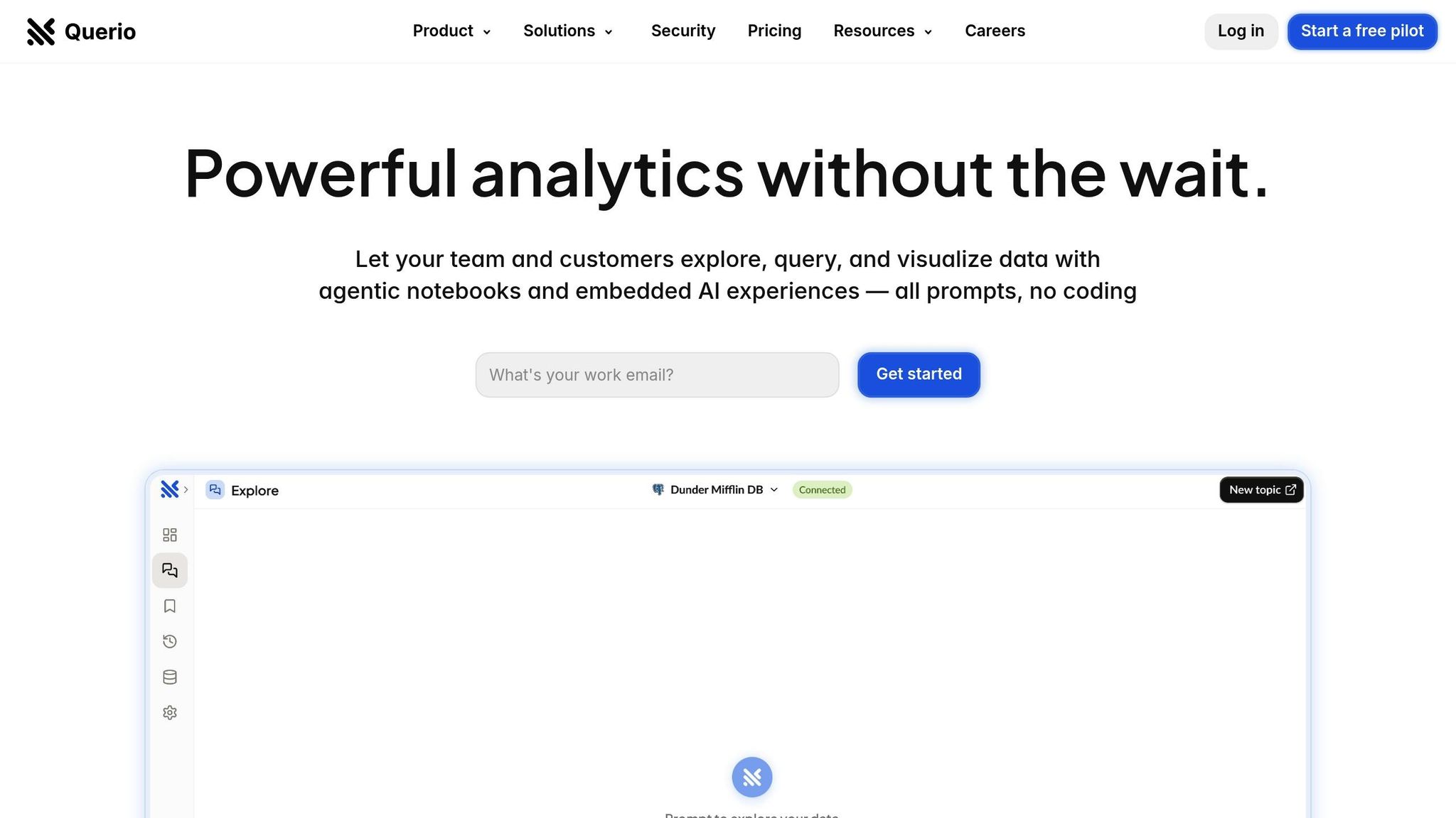
Getting your business data into Querio is simple and secure. The platform integrates directly with your existing data warehouse or database, so there's no need to export files or duplicate information. This ensures your visualizations always display the most up-to-date data.
How to Set Up Data Connections
Querio seamlessly connects to major data warehouses like Snowflake, BigQuery, and Postgres. To get started, you’ll securely input your database credentials using Querio’s encrypted connection interface.
Providing read-only credentials allows Querio to access your data without altering it. This ensures your data stays intact while giving the platform the information it needs to generate accurate visualizations.
During setup, Querio’s AI learns your business terminology and data structure. For instance, if your company uses abbreviations like "MRR" for "Monthly Recurring Revenue" or has unique product codes, Querio will recognize and interpret these terms when answering your queries. To ensure you're tracking the right KPIs, you can use a business metrics planner to align your data with growth goals.
The setup process involves entering your database host, port, username, and password into a secure form. Querio then tests the connection to confirm everything is functioning correctly before proceeding.
Meeting Compliance and Security Requirements
Security is a top priority when handling business data, especially for US-based organizations managing sensitive information like financial records or customer details. Querio is SOC 2 Type II compliant, meaning its security practices and data protection measures have been independently audited.
For industries like healthcare or finance, where regulatory compliance is non-negotiable, Querio’s security framework supports these requirements while enabling modern business intelligence features. Additionally, governance tools let your data team control who can access specific information and how it’s used.
Querio also guarantees a 99.9% uptime SLA, ensuring stable and reliable data connections. For teams that rely on real-time data for critical decisions, this level of reliability is essential.
With compliance and security covered, you can confidently access live data for faster insights.
Benefits of Live Data Access
Live data connections dramatically improve how quickly your team can react to changes. Instead of waiting for scheduled reports, your visuals update automatically as new data becomes available.
For example, sales teams can instantly view the latest pipeline metrics, conversion rates, and revenue figures. This eliminates the need for manual tasks like exporting and cleaning CSV files or manually updating charts.
Whether you're tracking campaign performance, monitoring cash flow, or managing inventory, live connections ensure your visualizations reflect the current state of your business. This reduces errors caused by manual processes and keeps your team focused on making informed decisions.
With your data securely linked to Querio, you're ready to turn raw numbers into actionable insights with dynamic charts and graphs.
Step 2: Turn Raw Data into Charts and Graphs
After linking your data, it's time to transform those numbers into clear, actionable visuals. Querio's AI tool makes this process seamless by removing the need for complicated query languages, allowing you to focus on insights instead of technical hurdles.
Ask Questions in Plain English
With Querio, you can type out questions in everyday language, and the tool instantly generates accurate visualizations. Forget about writing SQL code or navigating confusing menus - just ask your questions as if you were talking to a coworker.
For example, typing "What were our monthly sales by region for the last 6 months?" will produce a multi-series line chart. Need something more detailed? Ask "Show me customer acquisition cost compared to lifetime value by marketing channel", and Querio will create a chart that highlights which channels deliver the best ROI.
What’s even better is that Querio learns your company's specific terminology over time. If your team uses phrases like "pipeline velocity" or internal product codes, the AI adapts and applies these terms consistently, saving you the hassle of remembering exact database field names or technical details.
Once these visuals are ready, they can be compiled into dynamic dashboards for a broader, executive-level view.
Create Dashboards for Executive Reports
Individual charts are just the start - Querio allows you to combine them into comprehensive dashboards. Using a simple drag-and-drop interface, you can design dashboards without needing any technical skills.
Start by generating charts for specific questions, then arrange them on a dashboard canvas. For example, a sales executive dashboard might include charts for monthly revenue trends, conversion funnel performance, top-selling products, and regional sales comparisons. These dashboards update automatically as new data flows in, ensuring they’re always current.
The dashboard builder also offers flexible layout options, so you can adjust for different screen sizes or presentation needs. Resize, reposition, or format charts to align with your company’s branding and visual guidelines.
Want to keep your team in the loop? Use the scheduled delivery feature to send out automated summaries, such as weekly updates or monthly board reports, as PDF attachments. This ensures stakeholders stay informed without needing direct access to the platform.
Dashboards also include interactive filters, letting users drill down into specific time frames, product categories, or regions. This means one dashboard can serve multiple purposes, with each user able to focus on the data that matters most to them.
Format Data Using US Standards
Querio automatically formats all visualizations to meet US standards, ensuring your data looks polished and professional. Currency values are displayed correctly - $1,234,567.89 or 1,250,000 - and dates follow the familiar MM/DD/YYYY format, such as 12/31/2024. Whether you’re analyzing daily sales or quarterly performance, the formatting feels intuitive.
Percentages are shown in an easy-to-read style, like 23.5%, instead of technical formats like 0.235. These standards apply across all visualization types, from simple bar graphs to detailed financial dashboards.
For temperature references, Fahrenheit is used, and measurements default to imperial units where applicable. This attention to detail ensures your visualizations align with US conventions, making them easier to understand and more suited for local audiences.
Step 3: Maintain Data Accuracy and Consistency
Great-looking charts lose their impact if the data behind them is unreliable. When different teams present conflicting numbers for the same metrics, it can erode trust in your analytics. The key to producing reliable visualizations is ensuring your data is accurate and consistent, backed by strong governance across your organization.
Define Business Metrics and Rules
Querio tackles this issue head-on by enabling your data team to define business logic, table relationships, and metric calculations once - and apply them consistently across all visualizations. This approach creates a single source of truth for your organization.
Here’s how it works: your data team sets the rules for how tables connect, clarifies distinctions like "customer" versus "lead", and standardizes complex metrics such as customer lifetime value or monthly recurring revenue. These clear definitions serve as the backbone for every chart, ensuring all teams work from the same playbook.
Querio also includes a business glossary that links your company's terminology to the correct database fields. So, when someone searches for "pipeline velocity" or enters internal product codes, Querio knows exactly where to pull the data and how to process it. This makes it easier for new team members to dive in and start asking impactful questions right away.
As your business evolves, these definitions automatically update across all visualizations. This centralized system eliminates the need for manual adjustments or time-consuming efforts to resolve discrepancies, saving your team hours of work.
Ensure Accuracy Through Governance
Querio’s governance framework ensures every visualization is built using a unified set of metrics and definitions. This centralized structure not only guarantees consistent reporting but also supports a secure and reliable data infrastructure. With SOC 2 Type II compliance and a 99.9% uptime SLA, Querio meets stringent enterprise standards for security and reliability.
Up next, discover how to automate and share these consistent insights seamlessly.
Step 4: Automate Reports and Share Analytics
Once you've built reliable and consistent visualizations, the next step is to ensure those insights flow smoothly into your daily operations. Querio's automation tools make this process effortless, delivering insights that are always up-to-date and reaching the right people at the right time.
Set Up Automated Report Delivery
Automation takes the hassle out of reporting, giving your team more time to focus on strategy. With scheduled dashboards, you can keep executives and teams informed without constant manual updates. Querio lets you set up automated report delivery tailored to your needs - whether it's daily sales updates at 8:00 AM, weekly performance summaries every Monday, or monthly financial reports by the 5th.
The reports are powered by live data connections, ensuring they’re always accurate. Querio pulls fresh data directly from platforms like Snowflake, BigQuery, or Postgres every time a report is generated. This means your CEO sees the latest revenue numbers, your marketing team monitors real-time conversion rates, and your operations team tracks current inventory levels - all without lifting a finger.
Configuring automated schedules is simple, and Querio ensures the reports are formatted perfectly for email delivery. Charts and visuals remain clear and easy to read across devices and email clients, so stakeholders can quickly grasp the insights.
Think of the time you'll save. Instead of spending hours every week manually pulling data and preparing reports, your team can focus on analyzing trends and making smarter decisions. These automated reports deliver the same level of accuracy and clarity as manual ones but with the added benefit of consistency and zero effort.
And it doesn’t stop there - Querio also allows you to embed these insights directly into the tools your teams already use, enabling real-time decision-making.
Embed Analytics for End Users
Querio's embedded analytics take things a step further by integrating real-time visualizations directly into your existing platforms. This means your teams and clients can access actionable insights without juggling multiple tools or waiting for updates.
The integration process is seamless. Whether you’re embedding customer-facing dashboards into a SaaS platform or sharing real-time metrics with partners, Querio ensures the data remains secure and accessible to the right people. For example, a sales rep checking a client dashboard in your CRM will see the latest pipeline data, while a customer logging into their portal can view their current usage stats and billing details. This instant access to up-to-date information empowers faster, better decisions.
From a technical perspective, Querio makes embedding analytics straightforward. Your development team can integrate these features into your applications without needing extensive coding or wrestling with complex APIs. The analytics build on the standardized metrics and governance you’ve already set up, ensuring consistency across all touchpoints.
Unlimited viewer access means you can share insights broadly without worrying about extra costs. This encourages widespread adoption and helps create a truly data-driven culture where everyone - from front-line employees to external partners - has the information they need.
Security is a top priority. Querio uses encrypted, read-only connections to your databases, so your data infrastructure remains protected. Users only see the information they’re authorized to access, with all the governance and security controls you’ve put in place. This way, you can share insights confidently, knowing your data is safe.
Conclusion: Make Data Visualization Simple with AI Tools
Turning raw business data into clear and actionable visualizations doesn’t have to feel overwhelming or time-consuming. Tools like Querio, powered by AI, make it possible to shift from endless spreadsheets to quick, meaningful insights - all without needing to write a single line of code.
This guide outlined a straightforward four-step process to simplify data visualization. By directly connecting your live data sources to Querio, you can skip the tedious task of manual data preparation. The platform’s natural-language querying lets anyone on your team ask questions in plain English and instantly see polished charts and graphs that align with US formatting standards. These features enable your organization to access reliable insights faster than ever.
What truly sets this approach apart is the blend of speed and precision. Traditional methods for generating reports can take hours, but Querio’s AI agent creates SQL queries on the fly, delivering visualized results in moments. Plus, by establishing a governance layer, you ensure that these fast insights are consistent and trustworthy across the board.
Automation is another game-changer. Instead of manually creating and sharing reports, you can rely on scheduled dashboards to keep stakeholders updated with fresh insights automatically. This means your team stays informed without having to lift a finger.
And the benefits don’t stop there. With AI-powered embedded analytics, you can share real-time visualizations securely within your platforms, extending these insights beyond internal teams. This integration enhances decision-making at every level of your business, empowering everyone involved.
With tools like Querio, data visualization shifts from being a technical challenge to an everyday part of your operations. Your team spends less time struggling with data and more time making smarter, faster decisions. Querio’s AI-driven platform simplifies the entire process - from connecting data to creating visualizations - helping your organization turn complexity into clarity.
FAQs
How does Querio protect my business data and ensure compliance when creating visualizations?
Querio takes the security of your business data seriously, ensuring it's protected at every stage of the visualization process. With advanced encryption protocols in place, your data is safeguarded both during transfer and while stored, keeping sensitive information out of the hands of unauthorized users.
On top of that, Querio aligns with key compliance frameworks like GDPR and CCPA, ensuring it meets strict regulatory standards. This commitment to responsible data handling means you can focus on transforming raw data into actionable insights without worrying about legal or security concerns.
Can Querio’s AI-powered tools adapt to the unique language and metrics of my business?
Querio’s AI is built to grasp the specific terminology, metrics, and nuances unique to your business. It aligns with your data requirements, ensuring the visualizations it generates are precise and aligned with what matters most to you.
By diving into your business context, Querio makes sense of complex data and delivers insights that are customized for your organization. This means you can make decisions more quickly and with greater confidence.
How can I use Querio's visualizations to improve decision-making across my business platforms?
Querio streamlines the process of adding AI-powered visualizations to your current business tools, helping you make quicker, well-informed decisions. It takes raw data and turns it into easy-to-understand dashboards, charts, and graphs that are customized to fit your specific needs.
Getting started is straightforward. Simply connect Querio to your data sources and set up visualizations that align with your business objectives. Once configured, these visuals can be embedded directly into platforms like CRM systems or project management tools. This ensures your team has real-time access to actionable insights, allowing them to focus on what truly drives results.
Related Blog Posts


