Building a High-Impact Dashboard Customer Experience
Transform your data into action. Build a powerful dashboard customer experience that boosts loyalty, reduces churn, and drives tangible business growth.
https://www.youtube.com/watch?v=RAOyhZJEPqQ
published
Outrank AI
dashboard customer experience, CX dashboard, customer experience, data visualization, business intelligence
41102be9-730a-4872-a4e2-12d69ec1f141

A great dashboard customer experience is more than just a collection of charts; it’s your organization's command center for understanding customers. It pulls together all your raw data, transforming it into a clear, real-time picture of customer interactions and feelings. This is what allows teams to finally move past siloed reports and make proactive decisions that tie better CX directly to business growth.
Why a Great Dashboard Customer Experience Matters Now

Let's be real: the old ways of managing customer experience are falling short. Too many companies are stuck in a reactive loop, scrambling to fix problems only after they’ve already soured a customer relationship. Relying on stale monthly reports and fragmented data just doesn't cut it anymore when customer expectations can shift overnight.
The numbers back this up. Forrester's 2025 Global Customer Experience Index revealed a troubling trend—CX quality is actually declining worldwide. In North America, a staggering 25% of brands saw their CX quality drop in 2025, while only a measly 7% managed to improve. The research points to a clear disconnect between what customers expect and what businesses are delivering.
This is exactly where a high-impact dashboard customer experience changes the game. It’s not just another reporting tool. It’s a strategic asset that provides a single source of truth for your entire company.
Moving From Reactive to Proactive
A well-built CX dashboard fundamentally shifts your team's posture from putting out fires to preventing them from starting. When you can visualize real-time data from every touchpoint—support tickets, social media mentions, in-app behavior, and survey feedback—you can catch negative trends before they snowball.
Imagine seeing a sudden dip in Customer Satisfaction (CSAT) scores right after a new feature release. A dashboard makes this instantly visible. Your product team can then jump on the issue immediately, investigate the cause, and roll out a fix before it turns into widespread frustration and potential churn. To truly grasp the potential here, it's essential to unlock insights with customer experience analytics.
A modern CX dashboard serves as a shared source of truth, getting everyone rowing in the same direction, grounded in customer reality rather than department-specific assumptions.
To make this even clearer, let's break down the essential pieces of a modern CX dashboard and why they matter.
Core Components of a Modern CX Dashboard
Here's a quick summary of the essential elements that define a high-impact customer experience dashboard.
Component | Function | Business Impact |
|---|---|---|
Unified Data Sources | Integrates data from CRM, support, analytics, and surveys. | Provides a 360-degree customer view, eliminating data silos. |
Real-Time Metrics | Displays live KPIs like CSAT, NPS, and CES. | Enables immediate response to customer issues and trends. |
Sentiment Analysis | Uses AI to gauge emotion from text feedback. | Uncovers the "why" behind scores, highlighting customer pain points. |
User Segmentation | Groups customers by behavior, value, or demographics. | Allows for targeted interventions and personalized experiences. |
Root Cause Exploration | Offers drill-down capabilities to investigate anomalies. | Pinpoints the exact drivers of CX changes, both good and bad. |
Predictive Insights | Forecasts future trends like churn risk or lifetime value. | Helps teams proactively retain customers and prioritize resources. |
Ultimately, investing in a superior dashboard customer experience gives you a serious competitive advantage, grounded in a few key benefits.
Real-Time Visibility: You get an up-to-the-minute pulse on customer health, letting you spot churn risks and satisfaction drops the moment they happen.
Smarter Decision-Making: By connecting CX metrics directly to business outcomes, you can confidently prioritize the initiatives that will actually move the needle on revenue and retention.
Cross-Functional Alignment: It breaks down the walls between marketing, sales, support, and product by giving everyone a shared, unified view of the entire customer journey.
Proven ROI: You can finally draw a clear line from improvements in the customer experience—like faster ticket resolution or a higher NPS—to tangible financial gains for the business.
Defining Your CX Goals and Critical Metrics
Before you even think about charts and colors, let's get one thing straight: a dashboard without a clear purpose is just digital noise. It might look impressive, but if it doesn't help you make smarter decisions, it’s a waste of screen space. The first and most important step is figuring out what "success" actually means for your business.
So, start by asking the tough questions. Are you trying to slash support ticket volume by getting customers to use your self-service tools? Do you need to get more people using that new feature you just launched? Or is the big goal to stop customers from leaving by spotting the warning signs earlier? Each of these objectives requires a completely different lens to look through.
Translating Business Goals into Measurable KPIs
Once you know what you're trying to achieve, you need to figure out how you'll measure it. This is where a lot of teams go wrong. They grab a bunch of generic, off-the-shelf metrics instead of choosing KPIs that are directly tied to their specific business goals. The aim isn't to track everything under the sun—it's to track the right things.
For a SaaS company obsessed with engagement, this might mean keeping a close eye on Daily Active Users (DAU), feature adoption rates, and how long people stick around in the app. But for an e-commerce brand, the focus would be entirely different: cart abandonment rates, how often customers come back to buy again, and their total Customer Lifetime Value (CLV).
The most powerful dashboards are ruthless in their focus. They don't just present data; they answer specific, high-stakes business questions that are directly linked to revenue, retention, and growth.
Nailing these metrics down from the start gives your dashboard a clear narrative. Instead of a random jumble of numbers, it tells a coherent story. It also gets everyone on the same page, with a shared definition of what a "win" looks like. For a full walkthrough on this, check out our guide to building a successful customer experience dashboard from scratch.
Choosing the Right Trio of CX Metrics
While your specific KPIs will be unique to your business, most effective dashboards are built on a foundation of three tried-and-true metrics. Together, they give you a well-rounded picture of how your customers really feel.
Net Promoter Score (NPS): This is your long-term loyalty gauge. It answers the simple question: "How likely are you to recommend us?" A high NPS is a fantastic indicator of brand health and future growth.
Customer Satisfaction (CSAT): Think of this as a real-time happiness check. CSAT is perfect for measuring sentiment right after a specific interaction, like a support call or a purchase, helping you pinpoint friction points in the customer journey.
Customer Effort Score (CES): This metric tells you how easy you are to do business with. It asks, "How much effort did you have to put in to get your issue resolved?" A low-effort experience is a huge driver of loyalty.
These three metrics form a solid core. The connection between CX and growth is undeniable—top SaaS companies, for example, often maintain a Net Promoter Score between 36 and 44 and see customer retention rates in the 75% to 85% range. Leaders in every industry use these KPIs to get a pulse on satisfaction and loyalty.
Ultimately, the goal is to choose metrics that truly move the needle. A hotel chain, for instance, would want to zero in on the specific customer retention metrics that matter for driving repeat bookings and glowing online reviews. This kind of focused, context-aware approach is what turns a generic dashboard into a strategic command center.
Unifying Your Customer Data Sources
A truly powerful dashboard is built on a foundation of solid, unified data. Without it, you’re just making pretty charts that tell a misleading—or flat-out wrong—story. The real work, the stuff that separates a game-changing tool from a vanity project, starts with breaking down the data silos that exist in every single organization.
This means hunting down every place your customer data lives. Think about your CRM, support desk, social media channels, and product analytics tools. Each system holds a valuable piece of the puzzle, and your goal is to connect these disparate sources to build a genuine 360-degree view of your customer.
Identifying Your Core Data Streams
Before you can integrate anything, you have to do a thorough inventory. Walk through the entire customer journey in your mind, from their first anonymous website visit to their most recent support ticket. Where is the information from each interaction actually stored?
You'll quickly find your core data sources probably include:
Customer Relationship Management (CRM): This is your command center for account info, contact details, and sales history. It tells you who the customer is and their commercial relationship with you.
Support & Help Desk Platforms: Systems like Zendesk or Intercom are absolute goldmines of qualitative data. You’ll find ticket histories, chat transcripts, and resolution times that reveal customer pain points and how efficient your service is.
Product Analytics Tools: Platforms like Amplitude or Mixpanel track in-app behavior. This data shows you what customers are actually doing, which features they use, and where they’re getting stuck.
Marketing & Engagement Platforms: This bucket includes everything from email marketing systems to social media monitoring tools and survey software (like NPS or CSAT tools). This stream gives you a window into customer sentiment and how effective your communications are.
Once you’ve mapped all this out, you can start planning the integration. The entire point is to create a single source of truth where data from every channel can be analyzed together. That holistic view is what elevates a basic report into a strategic dashboard customer experience.
Tackling Data Modeling and Cleansing
Let’s be honest: just pulling all your data into one place isn’t enough. Raw data from different systems is always messy, inconsistent, and formatted differently. A "customer ID" in your CRM might be an email address, while in your analytics tool, it's a unique numerical key. This is where data modeling becomes absolutely crucial.
You have to establish a common identifier to link customer records across all platforms. This process, known as identity resolution, is fundamental. Without it, you can't accurately attribute a frustrated support ticket to a specific user's confusing experience inside your product.
A dashboard built on dirty data is worse than no dashboard at all. It gives you a false sense of confidence and leads to poor decision-making. Taking the time to cleanse and standardize your data is non-negotiable.
Data cleansing is the hands-on, practical side of this challenge. It involves the meticulous work of correcting inaccuracies, removing duplicate entries, and standardizing formats (like ensuring all dates follow a YYYY-MM-DD format). This painstaking effort is what ensures the insights your dashboard provides are accurate and reliable.
For teams looking to make this process much more manageable, it's worth understanding the principles behind a semantic layer. You can learn more about semantic layers and their benefits in our detailed guide.
By 2025, having a centralized, real-time view of customer interactions across every touchpoint isn't a luxury; it's essential. Integrating data from channels like email, chat, phone, and social media allows businesses to finally map the complete customer journey and spot friction points before they become major problems.
Leading SaaS companies such as GoDaddy rely on these dashboards to monitor key metrics like customer retention and transactional NPS, which directly informs data-driven decisions to boost loyalty.
Ultimately, unifying your data is about creating a comprehensive narrative for each customer. It’s how you finally connect the dots between a marketing campaign they saw last month, a new feature they adopted yesterday, and a support ticket they filed this morning. This unified view is the bedrock upon which every valuable insight is built.
Designing a Dashboard That Tells a Story
Now that your data is unified and clean, you can start the real creative work. This is where you transform raw numbers into a clear, compelling narrative that actually inspires people to take action. A high-impact customer experience dashboard isn't about cramming every possible chart onto a single screen. It’s about thoughtful design that guides users toward meaningful insights.
The goal is simple: tell a story with your data. Think of each visualization as a paragraph and the overall layout as a chapter in that story. Does the flow make sense? Does it guide the viewer from a high-level summary down to the nitty-gritty details in a logical way? Remember, cluttered and confusing dashboards get ignored, no matter how accurate the underlying data is.
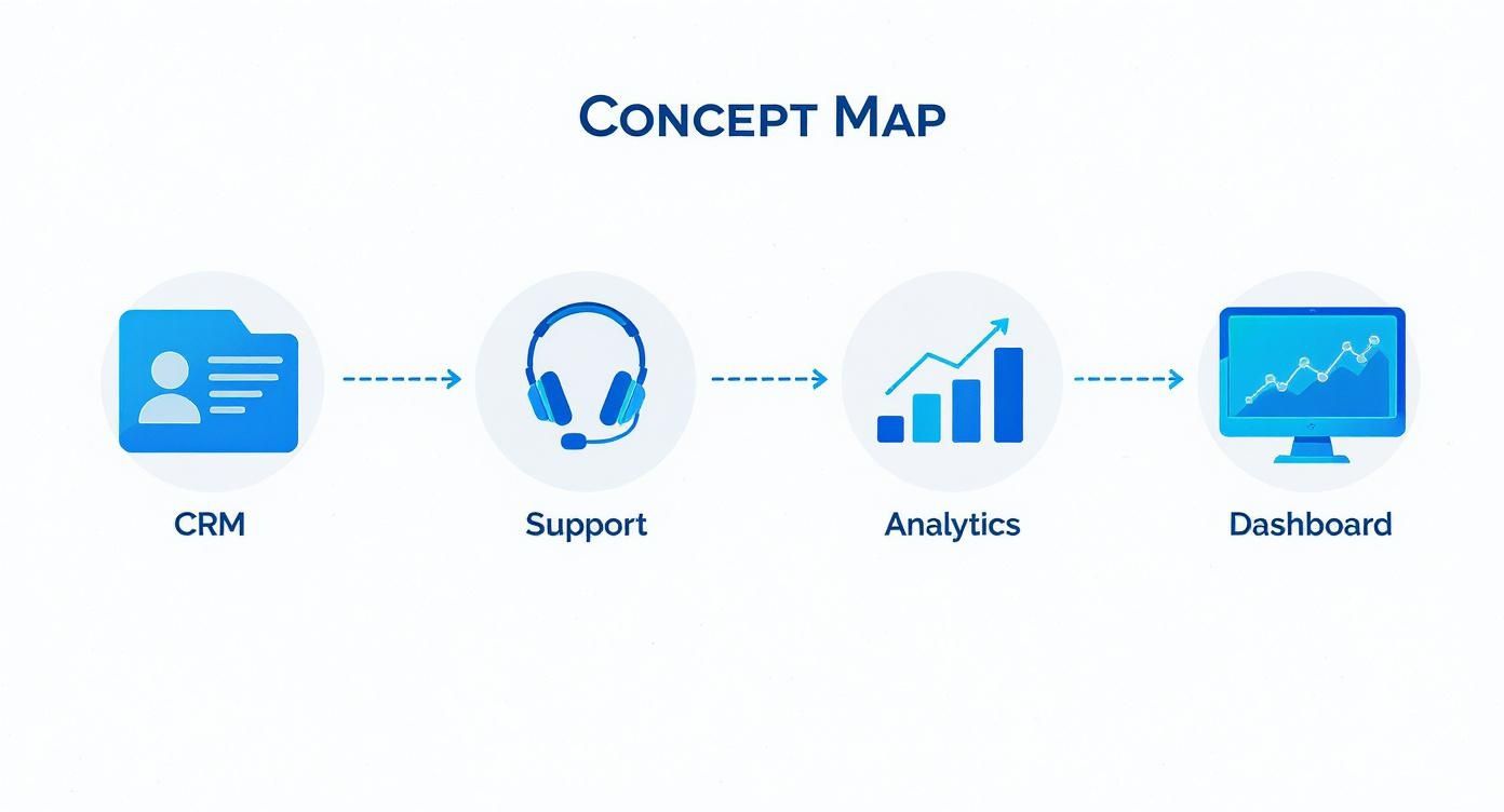
This concept map shows how different data sources, like your CRM and support platforms, can flow together to power a single, unified view of the customer experience.
The real magic happens when you consolidate all that siloed information into one central hub for clear, unambiguous analysis.
Choosing Visualizations That Speak Volumes
The type of chart you pick can make or break the clarity of your message. Each visualization has a specific job, and selecting the right one is crucial for getting your point across effectively. Please, avoid defaulting to pie charts for everything—our brains just aren't very good at comparing the size of different slices.
Be intentional with your choices instead.
Trend Lines for Tracking Progress: Line charts are perfect for showing how metrics like NPS or CSAT have changed over time. They're my go-to for spotting trends, identifying seasonal patterns, or seeing the immediate impact of a new product launch.
Bar Charts for Clear Comparisons: Need to compare metrics across different segments? Maybe you want to see customer satisfaction scores by support agent or churn rates by customer tier. Bar charts are your best friend here, making direct comparisons incredibly simple and intuitive.
Heat Maps for Engagement Hotspots: Ever wonder which parts of your website or app get the most clicks? Heat maps give you an immediate, visual gut check on user engagement, instantly highlighting popular features and potential areas of friction.
We’ve seen first-hand how the right visualization can turn a confusing dataset into an "aha!" moment for a team. To get this right, you need to match the metric to the chart type.
Here’s a quick guide to help you choose the best visualization for common CX metrics.
Choosing the Right Visualization for Your CX Metric
CX Metric | Best Visualization Type | Why It Works |
|---|---|---|
Net Promoter Score (NPS) over time | Line Chart | Clearly shows trends, dips, and spikes, making it easy to correlate changes with business events. |
CSAT Scores by product/service | Bar Chart | Provides a straightforward, at-a-glance comparison of satisfaction levels across different offerings. |
Customer Churn Rate by segment | Stacked Bar Chart | Not only compares churn between segments but also shows the composition of churn within a given period. |
First Contact Resolution (FCR) | Gauge or KPI Card | Offers a quick, immediate view of performance against a target, perfect for operational dashboards. |
Open-ended Survey Feedback | Word Cloud | Visually highlights the most frequently mentioned terms in customer comments, surfacing key themes instantly. |
Choosing wisely from options like these ensures your data is not just seen but truly understood. For a more detailed breakdown, our complete data visualization guide on choosing the right charts offers more examples and best practices.
Designing an Intuitive and Role-Based Layout
A great dashboard layout should feel effortless to navigate. I'm a big fan of structuring them like a newspaper: the most critical, high-level numbers—your "headlines"—go right at the top left. This gives anyone looking at it an instant snapshot of overall health before they dive deeper.
From there, the dashboard should invite exploration. Supporting charts and more detailed breakdowns can fill out the rest of the space, letting users drill down from the "what" to the "why."
One of the biggest mistakes I see in dashboard design is creating a single, one-size-fits-all view. A CEO and a frontline support agent care about very different things, and your dashboard needs to reflect that reality.
This is where role-based views become absolutely essential. You can't expect everyone to find value in the same set of metrics.
For the Executive Team: Keep it high-level and focused on strategic outcomes. Think Customer Lifetime Value (CLV), overall churn rate, and NPS trends. The goal is a quick, at-a-glance summary of business impact.
For the Support Manager: This dashboard needs to be operational. It should feature real-time metrics like Average Handle Time (AHT), First Contact Resolution (FCR), and CSAT scores broken down by individual agent or team.
For the Product Team: This view should directly connect customer feedback to product usage. Key visuals might include feature adoption rates, bug report trends, and those word clouds analyzing open-text feedback from surveys.
By tailoring the experience, you make sure every team member gets the insights they need without being drowned in irrelevant data. This focused approach is what drives adoption and makes the dashboard a daily habit, not a quarterly chore.
Weaving AI Into Your Dashboard to Find the "Why"

A great dashboard doesn't just show you what happened; it helps you understand why. Static charts are a fantastic starting point, but the real magic happens when you embed intelligence directly into your analytics. This is where AI transforms a simple reporting tool into an insightful, proactive engine for your team.
By bringing machine learning into the mix, you can finally shift from looking in the rearview mirror to anticipating what’s around the corner. The goal is to create a dashboard customer experience where every team member can not only see the data but also ask questions, dig into root causes, and spot hidden trends—all without needing a data scientist on speed dial.
This simple but powerful change empowers your teams to move from just observing to taking decisive action, turning the dashboard into a genuine partner in making smarter decisions.
Moving Past the Basic Metrics with AI
Traditional KPIs like NPS and CSAT are essential, but they often leave you with more questions than answers. Why did NPS drop last month? What specific problems are dragging down our satisfaction scores? AI is perfectly suited to answer these questions by digging into the unstructured data you're already collecting.
Here are three practical ways AI can immediately deepen your understanding:
Sentiment Analysis: Think about all the text in your open-ended survey responses, support chats, and social media comments. It’s an absolute goldmine. AI can analyze all of it at scale, automatically tagging feedback as positive, negative, or neutral and revealing the emotions driving your metrics.
Predictive Analytics: Imagine being able to flag customers who are likely to churn before they actually leave. By analyzing subtle behavioral shifts—like using the product less or submitting more support tickets—machine learning models can generate a churn risk score for every single user.
Anomaly Detection: No human can watch every metric, all the time. AI-powered anomaly detection acts as your team’s vigilant watchdog, automatically flagging unusual spikes or dips in your data. It could be a sudden surge in bug reports after a release, giving you a crucial head-start on fixing the problem.
These capabilities change the game, turning your dashboard from a passive report into an active early-warning system.
By layering AI into your dashboard, you give your teams the power to diagnose issues in minutes, not weeks. It’s all about finding the "why" behind the "what" with incredible speed and accuracy.
The best part is how accessible this becomes. You no longer have to export data for complex offline analysis. The insights are right there inside the dashboard, where your teams are already working.
Let Your Team Talk to the Data
One of the most exciting advances in the modern dashboard customer experience is the ability to interact with your data using plain English. Instead of being stuck with pre-built filters and charts, anyone on the team can ask complex questions and get answers on the spot.
This approach democratizes data, freeing your teams from relying on data analysts for every little ad-hoc request. It builds a culture of curiosity where anyone, no matter their technical skill, can dig deeper into customer behavior. For anyone curious about the tech, it's pretty amazing to see how AI builds custom dashboards in seconds from just a simple text prompt.
Here are a few examples of questions your team could ask an AI-powered dashboard:
"Show me the top reasons for customer churn last quarter, summarized from support tickets."
"Compare CSAT scores for customers who went through our new onboarding versus the old one."
"What are the common themes in negative feedback from our enterprise users?"
"Can you find users with high engagement but low satisfaction scores?"
This kind of conversational interface turns the dashboard from a static report into a dynamic analytical partner. It invites follow-up questions and makes exploring the customer journey feel natural and intuitive.
Ultimately, integrating AI isn't about adding flashy features. It's about giving your organization the tools to make faster, smarter, and more empathetic decisions. It closes the gap between seeing data and taking action, making sure every insight is ready to be used to make the customer experience better.
Rolling Out Your Dashboard for Maximum Impact
You’ve designed the perfect dashboard and your data is flowing beautifully. Now comes the critical part: getting it into the hands of the people who can actually use it to make a difference. A successful rollout isn't a one-and-done launch party; it’s about thoughtfully weaving this new tool into the daily fabric of your company's culture and decision-making process.
The single most effective way to get people to use your new dashboard customer experience is to meet them where they already are. Instead of making them open yet another browser tab, bring the insights directly into the tools they live in all day.
Think about surfacing key metrics in a Slack channel or embedding a specific view right inside your internal portal. Removing that little bit of friction makes the dashboard feel like a natural part of their existing workflow, not another chore to remember.
Establishing Secure Access and Governance
As you gear up for the launch, security and governance absolutely cannot be an afterthought. We're talking about sensitive customer data, and protecting it is non-negotiable.
The first step is setting up solid, role-based access controls. This ensures that team members only see the data that’s relevant and necessary for their jobs. A support agent, for example, might see their personal performance metrics, while a C-suite executive gets the 30,000-foot view of business outcomes. This tailored approach isn’t just about security—it also prevents information overload and makes the dashboard far more useful for everyone.
A dashboard is a living tool, not a static report. Build a governance framework that includes a clear process for validating data accuracy and a feedback loop for users to request changes or report issues. This ensures the dashboard remains a trusted and relevant resource over time.
To set yourself up for long-term success, focus on these three governance pillars:
Data Accuracy Framework: Put a regular audit process in place. You need to routinely check your data sources and double-check the logic behind your metric calculations. This is how you build and maintain trust in the numbers.
Role-Based Permissions: Clearly define who gets to do what. Map out specific user roles—like Viewer, Editor, or Admin—and assign them based on teams and seniority levels.
Continuous Improvement Loop: Create a dedicated channel for user feedback, whether it's a Slack channel, a simple form, or regular office hours. Actively review these suggestions to refine visualizations, add new metrics, and make sure the dashboard evolves as the business does.
By focusing on a seamless, secure, and iterative rollout, you'll transform your dashboard from a one-off project into an essential, trusted asset that genuinely helps create a better customer experience.
Frequently Asked Questions
What's the Biggest Mistake People Make When Building a CX Dashboard?
Easily the most common pitfall is getting bogged down in vanity metrics. It's tempting to fill a dashboard with impressive-looking numbers, but if those numbers don't lead to a clear action, they're just noise. A cluttered dashboard that doesn't help anyone make a better decision is ultimately a failure.
My advice? Always, always start with your core business objectives. From there, work backward to identify the specific KPIs that genuinely track your progress. Every single chart or widget on that dashboard should exist to answer a critical business question.
How Can I Make Sure My Team Actually Uses the New Dashboard?
Getting people to adopt a new tool is always a challenge, but I've found it boils down to three things: relevance, accessibility, and good old-fashioned training.
First, you need to create role-specific views. Your support team needs a different lens on the data than your product or marketing teams. A personalized view is a fundamental part of a great dashboard customer experience.
Second, don't make them go searching for it. Embed the dashboard directly into the tools they live in every day, whether that's Slack, your internal wiki, or a CRM. Finally, run training sessions that go beyond just how to click around. Focus on the why—how this dashboard makes their jobs easier and helps them hit their targets.
The real goal is to weave the dashboard into the fabric of a team's daily routine. It shouldn't feel like another bookmark to remember. When it's seamlessly integrated, data-driven decisions become a natural habit, not a chore.
How Often Should the Dashboard Data Be Refreshed?
There's no single right answer here—it completely depends on the metric and who's using it. For your frontline operational teams, things like live chat satisfaction scores or the number of open support tickets need to be updated in near real-time. They need that immediacy to jump on urgent customer issues.
On the other hand, the strategic metrics your leadership team watches—like quarterly Net Promoter Score (NPS) or Customer Lifetime Value—don't need that same velocity. A daily or even weekly refresh is perfectly fine for those. The key is to match the refresh rate to the speed at which that specific team needs to make decisions.
Ready to build a dashboard customer experience that turns curiosity into clear answers? Querio lets any team ask questions in plain English, visualize data instantly, and embed analytics directly into your product. Stop waiting for reports and start making smarter decisions today.

