
Mariia Krutsko

Design
7
m
It Has Always Been A Notebook
Brand and product finally aligned
Hello hello.
It has been a while since I wrote something but we recently launched a new website with a new brand for Querio, and as a person who suffered the most during that process I have a few things to say.
It is not a secret that Querio lacked personality. It was giving npc in the SaaS world. Change the logo and you can never tell who this is. But we want to stand out. So as every self-respected startup we did a big rebrand.
You see the problem, right? 👆
The North Star
We want our website to leave a defined footprint on whomever looks at it.
Let’s take an imaginary friend, Tom, as an example. Tom works in tech and [fun fact] an average tech person sees 25-50 websites a day (source: chatgpt, so take with a grain of salt, but you get the point). Thus, in this mishmash of websites Tom saw just today, we need to ensure he does not forget about us.
Take Tom, data analyst, bit of a nerd. Not only we need his brain to go “That’s cool, very creative” but also “Wait a second… this looks like it was made for me, let’s explore.”
What Triggered The Change
We knew for a while that we needed stronger branding. We could feel it. The problem was, we didn’t know what it should look like. Too many ideas were flying around the room. None of them were bad, but how do you pick just one?
It’s especially hard when you’re trying to sell to multiple audiences at the same time. Our ICPs included product teams, data teams, ops teams, basically anyone remotely connected to data. Unfortunately, Rami is a little too good at getting people hyped about data.
So, before touching any design work, we had to answer a much bigger question:
Who are we actually selling to?
After countless trials and errors, our sales department (Rami + Dan) discovered that the best person to sell our product to is a data person who is on the edge of a crashout from overwhelming workload, inefficiencies, messy systems, and a bunch of annoying coworkers asking “heeey, you know you're my favourite coworker, right? Just need this insight asap”.
So, we narrowed our target buyer persona down to just Tom as he is today.
And once we had a better understanding of who we were selling to, the direction felt MUCH more defined.
The Process
Brainstorming
Okay, we have a persona, we have the reason and idea of the final outcome. However, we still have lots of questions on how to get there. After countless brainstorming sessions, we agreed on two important aspects for our redesign:
How do we want the product to feel?
Querio feels…


How do we want the user to feel?
Users feel…


This opened doors to some cool ideas about how it should look later on.
As a result the design had to be:
Techy enough to attract the data team,
Simple enough not to scare everyone else away
Catchy and unique
Not too boring, not too silly
No generic AI/BI tool vibe - something more innovative.
Reflect our notebook concept
Moodboarding

We designers are super protective over our designs and feel a strong sense of ownership. We rarely want others to interfere (please don't). Honestly, it's good practice to get your team on board and bring them along on this journey of building a brand identity. Especially during the stages of brainstorming and mood-boarding.
more ideas → better ideas → more productive overall.
I may have felt attacked a few times, but my team's ideas and comments really helped establish the final look and feel.
Here’s step by step tutorial on how we did it:
Annoy everyone with your questions and make their opinion feel valued
Welcome ALL ideas
Try everything out
See if you like it
Ask for feedback
Repeat until it clicks and feels right
What finally clicked
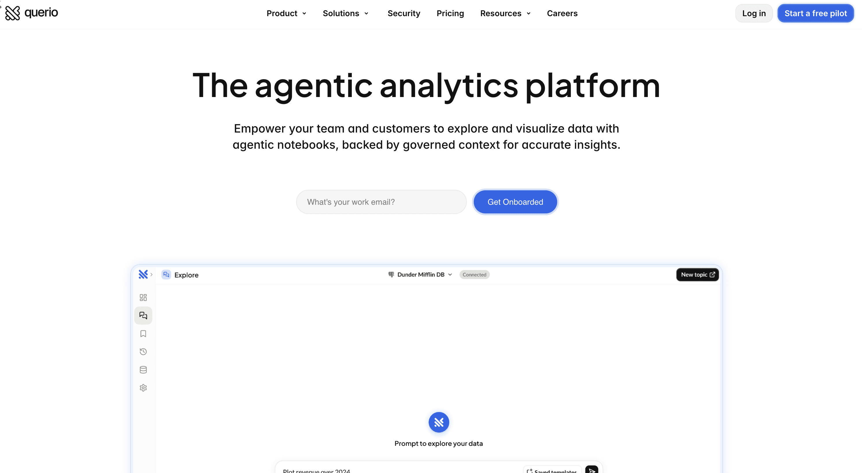
The core idea behind Querio’s visual style is that everything is a notebook, just like the app itself. Specifically, a Jupyter notebook under the hood. This concept is reflected in the background (a real notebook texture) and reactive Jupyter-style cells, which embodies the idea of an interactive notebook. The grid gives a feeling of a structure, accuracy and precision, and the notebook itself - explorations, messing around, discovering the answer.
A Few Cool Details
Gradients But Used Mindfully. Colourful gradients extend the idea of using distinct colours for different tabs (i.e., features) in the app, while also adding depth and visual contrast.

Custom Icons. Constructed from parts of the logo emphasise that all data work can be accomplished within a single app.

Techy Font. A monospaced font family is used decoratively as a reminder that code is the most powerful way to work with data. Bonus: tech people love monospaced fonts.
<Hello/>
Illustration. Blue sketch accents enhance brand recognition.

The Personality
I strongly believe in the phrase "people buy from people". There is a time and place to add your personality into a serious thing like the app that holds your company’s most valuable data but in the end it is not some corporate robot behind our customers, it is Tom who wants to be understood and saved from his misery. But without a doubt this is a very slippery slope. Too much personality → you seem unserious, too little → you seem like a pain to work with.
In fact, this not only applies to customers but also for investors, potential employees, the list goes on. The cooler the team, the more people want to be a part of it.This fan base unlocks various opportunities. Take Ryanair for example, would they have built such a large following without their ironic social media presence? By the book, it might seem too unserious for an airline, but hey if it works, it works. Haters will hate but numbers speak for themselves.
We did an excellent job expressing our vibe while keeping things professional. On one had there is the “careers” page with lots of fun elements and “easter eggs”. On the other hand there’s the “security” page, that is looking more like a formal document meant to address potential customers’ concerns and doubts. As I said before, there is time and place for everything.

The Challenges Along The Way
Never-ending Updates
The biggest pain in my existence is something I bring on myself. I spoke to quite a few designers and no matter their seniority it is the same pattern for all:
You make something
You like it
You look at that the next day/week/month
You hate it
You try to change it but you do not have the time.
Does it indicate a sign of growth? Maybe. Does it make you life miserable? Absolutely.
So far I have come up with only one solution to this: accept that change is inevitable and create an environment where it can happen as effortlessly as possible. Meaning creating components for EVERYTHING and use them consistently. A good rule of thumb is: if you find yourself duplicating an element, it should probably be a component. However, do not create ten different components for the same thing. Left-aligned card and center-aligned card is probably just a card and you are better off sticking with one. No need to clutter your design system that is already fighting for its life trying to stay up to date.
Never-ending Feedback
Ahh yes, on top of your own feedback you get a random “hmm I don’t like it” from others, which is fair but annoying. You fall off track trying to fix this problem
Here is another way how to approach it:

And My Personal Favorite - Competing Ideas
My genius idea vs popular competing idea = tough situation. Sometimes you have to admit defeat: make the design, then cry at home later. The harsh truth is probably that there is an underlying reason for why the other idea works better. But being so infatuated with our work, we designers, often get too attached to let it go. We try to change it, rephrase it, tweak it, anything to keep it alive just like a toxic relationship.
I have definitely been guilty of this. I once created this whole “game-like” panel for the hero section, with 3D buttons and a switch. It looked cool. The idea was there. The execution on the other hand? Not so much. No one realised it was clickable. The frame drew more attention to itself than to the actual product screenshot inside. Overall, it did not serve its purpose and may have done more harm than good - worst traffic conversion we ever had :/

How To Know If Your Brand Identity Was Good?
Sadly there is no way to truly know. Only time will tell. If at same time next year we have a whole different look, then it would mean one of two things:
The design didn’t serve our persona very well
The persona has changed
For now, all we can do is track the metrics, get feedback and polish what we have.
On that note I’m off to fix a tablet version of our website. I’m sure there is a bug. There always is. The tablet version is cursed I swear.
👋
Written by

