Business Intelligence
What are some data visualization tools
Explore popular data visualization tools that enhance decision-making through AI-driven features and seamless collaboration for various business needs.
Data visualization tools help transform complex data into clear visuals, enabling better decision-making. Here's a quick summary of top AI-native business intelligence tools and their essential features of modern BI tools:
Querio: AI-driven, natural language interface, real-time database connections, and collaborative notebooks.
Tableau: Advanced visualizations, AI tools like Einstein Copilot, and strong data source connectivity.
Microsoft Power BI: Seamless Microsoft integration, AI-powered insights, and collaborative workspaces.
Looker: Focus on data governance, LookML for semantic consistency, and integration with Google Workspace.
Zoho Analytics: Affordable, AI features like Zia Insights, and extensive data source connectivity.
QlikView: Flexible deployment, AI-driven analytics, and broad data integration options.
Quick Comparison
Tool | Key Features | Pricing (per user/month) | Best For |
|---|---|---|---|
Querio | AI-powered, no coding needed | Contact for pricing | Teams needing AI-driven simplicity |
Tableau | Advanced visuals, AI tools | $15-$75 | Enterprises needing detailed dashboards |
Microsoft Power BI | Microsoft ecosystem integration, AI tools | $10-$20 | Organizations using Microsoft 365 |
Looker | Data governance, LookML modeling | Contact for pricing | Companies focused on data consistency |
Zoho Analytics | Affordable, AI-driven insights | Starts at $24 | Small to mid-sized businesses |
QlikView | Flexible deployment, real-time analytics | $200+ | Large organizations with complex needs |
Choosing the right tool depends on your team's expertise, budget, and data needs. Each offers unique strengths for specific use cases.
7 Best Data Visualization Tools 2025 (Full Software Demo & Comparsion)
1. Querio

Querio is a business intelligence platform designed to make data analysis accessible to everyone, regardless of technical expertise. With Querio, users can query, analyze, and explore data using AI - no coding skills needed.
AI-Powered Simplicity
Querio uses AI to simplify how users interact with data. Its natural language interface allows you to ask questions in plain English and get actionable insights instantly. This approach can generate reports up to 20 times faster, saving users an average of 8 hours of data work each week[3].
Seamless Data Connections
Querio connects directly to major databases, providing real-time access to up-to-date information. By eliminating the need for complicated integrations, it streamlines workflows and ensures users can focus on analysis rather than setup.
Built for Collaboration
Collaboration is at the heart of Querio. Its shared natural language interface and interactive notebooks allow data professionals to dive into advanced analytics while making insights easy to share. This encourages teamwork and helps all team members make informed, data-driven decisions.
Getting Started
Getting started with Querio is straightforward. Simply sign up on their website, link your data sources, and begin analyzing reports without delay[2].
2. Tableau

Tableau is a leading platform in the business intelligence space, recognized as a Gartner Magic Quadrant Leader. Known for its powerful visualization tools and advanced analytics, Tableau helps organizations of all sizes turn raw data into actionable insights[4].
AI-driven capabilities
Beyond its core visualization features, Tableau integrates artificial intelligence to simplify data analysis and make insights more accessible - even to users without technical expertise[4].
Key AI tools like Einstein Copilot and Tableau Pulse enhance productivity by offering in-context assistance and generating automated visualization suggestions. These tools deliver personalized insights directly within workflows, making data analysis smoother and faster[4][5]. Tableau's AI capabilities also help users quickly identify trends and patterns in their data, unlocking deeper understanding[4].
Tableau AI is applied across various industries. For example:
Healthcare: Analyzing patient data to identify trends, predict outcomes, and improve care while reducing readmissions[5].
Retail: Supporting demand forecasting, inventory management, and personalized marketing to better predict customer preferences and increase sales[5].
Finance: Enabling real-time risk assessment, fraud detection, and investment analysis to spot potentially fraudulent transactions before they escalate[5].
Data source connectivity
One of Tableau's standout features is its ability to connect to a wide range of data sources. It supports spreadsheets, text files, big data platforms, relational databases, cube databases, public datasets, and cloud-based databases[7]. With connectors like JDBC, ODBC, web data connectors, and custom plugins, Tableau ensures smooth data integration[7].
The Tableau Server acts as a centralized hub for data and connections, reducing redundancy and enabling teams to access shared data sources directly from their workbooks[6][9]. Tableau also supports complex data scenarios by combining data from single or multiple databases using methods such as relationships, joins, unions, and blends[8]. These features make it easier for teams to collaborate and work with consistent data sets.
Collaboration features
Tableau's collaborative tools build on its robust data connectivity. With Tableau Server, teams can share data sources, manage extracts, and consolidate access while maintaining security and governance[9]. This centralized system ensures that everyone works with consistent data definitions.
The platform also supports interactive dashboards, which team members can explore and customize to meet their specific needs. This interactivity encourages a culture of data-driven decision-making across all levels of an organization.
Pricing and scalability
Tableau follows a tiered licensing model with three user roles:
Creator: $75/user/month
Explorer: $42/user/month
Viewer: $15/user/month
These prices apply to both Tableau Cloud (SaaS) and Tableau Server (self-hosted) options when billed annually[13][14].
The median annual cost for Tableau is $29,386, with pricing ranging from $3,123 to $147,752 depending on the organization's size and needs[10]. Currently, new customers can save 20% on Enterprise edition licenses through a limited-time offer that expires on July 31, 2025[13].
Tableau Server is designed to scale efficiently, supporting up to 100 users per core and expanding linearly as organizations grow[11]. It can be configured flexibly based on data infrastructure, user load, and device requirements[12].
For organizations looking to save, Tableau offers special pricing for startups, nonprofits, and educational institutions[14]. Additionally, enterprises that negotiate effectively can often cut per-user costs by 10-30% or more compared to standard pricing[15].
3. Microsoft Power BI
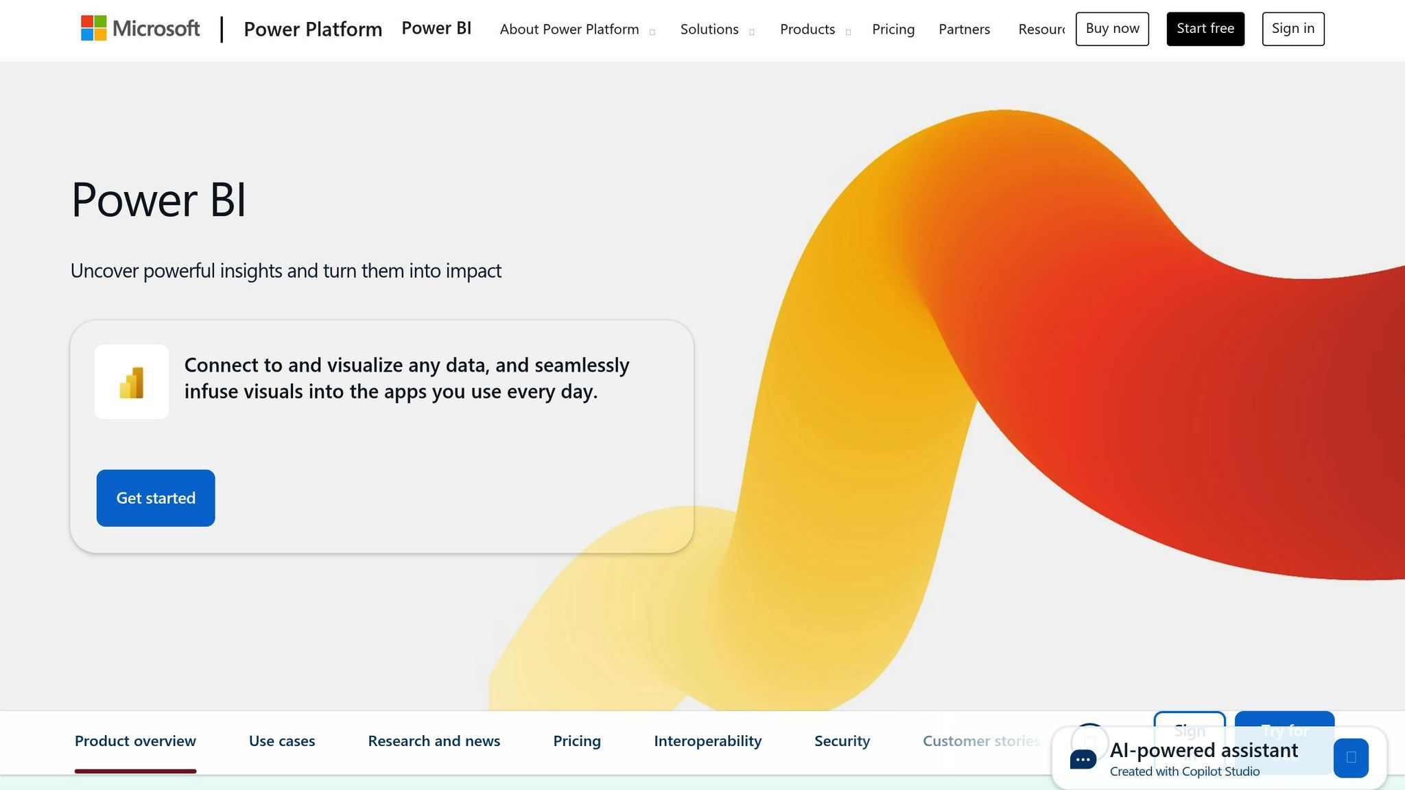
Microsoft Power BI integrates seamlessly with the Microsoft ecosystem, providing a familiar platform for building visualizations and reports.
AI-driven capabilities
Power BI leverages AI and natural language processing to allow users to ask questions in plain English and instantly receive visual answers.
The standalone Copilot feature enhances this functionality by enabling users to locate and analyze reports, semantic models, apps, and data agents through natural language queries[16]. To activate this feature, administrators need to enable Copilot in Power BI and adjust the tenant setting labeled "Users can access a standalone, cross-item Power BI Copilot experience"[16].
Here are some of the key AI tools available:
AI Data Schema: Lets semantic model authors pinpoint specific parts of their data model for Copilot to prioritize[16].
Verified Answers: Automatically provides pre-written responses to commonly asked questions[16].
AI Instructions: Supplies contextual guidance, helping Copilot better understand business logic for more accurate outputs[16].
For example, Standard Bank utilized Power BI's AI tools, including Copilot and AutoML, to analyze customer behavior and improve forecasting accuracy[17].
Data source connectivity
Power BI stands out for its ability to connect to a wide range of data sources via the Power Query engine, supporting hundreds of connections[21]. These sources include files, databases, Azure services, and online platforms. Power BI also offers two modes - Import and DirectQuery - to ensure data remains current and accessible[18][19][20].
For secure on-premises data access, Power BI uses a gateway[19]. Additionally, PBIDS files simplify the setup process by pre-defining the connection details and data source specifications, making it easier for new users to get started[18].
Collaboration features
Power BI enhances team collaboration through features like Workspaces, which allow teams to co-manage dashboards, reports, semantic models, and workbooks[22]. Integration with Microsoft Teams brings data into everyday workflows by embedding reports and dashboards directly into Teams channels, enabling data-driven discussions[22][23][24].
For instance, Microsoft's Data Intelligence team trained partner teams to use Power BI. One team, responsible for network parts, created a dashboard to manage network device vendors, speeding up cost-saving negotiations[25].
"Using Microsoft Power BI's easily adaptable features, business users can quickly self-serve the datasets they need and build their own reports … They feel in complete control because they own and invest in it."
Srinivas Kanamarlapudi, senior software engineer on the Data Intelligence team at Microsoft[25]
Built-in commenting allows users to discuss insights directly within reports, while the sharing system offers flexible permission levels for viewing, editing, and resharing[22][23]. These collaborative features create a strong foundation for advanced visualization and reporting capabilities, which will be explored in later sections.
4. Looker

Looker delivers powerful data visualization tools tailored for enterprise use, emphasizing semantic consistency through its LookML layer. This ensures a single source of truth, enabling teams to collaborate more effectively and make data-driven decisions with confidence.
AI-driven capabilities
At the heart of Looker's AI features is Gemini, an assistant that allows users to interact with their data using natural language processing. With Gemini, you can simply ask questions in plain English and get instant visual answers, making data exploration more intuitive.
Looker also offers several time-saving AI tools to simplify workflows:
Visualization Assistant: Quickly generates custom charts based on straightforward prompts.
Formula Assistance: Makes complex calculations easier to manage.
Automated Slide Generation: Prepares presentation-ready visuals for meetings in no time.
LookML Code Assistance: Speeds up data modeling tasks while reducing coding errors.
For example, a retail company paired Looker with Duet AI to analyze dashboards using conversational queries. This helped them identify trends, forecast demand, and improve profitability[26].
Data source connectivity
Looker connects with a wide array of SQL database dialects, offering two levels of support to meet diverse business needs:
Supported Dialects: Fully backed with updates and regular testing.
Integration Dialects: Designed for specialized use cases with partial support.
The platform seamlessly integrates with leading cloud data warehouses like Amazon Redshift, Google BigQuery, Snowflake, and Microsoft Azure Synapse Analytics. It also works with traditional databases such as PostgreSQL, MySQL, Oracle, and SQL Server, as well as modern analytics platforms like Databricks, Apache Spark, and ClickHouse.
For businesses operating in hybrid environments, Looker supports both cloud-native and on-premises connections. While most database drivers are included, some specialized ones like Actian Avalanche and Teradata require manual setup for customer-hosted installations.
Additionally, Looker Studio expands connectivity by allowing multiple data sources within a single dashboard. This lets users combine data from platforms like Google Analytics, Google Sheets, and third-party marketing tools into unified visualizations.
Collaboration features
Looker excels in fostering collaboration through shared data experiences, ensuring teams stay aligned when interpreting data. Users can create interactive dashboards and reports that others can comment on and discuss directly within the platform.
The semantic modeling layer plays a key role here, standardizing data definitions across the board. This eliminates confusion caused by varying interpretations of metrics, which is especially valuable for cross-departmental collaboration involving sales, marketing, finance, and operations.
With team workspaces in Looker Studio Pro, administrators can manage assets centrally and control sharing permissions at scale. The platform also integrates with Slack, sending instant notifications about critical data changes so stakeholders stay informed without having to monitor dashboards constantly.
For those using Google Workspace, Looker offers Connected Sheets integration, allowing teams to explore modeled data right within familiar spreadsheet tools. This bridges the gap between advanced analytics and everyday workflows, making insights accessible to everyone in the organization.
These features highlight Looker's emphasis on creating a unified, collaborative approach to data analysis, setting the stage for our broader comparison.
5. Zoho Analytics

Zoho Analytics is a BI platform powered by AI, with over 20,000 customers and 3 million users. It makes data visualization more approachable through smart automation and extensive connectivity options.
AI-driven capabilities
The platform’s Ask Zia feature transforms the way users interact with data. By typing plain-English queries, users can instantly generate reports and KPI widgets. For those starting from scratch, using a KPI dashboard planner can help define the right metrics before building.
"The Ask Zia and Zia Insights features are so cool. I can ask for a specific agent name for their quarterly or monthly performance and get to see if their sales numbers are trending up or down, and from which geographic areas their sales are coming from. I can also dive into why they can't close deals in other areas and try to replicate the successful ones." - John Sheldon, Business Intelligence Manager, Renu Energy Solutions [28]
Meanwhile, Zia Insights takes reporting a step further by providing contextual narratives and visuals. The platform also offers AI-powered automatic report and dashboard creation. For businesses looking to predict outcomes, Zoho Analytics includes tools for forecasting, trend analysis, anomaly detection, clustering, and what-if analysis, helping teams plan for what’s ahead.
This integration of AI ensures both powerful and flexible data connectivity.
Data source connectivity
Zoho Analytics supports connections to over 500 data sources, including databases, apps, files, and web feeds, with options for live or scheduled synchronization. Its no-code builder, SDKs, and data blending capabilities allow users to create custom connections and unified visualizations.
"Zoho Analytics integration is very smooth. I found no hindrance while integrating other apps with Zoho Analytics." - Greg Szabo, Co-founder and Operations Manager, Package Mate [27]
Collaboration features
Once connected, Zoho Analytics makes teamwork easy. It enables real-time collaboration through features like in-report commenting, chat, automated alerts, and detailed access controls, ensuring efficient communication across teams.
"Zoho Analytics is very easy to set up and easy to learn. It's robust and stable, and it makes it easy for me and my team to create dashboards and collaborate." - Filip Goossens, CEO & MD of ON TIME Logistics [29]
Pricing and scalability
Zoho Analytics is designed to be both cost-effective and scalable. With a 4.4/5 rating on Gartner Peer Insights and a 91% user recommendation rate, it balances affordability with a wide range of features. It caters to small teams and large enterprises alike, offering a data preparation studio with over 250 transformation functions and more than 50 visualization options.
6. QlikView

QlikView is a versatile business intelligence (BI) platform designed to meet the needs of organizations of all sizes. It provides flexible deployment options and pricing that grows with your business.
AI-Driven Capabilities
QlikView integrates artificial intelligence to deliver smarter, faster insights. Its natural language interface detects anomalies, predicts trends, and provides contextual answers across both structured reports and unstructured data sources [30][31].
"Enterprises struggle making intelligence accessible and actionable for their business users. Too many systems deliver insights and answers after the fact. We're building something different: a platform where AI detects what matters, surfaces it in context, and lets you act - all within the analytics environment itself." - Brendan Grady, Executive Vice President and General Manager of Qlik's Analytics Business Unit [30]
The platform’s AI capabilities are designed to produce explainable insights while minimizing bias, ensuring that decisions are both informed and actionable [31]. Real-world examples highlight its impact:
Volkswagen Financial Services streamlined technical documentation processes, achieving a 15x faster onboarding time.
BT Group cut reporting times from days to mere seconds.
Foodbank Victoria reduced food costs by 15% per kilogram using real-time analytics.
"This isn't about making dashboards obsolete; it's about making decisions easier." - James Fisher, Chief Strategy Officer at Qlik [31]
QlikView's AI features are complemented by its seamless ability to integrate data from various sources, making it a comprehensive tool for decision-making.
Data Source Connectivity
QlikView’s Connector Factory provides access to an extensive range of 622 applications and data sources. With the addition of CData Virtuality, users can integrate virtually any application, database, or warehouse into their workflows [32][33].
The platform supports a variety of data integration scenarios, including:
Modernizing mainframe systems
Migrating from Oracle to Hadoop
Creating data lakes
Whether users need real-time access or consolidated data for analysis, QlikView ensures smooth connectivity and integration [34].
Pricing and Scalability
QlikView offers flexible pricing plans tailored to businesses at different stages of growth. Here’s a breakdown of its pricing structure:
Plan | Price | Data Capacity | Key Features |
|---|---|---|---|
Starter | $200/month | 25 GB (fixed) | 10 users minimum, 50,000 Standard Automations |
Standard | $825/month | Starts at 25 GB | 20 full users, 200 AI questions, 1,000 reports/month |
Premium | $2,750/month | Starts at 50 GB | Up to 100,000 Basic Users, 1,000 AI questions, 5,000 reports/month |
Enterprise | Custom Quote | Starts at 250 GB | 5,000 AI questions, 25,000 reports/month, advanced features |
Pricing adjusts based on the number of users and includes multiple deployment options:
Cloud-based for instant scalability
On-premise for organizations needing strict data control
Hybrid setups to combine the benefits of both environments
Licensing is typically offered through annual contracts, with opportunities to negotiate lower per-user costs as businesses expand [35].
Strengths and Weaknesses
Here’s a breakdown of the key strengths and challenges of each tool, as well as what types of users they’re best suited for.
Querio shines with its AI-powered natural language interface, direct database connectivity, and collaborative notebooks. These features make it a great choice for teams that need seamless collaboration between business and data professionals.
Tableau is a leader in data visualization, holding over 30% of the global market share [1]. Its drag-and-drop interface makes it easy to create interactive dashboards and tell compelling data stories [40]. However, its high pricing and the need for an additional governance layer can make it tricky for larger organizations to manage [40].
Microsoft Power BI is a strong option for companies already using Microsoft 365. It offers excellent integration with the Microsoft ecosystem and provides robust, AI-driven visuals [40]. On the downside, it has a steep learning curve - especially for advanced features like DAX - and struggles with performance when handling large datasets [36][39].
Looker stands out for its focus on data governance and consistency, thanks to its LookML modeling language [37][38]. Once mastered, it ensures reliable insights and strong data integrity across the organization. However, its complexity can be overwhelming for new users, and it requires a significant time investment to fully grasp [38].
Zoho Analytics offers affordable pricing and integrates well with other Zoho products. It also features AI-generated narrative outputs, making it an appealing option for marketing teams that need solid visualizations without breaking the bank [40]. That said, it lacks some advanced charting options and has a smaller third-party ecosystem [40].
QlikView provides flexible deployment options and can connect to a wide range of data sources. However, it demands extensive training and comes with rising licensing costs as your organization grows.
Here’s a quick comparison of the tools for easy reference:
Tool | Key Strengths | Main Weaknesses | Best For |
|---|---|---|---|
Querio | AI-driven natural language; direct database connectivity; collaborative notebooks | - | Teams prioritizing AI-powered data access |
Tableau | Advanced visualizations; large user community; interactive dashboards | High pricing; complex administration | Enterprises needing detailed dashboards |
Power BI | Seamless Microsoft integration; cost-effective; AI-powered visuals | Steep learning curve (e.g., DAX); performance issues with large datasets | Organizations using Microsoft 365 |
Looker | Strong data governance; reliable insights via LookML | Difficult for beginners; time-intensive to master | Companies focused on data governance |
Zoho Analytics | Affordable pricing; integrates with Zoho; AI narrative outputs | Limited advanced charts; smaller third-party ecosystem | Small to mid-sized businesses using Zoho |
QlikView | Flexible deployment; broad data connectivity | Requires significant training; escalating costs | Organizations needing flexibility and connectivity |
The best tool for your needs will depend on your team’s expertise, budget, and long-term goals for managing and visualizing data.
Conclusion
Selecting the right data visualization tool requires a clear understanding of your business needs, technical skills, and budget. With 54% of enterprises identifying BI and data-driven solutions as essential to their operations [41], making the right choice is more important than ever.
For larger enterprises, the decision often depends on existing systems and strategic goals. If your organization already uses Microsoft products, Power BI stands out for its seamless integration and AI-driven insights. On the other hand, if creating different types of graphs and compelling data stories is your focus, Tableau is worth the investment despite its higher price tag.
Smaller businesses have plenty of affordable options, too. Platforms like Zoho Analytics offer cost-effective solutions with user-friendly, AI-powered features that fit tighter budgets.
For those managing complex data relationships or large datasets, QlikView provides distinct advantages with its associative data model and flexible deployment options. However, its interface may require additional training to fully leverage its capabilities.
These choices highlight broader trends in the evolving data visualization market. As AI becomes more integrated into these tools, platforms like Querio are making it easier to analyze data through natural language queries. The market itself is expected to grow to $12.48 billion by 2028, with an annual growth rate of 11.6% [1]. Whether you're a startup looking for affordable insights or a large enterprise needing scalable solutions, the key is matching the tool's features to your organization's data expertise and strategic vision.
Taking advantage of free trials and aligning tools with your organization's specific needs will not only streamline decision-making but also foster better collaboration across teams.
FAQs
What should I consider when choosing the right data visualization tool for my organization?
When choosing a data visualization tool, the first step is to pinpoint the type of data you'll be working with - whether it's numerical, categorical, or time-series data. Different tools excel at handling specific data types or creating particular styles of visualizations.
Next, take into account the preferences of your audience. Do they need straightforward, easy-to-read charts? Or are they looking for more intricate, interactive dashboards? Tailoring your choice to their needs ensures your visualizations are clear and effective.
You’ll also want to assess the tool's ease of use. A straightforward interface not only saves time but also encourages your team to adopt it more readily. Don’t forget to factor in the cost and how well the tool integrates with your current systems. These considerations can significantly impact your budget and overall workflow.
By matching the tool’s capabilities with your organization’s objectives, you can deliver meaningful, data-driven insights that meet your specific requirements.
How do AI-powered features improve data visualization tools?
AI-powered features are changing the game for data visualization tools by making processes smoother, boosting interactivity, and offering richer insights. With the help of machine learning and natural language processing, these tools can handle tasks like data cleaning, preparation, and integration automatically. This not only saves time but also cuts down on errors.
Interactive dashboards powered by AI allow for real-time data exploration, making it easier to spot patterns and trends that might have been overlooked. By breaking down complex datasets and presenting insights in a more user-friendly way, these tools help businesses make quicker, smarter decisions that align with their objectives.
What’s the difference between cloud-based and on-premise data visualization tools?
The Key Differences Between Cloud-Based and On-Premise Data Visualization Tools
When comparing cloud-based and on-premise data visualization tools, the main distinctions come down to scalability, cost, control, and security.
Cloud-based tools are known for their flexibility. They let businesses scale resources up or down as needed, which is especially useful for growing organizations. With a pay-as-you-go model, these tools usually have lower upfront costs, but expenses can grow over time with increased usage. Another advantage is their accessibility - teams can collaborate easily, no matter where they’re located, making them ideal for remote or distributed work environments.
On-premise tools, by contrast, offer complete control over the infrastructure. This makes them a strong choice for organizations managing sensitive data or operating under strict compliance rules. However, this level of control comes with significant upfront costs for hardware and ongoing maintenance, which can strain resources. While cloud solutions are known for their adaptability, on-premise tools often deliver more reliable performance since data is processed locally.
Ultimately, the right choice depends on your organization's specific needs, budget, and how you prioritize data control and accessibility.
Related Blog Posts


